Lovelace Button card for your entities.
- works with any toggleable entity
- 6 available actions on tap and/or hold:
none,toggle,more-info,navigate,urlandcall-service - state display (optional)
- custom color (optional), or based on light rgb value
- custom state definition with customizable color, icon and style (optional)
- custom size (optional)
- custom icon (optional)
- custom css style (optional)
- multiple layout support
- units can be redefined or hidden
- 2 color types
icon: apply color settings to the icon onlycard: apply color settings to the card only
- automatic font color if color_type is set to
card - support unit of measurement
- blank card and label card (for organization)
- blink animation support
- rotating animation support
- confirmation popup for sensitive items (optional)
- support for custom_updater
For now, for long press to work, you'll need to have a standard home-assistant card which supports long-press in the view (eg: entity-button)
If you don't have a standard home-assistant card with long-press enabled in your view, only simple clicks will be supported and you'll see a warning in the javascript console of your browser.
| Name | Type | Default | Supported options | Description |
|---|---|---|---|---|
type |
string | Required | custom:button-card |
Type of the card |
entity |
string | Required | switch.ac |
entity_id |
icon |
string | optional | mdi:air-conditioner |
Icon to display. Will be overriden by the icon defined in a state (if present). Defaults to the entity icon. Hide with show_icon: false |
color_type |
string | icon |
icon | card | blank-card | label-card |
Color either the background of the card or the icon inside the card. Setting this to card enable automatic font and icon color. This allows the text/icon to be readable even if the background color is bright/dark. Additional color-type options blank-card and label-card can be used for organisation (see examples). |
color |
string | optional | auto | rgb(28, 128, 199) |
Color of the icon/card. auto sets the color based on the color of a light. By default, if the entity state is off, the color will be var(--paper-item-icon-active-color), for on it will be var(--paper-item-icon-color) and for any other state it will be var(--primary-text-color). You can redefine each colors using state |
size |
string | 40% |
20px |
Size of the icon. Can be percentage or pixel |
tap_action |
object | optional | See Action | Define the type of action on click, if undefined, toggle will be used. |
hold_action |
object | optional | See Action | Read this first Define the type of action on hold, if undefined, nothing happens. |
name |
string | optional | Air conditioner |
Define an optional text to show below the icon |
show_name |
boolean | true |
true | false |
Wether to show the name or not. Will pick entity_id's name by default, unless redefined in the name property or in any state name property |
show_state |
boolean | false |
true | false |
Show the state on the card. defaults to false if not set |
show_icon |
boolean | true |
true | false |
Wether to show the icon or not. Unless redefined in icon, uses the default entity icon from hass |
show_units |
boolean | true |
true | false |
Display or hide the units of a sensor, if any. |
units |
string | optional | Kb/s, lux, ... |
Override or define the units to display after the state of the entity. If omitted, it's using the entity's units |
style |
object list | optional | - text-transform: none |
Define a list of css attribute and their value to apply to the card |
state |
object list | optional | See State | State to use for the color, icon and style of the button. Multiple states can be defined |
confirmation |
string | optional | Free-form text | Show a confirmation popup on tap with defined text |
layout |
string | optional | See Layout | The layout of the button can be modified using this option |
on_hold, read this first
| Name | Type | Default | Supported options | Description |
|---|---|---|---|---|
action |
string | toggle |
more-info, toggle, call-service, none, navigate, url |
Action to perform |
navigation_path |
string | none | Eg: /lovelace/0/ |
Path to navigate to (e.g. /lovelace/0/) when action defined as navigate |
url |
string | none | Eg: https://www.google.fr |
URL to open on click when action is url. The URL will open in a new tab |
service |
string | none | Any service | Service to call (e.g. media_player.media_play_pause) when action defined as call-service |
service_data |
object | none | Any service data | Service data to include (e.g. entity_id: media_player.bedroom) when action defined as call-service |
| Name | Type | Default | Supported options | Description |
|---|---|---|---|---|
operator |
string | == |
See Available Operators | The operator used to compare the current state against the value |
value |
string/number | required (unless operator is default) |
If your entity is a sensor with numbers, use a number directly, else use a string | The value which will be compared against the current state of the entity |
name |
string | optional | Any string, 'Alert', 'My little switch is on', ... |
if show_name is true, the name to display for this state. If undefined, uses the general config name, and if undefined uses the entity name |
icon |
string | optional | mdi:battery |
The icon to display for this state. Defaults to the entity icon. Hide with show_icon: false |
color |
string | var(--primary-text-color) |
Any color, eg: rgb(28, 128, 199) or blue |
The color of the icon (if color_type: icon) or the background (if color_type: card) |
style |
string | optional | Any CSS style. If nothing is specified, the main style is used unless undefined. If you want to override the default style of the main part of the config, use style: [] |
Define a list of css attribute and their value to apply to the card |
spin |
boolean | false |
true | false |
Should the icon spin for this state? |
| Operator | value example |
Description |
|---|---|---|
< |
5 |
Current state is inferior to value |
<= |
4 |
Current state is inferior or equal to value |
== |
42 or 'on' |
This is the default if no operator is specified. Current state is equal (== javascript) to value |
>= |
32 |
Current state is superior or equal to value |
> |
12 |
Current state is superior to value |
!= |
'normal' |
Current state is not equal (!= javascript) to value |
regex |
'^norm.*$' |
value regex applied to current state does match |
default |
N/A | If nothing matches, this is used |
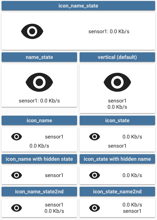
This option enables you to modify the layout of the card.
It is fully compatible with every show_* option. Make sure you set show_state: true if you want to show the state
Multiple values are possible, see the image below for examples:
vertical(default value if nothing is provided): Everything is centered vertically on top of each othericon_name_state: Everything is aligned horizontally, name and state are concatenatedname_state: Icon sits on top of name and state concatenated on one lineicon_name: Icon and name are horizontally aligned, state is centered belowicon_state: Icon and state are horizontally aligned, name is centered belowicon_name_state2nd: Icon, name and state are horizontally aligned, name is above stateicon_state_name2nd: Icon, name and state are horizontally aligned, state is above name
- Download the button-card
- Place the file in your
config/wwwfolder - Include the card code in your
ui-lovelace-card.yaml
title: Home
resources:
  - url: /local/button-card.js
type: module- Write configuration for the card in your
ui-lovelace.yaml
- Make sure the custom_updater component is installed and working.
- Configure Lovelace to load the card.
resources:
  - url: /customcards/github/custom-cards/button-card.js?track=true
type: module- Run the service
custom_updater.check_allor click the "CHECK" button if you use thetracker-card. - Refresh the website.
Show a button for the air conditioner (blue when on, var(--disabled-text-color) when off):
- type: "custom:button-card"
  entity: switch.ac
  icon: mdi:air-conditioner
  color: rgb(28, 128, 199)
Redefine the color when the state if off to red:
- type: "custom:button-card"
  entity: switch.ac
  icon: mdi:air-conditioner
  color: rgb(28, 128, 199)
  state:
    - value: "off"
      color: rgb(255, 0, 0)
Show an ON/OFF button for the home_lights group:
- type: "custom:button-card"
  entity: group.home_lights
  show_icon: false
  show_state: true
Light entity with custom icon and "more info" pop-in:
- type: "custom:button-card"
  entity: light.living_room_lights
  icon: mdi:sofa
  color: auto
  tap_action:
    action: more-info
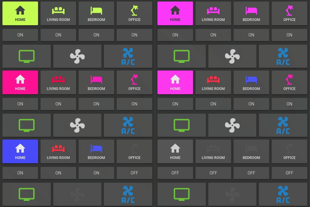
Light card with card color type, name, and automatic color:
- type: "custom:button-card"
  entity: light._
  icon: mdi:home
  color: auto
  color_type: card
  tap_action:
    action: more-info
  name: Home
  style:
    - font-size: 12px
    - font-weight: bold
Horizontal stack with :
- 2x blank cards
- 1x volume up button with service call
- 1x volume down button with service call
- 2x blank cards
- type: horizontal-stack
  cards:
    - type: "custom:button-card"
      color_type: blank-card
    - type: "custom:button-card"
      color_type: blank-card
    - type: "custom:button-card"
      color_type: card
      color: rgb(223, 255, 97)
      icon: mdi:volume-plus
      tap_action:
        action: service
        service: media_player.volume_up
        service_data:
          entity_id: media_player.livimg_room_speaker
    - type: "custom:button-card"
      color_type: card
      color: rgb(223, 255, 97)
      icon: mdi:volume-minus
      tap_action:
        action: service
        service: media_player.volume_down
        service_data:
          entity_id: media_player.livimg_room_speaker
    - type: "custom:button-card"
      color_type: blank-card
    - type: "custom:button-card"
      color_type: blank-card
Vertical Stack with :
- 1x label card
- Horizontal Stack with :
- 1x Scene 1 Button
- 1x Scene 2 Button
- 1x Scene 3 Button
- 1x Scene 4 Button
- 1x Scene Off Button
- type: vertical-stack
  cards:
    - type: "custom:button-card"
      color_type: label-card
      color: rgb(44, 109, 214)
      name: Kitchen
    - type: horizontal-stack
      cards:
        - type: "custom:button-card"
          entity: switch.kitchen_scene_1
          color_type: card
          color: rgb(66, 134, 244)
          icon: mdi:numeric-1-box-outline
        - type: "custom:button-card"
          entity: switch.kitchen_scene_2
          color_type: card
          color: rgb(66, 134, 244)
          icon: mdi:numeric-2-box-outline
        - type: "custom:button-card"
          entity: switch.kitchen_scene_3
          color_type: card
          color: rgb(66, 134, 244)
          icon: mdi:numeric-3-box-outline
        - type: "custom:button-card"
          entity: switch.kitchen_scene_4
          color_type: card
          color: rgb(66, 134, 244)
          icon: mdi:numeric-4-box-outline
        - type: "custom:button-card"
          entity: switch.kitchen_off
          color_type: card
          color: rgb(66, 134, 244)
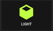
icon: mdi:eye-off-outlineInput select card with select next service and custom color and icon for states. In the example below the icon mdi:cube-outline will be used when value is sleeping and mdi:cube in other cases.
If you don't specify any operator, == will be used to match the current state against the value
- type: "custom:button-card"
  entity: input_select.cube_mode
  icon: mdi:cube
  tap_action:
    action: service
    service: input_select.select_next
    service_data:
      entity_id: input_select.cube_mode
  show_state: true
  state:
    - value: "sleeping"
      color: var(--disabled-text-color)
      icon: mdi:cube-outline
    - value: "media"
      color: rgb(5, 147, 255)
    - value: "light"
color: rgb(189, 255, 5)The definition order matters, the first item to match will be the one selected.
- type: "custom:button-card"
  entity: sensor.temperature
  show_state: true
  state:
    - value: 15
      operator: '<='
      color: blue
      icon: mdi:thermometer-minus
    - value: 25
      operator: '>='
      color: red
      icon: mdi:thermometer-plus
    - operator: 'default' # used if nothing matches
      color: yellow
      icon: mdi: thermometer
      style:
- opacity: 0.5Buttons can link to different views using the navigate action:
- type: "custom:button-card"
  color_type: label-card
  icon: mdi:home
  name: Go To Home
  tap_action:
    action: navigate
    navigation_path: /lovelace/0
The navigation_path also accepts any Home Assistant internal URL such as /dev-info or /hassio/dashboard for example.
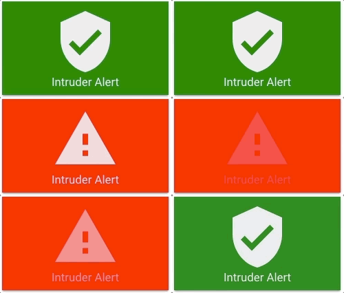
You can make the whole button blink:
- type: "custom:button-card"
  color_type: card
  entity: binary_sensor.intruder
  name: Intruder Alert
  state:
    - value: "on"
      color: red
      icon: mdi:alert
      style:
        - animation: blink 2s ease infinite
    - operator: default
      color: green
icon: mdi:shield-check- ciotlosm for the readme template and the awesome examples


