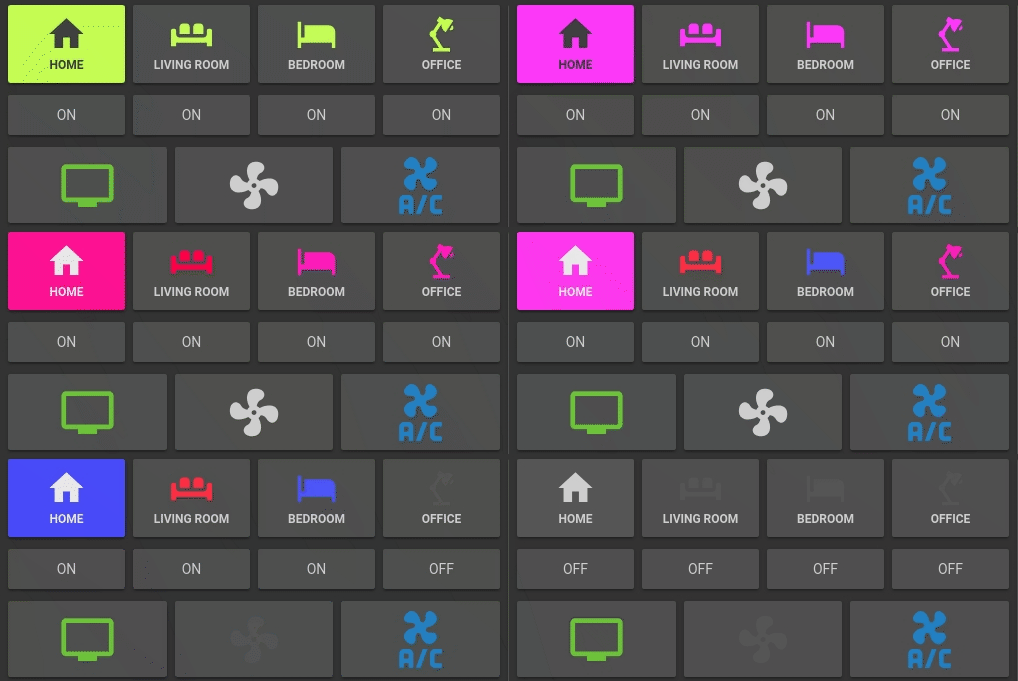
Lovelace Button card for your entities.
- works with any toggleable entity
- 6 available actions on tap and/or hold and/or double click:
none,toggle,more-info,navigate,urlandcall-service - state display (optional)
- custom color (optional), or based on light rgb value/temperature
- custom state definition with customizable color, icon and style (optional)
- custom size of the icon, width and height (optional)
- Support for templates in some fields
- custom icon (optional)
- custom css style (optional)
- multiple layout support and custom layout support
- units for sensors can be redefined or hidden
- 2 color types
icon: apply color settings to the icon onlycard: apply color settings to the card only
- automatic font color if color_type is set to
card - blank card and label card (for organization)
- blink animation support
- rotating animation support
- confirmation popup for sensitive items (optional) or locking mecanism
- haptic support for the Beta IOS App
- support for custom_updater
| Name | Type | Default | Supported options | Description |
|---|---|---|---|---|
type |
string | Required | custom:button-card |
Type of the card |
entity |
string | optional | switch.ac |
entity_id |
icon |
string | optional | mdi:air-conditioner |
Icon to display. Will be overriden by the icon defined in a state (if present). Defaults to the entity icon. Hide with show_icon: false |
color_type |
string | icon |
icon | card | blank-card | label-card |
Color either the background of the card or the icon inside the card. Setting this to card enable automatic font and icon color. This allows the text/icon to be readable even if the background color is bright/dark. Additional color-type options blank-card and label-card can be used for organisation (see examples). |
color |
string | optional | auto | rgb(28, 128, 199) |
Color of the icon/card. auto sets the color based on the color of a light. By default, if the entity state is off, the color will be var(--paper-item-icon-active-color), for on it will be var(--paper-item-icon-color) and for any other state it will be var(--primary-text-color). You can redefine each colors using state |
size |
string | 40% |
20px |
Size of the icon. Can be percentage or pixel |
tap_action |
object | optional | See Action | Define the type of action on click, if undefined, toggle will be used. |
hold_action |
object | optional | See Action | Define the type of action on hold, if undefined, nothing happens. |
dbltap_action |
object | optional | See Action | Define the type of action on double click, if undefined, nothing happens. |
name |
string | optional | Air conditioner |
Define an optional text to show below the icon |
label |
string | optional | Any string that you want | Display a label below the card. See Layouts for more information. |
label_template |
string | optional | See templates. Any javascript code which returns a string. Overrides label |
|
show_name |
boolean | true |
true | false |
Wether to show the name or not. Will pick entity_id's name by default, unless redefined in the name property or in any state name property |
show_state |
boolean | false |
true | false |
Show the state on the card. defaults to false if not set |
show_icon |
boolean | true |
true | false |
Wether to show the icon or not. Unless redefined in icon, uses the default entity icon from hass |
show_units |
boolean | true |
true | false |
Display or hide the units of a sensor, if any. |
show_label |
boolean | false |
true | false |
Display or hide the label/label_template |
show_last_changed |
boolean | false |
true | false |
Replace the label altogether and display the the last_changed attribute in a nice way (eg: 12 minutes ago) |
show_entity_picture |
boolean | false |
true | false |
Replace the icon by the entity picture (if any) or the custom picture (if any). Falls back to using the icon if both are undefined |
entity_picture |
string | optional | Can be any of /local/* file or a URL |
Will override the icon/the default entity_picture with your own image. Best is to use a square image. You can also define one per state |
units |
string | optional | Kb/s, lux, ... |
Override or define the units to display after the state of the entity. If omitted, it's using the entity's units |
styles |
object list | optional | See styles | |
state |
object list | optional | See State | State to use for the color, icon and style of the button. Multiple states can be defined |
confirmation |
string | optional | Free-form text | Show a confirmation popup on tap with defined text |
lock |
boolean | false |
true | false |
See lock. This will display a normal button with a lock symbol in the corner. Clicking the button will make the lock go away and enable the button to be manoeuvred for five seconds |
layout |
string | optional | See Layout | The layout of the button can be modified using this option |
| Name | Type | Default | Supported options | Description |
|---|---|---|---|---|
action |
string | toggle |
more-info, toggle, call-service, none, navigate, url |
Action to perform |
navigation_path |
string | none | Eg: /lovelace/0/ |
Path to navigate to (e.g. /lovelace/0/) when action defined as navigate |
url |
string | none | Eg: https://www.google.fr |
URL to open on click when action is url. The URL will open in a new tab |
service |
string | none | Any service | Service to call (e.g. media_player.media_play_pause) when action defined as call-service |
service_data |
object | none | Any service data | Service data to include (e.g. entity_id: media_player.bedroom) when action defined as call-service |
haptic |
string | none | success, warning, failure, light, medium, heavy, selection |
Haptic feedback for the Beta IOS App |
| Name | Type | Default | Supported options | Description |
|---|---|---|---|---|
operator |
string | == |
See Available Operators | The operator used to compare the current state against the value |
value |
string/number | required (unless operator is default) |
If your entity is a sensor with numbers, use a number directly, else use a string | The value which will be compared against the current state of the entity |
name |
string | optional | Any string, 'Alert', 'My little switch is on', ... |
if show_name is true, the name to display for this state. If undefined, uses the general config name, and if undefined uses the entity name |
icon |
string | optional | mdi:battery |
The icon to display for this state. Defaults to the entity icon. Hide with show_icon: false |
color |
string | var(--primary-text-color) |
Any color, eg: rgb(28, 128, 199) or blue |
The color of the icon (if color_type: icon) or the background (if color_type: card) |
styles |
string | optional | See styles | |
spin |
boolean | false |
true | false |
Should the icon spin for this state? |
entity_picture |
string | optional | Can be any of /local/* file or a URL |
Will override the icon/the default entity_picture with your own image for this state. Best is to use a square image |
label |
string | optional | Any string that you want | Display a label below the card. See Layouts for more information. |
label_template |
string | optional | See templates. Any javascript code which returns a string. Overrides label |
The order of your elements in the state object matters. The first one which is true will match.
| Operator | value example |
Description |
|---|---|---|
< |
5 |
Current state is inferior to value |
<= |
4 |
Current state is inferior or equal to value |
== |
42 or 'on' |
This is the default if no operator is specified. Current state is equal (== javascript) to value |
>= |
32 |
Current state is superior or equal to value |
> |
12 |
Current state is superior to value |
!= |
'normal' |
Current state is not equal (!= javascript) to value |
regex |
'^norm.*$' |
value regex applied to current state does match |
template |
See templates for examples. value needs to be a javascript expression which returns a boolean. If the boolean is true, it will match this state |
|
default |
N/A | If nothing matches, this is used |
This option enables you to modify the layout of the card.
It is fully compatible with every show_* option. Make sure you set show_state: true if you want to show the state
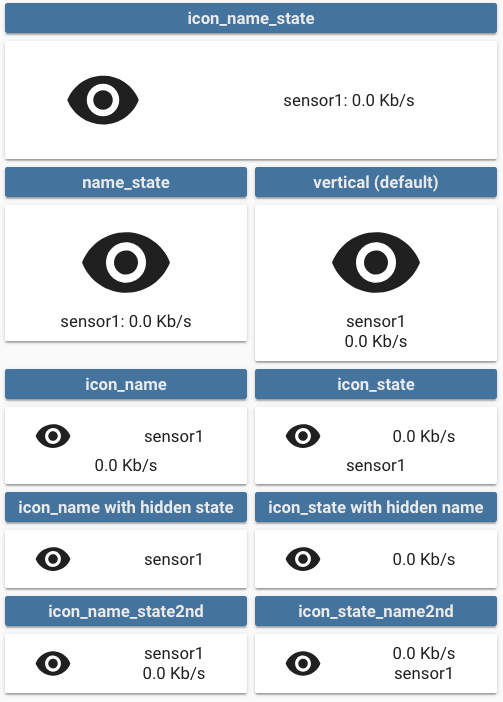
Multiple values are possible, see the image below for examples:
vertical(default value if nothing is provided): Everything is centered vertically on top of each othericon_name_state: Everything is aligned horizontally, name and state are concatenated, label is centered belowname_state: Icon sits on top of name and state concatenated on one line, label belowicon_name: Icon and name are horizontally aligned, state and label are centered belowicon_state: Icon and state are horizontally aligned, name and label are centered belowicon_label: Icon and label are horizontally aligned, name and state are centered belowicon_name_state2nd: Icon, name and state are horizontally aligned, name is above state, label below name and stateicon_state_name2nd: Icon, name and state are horizontally aligned, state is above name, label below name and state
label_template supports templating as well as value for state when operator: template
label_template: It will be interpreted as javascript code and the code should return a string.label_templatesupports inline HTML, so you can do stuff like:label_template: > return 'Connection: ' + (states['switch.connection'].state === 'on' ? '<span style="color: #00FF00;">enabled</span>' : '<span style="color: #FF0000;">disabled</span>') + ' / ' + (states['binary_sensor.status'].state === 'on' ? 'connected' : 'disconnected')
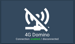
valueforstatewhenoperator: template: It will be interpreted as javascript code and the code should return a boolean (trueorfalse)
Inside the javascript code, you'll have access to those variables:
entity: The current entity object, if the entity is defined in the cardstates: An object with all the states of all the entities (equivalent tohass.states)user: The user object (equivalent tohass.user)hass: The completehassobject
The value shouldn't be enclosed in quotes:
label_template: >
  return states['light.mylight'].attributes.brightness
or
state:
  - operator: template
    value: >
      return states['input_select.light_mode'].state === 'night_mode'
See here for some examples.
For each element in the card, styles can be defined in 2 places:
- in the main part of the config
- in each state
Styles defined in each state are additive with the ones defined in the main part of the config. In the state part, just define the ones specific to your current state and keep the common ones in the main part of the config.
The style object members are:
card: styles for the card itself. Styles that are defined here will be applied to the whole card and it's content, unless redefined in elements below.icon: styles for the iconentity_picture: styles for the picture (if any)name: styles for the namestate: styles for the statelabel: styles for the labellock: styles for the lock icon (see here for the default style)
- type: custom:button-card
  [...]
  styles:
    card:
      - xxxx: value
    icon:
      - xxxx: value
    entity_picture:
      - xxxx: value
    name:
      - xxxx: value
    state:
      - xxxx: value
    label:
      - xxxx: value
  state:
    - value: 'on'
      styles:
        card:
          - yyyy: value
        icon:
          - yyyy: value
        entity_picture:
          - yyyy: value
        name:
          - yyyy: value
        state:
          - yyyy: value
        label:
          - yyyy: value
This will render:
- The
cardwith the stylesxxxx: valueandyyyy: valueapplied - Same for all the others.
See styling for a complete example.
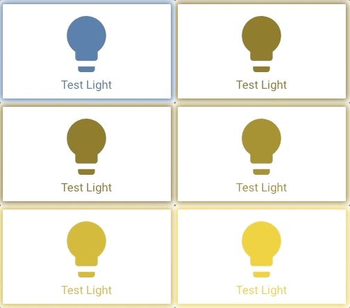
If a light entity is assigned to the button, then the CSS variable --button-card-light-color will contain the current light color so that you can use it in other parts of the button. When off, it will be set to var(--paper-item-icon-color)
styles:
  name:
    color: var(--button-card-light-color)
  card:
    - -webkit-box-shadow: 0px 0px 9px 3px var(--button-card-light-color)
- box-shadow: 0px 0px 9px 3px var(--button-card-light-color)For advanced styling, there are 2 other options in the styles config object:
grid: mainly layout for the gridimg_cell: mainly how you position your icon in it's cell
This is how the button is constructed (HTML elements):
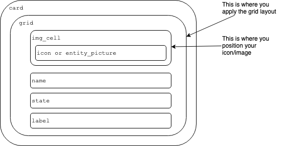
The grid element uses CSS grids to design the layout of the card:
img_cellelement is going to thegrid-area: iby defaultnameelement is going to thegrid-area: nby defaultstateelement is going to thegrid-area: sby defaultlabelelement is going to thegrid-area: lby default
You can see how the default layouts are constructed here and inspire yourself with it. We'll not support advanced layout questions here, please use home-assitant's community forum for that.
To learn more, please use Google and this excellent guide about CSS Grids :)
Some examples:
-
label on top:
styles:
  grid:
    - grid-template-areas: '"l" "i" "n" "s"'
    - grid-template-rows: min-content 1fr min-content min-content
    - grid-template-columns: 1fr
-
icon on the right side (by overloading an existing layout):
- type: "custom:button-card"
  entity: sensor.sensor1
  layout: icon_state_name2nd
  show_state: true
  show_name: true
  show_label: true
  label: label
  styles:
    grid:
      - grid-template-areas: '"n i" "s i" "l i"'
      - grid-template-columns: 1fr 40%
-
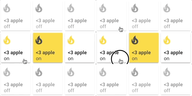
Apple Homekit-like buttons:
- type: custom:button-card
  entity: switch.skylight
  name: <3 Apple
  icon: mdi:fire
  show_state: true
  styles:
    card:
      - width: 100px
      - height: 100px
    grid:
      - grid-template-areas: '"i" "n" "s"'
      - grid-template-columns: 1fr
      - grid-template-rows: 1fr min-content min-content
    img_cell:
      - align-self: start
      - text-align: start
    name:
      - justify-self: start
      - padding-left: 10px
      - font-weight: bold
      - text-transform: lowercase
    state:
      - justify-self: start
      - padding-left: 10px
  state:
    - value: 'off'
      styles:
        card:
          - filter: opacity(50%)
        icon:
          - filter: grayscale(100%)
- Download the button-card
- Place the file in your
config/wwwfolder - Include the card code in your
ui-lovelace-card.yaml
title: Home
resources:
  - url: /local/button-card.js
type: module- Write configuration for the card in your
ui-lovelace.yaml
- Make sure the custom_updater component is installed and working.
- Configure Lovelace to load the card.
resources:
  - url: /customcards/github/custom-cards/button-card.js?track=true
type: module- Run the service
custom_updater.check_allor click the "CHECK" button if you use thetracker-card. - Refresh the website.
Show a button for the air conditioner (blue when on, var(--disabled-text-color) when off):
- type: "custom:button-card"
  entity: switch.ac
  icon: mdi:air-conditioner
  color: rgb(28, 128, 199)
Redefine the color when the state if off to red:
- type: "custom:button-card"
  entity: switch.ac
  icon: mdi:air-conditioner
  color: rgb(28, 128, 199)
  state:
    - value: "off"
      color: rgb(255, 0, 0)
Show an ON/OFF button for the home_lights group:
- type: "custom:button-card"
  entity: group.home_lights
  show_icon: false
  show_state: true
Light entity with custom icon and "more info" pop-in:
- type: "custom:button-card"
  entity: light.living_room_lights
  icon: mdi:sofa
  color: auto
  tap_action:
    action: more-info
Light card with card color type, name, and automatic color:
- type: "custom:button-card"
  entity: light._
  icon: mdi:home
  color: auto
  color_type: card
  tap_action:
    action: more-info
  name: Home
  styles:
    card:
      - font-size: 12px
      - font-weight: bold
Horizontal stack with :
- 2x blank cards
- 1x volume up button with service call
- 1x volume down button with service call
- 2x blank cards
- type: horizontal-stack
  cards:
    - type: "custom:button-card"
      color_type: blank-card
    - type: "custom:button-card"
      color_type: blank-card
    - type: "custom:button-card"
      color_type: card
      color: rgb(223, 255, 97)
      icon: mdi:volume-plus
      tap_action:
        action: call-service
        service: media_player.volume_up
        service_data:
          entity_id: media_player.livimg_room_speaker
    - type: "custom:button-card"
      color_type: card
      color: rgb(223, 255, 97)
      icon: mdi:volume-minus
      tap_action:
        action: call-service
        service: media_player.volume_down
        service_data:
          entity_id: media_player.livimg_room_speaker
    - type: "custom:button-card"
      color_type: blank-card
    - type: "custom:button-card"
      color_type: blank-card
Vertical Stack with :
- 1x label card
- Horizontal Stack with :
- 1x Scene 1 Button
- 1x Scene 2 Button
- 1x Scene 3 Button
- 1x Scene 4 Button
- 1x Scene Off Button
- type: vertical-stack
  cards:
    - type: "custom:button-card"
      color_type: label-card
      color: rgb(44, 109, 214)
      name: Kitchen
    - type: horizontal-stack
      cards:
        - type: "custom:button-card"
          entity: switch.kitchen_scene_1
          color_type: card
          color: rgb(66, 134, 244)
          icon: mdi:numeric-1-box-outline
        - type: "custom:button-card"
          entity: switch.kitchen_scene_2
          color_type: card
          color: rgb(66, 134, 244)
          icon: mdi:numeric-2-box-outline
        - type: "custom:button-card"
          entity: switch.kitchen_scene_3
          color_type: card
          color: rgb(66, 134, 244)
          icon: mdi:numeric-3-box-outline
        - type: "custom:button-card"
          entity: switch.kitchen_scene_4
          color_type: card
          color: rgb(66, 134, 244)
          icon: mdi:numeric-4-box-outline
        - type: "custom:button-card"
          entity: switch.kitchen_off
          color_type: card
          color: rgb(66, 134, 244)
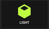
icon: mdi:eye-off-outlineInput select card with select next service and custom color and icon for states. In the example below the icon mdi:cube-outline will be used when value is sleeping and mdi:cube in other cases.
If you don't specify any operator, == will be used to match the current state against the value
- type: "custom:button-card"
  entity: input_select.cube_mode
  icon: mdi:cube
  tap_action:
    action: call-service
    service: input_select.select_next
    service_data:
      entity_id: input_select.cube_mode
  show_state: true
  state:
    - value: "sleeping"
      color: var(--disabled-text-color)
      icon: mdi:cube-outline
    - value: "media"
      color: rgb(5, 147, 255)
    - value: "light"
color: rgb(189, 255, 5)The definition order matters, the first item to match will be the one selected.
- type: "custom:button-card"
  entity: sensor.temperature
  show_state: true
  state:
    - value: 15
      operator: '<='
      color: blue
      icon: mdi:thermometer-minus
    - value: 25
      operator: '>='
      color: red
      icon: mdi:thermometer-plus
    - operator: 'default' # used if nothing matches
      color: yellow
      icon: mdi: thermometer
      styles:
        card:
- opacity: 0.5Buttons can link to different views using the navigate action:
- type: "custom:button-card"
  color_type: label-card
  icon: mdi:home
  name: Go To Home
  tap_action:
    action: navigate
    navigation_path: /lovelace/0
The navigation_path also accepts any Home Assistant internal URL such as /dev-info or /hassio/dashboard for example.
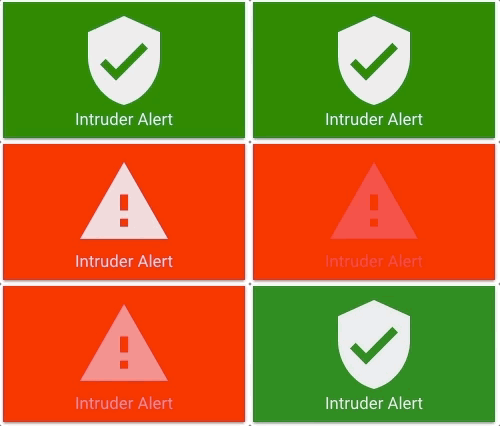
You can make the whole button blink:
- type: "custom:button-card"
  color_type: card
  entity: binary_sensor.intruder
  name: Intruder Alert
  state:
    - value: "on"
      color: red
      icon: mdi:alert
      styles:
        card:
          - animation: blink 2s ease infinite
    - operator: default
      color: green
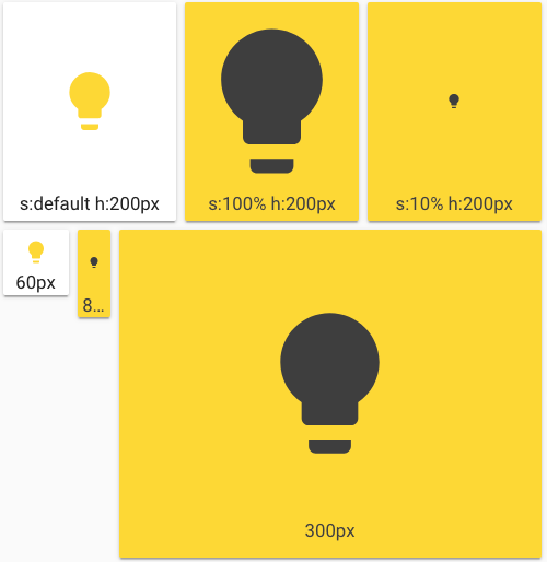
icon: mdi:shield-checkThrough the styles you can specify the width and height of the card, and also the icon size through the main size option. Playing with icon size will growth the card unless a height is specified.
If you specify a width for the card, it has to be in px. All the cards without a width defined will use the remaining space on the line.
- type: horizontal-stack
  cards:
    - type: "custom:button-card"
      entity: light.test_light
      color: auto
      name: s:default h:200px
      styles:
        card:
          - height: 200px
    - type: "custom:button-card"
      entity: light.test_light
      color_type: card
      color: auto
      name: s:100% h:200px
      size: 100%
      styles:
        card:
          - height: 200px
    - type: "custom:button-card"
      entity: light.test_light
      color_type: card
      color: auto
      size: 10%
      name: s:10% h:200px
      styles:
        card:
          - height: 200px
- type: horizontal-stack
  cards:
    - type: "custom:button-card"
      entity: light.test_light
      color: auto
      name: 60px
      styles:
        card:
          - height: 60px
          - width: 60px
    - type: "custom:button-card"
      entity: light.test_light
      color_type: card
      color: auto
      name: 80px
      styles:
        card:
          - height: 80px
          - width: 30px
    - type: "custom:button-card"
      entity: light.test_light
      color_type: card
      color: auto
      name: 300px
      styles:
        card:
- height: 300px- type: "custom:button-card"
color_type: icon
entity: light.test_light
label_template: >
var bri = states['light.test_light'].attributes.brightness;
return 'Brightness: ' + (bri ? bri : '0') + '%';
show_label: true
size: 15%
styles:
card:
- height: 100px
- type: "custom:button-card"
color_type: icon
entity: light.test_light
layout: icon_label
label_template: >
return 'Other State: ' + states['switch.skylight'].state;
show_label: true
show_name: false
styles:
card:
- height: 100pxThe javascript code inside value needs to return true of false.
Example with template:
- type: "custom:button-card"
  color_type: icon
  entity: switch.skylight
  show_state: true
  show_label: true
  state:
    - operator: template
      value: >
        return states['light.test_light'].attributes
        && (states['light.test_light'].attributes.brightness <= 100)
      icon: mdi:alert
    - operator: default
      icon: mdi:lightbulb
- type: "custom:button-card"
  color_type: icon
  entity: light.test_light
  show_label: true
  state:
    - operator: template
      value: >
        return states['input_select.light_mode'].state === 'night_mode'
      icon: mdi:weather-night
      label: Night Mode
    - operator: default
      icon: mdi:white-balance-sunny
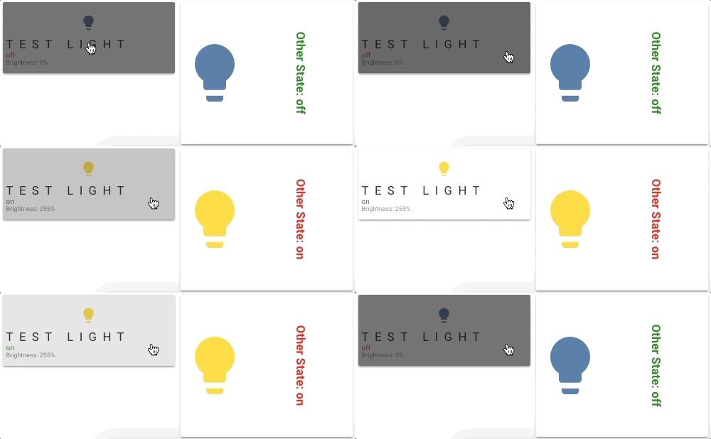
label: Day Mode- type: "custom:button-card"
color_type: icon
entity: light.test_light
label_template: >
var bri = states['light.test_light'].attributes.brightness;
return 'Brightness: ' + (bri ? bri : '0') + '%';
show_label: true
show_state: true
size: 10%
styles:
card:
- height: 100px
label:
- color: gray
- font-size: 9px
- justify-self: start
- padding: 0px 5px
name:
- text-transform: uppercase
- letter-spacing: 0.5em
- font-familly: cursive
- justify-self: start
- padding: 0px 5px
state:
- justify-self: start
- font-size: 10px
- padding: 0px 5px
state:
- value: 'on'
styles:
state:
- color: green
- value: 'off'
styles:
state:
- color: red
card:
- filter: brightness(40%)
- type: "custom:button-card"
color_type: icon
entity: light.test_light
layout: icon_label
label_template: >
return 'Other State: ' + states['switch.skylight'].state;
show_label: true
show_name: false
size: 100%
styles:
card:
- height: 200px
label:
- font-weight: bold
- writing-mode: vertical-rl
- text-orientation: mixed
state:
- value: 'on'
styles:
label:
- color: red
- value: 'off'
styles:
label:
- color: green- type: horizontal-stack
cards:
- type: "custom:button-card"
entity: switch.test
lock: true
- type: "custom:button-card"
color_type: card
lock: true
color: black
entity: switch.test- ciotlosm for the readme template and the awesome examples


