图例组件。
图例(legend)是图表的辅助元素,使用颜色、大小、形状区分不同的数据类型,用于图表中数据的筛选。G2 会根据设置图形属性映射以及数据的类型自动生成不同的图例。 shape, color, size 只有当
<Geom />组件上有这三个属性中任意一个时,并且将<Legend>组件的 name 属性跟这个属性的字段关联上,才会显示图例;
- shape 属性,会根据不同的 shape 类型生成图例;
- color 属性, 会赋予不同的图例项不同的颜色来区分图形;
- size 属性, 在图例上显示图形的大小。
-
<Legend />组件只可以作为<Chart />组件的孩子,同时<Legend />组件下不能嵌套其他图表组件。 -
BizCharts 中将 Legend 抽离为一个单独的组件,不使用 Legend 组件则默认不显示所有图例,如下所示:
// 不显示图例
<Chart width={600} height={400} data={data}>
	<Geom type="bar" position="genre*sold" color="genre" />
</Chart>- 使用
<Legend/>组件时,可以指定当前图例对应数据源中的字段名(字段名为name),不指定则默认设置所有图例;
// 指定图例对应数据源中的字段名
<Chart width={600} height={400} data={data}>
    // Geom 组件上必须有 `shape, color, size `中某个属性值为 genre 字段,才会有图例出现。
	<Legend name="genre" position="right" title={null} dx={20} />
	<Geom type="bar" position="genre*sold" color="genre" />
</Chart>

// 不指定图例对应数据源中的字段名,则默认设置所有图例
<Chart width={600} height={400} data={data}>
	<Legend position="right" title={null} dx={20} />
	// Geom 组件上必须有 `shape, color, size `中某个属性值为 genre 字段,才会有图例出现。
	<Geom type="bar" position="genre*sold" color="genre" />
</Chart>- 一旦使用
<Legend/>组件,那么所有的图例都会显示,如若需要隐藏某一个图例,务必将 visible 参数并置为 false,如下所示:
<Chart width={600} height={400} data={data}>
	<Legend name="genre" visible={false} />
	<Geom type="bar" position="genre*sold" color="genre" />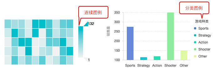
</Chart>分类类型和连续类型的配置有一定的区别,下面列出了这两种类型支持的可配置的属性:

图例的对应到数据源中的数据字段名,不传则默认设置所有图例。
该图例是否可见。 默认值:true。
该图显示位置。 默认值:'right'。
图例标题是否显示,null 为不展示,默认 top bottom 两个位置的图例不展示标题。。 默认值: top/bottom 两个位置图例 false,其他为 true。
图例 x 方向的整体偏移。
图例 y 方向的整体偏移。
图例每项之间的间距,如果是水平排布则为左右间距,如果是竖直排布则为上下间距。
图例项垂直方向的间距。
图例项的宽度,当图例有很多图例项,并且用户想要这些图例项在同一平面内垂直对齐,此时这个属性可帮用户实现此效果。
取消选中时图例 marker 颜色。
图例的背景样式配置。
{
  fill:"#ff0000",
  fillOpacity:0.5,
}是否允许全部取消。 默认值:false,不允许。
用于格式化图例每项的文本显示。
用于图例 marker 的显示样式。
可选项有: 'circle', 'square', 'bowtie', 'diamond', 'hexagon', 'triangle', 'triangle-down', 'hollowCircle', 'hollowSquare', 'hollowBowtie', 'hollowDiamond', 'hollowHexagon', 'hollowTriangle', 'hollowTriangle-down', 'cross', 'tick', 'plus', 'hyphen', 'line'
图例的背景样式配置。
{
  fill:"#ff0000",
  stroke:"#dddddd",
}是否可以点击。
是否默认开启鼠标 hover 到图例项上的交互,默认为 false。
clickable 为 true 时生效,图例的选中模式。
自定义图例项鼠标 hover 事件,hoverable 为 false 不生效。
自定义图例项点击事件, clickable 为 false 不生效
分类 html 自定义图例大部分属性跟分类图例是一样的,需要额外设置以下属性。
是否使用html。
使用html时的外层模板,模版如下。
<!-- 图例最外层容器 -->
<div class="g2-legend" style="position:absolute;top:20px;right:60px;width:auto;">
  <!-- 图例标题 -->
  <h4 class="g2-legend-title"></h4>
  <!-- 图例项列表容器 -->
  <ul class="g2-legend-itemlist" style="list-style-type:none;margin:0;padding:0;"></ul>
</div>用户设置的图例项 html 模板,模板如下。
<!-- 图例最外层容器 -->
<li class="g2-legend-item item-{index} {checked}" data-color="{originColor}" data-value="{originValue}" style="cursor: pointer;font-size: 14px;">
  <!-- marker -->
  <i class="g2-legend-marker" style="width:10px;height:10px;border-radius:50%;display:inline-block;margin-right:10px;background-color: {color};"></i>
  <!-- 图例项文本 -->
  <span class="g2-legend-text">{value}</span>
</li>当用户使用 html 的时候,超出高度或者宽度会自动换行。
连续图例部分属性跟分类图例是一样的(name, position, offsetX, offsetY, title),需要额外设置以下属性。
连续图例是否可滑动。
连续图例宽度。
连续图例高度。
自定义图例大部分属性跟普通图例一样,需要额外配置的属性有。
是否自定义图例。 默认值:false。
自定义图例的配置。需要用户自己声明具体的图例项(每个图例项结构为 { value: '', fill: '', marker: '' })以及图例项的 hover 和 click 事件。
<Legend
  custom={true},
  items={[
    { value: 'waiting', fill: '#3182bd', marker: 'shape' },
    { value: 'call', fill: '#99d8c9', marker: 'shape' },
    { value: 'people', fill: '#fdae6b', marker: 'shape' },
  ]}
  onHover={ev => {}} // 自定义 hover 事件
  onClick={ev => {}} // 自定义 click 事件
/>// 略...
<Chart height={400} data={dv} scale={cols} forceFit>
<Axis name="month" />
<Axis name="temperature" label={{formatter: val => `${val}°C`}}/>
<Legend />
<Tooltip crosshairs={{type : "y"}}/>
<Geom type="line" position="month*temperature" size={2} color={'city'} />
<Geom type='point' position="month*temperature" size={4} shape={'circle'} color={'city'} style={{ stroke: '#fff', lineWidth: 1}} />
</Chart>