Orbit is an open-source design system that aims to bring order and consistency to Kiwi.com products as well as the processes behind building them. It elevates the user experience and increases the speed and efficiency of how we design and build products.
This library allows developers to implement Orbit in a project using Jetpack Compose for Android.
Orbit Compose builds upon Material 3 library. If you need an integration with Material 2, see Theming chapter.
We publish our releases in Maven Central. To use this library, you can add the following dependencies to your Gradle file:
implementation("kiwi.orbit.compose:ui:<version>")
implementation("kiwi.orbit.compose:icons:<version>")
implementation("kiwi.orbit.compose:illustrations:<version>")
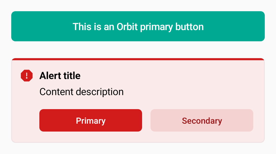
In order to use one of Orbit's components, simply add them to your Composable function.
@Composable
fun MyScreen() {
    Column(
        verticalArrangement = Arrangement.spacedBy(8.dp),
        modifier = Modifier.padding(16.dp)
    ) {
        val maxWidth = Modifier.fillMaxWidth()

        ButtonPrimary(onClick = {}, maxWidth) {
            Text("This is an Orbit primary button")
        }

        Spacer(modifier = Modifier.padding(4.dp))

        AlertCritical(
            title = { Text("Alert title") },
            content = { Text("Content description") },
            actions = {
                ButtonPrimary(onClick = {}) { Text("Primary") }
                ButtonSecondary(onClick = {}) { Text("Secondary") }
            },
        )
    }
}
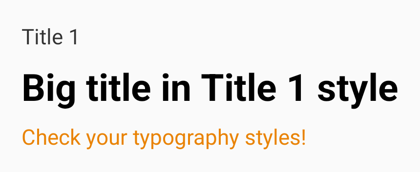
Colors, typography, and other foundational elements can be used by accessing the OrbitTheme object:
Text("Title 1", emphasis = ContentEmphasis.Minor)
Text("Big title in Title 1 style", style = OrbitTheme.typography.title1)
Text("Check your typography styles!", color = OrbitTheme.colors.warning.normal)
Icons and illustrations can be accessed in the same way, with the corresponding Icons and Illustrations
objects:
Image(painter = Illustrations.AppKiwi, contentDescription = "app_kiwi")You can check out our component Catalog by downloading and installing our showcase application from Google Play.
The API documentation lists all possible types and composables in our library.
Read our contributing guidelines to see how you can participate in this project.
Any feedback you have for us is appreciated. If you have any suggestions about what we can do, do not hesitate to report the issue and we'll take a look at it.


