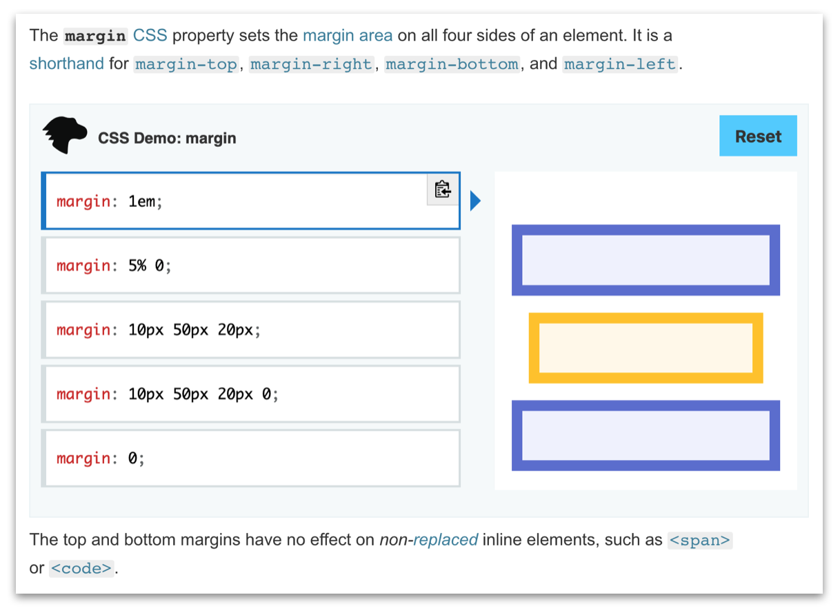
A style guide for people contributing interactive CSS examples. To learn the mechanics of contributing, see the project README. This article describes the characteristics that make a good example.
CSS examples consist of:
-
an DOM element whose ID is
"example-element" -
a set of choices, where each choice is one or more CSS
property: value;declarations. One of these choices is selected initially, and the user can select a different choice. When a choice is selected, all the CSS declarations it contains will be applied to "example-element".
You can also supply additional DOM elements, where that makes sense. For example, the position example has one box which is the "example-element", but also includes extra boxes to show how setting the position property for an element interacts with the other elements in a layout.
You can also provide extra CSS both for the example element and any additional elements, where that makes sense. This CSS won't be shown in the choices, but will be applied. For example, the position example applies a different style to example-element (yellow with a red border) to distinguish it from the other boxes.
The most basic form of the CSS choices is a group of one-line CSS style declarations, where each line illustrates a different form of the property. For example:
This is the recommended style for most examples.
If the set of CSS choices overflows its container vertically, then the set's container gets a vertical scrollbar, and overflowed choices are not visible without scrolling. We want to avoid this if possible, because users will often not notice the overflowed choices.
To avoid vertical scrollbars, you have space for 6 one-line choices. If the property can take more than 6 forms (for example, for all the different filter functions then it is best to choose 6 that are illustrative. It's not essential to have an example for every form.
If the property takes fewer than 6 forms, it's fine to show fewer. For example: text-overflow.
If any CSS declaration overflows its container horizontally, then the container for its choice will get a horizontal scrollbar, and the part of the declaration that overflows will not be visible without scrolling. This isn't as bad for discoverability as vertical overflow, but we'd still prefer to avoid it.
So try to be concise in the syntax you use, but not at the expense of making the code understandable and good practice. Quite often you won't be able to avoid horizontal scrollbars: see background-image for example.
Sometimes you'll want to show extra CSS declarations, in addition to the one for the property you are illustrating. This is slightly unusual though, and should be used only where the extra properties are closely related to the property being illustrated.
For example, in the example for position we show top and left for forms like position: relative;, because they're needed to understand the effect of these declarations, and because we want to invite people to play around with those values.
But be restrained with this. Including unrelated declarations makes it harder to see what a specific example is intended to illustrate.
If you have multiple declarations, each one should occupy its own line. Note that position breaks this rule, because otherwise it would be impossible to fit relevant forms without having a vertical scrollbar. This is quite unsatisfactory though, and is only acceptable here because top and left are closely related to each other, and are only there in a "supporting" role: they are not the property being illustrated.
Since vertical space is at a premium, avoid comments unless they are really needed. Keep in mind that these are examples, not documentation in themselves.
By default, the first choice will be selected. You can override this by adding initial-choice="true" to the example-choice DIV:
<div class="example-choice" initial-choice="true">...</div>The CSS interactive examples are visual in nature. Because of this, you will often need to make use of shapes, borders, lines etc. as part of your example. To maintain consistency with the MDN Web Docs branding, please always refer to the color style guide when choosing colors.
We do acknowledge that this specific set of colors might not always work for your intended purpose. The above is therefore a guide, and is not meant to be hard and fast rules. Should you find that these colors cause legibility, and/or contrast problems, feel free to use a suitable substitute and make note of it in your pull request.
Sometimes you'll want to include images with the example. If you do:
- make sure their license allows you to use them. It's difficult for us to satisfy an attribution requirement with the editor, so try to use images that have a very permissive license such as CC0.
- run them through https://tinypng.com or https://imageoptim.com, to reduce the page weight of the examples.
- For
SVG, run the code through SVGOMG, and ensure that theSVGfile has an empty line at the end of the file
On MDN pages the editor is laid out "side by side": that is with the example choices on the left and the output on the right, as it is in the local server that's started by npm start. Then if the page width goes below some threshold it switches to "top and bottom", with the example choices above and the output below.
This means that ideally, the example should still work with an editor width of about 740 pixels:
This can be a difficult constraint to satisfy, but you should test at this width, and try to make it work, if it's possible.
The interactive-examples project follows the same guidelines with regards to CSS code style as other projects that form part of the MDN Web Docs project. To ease review time for everyone, and ensure good coding practice, please review the guidelines on terminology and formatting when writing CSS.
You can validate your example anytime by running the following npm script:
npm run lint:cssWe've also provided the following command:
npm run fix:css