


This is another Python implementation of UpSet plots by Lex et al. [Lex2014]. UpSet plots are used to visualise set overlaps; like Venn diagrams but more readable. Documentation is at https://upsetplot.readthedocs.io.
This upsetplot library tries to provide a simple interface backed by an
extensible, object-oriented design.
The basic input format is a pandas.Series containing counts
corresponding to set intersection sizes. The index indicates which rows
pertain to which sets, by having multiple boolean indices, like example
in the following:
>>> from upsetplot import generate_data
>>> example = generate_data(aggregated=True)
>>> example  # doctest: +NORMALIZE_WHITESPACE
set0   set1   set2
False  False  False      56
              True      283
       True   False    1279
              True     5882
True   False  False      24
              True       90
       True   False     429
              True     1957
Name: value, dtype: int64
Then:
>>> from upsetplot import plot
>>> plot(example)  # doctest: +SKIP
>>> from matplotlib import pyplot
>>> pyplot.show()  # doctest: +SKIP
makes:
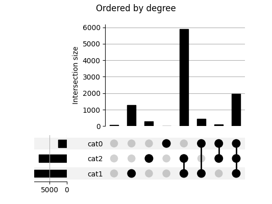
This plot shows the cardinality of every set combination seen in our data. The
leftmost column counts items absent from any set. The next three columns count
items only in set1, set2 and set3` respectively, with following
columns showing cardinalities for items in each combination of exactly two
named sets. The rightmost column counts items in all three sets.
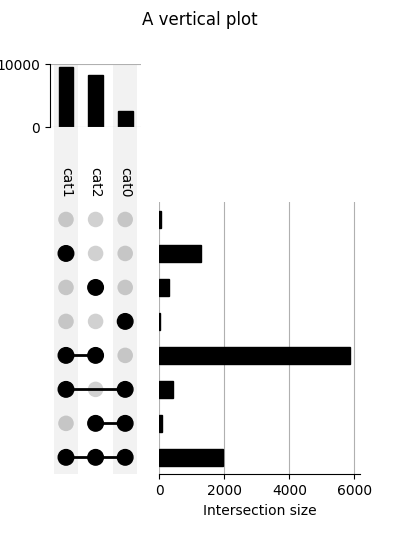
We call the above plot style "horizontal" because the set intersections are presented from left to right. Vertical plots are also supported!
Providing a DataFrame rather than a Series as input allows us to expressively plot the distribution of variables in each subset.

While the dataset above is randomly generated, you can prepare your own dataset for input to upsetplot. A helpful tool is from_memberships, which allows us to reconstruct the example above by indicating each data point's set membership:
>>> from upsetplot import from_memberships
>>> example = from_memberships(
...     [[],
...      ['set2'],
...      ['set1'],
...      ['set1', 'set2'],
...      ['set0'],
...      ['set0', 'set2'],
...      ['set0', 'set1'],
...      ['set0', 'set1', 'set2'],
...      ],
...      data=[56, 283, 1279, 5882, 24, 90, 429, 1957]
... )
>>> example  # doctest: +NORMALIZE_WHITESPACE
                          0
set0   set1   set2
False  False  False      56
              True      283
       True   False    1279
              True     5882
True   False  False      24
              True       90
       True   False     429
              True     1957
To install the library, you can use pip:
$ pip install upsetplot
Installation requires:
- pandas
- matplotlib >= 2.0
- seaborn to use UpSet.add_catplot
It should then be possible to:
>>> import upsetplot
in Python.
Probably for petty reasons. It appeared py-upset was not being maintained. Its input format was undocumented, inefficient and, IMO, inappropriate. It did not facilitate showing plots of each set intersection distribution as in Lex et al's work introducing UpSet plots. Nor did it include the horizontal bar plots illustrated there. It did not support Python 2. I decided it would be easier to construct a cleaner version than to fix it.
| [Lex2014] | Alexander Lex, Nils Gehlenborg, Hendrik Strobelt, Romain Vuillemot, Hanspeter Pfister, UpSet: Visualization of Intersecting Sets, IEEE Transactions on Visualization and Computer Graphics (InfoVis '14), vol. 20, no. 12, pp. 1983–1992, 2014. doi: doi.org/10.1109/TVCG.2014.2346248 |