Storybook is an open source tool for building UI components and pages in isolation. It streamlines UI development, testing, and documentation.
At Expensify, we primarily use Storybook to provide interactive documentation of our design system. This helps bridge the gap between design and engineering to encourage code reusibility and improve communication.
The Storybook docs deploy automatically so there's nothing extra to do here. Storybook is built to the /dist folder and lives at https://new.expensify.com/docs/index.html.
To test a local build we can run
npm run storybook-build
This will create a /docs directory in /dist with the static site.
To skip building and load Storybook on a local server run:
npm run storybook
A story captures the rendered state of a UI component. Developers write multiple stories per component that describe all the “interesting” states a component can support.
All of our stories are located in a single directory /src/stories.
To create a new story for a component that does not yet have one it's a good idea to copy an existing story file and then update the relevant details. We are using the Component Story Format to write our stories.
Here's an example story:
import React from 'react';
import Button from '../components/Button';

export default {
	// Title field will determine how the story displays in the sidebar
    title: 'Components/Button',
    component: Button,
};

// Optional `args` are passed which determine the props the example component will have
const Template = args => <Button {...args} />;

// Each story must be exported with a named export
export const Default = Template.bind({});
Default.args = {
    text: 'Save & Continue',
    success: true,
};
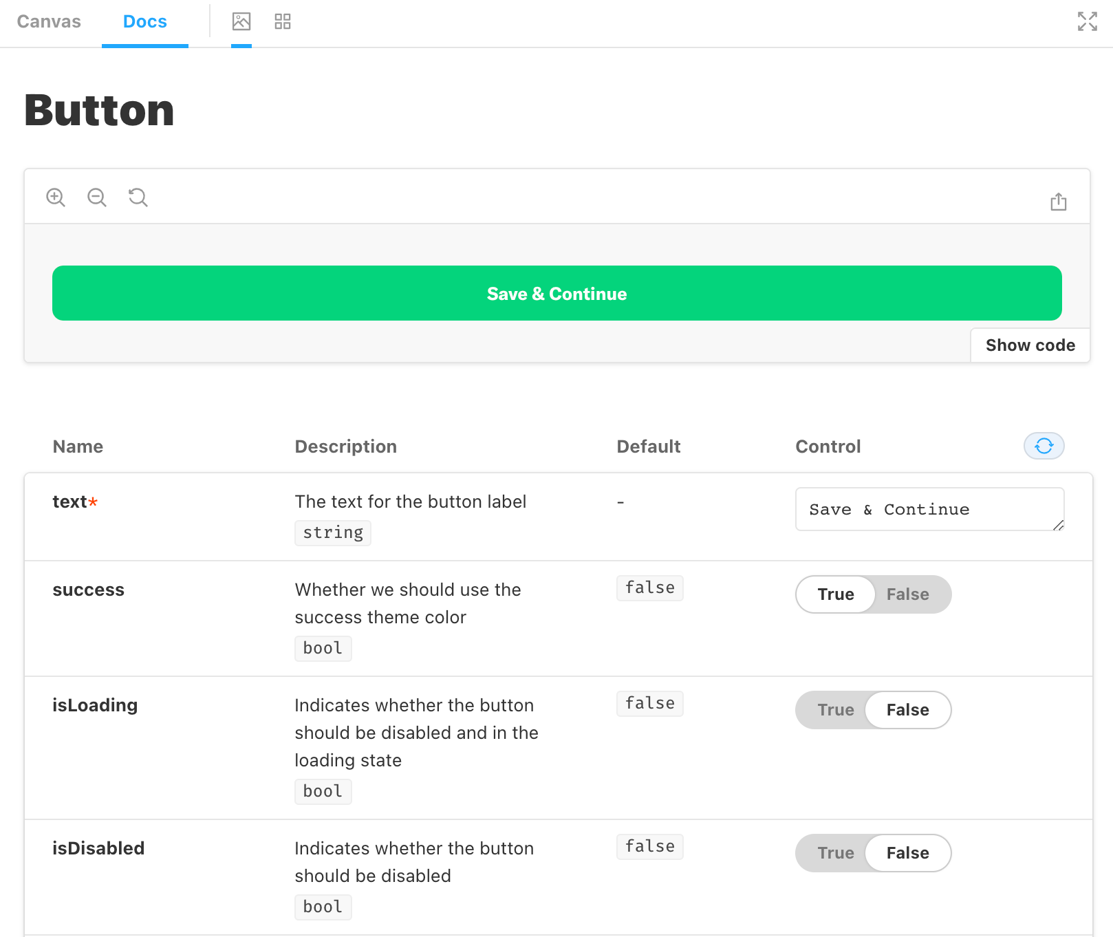
That will give us an interactive playground to test out various component attributes with the defaults we passed.
Note that we did not need to write any of the descriptions for these props. This is because they are automatically generated from a React component's propTypes.
Not yet, but PRs are welcome!
