- Create a new page titled "Block Designs". Leave it empty for now.
- In the theme folder, create a
functions.phpfile. - We will be adding some custom CSS later in this Step. For this custom CSS to work properly, enqueue the theme's stylesheet (
style.css) by adding the following code to thefunctions.phpfile:
<?php

function wpu_setup() {

    // Enqueue editor styles.
    add_editor_style( 'style.css' );
}
add_action( 'after_setup_theme', 'wpu_setup' );

function wpu_enqueue_scripts() {

	// Register theme stylesheet.
	wp_register_style(
		'wpu-styles',
		get_template_directory_uri() . '/style.css',
		array(),
		wp_get_theme()->get( 'Version' ),
	);

	// Enqueue theme stylesheet.
	wp_enqueue_style( 'wpu-styles' );
}
add_action( 'wp_enqueue_scripts', 'wpu_enqueue_scripts' );- On the "Block Designs" page, design the site header using the following composition (not a complete list):
- Use the WordPress University - Logo.png file for the Site Logo.
- Site Logo image width is
32px. - Site Title has a
Largefont size. - Outer Row block has a
widewidth. - Group container has a
Primarybackground, top/bottom padding of0.85rem, and right/left padding of2. - Search block uses "Button only" styling.
-
Design the site header using the following composition (not a complete list):
- Site Logo image width is
100px. - Site Title has a
Largefont size. - Paragraphs are
SmallandExtra Small. - Outer Columns block has a
widewidth. - Group container has a
Primarybackground, top/bottom padding of4, and right/left padding of2. - The Social Icons block is set to "Logos Only".

- Site Logo image width is
-
On mobile, the right column should appear first. This will require some custom CSS. Add the custom CSS class
is-style-mobile-reverse-orderto the Columns block. In the theme'sstyle.cssfile, add the following code:
/* Reverse column order on mobile in the Columns block. */
@media (max-width: 781px) {
    .wp-block-columns.is-style-mobile-reverse-order {
        flex-direction: column-reverse;
    }
}- The content of the right column should also be aligned left on mobile. This will also require some custom CSS. Add the custom CSS class
is-style-mobile-content-align-leftto the right Column block. In the theme'sstyle.cssfile, add the following code:
/* Align content in a Column block left on mobile. */
@media (max-width: 781px) {
    .wp-block-column.is-style-mobile-content-align-left {
        text-align: left;
    }

    .wp-block-column.is-style-mobile-content-align-left * {
        align-items: flex-start !important;
        justify-content: flex-start !important;
    }
}- Confirm that the footer appears correctly on mobile.
-
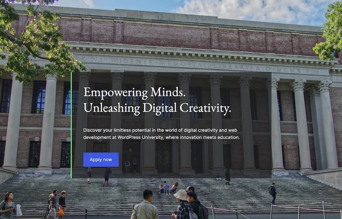
Design the site homepage banner using the following composition (not a complete list):
- Cover is full width and has a minimum height of
100vh. - Cover has padding set to
0. - Group has a background color of
#1E1E1EB3. - Group has a left border width of
4pxinQuaternary. - Group has padding and block spacing set to
3.

- Cover is full width and has a minimum height of


