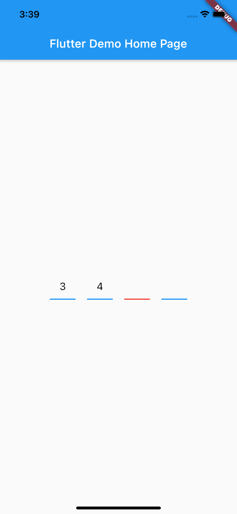
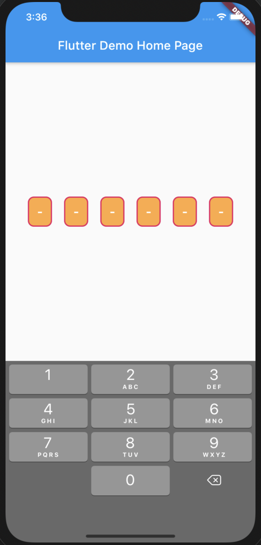
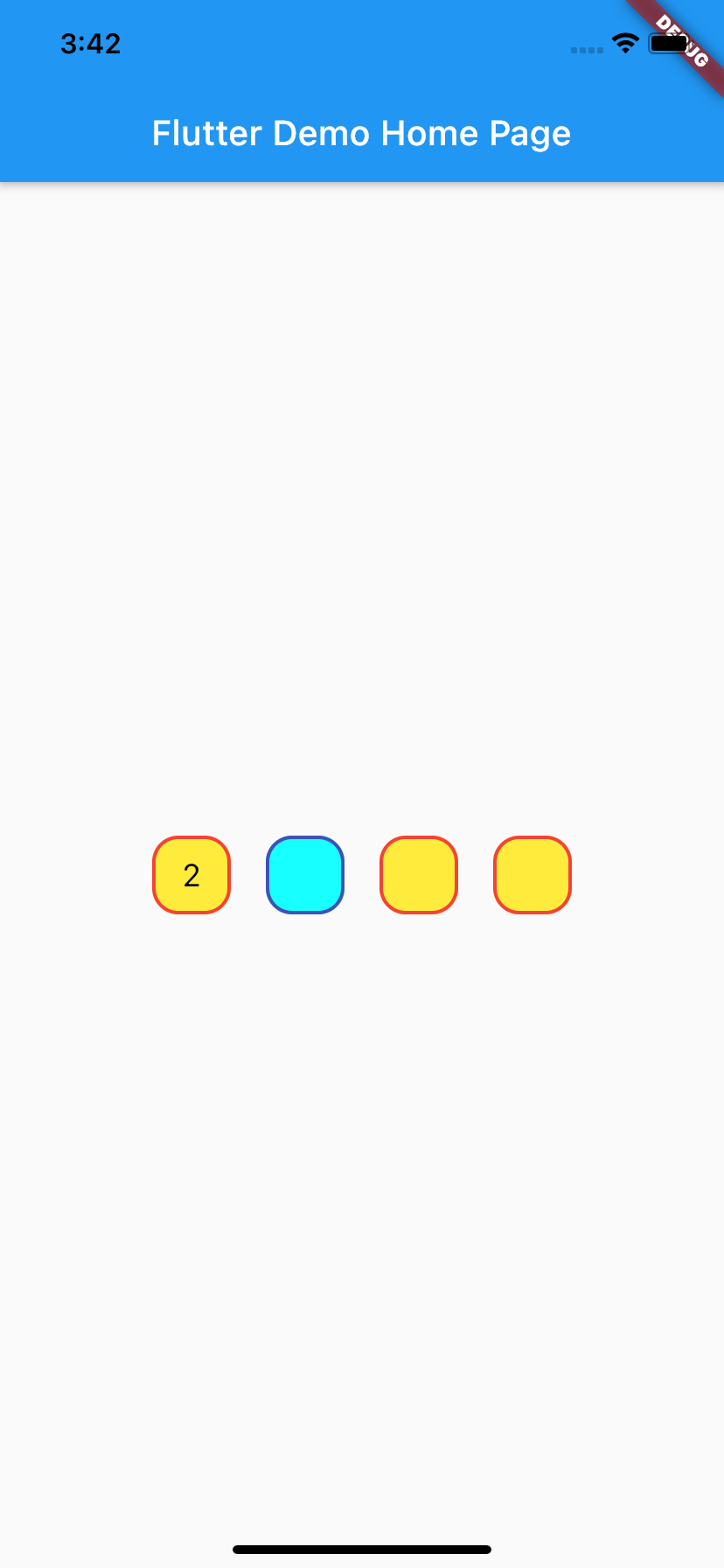
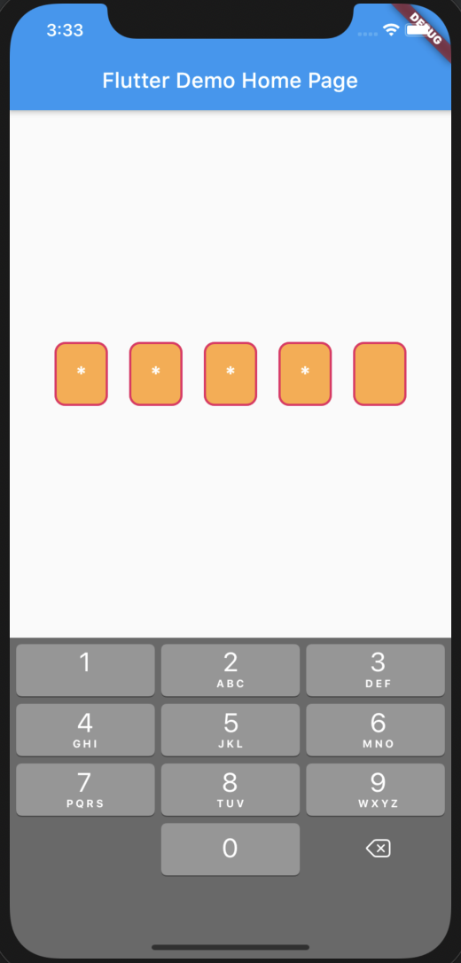
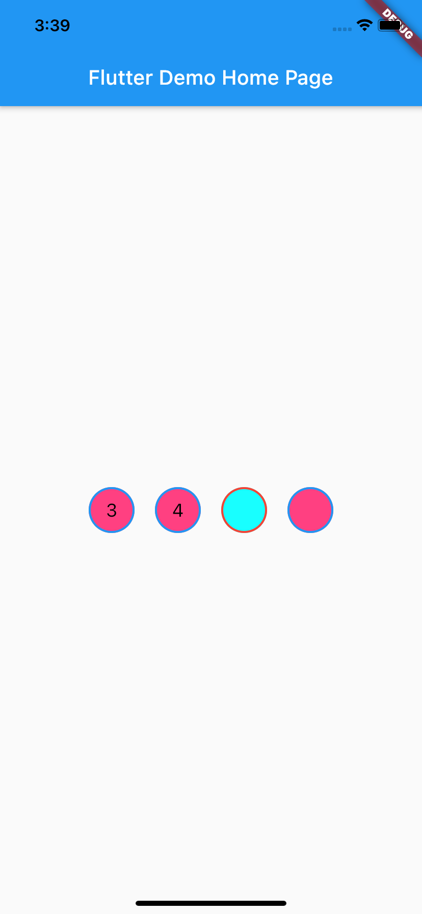
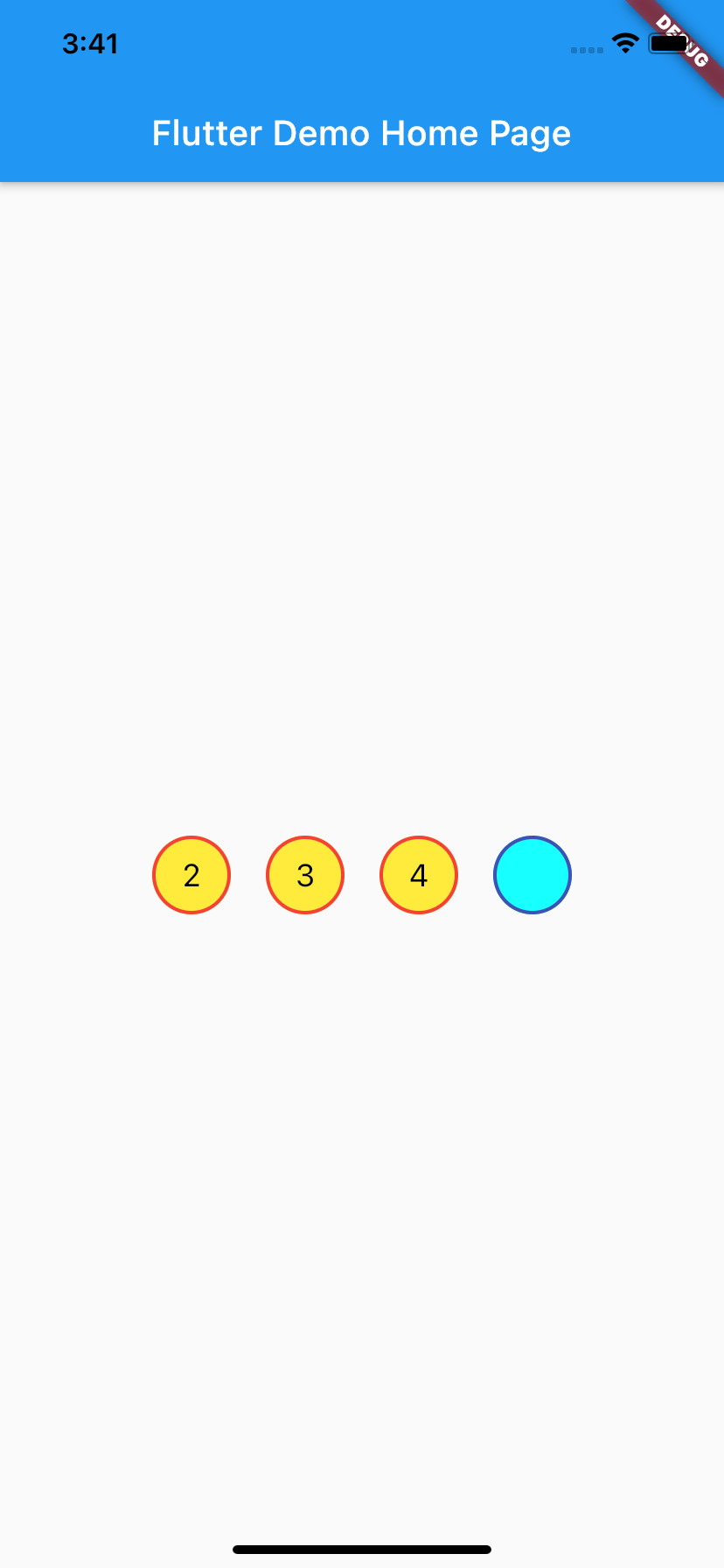
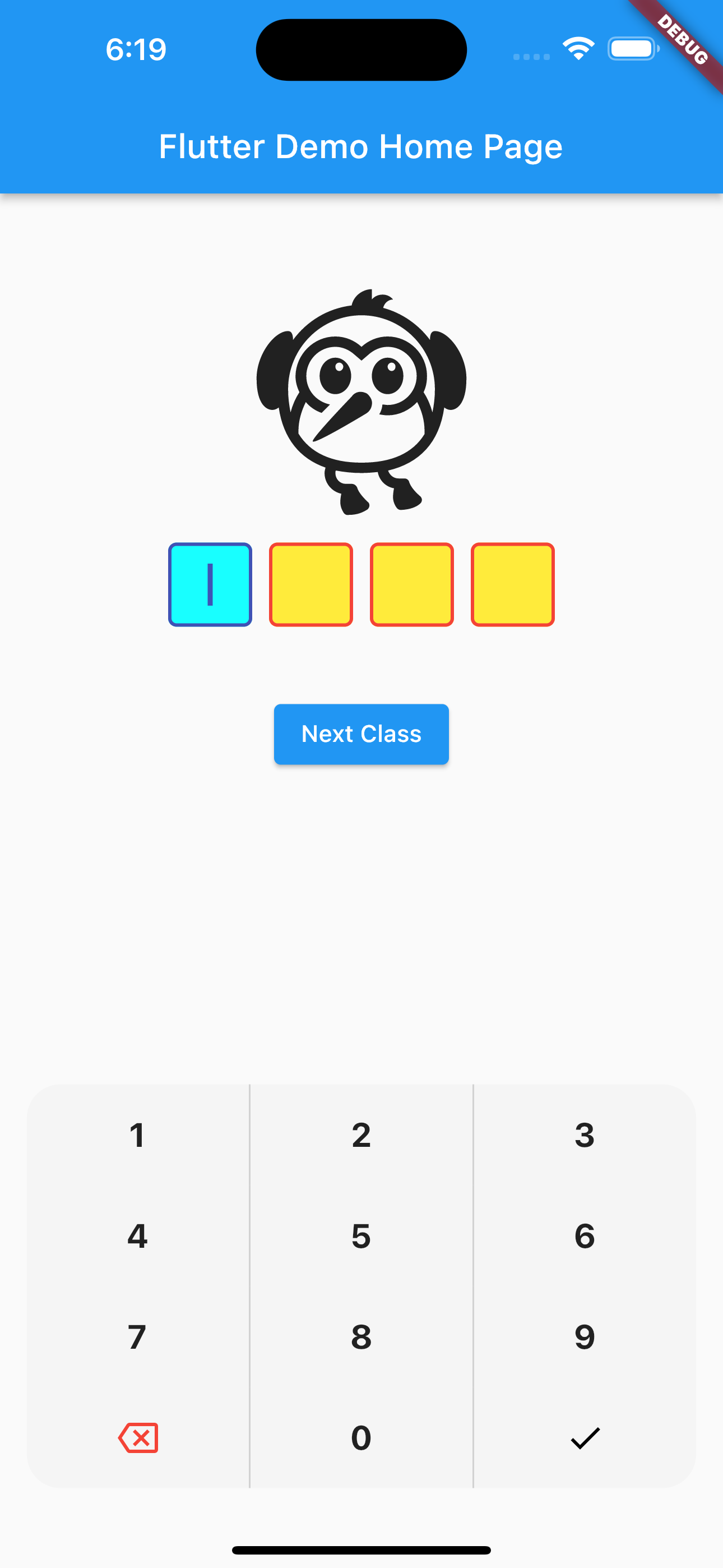
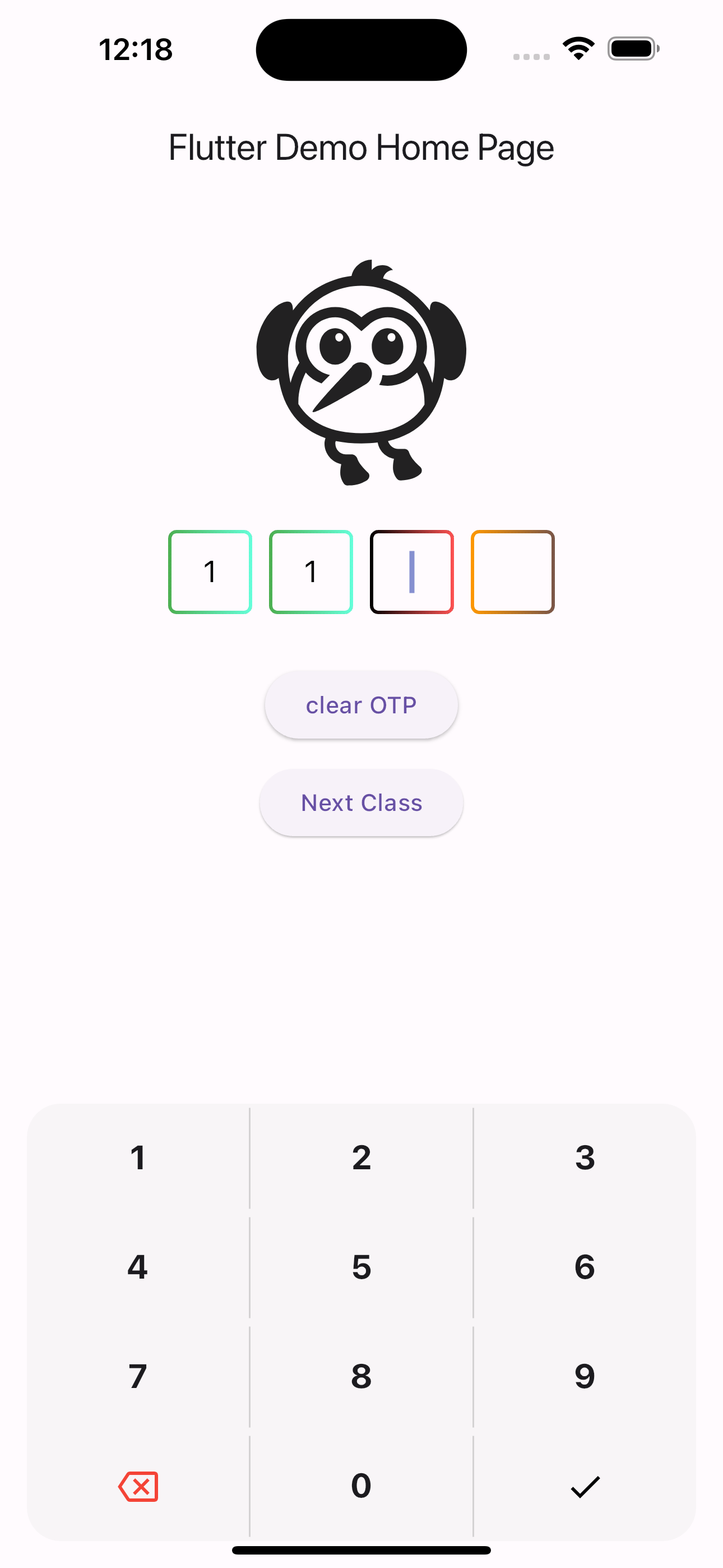
A flutter package which will help you to generate pin code fields with beautiful design and animations. It's a beautiful and highly customizable Flutter widget for entering pin code.
Created by Shivam Mishra @shivbo96
- Depend on it Add this to your package's pubspec.yaml file:
dependencies:
otp_pin_field: <VERSION>- Install it You can install packages from the command line: with Flutter:
$ flutter packages get
Alternatively, your editor might support flutter packages get. Check the docs for your editor to learn more.
- Import it Now in your Dart code, you can use:
import 'package:otp_pin_field/otp_pin.dart';| name | type | default | description |
|---|---|---|---|
| fieldCount | int | 4 | The total length of pin number & the number of pin boxes. |
| highlightBorder | bool | true | highlight the focused pin box. |
| activeFieldBorderColor | Color | Colors.black | Set color of the focused pin box. |
| activeFieldBackgroundColor | Color | Colors.transparent | Set background color of the focused pin box. |
| defaultFieldBorderColor | Color | Colors.black45 | Set color of the unfocused pin box. |
| defaultFieldBackgroundColor | Color | Colors.transparent | Set background color of the unfocused pin box. |
| fieldPadding | double | 20.0 | Set padding for pin box. |
| fieldBorderRadius | double | 2.0 | Set border radius for pin box. |
| fieldBorderWidth | double | 2.0 | Set border width for pin box. |
| textStyle | TextStyle | TextStyle(fontSize: 18.0,color: Colors.black,) | TextStyle for styling pin characters. |
| otpPinFieldInputType | OtpPinFieldInputType | OtpPinFieldInputType.none | Want to show text of otp_pin_field(OtpPinFieldInputType.none) or not(OtpPinFieldInputType.password) or want to show some special character(OtpPinFieldInputType.custom) |
| otpPinInputCustom | String | "*" | Special character to mask the pin code. Will only work if uses otpPinFieldInputType is set to OtpPinFieldInputType.custom. |
| onSubmit | void Function(String) | Callback when the max length of pin code is reached. | |
| onChange | void Function(String) | Callback when there is any change in OTP Pin Field. | |
| otpPinFieldStyle | OtpPinFieldStyle | OtpPinFieldStyle() | Customization for the individual pin boxes. Check OtpPinFieldStyle for possible options. |
| fieldHeight | double | 45.0 | Height of pin boxes. |
| fieldWidth | double | 70.0 | Width of pin boxes. |
| otpPinFieldDecoration | OtpPinFieldDecoration | OtpPinFieldDecoration.underlinedPinBoxDecoration | Predefine customization for the individual pin boxes. Check OtpPinFieldStyle for possible options and use OtpPinFieldDecoration.custom for fully customization like boarder radius,width, active and default otp_pin_field colors and etc.. |
| keyboardType | TextInputType | TextInputType.number | The type of the input keyboard |
| autofocus | bool | false | Autofocus on view entered |
| cursorColor | Color | Color.black | To give color to the cursor |
| cursorWidth | double | 2 | To give width to the cursor |
| showCursor | bool | true | To show cursor in the otp pin fields |
| mainAxisAlignment | MainAxisAlignment | MainAxisAlignment.center | Manage the spacing in the otp pin fields |
| upperChild | Widget | Container() | Widget which will show above the otp pin fields only when showCustomKeyboard is set to be true |
| middleChild | Widget | Container() | Widget which will show between the otp pin fields and Custom Keyboard only when showCustomKeyboard is set to be true |
| showCustomKeyboard | bool | false | To show custom keyboard in place default keyboard |
| customKeyboard | Widget | Widget which help you to show your own custom keyboard in place if default custom keyboard | |
| showDefaultKeyboard | bool | true | Bool which manage to show default OS keyboard |
| autoFillEnable | bool | false | Bool which manage to enable auto fill functionality For Ios it is not needed as the SMS autofill is provided by default, but not for Android, that's where this key is useful. |
| smsRegex | String | '\d{0,4}' | String which take use to show the OTP from the message |
| phoneNumbersHint | bool | false | Bool which manage to enable auto fill functionality Is a widget that will allow you ask for system phone number and autofill the widget if a phone is choosen by the user. [Android only] |
| textInputAction | TextInputAction | TextInputAction.done | In case you want to change the action of keyboard |
| filledFieldBackgroundColor | Color | Colors.transparent | Set background color of the filled field pin box. |
| filledFieldBorderColor | Color | Colors.transparent | Set color of the border of filled field pin box. |
| activeFieldBorderGradient | Gradient | Set gradient border Color for focused field pin box. | |
| filledFieldBorderGradient | Gradient | Set gradient border Color for filled field pin box. | |
| defaultFieldBorderGradient | Gradient | Set gradient border Color for unfocused/default field pin box. | |
| onPhoneHintSelected | Function(String) | Callback when you select the autofill hints. | |
| beforeTextPaste | bool Function(String?)? | null | This callback execute before you copy paste the OTP |
| showHintText | bool | false | Bool to show hints in pin field or not |
| hintTextColor | Color | Color.black45 | To set the color of hints in pin field or not |
| hintText | String | 0 | To set the text of hints in pin field |
///  Otp pin Controller
  final _otpPinFieldController = GlobalKey<OtpPinFieldState>();


         OtpPinField(
            key: _otpPinFieldController,

            ///in case you want to enable autoFill
            autoFillEnable: false,

            ///for Ios it is not needed as the SMS autofill is provided by default, but not for Android, that's where this key is useful.
            textInputAction: TextInputAction.done,

            ///in case you want to change the action of keyboard
            /// to clear the Otp pin Controller
            onSubmit: (text) {
              print('Entered pin is $text');

              /// return the entered pin
            },
            onChange: (text) {
              print('Enter on change pin is $text');

              /// return the entered pin
            },
            onCodeChanged: (code) {
              print('onCodeChanged  is $code');
            },

            /// to decorate your Otp_Pin_Field
            otpPinFieldStyle: OtpPinFieldStyle(

              /// bool to show hints in pin field or not
                showHintText: true,

              /// to set the color of hints in pin field or not
              // hintTextColor: Colors.red,

              /// To set the text  of hints in pin field
              // hintText: '1',

              /// border color for inactive/unfocused Otp_Pin_Field
              // defaultFieldBorderColor: Colors.red,

              /// border color for active/focused Otp_Pin_Field
              // activeFieldBorderColor: Colors.indigo,

              /// Background Color for inactive/unfocused Otp_Pin_Field
              // defaultFieldBackgroundColor: Colors.yellow,

              /// Background Color for active/focused Otp_Pin_Field
              // activeFieldBackgroundColor: Colors.cyanAccent,

              /// Background Color for filled field pin box
              // filledFieldBackgroundColor: Colors.green,

              /// border Color for filled field pin box
              // filledFieldBorderColor: Colors.green,
              //
              /// gradient border Color for field pin box
              activeFieldBorderGradient: LinearGradient(colors: [Colors.black, Colors.redAccent]),
              filledFieldBorderGradient: LinearGradient(colors: [Colors.green, Colors.tealAccent]),
              defaultFieldBorderGradient: LinearGradient(colors: [Colors.orange, Colors.brown]),
            ),
            maxLength: 4,

            /// no of pin field
            showCursor: true,

            /// bool to show cursor in pin field or not
            cursorColor: Colors.indigo,

            /// to choose cursor color
            upperChild: Column(
              children: [
                SizedBox(height: 30),
                Icon(Icons.flutter_dash_outlined, size: 150),
                SizedBox(height: 20),
              ],
            ),
            middleChild: Column(
              children: [
                SizedBox(height: 30),
                ElevatedButton(
                    onPressed: () {
                      _otpPinFieldController.currentState
                          ?.clearOtp(); // clear controller
                    },
                    child: Text('clear OTP')),
                SizedBox(height: 10),
                ElevatedButton(
                    onPressed: () => Navigator.push(context,
                        MaterialPageRoute(builder: (context) => NextPage())),
                    child: Text('Next Class')),
                SizedBox(height: 30),
              ],
            ),

            ///bool which manage to show custom keyboard
            showCustomKeyboard: true,

            /// Widget which help you to show your own custom keyboard in place if default custom keyboard
            // customKeyboard: Container(),
            ///bool which manage to show default OS keyboard
            // showDefaultKeyboard: true,

            /// to select cursor width
            cursorWidth: 3,

            /// place otp pin field according to yourself
            mainAxisAlignment: MainAxisAlignment.center,

            /// predefine decorate of pinField use  OtpPinFieldDecoration.defaultPinBoxDecoration||OtpPinFieldDecoration.underlinedPinBoxDecoration||OtpPinFieldDecoration.roundedPinBoxDecoration
            ///use OtpPinFieldDecoration.custom  (by using this you can make Otp_Pin_Field according to yourself like you can give fieldBorderRadius,fieldBorderWidth and etc things)
            otpPinFieldDecoration:
                OtpPinFieldDecoration.defaultPinBoxDecoration,
          ),
For the code to be receive, it need to follow some rules as describe here: https://developers.google.com/identity/sms-retriever/verify
- Be no longer than 140 bytes
- Contain a one-time code that the client sends back to your server to complete the verification flow
- End with an 11-character hash string that identifies your app
One example of SMS would be:
8125 is you verification code Ov114rXIhwf ( Ov114rXIhwf is your hash value which you will get in log ``` search your hash value is`` and append that value in your sms)
refer to example/lib/main.dart


