
https://pub.dev/packages/flutter_neumorphic

dependencies:
  flutter_neumorphic: ^1.0.0
The in your .dart files
import 'package:flutter_neumorphic/flutter_neumorphic.dart';
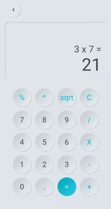
A Modern / Material (upgraded) card usually is a surface floating on top of our perceived background and casting a shadow onto it. The shadow both gives it depth and also in many cases defines the shape itself — as it’s quite often borderless.
Neumorphic card however pretends to extrude from the background. It’s a raised shape made from the exact same material as the background. When we look at it from the side we see that it doesn’t “float”.
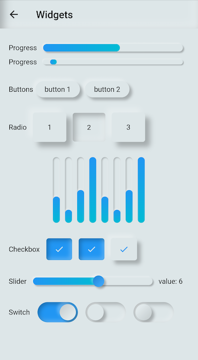
| Preview | Widget | Description |
|---|---|---|
 |
Neumorphic | The main Neumorphic Widget, a container which adds white/dark gradient depending on a lightsource and a depth |
 |
NeumorphicButton | A neumorphic button that plays with the depth to respond to user interraction |
 |
NeumorphicRadio | A set of neumorphic button whith only one selected at time, depending on a value & groupValue |
 |
NeumorphicCheckbox | A button associated with a value, can be checked/unckecked, if checked, takes the accent color |
 |
NeumorphicSwitch | An On/Off toggle, associated with a value, if toggled, takes the accent color |
 |
NeumorphicSlider | A Neumorphic seekbar (range slider), the user can select a value in a range |
 |
NeumorphicProgress | A determinate progress, takes the displayed percentage |
 |
NeumorphicIndeterminateProgress | An inderminate progress-bar |
 |
NeumorphicIndicator | A vertical / horizontal indicator bar, takes a percentage |
 |
NeumorphicBackground | Take the background color of the theme, can clip the screen with a borderRadius |
Neumorphic(
  boxShape: NeumorphicBoxShape.roundRect(borderRadius: BorderRadius.circular(12)),
  style: NeumorphicStyle(
    shape: NeumorphicShape.concave,
    depth: 8,
    lightSource: LightSource.topLeft,
    color: Colors.grey
  ),
  child: ...
)

☝️ Playing with LightSource & Depth
| Attributes | Values | Description |
|---|---|---|
| LightSource | TopLeft, BottomRight, etc. / (dx, dy) | The source of light specifit to the theme or the widget, used to project white/dark shadows on neumorphic elements |
| Shape | Concave / Convex / Flat | The shape of the curve used in the neumorphic container |
| Depth | -20 <= double <= 20 | The distance of the widget to his parent. Can be negative => emboss. It influences on the shadow's color and its size/blur |
| Intensity | 0 <= double <= 1 | The intensity of the Light, it influences on the shadow's color |
| Color | any Color | The default color of Neumorphic elements |
| Accent | any Color | The default accent color of the Neumorphic element when activated (eg: checkbox) |
| Variant | any Color | The default secondary color of the Neumorphic element (eg: used as second color on the progress gradient) |
| BoxShape | Circle, RoundRect(radius), Stadium | The box shape of a Neumorphic element. Stadium : roundrect with cirlces on each side |
| Shape | WIDGET | IMAGE | CONDITION |
|---|---|---|---|
| Flat |  |
 |
depth >= 0 && shape == Flat |
| Convex | 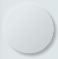 |
 |
depth >= 0 && shape == Convex |
| Concave | 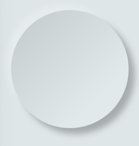 |
 |
depth >= 0 && shape == Concave |
| Emboss |  |
 |
depth < 0 |

NeumorphicTheme(
    currentTheme: CurrentTheme.LIGHT, //or DARK / SYSTEM
    darkTheme: NeumorphicThemeData(
        baseColor: Color(0xff333333),
        accentColor: Colors.green,
        lightSource: LightSource.topLeft,
        depth: 4,
        intensity: 0.3,
    ),
    theme: NeumorphicThemeData(
        baseColor: Color(0xffDDDDDD),
        accentColor: Colors.cyan,
        lightSource: LightSource.topLeft,
        depth: 6,
        intensity: 0.5,
    ),
    child: ...
)
To retrieve the current used theme :
final theme = NeumorphicTheme.getCurrentTheme(context);
final baseColor = theme.baseColor;
final accentColor = theme.accentColor;
...
Toggle from light to dark
NeumorphicTheme.of(context).currentTheme = CurrentTheme.DARK;Know if using dark
if(NeumorphicTheme.of(context).isUsingDarkMode){

}| Contributors | |
|---|---|
 |
Florent Champigny |
 |
Olivier Bonvila |
 |
Gyl Jean Lambert |
Flutter-Neumorphic is released under the Apache2 license. See LICENSE for details.
If you use the open-source library in your project, please make sure to credit and backlink to www.idean.com
