[toc]
默认情况下,盒子可见框的大小由内容区、内边距和边框共同决定
box-sizing用来设置盒子尺寸的计算方式(设置 width 和 height 的作用)
.box {
  width: 200px;
  height: 200px;
  background-color: yellow;
  border: 10px red solid;
  /* box-sizing: content-box; */
  box-sizing: border-box;
}
可选值:
-
content-box默认值,宽度和高度用来设置内容区的大小 -
border-box宽度和高度用来设置整个盒子可见框的大小
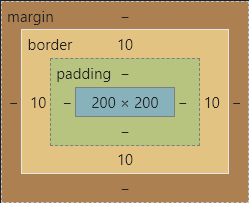
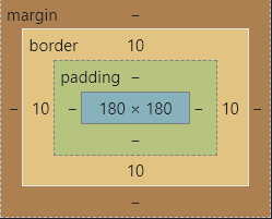
width和height指的是内容区、内边距和边框的总大小
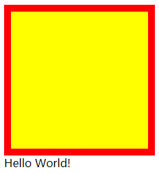
outline用来设置元素的轮廓线,用法和border一模一样
轮廓和边框不同点是,轮廓不会影响到可见框的大小
边框
.box {
  width: 200px;
  height: 200px;
  background-color: yellow;
  border: 10px red solid;
}
轮廓
.box {
  width: 200px;
  height: 200px;
  background-color: yellow;
  outline: 10px red solid;
}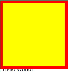
可以很明显看到outline与border的区别
我们一般不会直接这么设置轮廓,而是下面这种场景
.box:hover {
  outline: 10px red solid;
}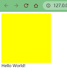
从上面的动态图也可以很清晰地看出,outline属性并没有改变盒子的布局
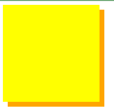
box-shadow属性用于在一个元素的框架周围添加阴影效果你可以设置多个由逗号分隔的效果
一个盒状阴影由相对于元素的 X 和 Y 的偏移量、模糊和扩散半径以及颜色来描述
box-shadow用来设置元素的阴影效果,阴影不会影响页面布局
.box {
  width: 200px;
  height: 200px;
  background-color: yellow;
  box-shadow: 10px 10px orange;
}
box-shadow: 10px 10px 5px orange;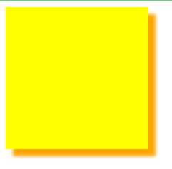
box-shadow: 10px 10px 5px rgba(0, 0, 0, 0.2);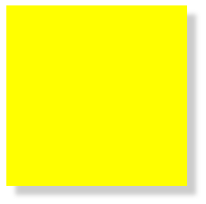
- 第一个值-水平偏移量:设置阴影的水平位置
- 正值向右移动
- 负值向左移动
- 第二个值-垂直偏移量:设置阴影的垂直位置
- 正值向下移动
- 负值向上移动
- 第三个值-阴影的模糊半径
- 第四个值-阴影的颜色
border-radius属性使一个元素的外边框边缘的角变圆你可以设置一个半径来做圆角,或者设置两个半径来做椭圆角
border-radius 用来设置圆角,圆角设置的是圆的半径大小
border-top-left-radiusborder-top-right-radiusborder-bottom-left-radiusborder-bottom-right-radius
border-radius: 20px;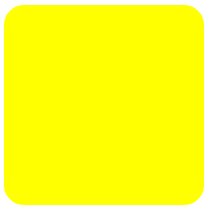
border-top-right-radius: 50px 100px;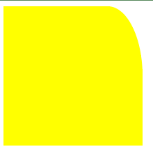
border-radius 可以分别指定四个角的圆角
- 四个值:
左上右上右下左下 - 三个值:
左上右上/左下右下 - 两个值:
左上/右下右上/左下 - 一个值:
左上/右上/右下/左下
这里同样不需要死记硬背,只要记住遵循顺时针方向和矩形中心点对称原则
与border不同的是,border是从上开始顺时针设置,而圆角是从左上开始
原理很简单,就是绘制正方形,并将四个圆角半径设置为正方形的一半
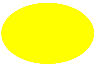
.box {
  width: 200px;
  height: 200px;
  background-color: yellow;
  border-radius: 50%;
}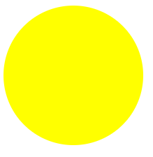
只需要对上述样式对一点点的改动,设置width和height属性不相等即可
.box {
  width: 300px;
  height: 200px;
  background-color: yellow;
  border-radius: 50%;
}
html 代码
<div class="box1">
  <div class="box2">
    <div class="box3">
      <div class="box4">
        <div class="box5">
          <div class="box6">
            <div class="box7">
              <div class="box8">
                <div class="boxRect">
                  <div class="boxCirc"></div>
                  <div class="boxRectLeft1"></div>
                  <div class="boxRectRight1"></div>
                </div>
              </div>
            </div>
          </div>
        </div>
      </div>
    </div>
  </div>
</div>
css 样式
.box1 {
  background-color: #da251e;
  /* 这里使用css的一个表达式,方便加减乘除计算 */
  width: calc(1719.2px / 2 + 360px * 2 - 12.2px * 0 * 2);
  height: calc(360px * 2 - 12.2px * 0 * 2);
  margin: 100px auto;
  border: 0.5px white solid;
  /* 圆角 */
  border-radius: calc(360px - 12.2px * 0) / 50%;
  /* 盒子 */
  box-sizing: border-box;
}

.box2 {
  width: calc(1719.2px / 2 + 360px * 2 - 12.2px * 1 * 2);
  height: calc(360px * 2 - 12.2px * 1 * 2);
  margin: 12.2px auto;
  border: 0.5px white solid;
  border-radius: calc(360px - 12.2px * 1) / 50%;
  box-sizing: border-box;
}

.box3 {
  width: calc(1719.2px / 2 + 360px * 2 - 12.2px * 2 * 2);
  height: calc(360px * 2 - 12.2px * 2 * 2);
  margin: 12.2px auto;
  border: 0.5px white solid;
  border-radius: calc(360px - 12.2px * 2) / 50%;
  box-sizing: border-box;
}

.box4 {
  width: calc(1719.2px / 2 + 360px * 2 - 12.2px * 3 * 2);
  height: calc(360px * 2 - 12.2px * 3 * 2);
  margin: 12.2px auto;
  border: 0.5px white solid;
  border-radius: calc(360px - 12.2px * 3) / 50%;
  box-sizing: border-box;
}

.box5 {
  width: calc(1719.2px / 2 + 360px * 2 - 12.2px * 4 * 2);
  height: calc(360px * 2 - 12.2px * 4 * 2);
  margin: 12.2px auto;
  border: 0.5px white solid;
  border-radius: calc(360px - 12.2px * 4) / 50%;
  box-sizing: border-box;
}

.box6 {
  width: calc(1719.2px / 2 + 360px * 2 - 12.2px * 5 * 2);
  height: calc(360px * 2 - 12.2px * 5 * 2);
  margin: 12.2px auto;
  border: 0.5px white solid;
  border-radius: calc(360px - 12.2px * 5) / 50%;
  box-sizing: border-box;
}

.box7 {
  width: calc(1719.2px / 2 + 360px * 2 - 12.2px * 6 * 2);
  height: calc(360px * 2 - 12.2px * 6 * 2);
  margin: 12.2px auto;
  border: 0.5px white solid;
  border-radius: calc(360px - 12.2px * 6) / 50%;
  box-sizing: border-box;
}

.box8 {
  background-color: #00923f;
  width: calc(1719.2px / 2 + 360px * 2 - 12.2px * 7 * 2);
  height: calc(360px * 2 - 12.2px * 7 * 2);
  margin: 12.2px auto;
  border: 0.5px white solid;
  border-radius: calc(360px - 12.2px * 7) / 50%;
  box-sizing: border-box;
}

.boxRect {
  width: calc(1719.2px / 2);
  height: calc(360px * 2 - 12.2px * 7 * 2 - 10px);
  margin: 5px auto;
  border: 0.5px white solid;
  box-sizing: border-box;
}

.boxCirc {
  width: 100px;
  height: 100px;
  margin: calc((360px * 2 - 12.2px * 7 * 2 - 10px - 100px) / 2) auto;
  border: 0.5px white solid;
  border-radius: 50%;
  box-sizing: border-box;
}

.boxRectLeft1 {
  width: 100px;
  height: 200px;
  margin-top: calc(-360px * 2 / 2 + 12.2px * 7 * 2 / 2 + 10px - 200px / 2);
  border: 0.5px white solid;
  box-sizing: border-box;
}

.boxRectRight1 {
  width: 100px;
  height: 200px;
  margin-top: calc(-360px * 2 / 2 + 12.2px * 7 * 2 / 2 + 10px + 50px);
  margin-left: calc(1719.2px / 2 - 100px);
  border: 0.5px white solid;
  box-sizing: border-box;
}
效果图

由于因为到目前为止,还没有学习更多的布局定位知识,所以一些其他的细节地方比较难绘制
这里就大概绘制一个雏形出来,等后面学习了绝对定位和相对定位之后再做补充和完善,会相对容易一些
学完了浮动,我们终于可以继续完善绿茵足球场了
废话不多说,直接上代码
<!DOCTYPE html>
<html lang="en">
  <head>
    <meta charset="UTF-8" />
    <meta http-equiv="X-UA-Compatible" content="IE=edge" />
    <meta name="viewport" content="width=device-width, initial-scale=1.0" />
    <title>田径场</title>
    <style>
      /* 公共部分 */
      .box1,
      .box2,
      .box3,
      .box4,
      .box5,
      .box6,
      .box7,
      .box8,
      .boxRect,
      .boxColLine,
      .boxRectLeft1,
      .boxRectLeft2,
      .boxCircLeft,
      .boxCirc,
      .boxCircRight,
      .boxRectRight1,
      .boxRectRight2,
      .football {
        box-sizing: border-box;
        border: 0.5px white solid;
      }

      .box2,
      .box3,
      .box4,
      .box5,
      .box6,
      .box7,
      .box8 {
        margin: 12.2px auto;
      }

      .boxRectLeft1,
      .boxRectLeft2,
      .boxCircLeft {
        float: left;
        /* 去除左边框 */
        border-left: none;
      }

      .boxCircRight,
      .boxRectRight1,
      .boxRectRight2 {
        float: right;
        /* 去除右边框 */
        border-right: none;
      }

      /* ==========田径场========== */
      .box1 {
        background-color: #da251e;
        width: calc(1719.2px / 2 + 360px * 2 - 12.2px * 0 * 2);
        height: calc(360px * 2 - 12.2px * 0 * 2);
        margin: 100px auto;
        border-radius: calc(360px - 12.2px * 0) / 50%;
      }

      .box2 {
        width: calc(1719.2px / 2 + 360px * 2 - 12.2px * 1 * 2);
        height: calc(360px * 2 - 12.2px * 1 * 2);
        border-radius: calc(360px - 12.2px * 1) / 50%;
      }

      .box3 {
        width: calc(1719.2px / 2 + 360px * 2 - 12.2px * 2 * 2);
        height: calc(360px * 2 - 12.2px * 2 * 2);
        border-radius: calc(360px - 12.2px * 2) / 50%;
      }

      .box4 {
        width: calc(1719.2px / 2 + 360px * 2 - 12.2px * 3 * 2);
        height: calc(360px * 2 - 12.2px * 3 * 2);
        border-radius: calc(360px - 12.2px * 3) / 50%;
      }

      .box5 {
        width: calc(1719.2px / 2 + 360px * 2 - 12.2px * 4 * 2);
        height: calc(360px * 2 - 12.2px * 4 * 2);
        border-radius: calc(360px - 12.2px * 4) / 50%;
      }

      .box6 {
        width: calc(1719.2px / 2 + 360px * 2 - 12.2px * 5 * 2);
        height: calc(360px * 2 - 12.2px * 5 * 2);
        border-radius: calc(360px - 12.2px * 5) / 50%;
      }

      .box7 {
        width: calc(1719.2px / 2 + 360px * 2 - 12.2px * 6 * 2);
        height: calc(360px * 2 - 12.2px * 6 * 2);
        border-radius: calc(360px - 12.2px * 6) / 50%;
      }

      .box8 {
        background-color: #00923f;
        width: calc(1719.2px / 2 + 360px * 2 - 12.2px * 7 * 2);
        height: calc(360px * 2 - 12.2px * 7 * 2);
        border-radius: calc(360px - 12.2px * 7) / 50%;
      }

      /* ==========绿茵足球场========== */
      .boxRect {
        width: calc(1719.2px / 2);
        height: calc(360px * 2 - 12.2px * 7 * 2 - 10px);
        margin: 5px auto;
      }

      .boxRectLeft1 {
        width: 100px;
        height: 200px;
        margin-top: calc(
          360px * 2 / 2 - 12.2px * 7 * 2 / 2 - 10px / 2 - 200px / 2
        );
      }

      .boxRectLeft2 {
        width: 50px;
        height: 100px;
        margin-top: calc(200px / 2 - 100px / 2);
      }

      .boxCircLeft {
        width: 50px;
        height: 100px;
        margin-top: calc(
          360px * 2 / 2 - 12.2px * 7 * 2 / 2 - 10px / 2 - 100px / 2
        );
        border-radius: 0 100px 100px 0;
      }

      .boxCirc {
        float: left;
        width: 100px;
        height: 100px;
        margin: calc(360px * 2 / 2 - 12.2px * 7 * 2 / 2 - 10px / 2 - 100px / 2) auto;
        margin-left: calc(1719.2px / 2 / 2 - 100px - 50px - 100px / 2);
        border-radius: 50%;
      }

      .boxCircRight {
        width: 50px;
        height: 100px;
        margin-top: calc(
          360px * 2 / 2 - 12.2px * 7 * 2 / 2 - 10px / 2 - 100px / 2
        );
        border-radius: 100px 0 0 100px;
      }

      .boxRectRight1 {
        width: 100px;
        height: 200px;
        margin-top: calc(
          360px * 2 / 2 - 12.2px * 7 * 2 / 2 - 10px / 2 - 200px / 2
        );
      }

      .boxRectRight2 {
        width: 50px;
        height: 100px;
        margin-top: calc(200px / 2 - 100px / 2);
      }

      .boxColLine {
        width: 0;
        height: 100%;
        margin-left: calc(1719.2px / 2 / 2);
        /* 边框样式 */
        border: 0.25px white dashed;
      }

      /* ==========足球========== */
      .football {
        float: right;
        width: 10px;
        height: 10px;
        background-color: black;
        margin: 100px;
        border-radius: 50%;
      }
    </style>
  </head>

  <body>
    <div class="box1">
      <div class="box2">
        <div class="box3">
          <div class="box4">
            <div class="box5">
              <div class="box6">
                <div class="box7">
                  <div class="box8">
                    <div class="boxRect">
                      <div class="boxRectLeft1">
                        <div class="boxRectLeft2"></div>
                      </div>
                      <div class="boxCircLeft"></div>
                      <div class="boxCirc"></div>
                      <div class="boxRectRight1">
                        <div class="boxRectRight2"></div>
                      </div>
                      <div class="boxCircRight"></div>
                      <!-- 足球 -->
                      <div class="football"></div>
                      <div class="boxColLine"></div>
                    </div>
                  </div>
                </div>
              </div>
            </div>
          </div>
        </div>
      </div>
    </div>
  </body>
</html>
这次主要的改动如下:
- 提取公共 css 代码
- 使用
float属性进行布局 - 删除重叠部分边框样式(叠加之后颜色会变粗,这里去掉同一侧的边框样式)
不过需要注意的是由于boxColLine不是float元素,应该放置最下方
这样可以利用浮动的特点,防止对布局产生影响
最终效果
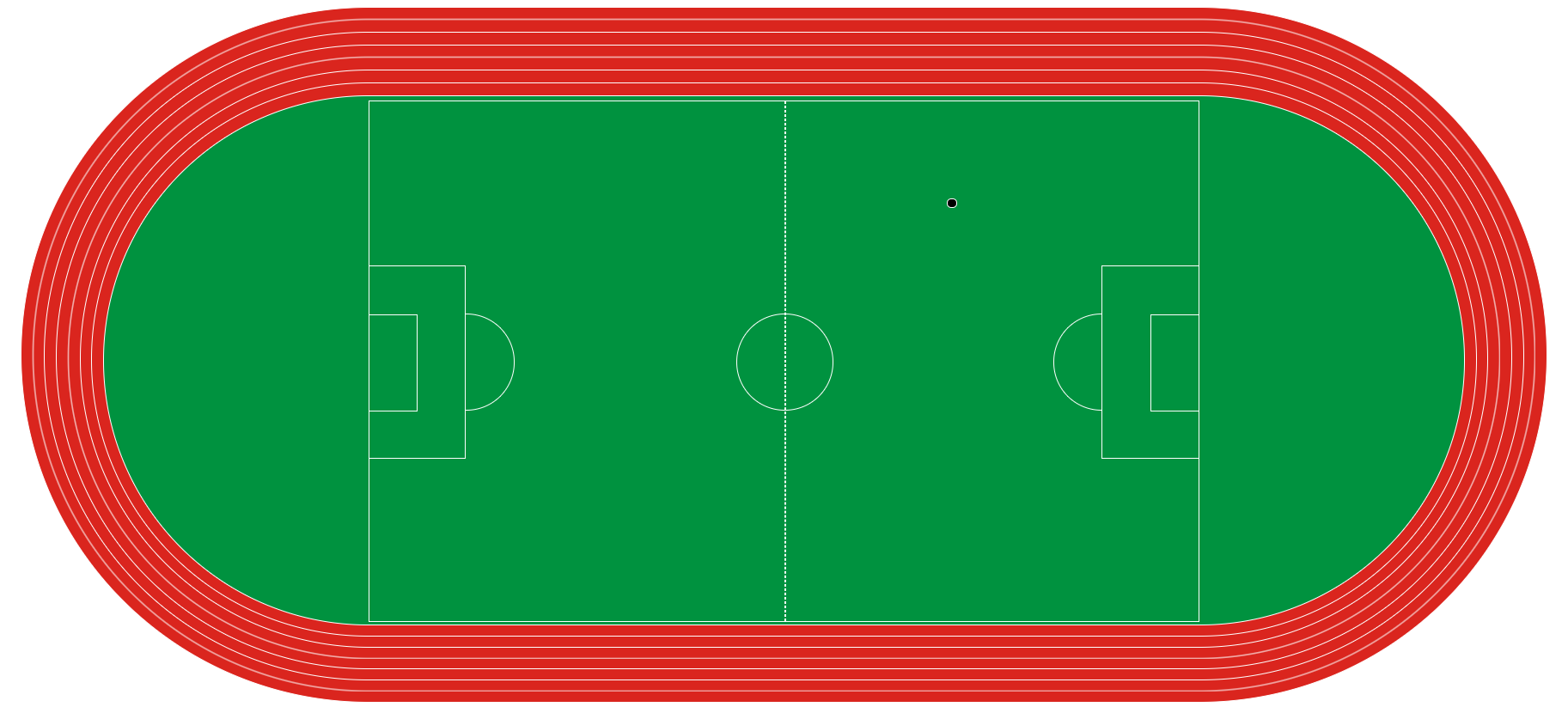
终于可以愉快的踢球了
搞错了,再来