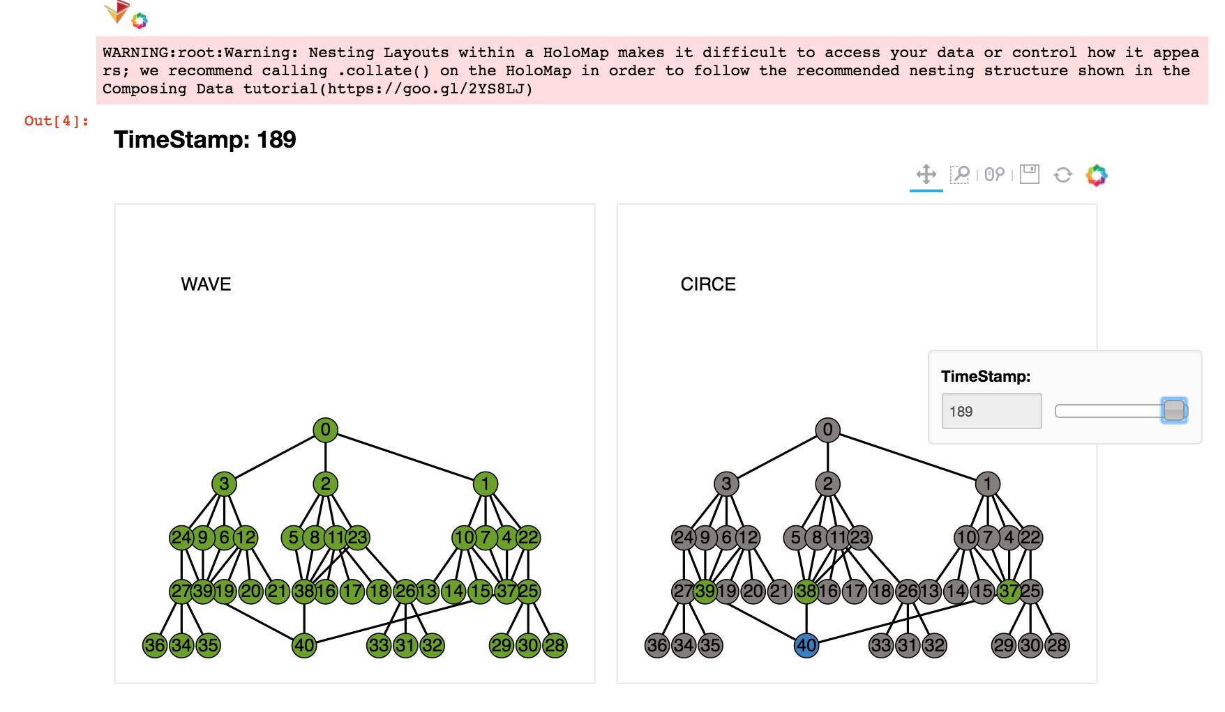
Visualization tool for Jupiter. This tool generates an interactive plot to show the scheduling result of WAVE and the dispatcher mapping of CIRCE.
.
├── README.md                   # this file
├── Dockerfile                  # file to generate the Docker image
├── visualizer.ipynb            # Jupyter notebook to generate the interactive plot
├── input_files                 # directory containing the files needed by this visualizer (output by Jupiter)
│   ├── DAG.txt                 # DAG representing the task graph
│   ├── circe_output.txt        # output file by CIRCE log
│   └── wave_output.txt         # output file by WAVE log
└── screenshots                 # screenshots for example run
To visualize your own application. Replace the DAG.txt, circe_output.txt and wave_output.txt in input_files by the actual system log. Make sure the format of your logs are in line with the example files in input_files.
This visualizer is Dockerized. To run the application, you need to have Docker installed.
To generate the Docker image, run:
$ cd <path-to-this-repo>
$ docker build -t <name-of-the-image> .
To run the image and interact with the jupyter notebook, run:
docker run -it -p 8888:8888 <name-of-the-image>
You will see the output of the last command as below:
Copy the above URL in your browser. You will see a running Jupyter notebook session. Open the visualizer.ipynb notebook. Run all the cells. You will see the output of the visualizer in cell [4], as below:
Note that the time for generating the plot may be more than 10 minutes.

