ButtonKit provides a new a SwiftUI Button replacement to deal with throwable and asynchronous actions. By default, SwiftUI Button only accept a closure.
With ButtonKit, you'll have access to an AsyncButton view, accepting a () async throws -> Void closure.
- Swift 5.9+ (Xcode 15+)
- iOS 15+, iPadOS 15+, tvOS 15+, watchOS 8+, macOS 12+, visionOS 1+
Install using Swift Package Manager
dependencies: [
    .package(url: "https://github.com/Dean151/ButtonKit.git", from: "0.3.0"),
],
targets: [
    .target(name: "MyTarget", dependencies: [
        .product(name: "ButtonKit", package: "ButtonKit"),
    ]),
]
And import it:
import ButtonKitUse it as any SwiftUI button, but throw if you want in the closure:
AsyncButton {
    try doSomethingThatCanFail()
} label {
    Text("Do something")
}
When the button closure throws, the button will shake by default
For now, only this shake behavior is built-in:
 |
| .throwableButtonStyle(.shake) |
You can still disable it by passing .none to throwableButtonStyle:
AsyncButton {
    try doSomethingThatCanFail()
} label {
    Text("Do something")
}
.throwableButtonStyle(.none)
You can also bring your own behavior using the ThrowableButtonStyle protocol.
In ThrowableButtonStyle, you can implement makeLabel, makeButton or both to alter the button look and behavior.
public struct TryAgainThrowableButtonStyle: ThrowableButtonStyle {
    public init() {}

    public func makeLabel(configuration: LabelConfiguration) -> some View {
        if configuration.errorCount > 0 {
            Text("Try again!")
        } else {
            configuration.label
        }
    }
}

extension ThrowableButtonStyle where Self == TryAgainThrowableButtonStyle {
    public static var tryAgain: TryAgainThrowableButtonStyle {
        TryAgainThrowableButtonStyle()
    }
}
Then, use it:
AsyncButton {
    try doSomethingThatCanFail()
} label {
    Text("Do something")
}
.throwableButtonStyle(.tryAgain)Use it as any SwiftUI button, but the closure will support both try and await.
AsyncButton {
    try await doSomethingThatTakeTime()
} label {
    Text("Do something")
}
When the process is in progress, another button press will not result in a new Task being issued. But the button is still enabled and hittable.
You can disable the button on loading using disabledWhenLoading modifier.
AsyncButton {
  ...
}
.disabledWhenLoading()
You can also disable hitTesting when loading with allowsHitTestingWhenLoading modifier.
AsyncButton {
  ...
}
.allowsHitTestingWhenLoading(false)
Access and react to the underlying task using asyncButtonTaskStarted or asyncButtonTaskEnded modifier.
AsyncButton {
  ...
}
.asyncButtonTaskStarted { task in
    // Task started
}
.asyncButtonTaskEnded {
    // Task ended or was cancelled
}
You can summarize both using asyncButtonTaskChanged modifier.
AsyncButton {
  ...
}
.asyncButtonTaskChanged { task in
    if let task {
        // Task started
    } else {
        // Task ended or was cancelled
    }
}
While the progress is loading, the button will animate, defaulting by replacing the label of the button with a ProgressView.
All sort of styles are built-in:
 |
 |
| .asyncButtonStyle(.overlay) | .asyncButtonStyle(.pulse) |
 |
 |
| .asyncButtonStyle(.leading) | .asyncButtonStyle(.trailing) |
You can disable this behavior by passing .none to asyncButtonStyle
AsyncButton {
    try await doSomethingThatTakeTime()
} label {
    Text("Do something")
}
.asyncButtonStyle(.none)
You can also build your own customization by implementing AsyncButtonStyle protocol.
Just like ThrowableButtonStyle, AsyncButtonStyle allows you to implement either makeLabel, makeButton or both to alter the button look and behavior while loading is in progress.
You might need to trigger the behavior behind a button with specific user actions, like when pressing the "Send" key on the virtual keyboard.
Therefore, to get free animated progress and errors behavior on your button, you can't just start the action of the button by yourself. You need the button to start it.
To do so, you need to set a unique identifier to your button:
enum LoginViewButton: Hashable {
  case login
}

struct ContentView: View {
    var body: some View {
        AsyncButton(id: LoginViewButton.login) {
            try await login()
        } label: {
            Text("Login")
        }
    }
}
And from any view, access the triggerButton environment:
struct ContentView: View {
    @Environment(\.triggerButton)
    private var triggerButton

    ...

    func performLogin() {
        triggerButton(LoginViewButton.login)
    }
}
Note that:
- The button Must be on screen to trigger it using this method.
- If the triggered button is disabled, calling triggerButton will have no effect
- If a task has already started on the triggered button, calling triggerButton will have no effect
AsyncButton supports progress reporting:
AsyncButton(progress: .discrete(totalUnitCount: files.count)) { progress in
    for file in files {
        try await file.doExpensiveComputation()
        progress.completedUnitCount += 1
    }
} label: {
    Text("Process")
}
.buttonStyle(.borderedProminent)
.buttonBorderShape(.roundedRectangle)
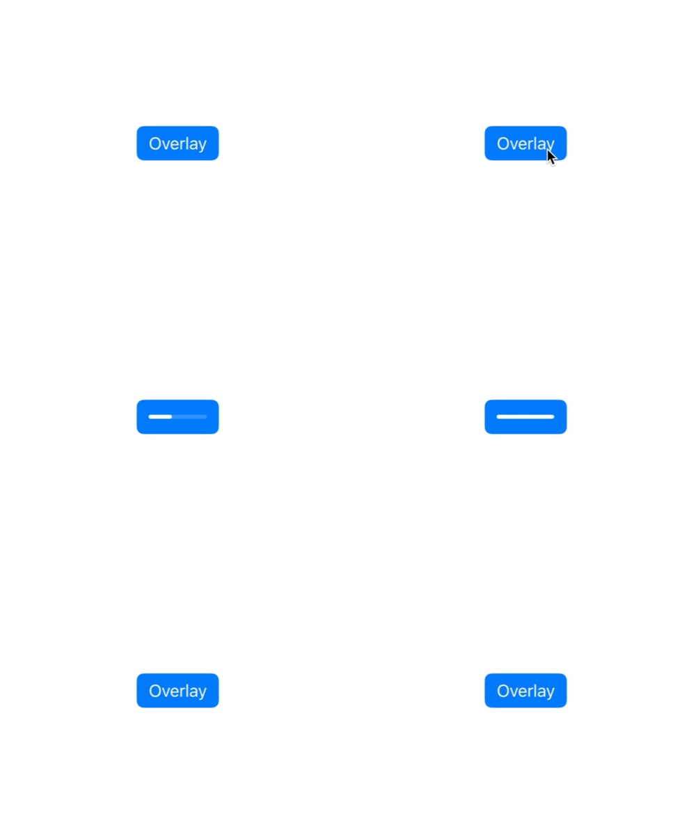
AsyncButtonStyle now also supports determinate progress as well, responding to configuration.fractionCompleted: Double? property:
AsyncButton(progress: .discrete(totalUnitCount: files.count)) { progress in
    for file in files {
        try await file.doExpensiveComputation()
        progress.completedUnitCount += 1
    }
} label: {
    Text("Process")
}
.buttonStyle(.borderedProminent)
.buttonBorderShape(.roundedRectangle)
.asyncButtonStyle(.trailing) |
 |
| .asyncButtonStyle(.overlay) | .asyncButtonStyle(.overlay(style: .percent)) |
 |
 |
| .asyncButtonStyle(.leading) | .asyncButtonStyle(.trailing) |
You can also create your own progression logic by implementing the TaskProgress protocol.
This would allow you to build logarithmic based progress, or a first step that is indeterminate, before moving to a deterministic state (like the App Store download button)
Available TaskProgress implementation are:
- Indeterminate, default non-determinant progress with
.indeterminate - Discrete linear (completed / total) with
.discrete(totalUnitsCount: Int) - Estimated progress that fill the bar in the provided time interval, stopping at 85% to simulate determinant loading with
.estimated(for: Duration) - (NS)Progress bridge with
.progress
You are encouraged to contribute to this repository, by opening issues, or pull requests for bug fixes, improvement requests, or support. Suggestions for contributions:
- Improving documentation
- Adding some automated tests 😜
- Helping me out to remove/improve all the type erasure stuff if possible?
- Adding some new built-in styles, options or properties for more use cases