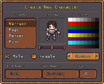
UI extension for MonoGame-based projects by Ronen Ness.
Get it from: GeonBit.UI git.
Full API documentation available here: Online docs.
GeonBit is an Entity-Component-System based game engine, powered by MonoGame.
GeonBit.UI is the UI / HUD system of the GeonBit engine, exported as an independent MonoGame extension under the MIT license.
It provide all the basic UI elements required to make a game / editor UI, and comes with few built-in UI skins compatible for commercial projects.
To see a GeonBit.UI demo, check out this YouTube video:
GeonBit.UI provide the following functionality:
- Helper class to handle user input and interactions with UI elements.
- Automatic positioning and anchors system that provide an easy way to place elements regardless of screen size.
- Events system to capture and respond to user interactions with UI.
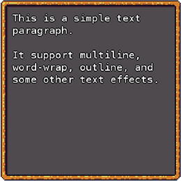
- Smart Paragraphs & Headers with multiline text, automatic word-wrap, outline, and other text effects.
- Panels (framed containers for widgets), with few built-in skins and dragging functionality.
- Buttons with few skins to choose from, toggle mode, and icons.
- Checkboxes and Radio buttons.
- Cursor rendering with few cursor styles (can be disabled if you draw your own cursor).
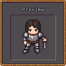
- Image & Icon widgets (comes with 40+ built-in icons).
- Select Lists with different skins, scrollbars, and dynamic content.
- Dropdown widgets with different skins.
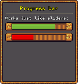
- Slider bars & Progress bars.
- Text boxes for user text input - support multiline, word-wrap, scrollbars and skins.
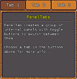
- PanelTabs to easily create multitab panels.
- Tooltip text.
- Message Boxes.
- Stylesheets and themes, easily extendable.
- Locked, disabled, shadow, and other basic UI effects and states.
- Global scaling property to support different screen sizes.
- Apply transformation matrix.
- And much more...
In GeonBit.UI you create your GUI layout using plain init code.
For example, the following code:
// create a panel and position in center of screen
Panel panel = new Panel(new Vector2(400, 400), PanelSkin.Default, Anchor.Center);
UserInterface.Active.AddEntity(panel);

// add title and text
panel.AddChild(new Header("Example Panel"));
panel.AddChild(new HorizontalLine());
panel.AddChild(new Paragraph("This is a simple panel with a button."));

// add a button at the bottom
panel.AddChild(new Button("Click Me!", ButtonSkin.Default, Anchor.BottomCenter));
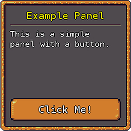
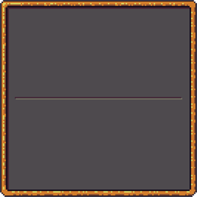
Will create the following UI panel at the center of the screen:
Before choosing GeonBit.UI, here are few caveats you should know about:
GeonBit.UI was developed and tested on 3 different machines, with windows 8 and 10. Theoretically It should work on any platform supported by MonoGame, but it might require some tweaks for some devices.
The text input widget is pretty basic and don't support advance text editing and things like copy & paste, selection, etc. So if your project require extensive text editing you might need to do some work on the text input widget.
GeonBit.UI is built to work with mouse / touch screens. It is currently not designed for keyboard-only / joystick input (e.g. it doesn't support tab navigating etc.)
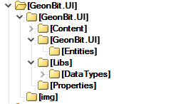
In the repository root you will find the following files and folders:
GeonBit.UI.sln: a Visual Studio solution with GeonBit.UI source + example code.Documentation.chm: full API documentation file (auto-generated).GeonBit.UI/: folder containing all the source code and resources of GeonBit.UI.
Inside the GeonBit.UI/ folder you will find the following files and folders:
Content: all the resources GeonBit.UI rely on. You will need to import some of it (explained in installation instructions coming up next).GeonBit.UI: GeonBit.UI source code (cs files).Libs: additional libs you need to compile with GeonBit.UI (currently there's only one).GeonBitUI_Examples.csandprogram.cs: GeonBit.UI demo app that demonstrate the different features and entities GeonBit.UI provides.
To see GeonBit.UI live before installing it in your project, you can open and run the solution file.
Please note however that you might need to install some fonts first from GeonBit.UI/Content/Fonts/ folder.
Note: GeonBit.UI require MonoGame 3.6 to run. For older MonoGame versions, please see tag 2.1.0.0.
You can either install GeonBit.UI with NuGet or manually.
First, run the NuGet install command:
Install-Package GeonBit.UI
Now there are two things to update in the Content Manager:
- Add a
Referenceto the DataTypes.dll lib, located inpackages\GeonBit.UI.<version>\lib\geonbitui\ - During installation, GeonBit.UI placed a folder in
Content\GeonBit.UI. Add this whole folder, as-is, to your content manager (when asked if to copy or link files, choose link, since the folder is already in its right place).
That's it! Just few things to remember:
- If you don't have the default themes fonts installed, you need to install the fonts from
GeonBit.UI/GeonBit.UI/Content/Fonts/. - If you want to edit the default themes (textures, styles, etc), its recommended to copy the theme to a new folder and never change the original package files, since they will be overridden next time you update GeonBit.UI via NuGet.
- If your development environment is on Linux, there are few more steps to follow: Installing on Linux.
To manually install GeonBit.UI into your project, follow these steps:
- Copy source: Copy the source code from
GeonBit.UI/GeonBit.UI/into your project source root (just copy the whole folder as-is). - Add content: Copy all the Content from
GeonBit.UI/GeonBit.UI/Content/GeonBit.UI/into your MonoGame pipeline Manager (can be done by clicking on "add folder" and selecting the GeonBit.UI folder). - Install fonts: You might need to install some fonts that GeonBit.UI uses and don't come by default in windows / linux. To do so, go to the
GeonBit.UI/GeonBit.UI/Content/Fonts/folder and install all the fonts there (they are all free to use including for commercial purposes). - Build DataTypes dll: Due to the way resources compile in MonoGame, there's a need to compile additional dll that contains serializable data types:
- Open the project inside
GeonBit.UI/GeonBit.UI/Libs/, build it, and add the output dll (DataTypes.dll) to your Content pipelineReferencesproperty and to your Project Reference dlls. - You can build only in
releasemode, since you'll probably never need to debug it. - You can use the example
GeonBit.UI.slnsolution to quickly build it without opening a new solution file.
That's it. You should now be able to compile and use GeonBit.UI in your projects.
To see a 5-minutes video tutorial illustrating the process, check out this YouTube video:
If you ever choose to remove GeonBit.UI from your project, simply follow these steps:
- Delete the
GeonBit.UIcontent folder from your content pipeline. - Delete the
GeonBit.UIsource folder from your solution / project source code. - Remove the
Referencesto the DataTypes dll from the pipeline manager and your project.
There are few more things to do if you use Linux:
- After installing the fonts from
GeonBit.UI/GeonBit.UI/Content/Fonts/, you also need to copy the font files into the folder where the spritefont files reside (e.g.Content/GeonBit.UI/themes/<team-name>/fonts/). - Since at this time MonoGame can't build effects on Linux, you need to use a pre-compiled effects. Take the built effects from
Content/BuiltEffects/and put them instead of the.fxfiles of your theme (e.g.Content/GeonBit.UI/themes/<team-name>/effects/). Also change their 'Build Action' from 'Build' to 'Copy'.
Once successfully integrated and project compiles, you can start using GeonBit.UI.
GeonBit.UI is built to be called from the MonoGame Game class in to strategic places - Update() and Draw():
- Init the
UserInterfacemanager in yourInitialize()function. - Update the
UserInterfacemanager every frame by callingUserInterface.Active.Update()in your gameUpdate()function. - Draw the UI every frame by calling
UserInterface.Active.Draw()in your gameDraw()function.
For example, take a look at the following Game class implementation:
using Microsoft.Xna.Framework;
using Microsoft.Xna.Framework.Graphics;
using Microsoft.Xna.Framework.Input;
using System.Collections.Generic;

// using GeonBit UI elements
using GeonBit.UI;
using GeonBit.UI.Entities;

namespace GeonBit.UI.Example
{
    /// This is the main class for your game.
    public class GeonBitUI_Examples : Game
    {
        // graphics and spritebatch
        GraphicsDeviceManager graphics;
        SpriteBatch spriteBatch;

		/// Game constructor.
        public GeonBitUI_Examples()
        {
            graphics = new GraphicsDeviceManager(this);
            Content.RootDirectory = "Content";
        }

        /// Allows the game to perform any initialization it needs to before starting to run.
        /// here we create and init the UI manager.
        protected override void Initialize()
        {
            // GeonBit.UI: Init the UI manager using the "hd" built-in theme
            UserInterface.Initialize(Content, BuiltinThemes.hd);

            // GeonBit.UI: tbd create your GUI layouts here..

            // call base initialize func
            base.Initialize();
        }

        /// LoadContent will be called once per game and is the place to load.
        /// here we init the spriteBatch (this is code you probably already have).
        protected override void LoadContent()
        {
            // Create a new SpriteBatch, which can be used to draw textures.
            spriteBatch = new SpriteBatch(GraphicsDevice);
        }

        /// Allows the game to run logic such as updating the world.
        /// here we call the UI manager update() function to update the UI.
        protected override void Update(GameTime gameTime)
        {
            // GeonBit.UIL update UI manager
            UserInterface.Active.Update(gameTime);

            // tbd add your own update() stuff here..

            // call base update
            base.Update(gameTime);
        }

        /// This is called when the game should draw itself.
        /// here we call the UI manager draw() function to render the UI.
        protected override void Draw(GameTime gameTime)
        {
            // clear buffer
            GraphicsDevice.Clear(Color.CornflowerBlue);

            // GeonBit.UI: draw UI using the spriteBatch you created above
            UserInterface.Active.Draw(spriteBatch);

            // call base draw function
            base.Draw(gameTime);
        }
    }
}
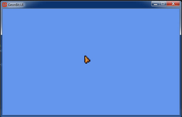
Executing the code above will result in an empty window with blueish background and the GeonBit.UI cursor rendered on it. It should look something like this:
If that worked, you are now ready to start creating your UI by adding entities to the manager.
Before we go over the different UI entities, its important to understand how elements are positioned on screen using the 'anchor' and 'offset' system.
An "anchor" is basically a pre-defined position inside a container (like top-left corner, center, etc..), while "offset" is the distance (in pixels) from that said position.
For example, you can position an entity with offset of 0, 20 pixels from its parent bottom-center, meaning there will be 20 pixels between the entity bottom and its parent bottom.
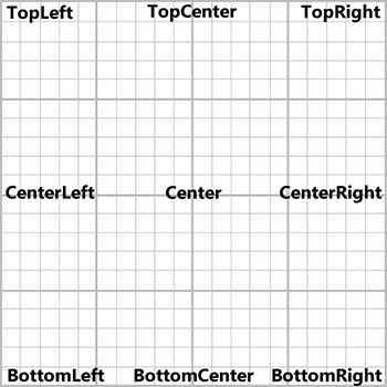
The following picture demonstrate all the anchors GeonBit.UI support:
In addition there are few special anchors that are used to place entities automatically one after another.
Note that when you place an entity using anchors, the anchor will refer to the entity direct parent, and not the entire screen. So if, for example, you place a button with a top-left anchor inside a panel - the position of the button will be linked to the top-left corner of the panel, and not the absolute top-left corner of the screen.
Placing everything with anchors and offset can quickly become a tedious job, especially if you have lots of entities that you just want to place one after another.
To fix that, GeonBit.UI introduce 3 dynamic anchor types: Auto, AutoInline, and AutoCenter.
- Auto anchor will position entities in the parent container one after another, with one entity per row, starting from the top-left corner.
- AutoInline is the same as Auto, but will try to squeeze entities together at the same row, given their accumulated width does not overflow the parent width.
- AutoCenter is the same as Auto, but will try to align entities to the center of the row.
Note that Auto anchors still support the offset property, which will be taken from the automatically calculated position.
Mixing auto anchors of different types works just as expected, but when you mix auto anchors with static anchors there's a special behavior you should know about;
An auto anchor always takes the position and size of its older sibling to know how to position itself. This means that if, for example, you place an auto anchored entity right after an entity with Bottom-left anchor, the Auto-Anchored entity will be placed below the first entity, meaning right below its bottom.
For that reason, whenever you mix Auto Anchors with static Anchors always place the static anchors last.
As you noticed before, we use the UserInterface to Update, Draw, and Initialize GeonBit.UI.
The UserInterface is the most top-level class in GeonBit.UI that manage and run the UI system, and at every given time there's only one active UserInterface, which can be accessed via UserInterface.Active.
When you call the static initializer UserInterface.Initialize(), it also creates a default UserInterface and set it as Active. However, you can later create your own UserInterface managers and swap between them (simply by setting the Active interface).
This is the main class you use from your Game's Update(), Draw() and Initialize() functions.
Add / remove entities to the current UI screen.
Provide access to the UI root entity, which is a special skinless panel that covers the entire screen and all entities are added to it.
Find() locate and return UI entities by their Identifier field. For example:
// search for a button named "myButton" recrusively.
Button btn = UserInterface.Active.Root.Find<Button>("myButton", true);
Will search the entire UI tree recursively and return the first Button entity that has the Identifier of 'myButton' (or null, if no such entity is found).
Note that Find() is implemented in a naive way and not very efficient, since its not assumed to be called very often.
Allow you to scale up / down the entire UI. Useful to adjust to different screen sizes.
If true, will not throw non-critical errors (For example selecting a non existing value in a list).
Enable / disable the usage of render targets internally. Explained in details later.
When using render targets, this is an optional transformation matrix you can apply on UI.
When using render targets, this determine if the cursor will be inside the render target (and also affected by RenderTargetTransformMatrix) or outside, and be in screen space.
Set the current cursor display, using either one of the built-in theme's cursors or a custom texture.
Now we can finally start talking about the different UI entities GeonBit.UI provides, and how to use them, starting from the base UI Entity.
Note: This is just a partial API of the entities, containing the most important properties and functions. Its recommended to look at the full API in the docs.
Docs: Entity Class.
Before going over the entities GeonBit.UI has to offer, lets go over the most basic class that all entities inherit from: Entity.
The important members and functions to know about an entity are the following:
Add or remove a child entity, which will be placed inside it.
Note that AddChild() accept a boolean param, inheritParentState, that when set to true the child entity will act as an extension of the parent entity and will always copy its state.
Return all entity children.
Remove all children from this entity.
Remove this entity from its parent.
As explained before, these determine the position of the entity inside its parent.
The size of the entity in pixels.
Most entities have a default size so you don't need to set it. However, there are three special values that are supported by the size property and you should know:
- Size of 0 means full parent size.
- Size of -1 means default entity size (vary per entity).
- Size between 0.0f and 1.0f (not inclusive) will be percents of parent size (e.g. 0.5f = 50% of parent size).
So if for example you set an entity size of (0, -1), it means the entity will have its default height with width of 100% of its parent width (minus the padding, which are explained next).
Note: Entities may behave unexpectedly and won't render correctly if set to a size too small for them.
Padding (in pixels) to position child entities inside this entity.
Padding property affect both position and size. So if, for example, you have an entity in the size of 100, 100 and padding of 20, 20, and you place inside it an entity with top-left Anchor and full size (size property of 0,0), the internal entity will actually start from top-left corner + 20,20, and its size will be 60,60 pixels (-20 from every side).
Show / hide this entity and its children.
When set to true, this entity and its children will not respond to user input.
Just like locked, but will also add a grayscale effect to the entities.
Simple way to add extra spacing before and after this entity (similar to CSS margin property), when using Auto Anchors.
When set to true, users will be able to drag this entity around. While this property is supported by all entities, it is most reasonable to use with panels and other container-like entities.
Note: when entity is Draggable you can determine weather or not it is limited to its parent boundaries by setting the LimitDraggingToParentBoundaries property.
An entity you can attach as a graphical background for this entity.
Unlike children entities, the Background entity will not invoke events etc. and will always be rendered behind this entity.
An optional object you can attach to this entity to add extra data to it. It will not affect the entity behavior in any way, its just something you can set and retrieve later for whatever purpose.
You can set callbacks to be called on different entity-related events. The available events all entities share are:
- OnMouseDown: called when the mouse left button is pressed on this entity (on the moment of pressing).
- OnMouseUp: called when mouse left button is released on this entity (on the moment of releasing).
- WhileMouseDown: called every frame while mouse left button is down over this entity.
- WhileMouseHover: called every frame while mouse hovers over this entity.
- OnClick: called when mouse left button is released on this entity.
- OnValueChange: called when the value of this entity change (relevant for entities with value only).
- OnVisiblityChange: called when the 'Visible' property of this entity changes.
- OnMouseEnter: called when mouse enter the entity boundaries.
- OnMouseLeave: called when mouse leave the entity boundaries.
- BeforeDraw: called every frame before we draw this entity (only if visible).
- AfterDraw: called every frame after we draw this entity (only if visible).
- BeforeUpdate: called every frame before entity update().
- AfterUpdate: called every frame after entity update().
- OnStartDrag: called when a user start dragging this entity.
- OnStopDrag: called when a user stop dragging this entity.
- WhileDragging: called every frame while user is dragging this entity.
All event callbacks receive one parameter, which is the Entity the event came from.
Note that you can either register an event callback on a specific entity to respond only to it, or register on the global UserInterface class to be called for any entity invoking the event.
The global option can be useful for stuff like adding sound when user click on an entity, etc.
Set style property for a given state. For example:
entity.SetStyleProperty("FillColor", Color.Blue, EntityState.MouseHover);Will set the fill color to blue, whenever mouse hover over the entity. Styles will be covered extensively later.
Get / set the current entity state (default / mouse hover / mouse down).
Note that if you override the state it will just be overridden again the next Update() call.
Set / get the default fill color style property.
Set / get the opacity of the entity's fill color.
Set / get the default shadow color style property.
Set / get the default shadow offset style property.
Set / get the default shadow scale style property.
Set / get the default scale style property.
Set / get the default outline color style property.
Set / get the default outline width style property.
Return true if this entity is disabled right now, including if disabled due to a parent being disabled.
Return true if this entity is locked right now, including if locked due to a parent being locked.
Return true if this entity is really visible right now, also check parents to make sure they are all visible.
Check if this entity is a child or a descendant of another entity.
Change entity anchor and position.
Change entity anchor.
Change entity offset.
Find a child with specific type and identifier. This function can either search recursively or look only in direct children.
Iterate over children and apply a callback function on them.
Move this entity to be at the front of all the children inside its direct parent. This is equivalent to just adding this entity last.
It was briefly mentioned before that Entities have StyleSheets (when talking about Entity.SetStyleProperty()). So what is a stylesheet?
A stylesheet is like a very, very simple CSS-like set of rules. Basically every entity have 3 possible states - default, mouse hover, and mouse down, and for every state we can have a different set of style rules to apply.
For example, you can use styles to turn a paragraph's outline color blue when mouse hovers over it.
All default style properties are defined as part of the Theme, but you can always change styles for specific entity instance.
Note that when a style property is not defined for a certain state (for example if you didn't define fill color for mouse down), the default styling will be used.
The following style properties are available for all entities and states:
Scale the entity size, or in text-related entities change the font size.
Entity primary color. For things like images, panels etc. this property will act as a tint color effect.
Outline color, if defined.
Outline width, or 0 for no outline.
Relevant only for text entities, when set to true will always align the text to center.
Relevant only for text entities, determine font style (regular / bold / italic).
Relevant for entities where you can select parts (like select list). Determine selection highlight color.
Entity shadow color. Set to alpha 0 (or Color.Transparent) for no shadow.
Shadow distance from entity original position.
Shadow scale (multiple base entity size).
Internal padding, for positioning and scaling children entities.
Extra space, in pixels, to hold after this entity when using auto anchors.
Extra space, in pixels, to hold before this entity when using auto anchors.
The following are all the entities available in GeonBit.UI.
Docs: Panel Class.
The most basic entity in GeonBit.UI is the panel entity.
A panel is just a container, either with a graphic frame or without any skin, that you place anywhere on the screen and add entities to it.
While you don't have to use panels to place entities (e.g. you can just add entities directly to the UI manager), its a good practice to use them as a method to group together layout parts.
To create a new panel and add it to the screen, use the following syntax:
// create a panel with default skin and anchor, at the size of 500x500, and add to UI manager.
// panels default anchor is the center of the screen, so this will create a panel in the center.
Panel panel = new Panel(new Vector2(500, 500));
UserInterface.Active.AddEntity(panel);
Or to create with different skin and advance parameters:
// create a panel at the top-left corner of with 10x10 offset from it, with 'Golden' panel skin.
// to see more skins check out the PanelSkin enum options or look at the panel examples in the example project.
Panel panel = new Panel(size: new Vector2(500, 500), skin: PanelSkin.Golden, anchor: Anchor.TopLeft, offset: new Vector2(10, 10));
UserInterface.Active.AddEntity(panel);
If you want a panel without frame, just use PanelSkin.None.
Note that UserInterface.Active.AddEntity() accept any type of entity, but from now on in all of our examples we'll be adding entities to a panel, and not directly to the manager.
By default, entities that exceed the panel boundaries will just be drawn outside of it.
However, you can change that behavior by setting the PanelOverflowBehavior flag:
- Overflow: default behavior.
- Clipped: will clip entities that exceed the boundaries.
- VerticalScroll: will clip entities that exceed the boundaries but also add a vertical scrollbar.
Note that in order to use the Clipped and VerticalScroll options you must first set to UseRenderTarget mode (explained later in this doc).
Docs: Paragraph Class.
Paragraph is a multiline text paragraph you can add to your UI. It can be a simple inline label, or a long, multiline text.
To create a new Paragraph:
// create a simple paragraph and add it to a panel we created before
Paragraph paragraph = new Paragraph("Hello world!");
panel.AddChild(paragraph);
Or to create a paragraph with advance parameters:
Paragraph paragraph = new Paragraph(text: "hello world", anchor: Anchor.Center, color: Color.Red, scale: 1.4f, size: new Vector2(100, 100), offset: new Vector2(10, 10));In addition to the basic API that every UI entity shares, Paragraph provide the following API:
The paragraph text itself. Support newline characters (\n) and can be changed dynamically after paragraph creation.
If true (default) text will break to fit parent width (meanings long sentences will not go beyond parent width).
Default font style property (regular / bold / italic).
Default align-to-canter style property (when true will align text to center).
Docs: MulticolorParagraph Class.
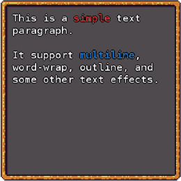
A paragraph that support color changes inside the text itself.
To switch colors add the {{COLOR}} tag anywhere inside the text, with one of the following options as 'COLOR':
- RED
- BLUE
- GREEN
- YELLOW
- BROWN
- BLACK
- WHITE
- CYAN
- PINK
- GRAY
- MAGENTA
- ORANGE
- PURPLE
- SILVER
- GOLD
- TEAL
- NAVY
Or, you can define your own custom color tags:
// adding {{SOME_COLOR}} will now use ColorVal as the paragraph fill color.
ColorInstruction.AddCustomColor("SOME_COLOR", ColorVal);Docs: Header Class.
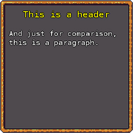
Header is just like a paragraph, but with different default styling. It doesn't provide any new functionality but rather a simple way to create pre-defined header text types.
To create a new header:
// create a simple header and add it to a panel we created before
Header header = new Header("This Is Header");
panel.AddChild(header);Docs: Label Class.
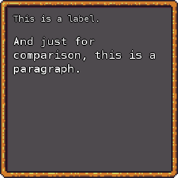
Label is just like a paragraph, but with different default styling. It doesn't provide any new functionality but rather a simple way to create pre-defined label text types.
To create a new label:
// create a simple label and add it to a panel we created before
Label label = new Label("This Is a label");
panel.AddChild(label);Docs: Button Class.
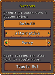
Buttons are clickable images with label. Usually when using buttons you'll also register an OnClick event handler, to respond whenever the user click on it.
To create a new button:
// create a button with default skin and "Default" label on it, and add it to a panel we created before
Button button = new Button("Default");
panel.AddChild(button);
To create a button with different skin and advanced parameters:
// will create a button with label "Button label", alternative skin, anchored to top-center, with 100 pixels height, and 50 pixels below container's top
Button button = new Button(text: "Button label", skin: ButtonSkin.Alternative, anchor: Anchor.TopCenter, size: new Vector2(0, 100), offset: new Vector2(0, 50));To listen and respond to the button being clicked, use the OnClick event handler:
button.OnClick = (Entity btn) => {
	// button was clicked, do something here!
};In addition to the basic API that every UI entity shares, Button provide the following API:
The label that appears on the button. This is just a paragraph instance that can be accessed from outside to change the text properties of the button.
If true, this button will behave like a checkbox, meaning that clicking it will make the button stay pressed down and in 'checked' mode, and clicking it again will release and uncheck it.
When in toggle mode, you can also register to the OnValueChange event to detect whenever the button is toggled, and use Checked to get / set the button current value.
When button is in toggle mode, set / get the button pressed mode.
You can override the default theme button textures for a specific instance, by using the SetCustomSkin() function. This function get 3 textures (one texture for every button state), and an optional vector indicating frame width in texture file.
Get / set current button skin.
Docs: CheckBox Class.
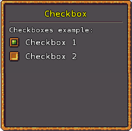
A checkbox is a label with a box next to it you can either check or uncheck. Its useful for boolean questions, such as "enable sound" etc.
To create a new CheckBox:
// create a checkbox with the label "Checkbox 1", and add it to a panel we created before
CheckBox check = new CheckBox("some question..");
panel.AddChild(check);
To create a CheckBox with advance parameters:
CheckBox check = new CheckBox(text: "some question..", anchor: Anchor.Auto, offset: new Vector2(10, 10));To listen and respond to whenever the CheckBox value changes, use the OnValueChange event handler:
check.OnValueChange = (Entity checkbox) => {
	// checkbox was changed, do something here!
};In addition to the basic API that every UI entity shares, CheckBox provide the following API:
The label that appears on the CheckBox. This is just a paragraph instance that can be accessed from outside to change the text properties of the CheckBox.
Set / get the value of the CheckBox, e.g. weather or not its currently marked as checked.
Docs: RadioButton Class.
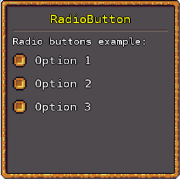
A Radio Button behaves just like a CheckBox, with the main difference that only one radio may be checked at a time. In other words, once you mark a Radio Button as checked, all its sibling Radio Buttons will be unchecked automatically.
Radio Buttons are useful for multiple choice questions where only one answer can be picked, for example if you ask the user to pick DirectX or OpenGL, UI language choice, etc..
Its important to note that the Radio Button only affect its direct siblings under the same parent, meaning that if you want to have a multiple groups of Radio Buttons under the same panel you can just group them together in separate skinless panels (skin set to None).
To create a new Radio Button:
// create a radio button with the label "Option 1", and add it to a panel we created before
RadioButton radio = new RadioButton("Option 1");
panel.AddChild(radio);
To create a Radio Button with advance parameters:
RadioButton radio = new RadioButton(text: "Option 1", anchor: Anchor.Auto, offset: new Vector2(10, 10));Just like with CheckBox, to listen and respond to value changes in Radio Buttons use the OnValueChange event handler:
radio.OnValueChange = (Entity entity) => {
	// radio was changed, do something here!
};
Note that when you check a radio button and it uncheck a sibling, the OnValueChange of the sibling will be triggered as well.
RadioButton inherit from CheckBox and provide the same API, without any additions.
Docs: SelectList Class.
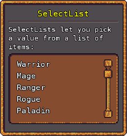
A SelectList is a list of (string) values the user can pick from. You can also add / remove items dynamically via code at runtime.
To create a new SelectList and add items to it:
// create a list with the size of (full-width, 280), add 3 items to it, and add it to a panel we created before
SelectList list = new SelectList(new Vector2(0, 280));
list.AddItem("item1");
list.AddItem("item2");
list.AddItem("item3");
panel.AddChild(list);
Note that the SelectList is made of a panel with paragraphs on it, meaning you can use any panel skin as the list background. To create a SelectList with different skin and advance parameters:
SelectList list = new SelectList(size: new Vector2(0, 200), anchor: Anchor.Center, offset: new Vector2(0, 10), skin: PanelSkin.Golden);If the list length is too big for the SelectList physical size, a scrollbar will be added automatically.
To listen and respond to when a user select an item from the list, use the OnValueChange event handler:
list.OnValueChange = (Entity entity) => {
	// a user picked an item from the list
};In addition to the basic API that every UI entity shares, SelectList provide the following API:
Add an item to the list. By default will append to the end, but you can also provide an index to insert into.
Note that its possible to add duplicated values, but it will cause annoying behavior when you try to select by-value or remove the item later (on item remove it will always pick the first found value and remove it).
Remove an item from the list by value or index.
Remove all items from list.
Return how many items currently in list.
Return if the list is currently empty.
Get / set the currently selected value as string.
- When no value is selected, null will be returned.
- To unselect you can set this property to null.
Get / set the currently selected index as int.
- When no value is selected, -1 will be returned.
- To unselect you can set this property to -1.
Unselect current value. This is the same as setting SelectedValue to null.
Get / set the current scrollbar position (if there is a visible scrollbar).
If there's a scrollbar on list, will scroll list to show the currently selected value.
If there's a scrollbar on list, will scroll to the bottom of the list.
Docs: DropDown Class.
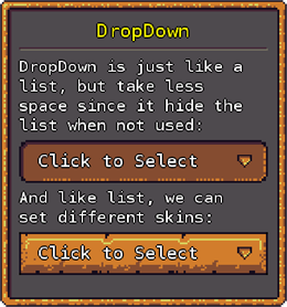
A DropDown is just like a list, but only shows the currently selected value, unless clicked on. This is a way to save UI space when the user don't interact with the list.
To create a new DropDown and add items to it:
// create a dropdown with the size of (full-width, 280), add 3 items to it, and add it to a panel we created before
DropDown drop = new DropDown(new Vector2(0, 280));
drop.AddItem("item1");
drop.AddItem("item2");
drop.AddItem("item3");
panel.AddChild(drop);
The size of the DropDown refer to the size of the list component when opened.
Note that just like the SelectList, DropDown uses panels as background so you can use any panel skin for it. To create a DropDown with different skin and advance parameters:
DropDown drop = new DropDown(size: new Vector2(0, 200), anchor: Anchor.Center, offset: new Vector2(0, 10), skin: PanelSkin.Golden);To listen and respond to when a user select from the DropDown, use the OnValueChange event handler:
dropdown.OnValueChange = (Entity entity) => {
	// a user picked an item from the drop-down list
};
DropDown inherit from SelectList and provide the same API, plus the following:
Get / set if the DropDown list is currently visible.
Text to show when no value is selected.
Docs: Slider Class.
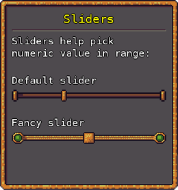
A slider looks like an horizontal scrollbar that lets the user pick a numeric value from a pre-defined range. Its useful for stuff like difficulty level, music volume property, etc.
To create a new Slider:
// create a slider with default skin and value range of 0-10 (inclusive), and add it to a panel we created before
Slider slide = new Slider(0, 10);
panel.AddChild(slide);
Slider comes with two skins - default and fancy. To create a Slider with different skin and advance parameters:
Slider slide = new Slider(min: 0, max: 10, skin: SliderSkin.Fancy, anchor: Anchor.Auto, offset: Vector2.Zero);Note that slider only support positive, round numbers. If you need fractions just allow bigger min and max values, and divide result by power of 10 (depends how accurate fractions you need).
To listen and respond to when a user pick values from the slider, use the OnValueChange event handler:
slider.OnValueChange = (Entity entity) => {
	// a user picked value from the slider
};In addition to the basic API that every UI entity shares, Slider provide the following API:
Get / set the current slider value.
If you set an invalid value (outside of range), value will just clap to fit the range.
Get / set the slider min value.
Get / set the slider max value.
Get / set steps count on slider (often known as 'ticks')
Get current value as a float ranging from 0.0f to 1.0f, which represent the value position between Min and Max.
Docs: ProgressBar Class.
A ProgressBar is just like a slider, but with graphics fitting of a progress bar. This is useful for loading screens or things like HP bar, experience bar until level up, etc..
To create a new ProgressBar:
// create a progress bar with range of 0-10 (inclusive), and add it to a panel we created before
ProgressBar prog = new ProgressBar(0, 10);
panel.AddChild(prog);
Unlike with Sliders, usually when using ProgressBars you don't want the user to be able to change the value. To lock ProgressBars simple use the Locked property from the base entity API.
To listen and respond to when a user pick value from the ProgressBar, use the OnValueChange event handler:
prog.OnValueChange = (Entity entity) => {
	// a user picked value from the progress bar
};
ProgressBar inherit from Slider and provide the same API, plus the following:
The image that draws the ProgressBar filled part. If you want to change color and add other effects to the fill itself, use the styling properties of this public member.
Docs: VerticalScrollbar Class.
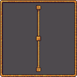
A VerticalScrollbar is an entity used internally by GeonBit.UI (for example when list items exceed its height), but you can also create and use this entity externally. It inherits from the Slider class and provide the same API and behavior.
To create a new VerticalScrollbar:
// create a scrollbar with range of 0-10 (inclusive), and add it to a panel we created before
VerticalScrollbar scrollbar = new VerticalScrollbar(0, 10);
panel.AddChild(scrollbar);To listen and respond to when a user scroll with the scrollbar, use the OnValueChange event handler:
scrollbar.OnValueChange = (Entity entity) => {
	// a user scrolled with the scrollbar
};
VerticalScrollbar inherit from Slider and provide the same API, without any additions.
Docs: Image Class.
An image is a renderable texture to draw in the UI.
To create a new Image:
// create a new image with texture 'texture1' and size of (100, 100), and add it to a panel we created before
Image img = new Image(texture1, new Vector2(100, 100));
panel.AddChild(img);
There are two draw modes for an image: Stretch, and Panel.
- Stretch draw mode is the default mode, that will just stretch the texture to fit the Image size.
- Panel draw mode is a special mode that will draw the frame of the image and tile its center parts as needed.
To understand Panel mode better, take a look at the panel textures that come with GeonBit.UI.
To create an Image with different mode and advance parameters:
// create a new image with texture 'texture1', size of (100, 100), panel draw mode, anchor top-center with offset of 0,10, and add it to a panel we created before
Image img = new Image(texture: texture1, size: new Vector2(100, 100), drawMode: ImageDrawMode.Panel, anchor: Anchor.TopCenter, offset: new Vector2(0, 10));
panel.AddChild(img);In addition to the basic API that every UI entity shares, Image provide the following API:
The current drawing mode of the image - Stretch / Panel.
When using Panel draw mode, this determine the frame width in percents (0f - 1f) relevant to the texture size.
Image texture to draw.
Image source rectangle.
Docs: Icon Class.
Icon is just a type of image with a different styling, and a list of built-in icons you can pick from.
To create a new Icon:
// create a new 'Sword' icon and add it to a panel we created before
Icon icon = new Icon(IconType.Sword);
panel.AddChild(icon);
Icons also come with a built-int inventory-like background (cells background). To create an Icon with background and advance parameters:
// create a new 'Sword' icon with background, scale of 1.2f, and top-left anchor with offset of 10,10
Icon icon = new Icon(IconType.Sword, anchor: Anchor.TopLeft, scale: 1.2f, background: true, offset: new Vector2(10, 10));
Icon inherit from Image and provide the same API, plus the following:
Show / hide the built-in inventory-like background.
Docs: PanelTabs Class.
A PanelTabs is a special entity you attach to panels to split them into tabs with automatic toggle buttons to switch between them.
To create a new PanelTabs:
// add tabs to a panel
PanelTabs tabs = new PanelTabs();
panel.AddChild(tabs);
And now to add a new tab:
// create a new tab titled "Tab 1"
// 'tab' is a struct that contains two entities: button, and panel.
PanelTabs.TabData tab = tabs.AddTab("Tab 1");
The code above will add a new tab with the title "Tab 1". It will also create the top button for the new tab.
The returned object, TabData, will contain 'button', which is the top button to select this tab, and 'panel', which is the panel that will be visible when this tab is selected.
If you override the Identifier, OnValueChange callback or AttachedData of the internal buttons and panels of the PanelTabs, things will break and not work properly.
To listen and respond to whenever user switch tabs, use the OnValueChange event handler:
tabs.OnValueChange = (Entity panelTabs) => {
	// the user switched tabs. to get the currently active tab use tabs.ActiveTab.
};In addition to the basic API that every UI entity shares, PanelTabs provide the following API:
Property to get the currently active tab data.
Create a new tab and return the tab object that contains the internal panel and switch button entities.
Change the currently active tab by string identifier.
Docs: ColoredRectangle Class.
ColoredRectangle is simple a renderable rectangle, with fill and outline colors.
To create a new ColoredRectangle:
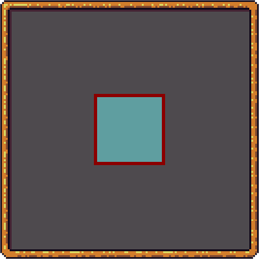
// create a new rectangle with 'CadetBlue' fill, 'DarkRed' 5 pixels-width outline, size of 100x100 and anchored to center. then add it to a pre-defined panel.
ColoredRectangle rect = new ColoredRectangle(Color.CadetBlue, Color.DarkRed, 5, new Vector2(100, 100), Anchor.Center);
panel.AddChild(rect);Docs: TextInput Class.
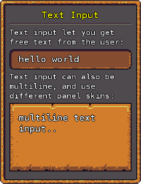
A text input is an input box where user can type free textual input. It support single line or multiline input, text validators, scrollbar when needed, and placeholders.
To create a new inline TextInput:
// create a new inline text input with placeholder string "Insert text..", and add to a pre-defined panel.
TextInput text = new TextInput(false);
text.PlaceholderText = "Insert text..";
panel.AddChild(text);
And to create a multiline TextInput:
// create a new multiline text input with height of 220 pixels, placeholder string "Insert text..", and add to a pre-defined panel.
TextInput multiText = new TextInput(true, new Vector2(0, 220));
multiText.PlaceholderText = "Insert text..";
panel.AddChild(multiText);
Note that the TextInput is made of a panel with paragraphs on it, meaning you can use any panel skin as the TextInput background. To create a TextInput with different skin and advance parameters:
//
// create multiline text input with size of 100,220, center anchor, and golden panel skin:
TextInput multiText = new TextInput(multiline: true, size: new Vector2(100, 220), anchor: Anchor.Center, offset: Vector2.Zero, skin: PanelSkin.Golden);To listen and respond to when a user type text into the TextInput, use the OnValueChange event handler:
textInput.OnValueChange = (Entity entity) => {
	// a user typed text into the text input
};In addition to the basic API that every UI entity shares, TextInput provide the following API:
The Paragraph entity used to display the input text (when TextInput is not empty). You can change the styling of this Paragraph to change how the input text looks.
The Paragraph entity used to display the placeholder text (when TextInput is empty). You can change the styling of this Paragraph to change how the placeholder text looks.
Optional input-length limit.
If true, will limit input-length to fit in TextInput physical size. This property is true by default for inline input, and false by default for multiline.
List of input validators / post-processors, to add special rules and limitations on this text input. For example, if you want English-only text, or numeric input only, etc.
For example, the following will attach slug validator to a text input:
textInput.Validators.Add(new GeonBit.UI.Entities.TextValidators.SlugValidator());To learn more about validators, see the docs: TextValidators.
Current placeholder text (text shown when TextInput is empty).
Current text input.
If TextInput is multiline and got scrollbar, scroll to show the current caret position.
Current caret position.
If TextInput is multiline and got scrollbar, this is the scrollbar current position.
Reset caret position to the end of the TextInput.
Docs: HorizontalLine Class.
A HorizontalLine is just an eye candy to seperate between different sections of the same panel, or to emphasize headers.
To create a new HorizontalLine:
// create a horizontal line and add it to a panel we created before
HorizontalLine hz = new HorizontalLine();
panel.AddChild(hz);Docs: LineSpace Class.
A LineSpace is just a simple way to create spaces between Auto-anchored entities. You can look at it like the HTML <br /> tag.
To create a new LineSpace:
// create a line spacer with the size of 3 lines, and add it to a panel we created before.
// this is like adding "<br /><br /><br />" in HTML (but only affect entities with Auto anchors).
LineSpace sp = new LineSpace(3);
panel.AddChild(sp);When calling UserInterface.Initialize(), you can also provide a Theme identifier parameter. for example:
UserInterface.Initialize(Content, BuiltinThemes.lowres);Will create a UI with a built-in theme called "lowres".
A Theme in GeonBit.UI is the set of Textures, Effects, Fonts and StyleSheets, that define the entire look and feel of the UI system.
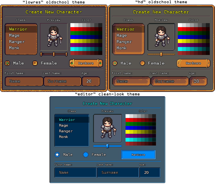
GeonBit.UI comes with 3 built-in themes you can use out of the box (they are 100% free for any purpose):
- lowres: Oldschool RPG style theme, with low resolution textures.
- hd: Oldschool RPG style theme, with higher resolution textures.
- editor: Clean, slick editor-style theme.
To see the available Themes you can use or to create your own theme, check out the Content/GeonBit.UI/themes/ folder. The best way to create a new theme is to copy one of the built-ins and change its files:
Contain required effects for the UI theme.
- silhouette.fx: effect to use to draw entities as colored silhouette (used to generate shadows).
- disabled.fx: effect to draw disabled entities (default implementation is in black and white).
Contain the SpriteFonts to use for paragraphs and texts. The fonts you use must be installed on your system when compiling them.
Note: GeonBit.UI is built to use monospace fonts. Using fonts that are not monospace may results in unexpected behavior and broken entities.
XML files with default styling for all entities. There are 3 files per entity type, for default state, mouse hover, and mouse down. To see values example and extra info, check out example.xml.
All the textures for this UI theme. Note that some textures also have a data file with the same name + "_md" (for example panel_default_md.xml), which contain some extra data about the texture, like frame size for panel-like textures.
Contain general data about the theme - name, author, extra info, credits, etc. This file is not really used inside GeonBit.UI, its just a way to attach metadata to themes.
Sometimes you want to draw the UI on a render target rather than directly on the screen. To do so, you can set the UseRenderTarget flag:
UserInterface.Active.UseRenderTarget = true;Once UseRenderTarget is set, all the UI drawings will be on a special render target that you can access via UserInterface.Active.RenderTarget.
When using RenderTargets you need to slightly change your Draw() function, instead of drawing GeonBit.UI last, you need to draw it first and then draw the RenderTarget last:
/// <summary>
/// This is called when the game should draw itself.
/// </summary>
/// <param name="gameTime">Provides a snapshot of timing values.</param>
protected override void Draw(GameTime gameTime)
{
    // draw ui
    UserInterface.Active.Draw(spriteBatch);

    // clear buffer
    GraphicsDevice.Clear(Color.CornflowerBlue);

    // do your game renderings...

    // use `UserInterface.Active.RenderTarget` here.
    // in this example we call DrawMainRenderTarget(), which will draw the UserInterface.Active.RenderTarget on the currently set target (or backbuffer if non is set)
    UserInterface.Active.DrawMainRenderTarget(spriteBatch);

    // call base draw function
    base.Draw(gameTime);
}
InputHelper is a useful helper class, used internally, that wraps access to keyboard and mouse.
If you find yourself writing logic such as storing previous MouseState or KeyboardState and comparing it to new states to detect stuff like key release, clicks, etc, you should take a look at this class.
It has lots of useful functionality.
This part describe steps needed when upgrading breaking versions.
When upgrading from 1x version to 2x version, follow these steps:
UserInterfaceis now a static class. Don't create it anymore, just Initialize() it.UserInterfaceInitialize now takes two params: 'Content' and theme identifier.- In the Content Manager, remove and add again the
Referenceto DataTypes.dll. - Cursor texture files changed + added cursor metadata. If you are using default themes remove and add them again. If you use custom theme checkout the cursor-related files in
theme/<id>/textures/to figure out how to arrange your cursor files and metadata. - If you used
DrawUtilsnote that its no longer a static class, its now an instance underUserInterface. - To prevent blurriness, Paragraphs base size changed from
1.175fto1f. Its better this way, but if you want to keep texts at the same size, setParagraph.BaseSize = 1.175f. UserInterface.SCALEwas renamed toUserInterface.GlobalScale.
When upgrading from 2.0.2.1 version to 2.1.0.0 version, the UserInterface class turns from static to an instance class, with UserInterface.Active always pointing at the currently active interface.
This means that everywhere you accessed UserInterface you should now access UserInterface.Active.
Changed binaries to be for MonoGame 3.6 (instead of 3.5). GeonBit.UI on MonoGame 3.5 is no longer supported. If you need older MG versions, please see release 2.1.0.0.
GeonBit.UI is distributed under the MIT license, and is 100% free to use for any commercial or non-commercial purpose.
For bug report, questions or feature requests, please use the GitHub Issues section.
For anything else, feel free to contact me directly at [email protected].
First stable released version.
This release contains lots of small bugs fixes and general improvements, mostly from first users feedbacks and more in-depth tests.
- Fixed slider Min value + Scaling + odd steps count mark positioning bug.
- Fixed positioning of empty paragraphs with Auto anchors.
- Made draggable entities always move to top when dragging start.
- Changed entities focus condition to be when mouse pressed on them, instead of released.
- Made draggable entities only start dragging when focused.
- Added scaling property to checkboxes / radio buttons.
- Fixed SelectList hightlight when scaled.
- Fixed draggable entities positioning bugs when screen is scaled.
- Fixed scrollbars mark positioning when scaled.
- Removed the forced x3 width factor for panels and buttons frames.
- Some graphic updates to the default HD theme.
- Fixed locked text-input with scrollbar scaling + wrapping issue.
Improvements and new features.
- Added function in InputHelper to change mouse position.
- Added source rectangle for images.
- Added background color for icons.
- Fixed dropdown / list selection problem when scaling.
- Optimize strings usage and getting keyboard input to produce less garbage.
- Added shadow scale style property.
- Added button custom skins.
- Added option to change panel and buttons skins after creation.
- Added Identifier to all entities + Find() functionality to locate children by identifier and / or type.
- Added support in size percents (e.g. size that is certain percent of its parent size).
- Added BringToFront() helper function.
- New entity: PanelTabs.
- Made all entities support Outline styling by default.
Made NuGet package and update to docs / readme.
Refactored UserInterface and some entity behaviors which were flawed. The changes in this version break the API and may require some code changes on migration.
- Changed UserInterface to be a fully static class.
- Made DrawUtils a non-static class, instantiated by UserInterface. This gives the ability to create an alternative DrawUtils and change the basic behavior.
- Changed Paragraphs default size to 1f, so fonts won't be scaled and blurry by default.
- Renamed the UserInterface 'SCALE' property into 'GlobalScale'.
- Refactored cursors and their types, Added IBeam cursor, and added an option to use custom cursors via the UserInterface.
- Added 'PromiscuousClicksMode' to entities to make them behave similar to windows. Most entities by default won't be in 'Promiscuous' mode.
- Added 'OnEntitySpawn' event, to make an easy place to init all newly created entities.
Some bug fixes, optimizations, and few new features.
- Improved dragging behavior + can set position while dragged (useful for snapping to grid).
- Extended DropDown API to make it more flexible.
- Reimplemented DropDown in a less patchy way.
- Added arrow that changes up/down to DropDown.
- Fixed mouse down event so it want trigger multiple event calls when mouse goes in and out of entity's boundaries.
- Added RenderTarget mode that draws everything on a RenderTarget instead of the default BackBuffer.
- Added overflow modes to panels.
- Added max items property to lists.
- Added access to the UserInterface Root panel, which is useful for Find() etc.
- Improved sliders and scrollbars behavior and steps count.
- Added optimizations to only recalculate entities destination rect when needed.
- Changed default fonts.
- Added option for LineSpace with size 0.
Bug fixes and some more optimizations.
- Fixed DropDown events.
- Fixed DropDown exception when setting value before adding to parent.
- Internal optimizations with render targets.
- Internal optimizations with strings.
- Fixed leakage with panel render targets.
Bug fixes and improvements to API.
- Fixed exception when clearing a panel with scrollbars.
- Added click-through feature, to make entities pass events through them.
- Fixed mouse leave and mouse up events when entity becomes invisible / disabled.
- Added
UserInterface.TargetEntitythat you can use to determine the entity currently pointed on. - Added option to insert child at a given index.
- Refactor - made entities
DefaultSizea static property, so you can access things likeButton.DefaultSizewithout having to instanciate it. - Fixed out-of-screen buttons in tabs panel that's attached to the top of the screen.
- Added option to easily set per-panel skin in tabs panel.
- Improved strings usage.
- Added project to build GeonBit.UI with MonoGame 3.6.
- Fixed DefaultSize static property to work with inheritance.
- Added
Clear()to UserInterface. - Provided public getter for the root panel.
- Fixed DropDown and auto-anchoring while inside tabs panel.
- Added multicolor paragraphs and label to progress bars (Thanks MrCapitalG!).
- Made the
UserInterfaceno longer a static class, instead there'sUserInterface.Activethat holds the currently active interface. This is useful to switch between UI layouts completely.
Switched to MonoGame 3.6. For older MonoGame versions, see tag 2.1.0.0.
- Added auto Max for vertical scrollbars.
- Fixed bug with lists with height of 0.
- Added option to lock specific items in SelectList.
- Made the MulticolorParagraph the default paragraph type the built-in entities use, with an option to override this behavior via a paragraph generator function.
- Fixed bug with MulticolorParagraph shadow/outline and scaling.
- Added new theme: editor.
- Removed redundant exception that caused warning on some compilers.
- Made vertical scrollbar adjust max automatically by default.
- Fixed vertical scrollbar with global scale.
- Refactored panel tabs - fixed bugs and made cleaner code (note: this slightly change their behavior).
- Optimized getting sorted children list - less garbage and sorting per frame.
- Refactored panels with scrollbar implementation - fixed bugs and made cleaner code.
- Fixed opacity bug.
- Added finer control over blending mode and sampler state.
- Changed progressbar label to be click-through by default, to make sure the progressbar can be dragged if not locked.
- Fixed paragraphs that are not left-aligned click and mouse-over detection.
- Fixed combobox and radio buttons label positioning with global scaling.
- Fixed mouse position on first frame of a new User Interface.
- Added outline opacity property.
- Added some text validators.
- Improved existing text validators efficiency + added support in spaces / no spaces.
- Added utility to generate message boxes.
- Added silent exceptions mode.
- Added custom exceptions for different cases.
- Renamed DropDown.cs file.
- Fixed panel scrollbar update - so it won't be called during interaction, to prevent bugs while scrolling and size changes.
- Fixed dropdown problems when inside scrolled panel.
- Better sliders and scrollbars behavior when changing max value.
- Fixed scrollbars to move one step when clicking on edge.
- Fixed sliders and scrollbars default steps count value.
- Fixed sliders and scrollbars when inside a panel with scrollbar.
- Added focus changed event and callback.
- Added default empty value property to text inputs.
- Changed textures to load lazily and only if used (instead of just loading everything during init).
- Added tooltip text.
- Changed the BeforeDraw callback to run before drawing background entity.
- Added background color property to paragraphs.
- Improved the way lists and dropdown works + fixed selection color.
- Adding entity functions now return the newly added entity.
- Fixed bug with dropdown width when its size is relative (for example 0.5f).
- Fixed tooltip text for complex entities like dropdown and lists.
- Fixed default tooltip text to never leave screen boundaries.
- Added AllowReselectValue mode to lists and dropdown entities.
- Fixed propagating events in lists and dropdown + added base function for that.
- Changed so that selecting the same value in a dropdown would still close it.
- Added msg boxes counter to msg boxes utility + a getter to check if there's anything opened.
- Added extra margin property to allow better control on entities selection.
- Fixed the annoying selection gap in lists and dropdown (clicking right between the lines).
- Fixed disposing render targets properly + adding the IDisposable API to UserInterface and Panels.
- Fixed list selection highlight with global scaling bug.
- Added auto clipping for items that are too long in lists and dropdown. This behavior can controlled by list properties.
- Added auto-height for lists and dropdowns.
- Fixed bug with dropdown default text not updating when set without selecting value.
- Added utility to create simple file menu.
- Fixed exception in panels with hidden overflow behavior.
- Added an option to hide text input characters with a chosen character (for example for password input field).
- Removed the 'input' param from all the internal functions.
- Added support in transformation matrix.
- Added support in drawing cursor outside rendering targets.
- Fixed a bug that re-creates input managers for no reason whenever creating new UserInterface().
- Added functions to get / set pixels of image texture.
- Added function to get texture coords from position.
GeonBit.UI was written by Ronen Ness, but uses some free textures made by awesome people who share their work for free. Most of the graphics are by Michele Bucelli ("Buch"), from this OpenGameArt entry: http://opengameart.org/content/golden-ui.
In addition, I used some icons from the following sources:
- http://opengameart.org/content/roguelikerpg-icons
- http://opengameart.org/content/roguelikerpg-items
- http://opengameart.org/content/arabian-icons
- http://opengameart.org/content/2d-static-spritesicons
- http://opengameart.org/content/30-ability-icons
- http://opengameart.org/content/whispers-of-avalon-item-icons
If you like GeonBit.UI, consider supporting these artists.
The following people contributed to the project via pull requests:
- Added MulticolorParagraph entity.
- Bug fixes in dragging entities and mouse down events.
