Performance measurement in government is a broad and varied discipline with laws like the Government Performance and Results Modernization Act that cover wide swaths of territory. In this larger context, Service Design Analytics aims to create a framework focused specifically on assessing and improving the performance of government services that involve direct transactions with the public. This framework will expand on the core principles of service design with a multidisciplinary approach that combines human centered design, business process modeling, and automated data analysis. Originating in the 1990’s, service design is a relatively new design discipline that is still evolving, but Designing for Service (Bloomsbury, 2017) provides a good definition:
"Service design is the activity of planning and organizing people, infrastructure, communication and material components of a service in order to improve its quality and the interaction between service provider and customers. It is now a growing field of both practice and academic research."
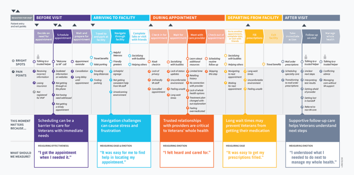
Service design thinking means taking a holistic approach to the way a service is orchestrated. By understanding key touch points across multiple modes of interaction, one can then find ways to reduce friction and streamline the whole process. One of the core tools for service design is a journey map. This takes a human centered approach to document user experience across the full path or lifecycle of a service.
The VA Patient Experience Journey Map represents a common set of moments Veterans experience before, during, and after an outpatient appointment. While this map does not represent what happens to every Veteran during every appointment, it is a good starting point to define the ideal patient experience at VA and recognize high impact improvement opportunities.
Journey maps and more in-depth user research can illuminate blind spots where the service provider is unaware of obstacles or inconveniences. They instill the service provider with more empathy for user experience.
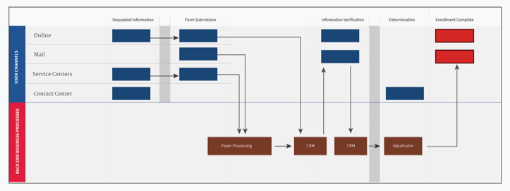
The other side of the equation is understanding how service transactions are processed behind the scenes and how these business operations relate to user interactions in the journey map. The approach to mapping this pathway from the business perspective is usually referred to as “business process modelling.” This is a well established discipline with standards like Business Process Model & Notation used to understand the interlocking mechanics and decision flows within an enterprise.
By integrating the user-centric journey map with a backend business process model as a comprehensive service blueprint, we can create a global view of operations to harmonize internal communication, contextualize user research, instrument and display performance analytics, and set priorities for improvement across all stakeholders.
The speedometer on a car’s dashboard isn’t helpful if you can’t see the speed limit sign through the windshield. And if your car has a GPS signal with the coordinates of your destination, but doesn’t have a map to show you where you are or roads to get there, those coordinates aren’t very useful. This is also true when producing business intelligence to improve service delivery without a service blueprint.
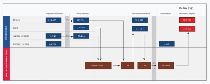
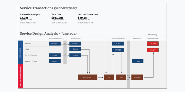
By instrumenting embedded measurement touchpoints throughout the service blueprint, we can begin to see not only top level metrics, but also the inner-workings of the service to identify areas that would most benefit from more attention.
The compelling draw of data-driven decision-making can make it tempting to look for common top level metrics to understand the performance of government services, but the reality is that universal indicators are not always practical. In the private sector, universal indicators like Net Promoter ScoreⓇ (NPS) are commonplace, but these types of indicators don’t always make sense in the public sector where there’s often a single service provider and the notion of a transactional “service” may not always bear the same type of incentives (e.g. paying your taxes).
Over the past few years the Government Digital Service (GDS) in the UK has experimented with a common indicator for customer satisfaction based on a simple question included across all services as part of the GDS Digital Service Standard. However, this metric has been determined to be an unreliable indicator. In many cases, they have observed that users tend to mix their emotional need for a particular benefit with the transactional process used for requesting that benefit. Instead, GDS is looking to measure “failure demand” or the demand generated based on the failure of a transaction or service to meet the user’s expectation. One common way to measure this is based on the volume of requests for help or calls to a contact center when associated with a specific screen or step in a larger transaction.
These types of universal indicators warrant more investigation, but there are a few common indicators that may be helpful. The most basic metric is the volume of transactions, particularly as broken down by channel (digital, paper, in-person, etc). Capturing the volume of transactions across the full path of a service can identify the maximum throughput and provide benchmarking when working to migrate users from one channel to another (e.g. paper to digital). When measuring throughput at a granular level it can help identify choke points or attrition at specific touchpoints. Other common useful metrics derived from the overall volume are the time to complete a transaction (particularly when measured against the SLA of a subcomponent of the whole service), and the cost per transaction (particularly when measured against opportunities to reduce cost like migrating to modern digital transactions).
The key to understanding the value and limitations of top level universal indicators is knowing that often they can only be used to identify if there is an opportunity for improvement across the whole service, but they can rarely be used to diagnose how or why. By instrumenting measurement throughout the service blueprint, we can equip program-level staff with sensors and alarms to notify them of problems before they become unmanageable.
Generic performance metrics alone will not guarantee performance improvement, whether it’s mandated or provided as a free service. We’ve learned this with the Digital Analytics Program where simply instrumenting a website with basic web analytics collection doesn’t include enough contextual information to measure goals for a particular service or transaction. We can measure what users do, but we don’t necessarily know why. Customizing both the capture and reporting of this information requires domain-specific education and experience. The Digital Analytics Program has expanded to help agencies deliver site improvements by not simply offering a tool, but pairing that tool with training and support so program staff can leverage its output in meaningful, goal-oriented ways.
By instilling this type of design thinking and analysis in a government-wide free or low-cost service offering, we can not only provide the shared tools for iterating on service blueprints and pulling disparate metrics together, but we can transform our understanding of services into one that encompasses multiple business units, considers the user’s perspective at its core, and provides data not just for senior decision makers, but program-level staff to identify where and how to improve user experience and operational efficiency.


