Second major iteration of Michael LoCascio's software engineering portfolio website, built with React.js. Access the live site via michaellocascio.com or mikelocascio.com.
Figma_portfolio_scroll.MP4
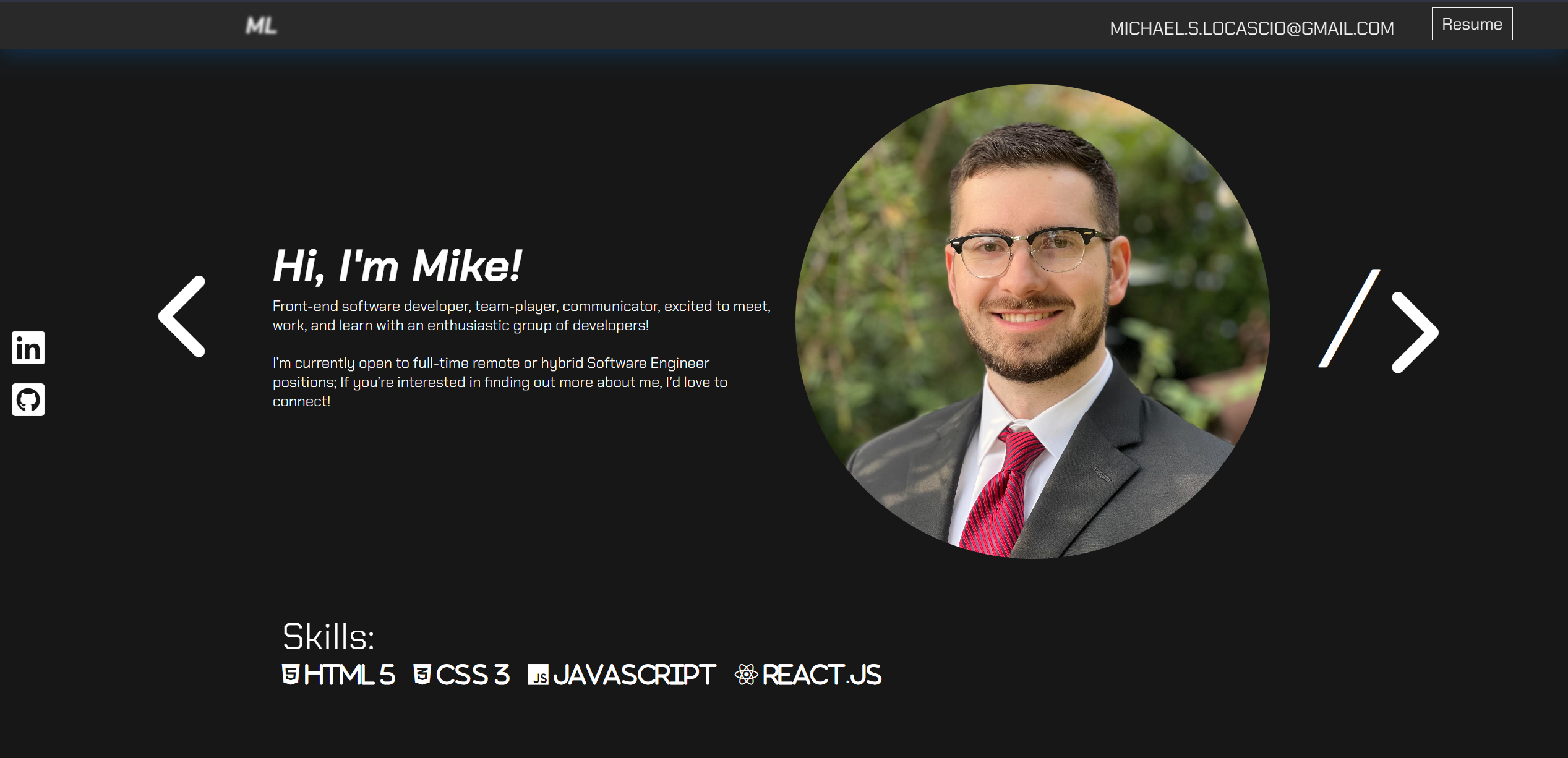
With the use of Figma, I was able to place my original website design side-by-side with what I envisioned for the updated version of my project. The goals I set for this update included:
- Creating Figma mockups from scratch using screenshots of original site design for critique
- Maximizing screen real estate by taking greater advantage of horizontal space (namely by placing my profile image next to my about-me section for larger displays)
- Simplifying the site visually to ensure quick and easy access to important information
- Consistency in color, font-family, and button design.
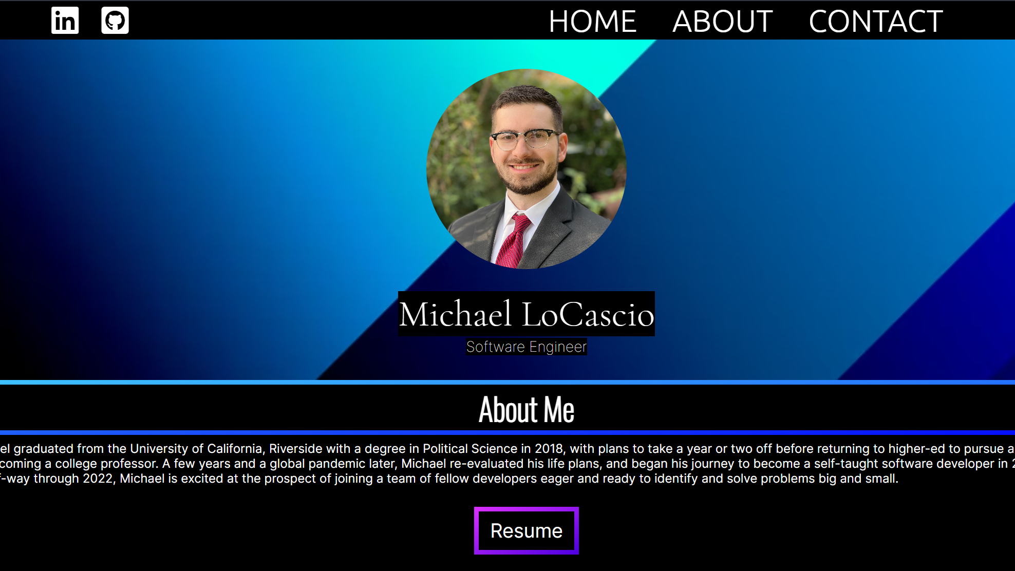
In version 1, I toyed around with the linear-gradient feature in css, which lead to a stark blue gradient border on black background. I initially liked this look, but after time away found that it was maybe a bit too heavy handed. I also gave far too much priority to my profile picture as a centerpiece, and the width of my about section didn't lend itself well to readability. For a first crack at programming a personal portfolio site with React, it wasn't too bad, but provided a strong foundation for later updates.

