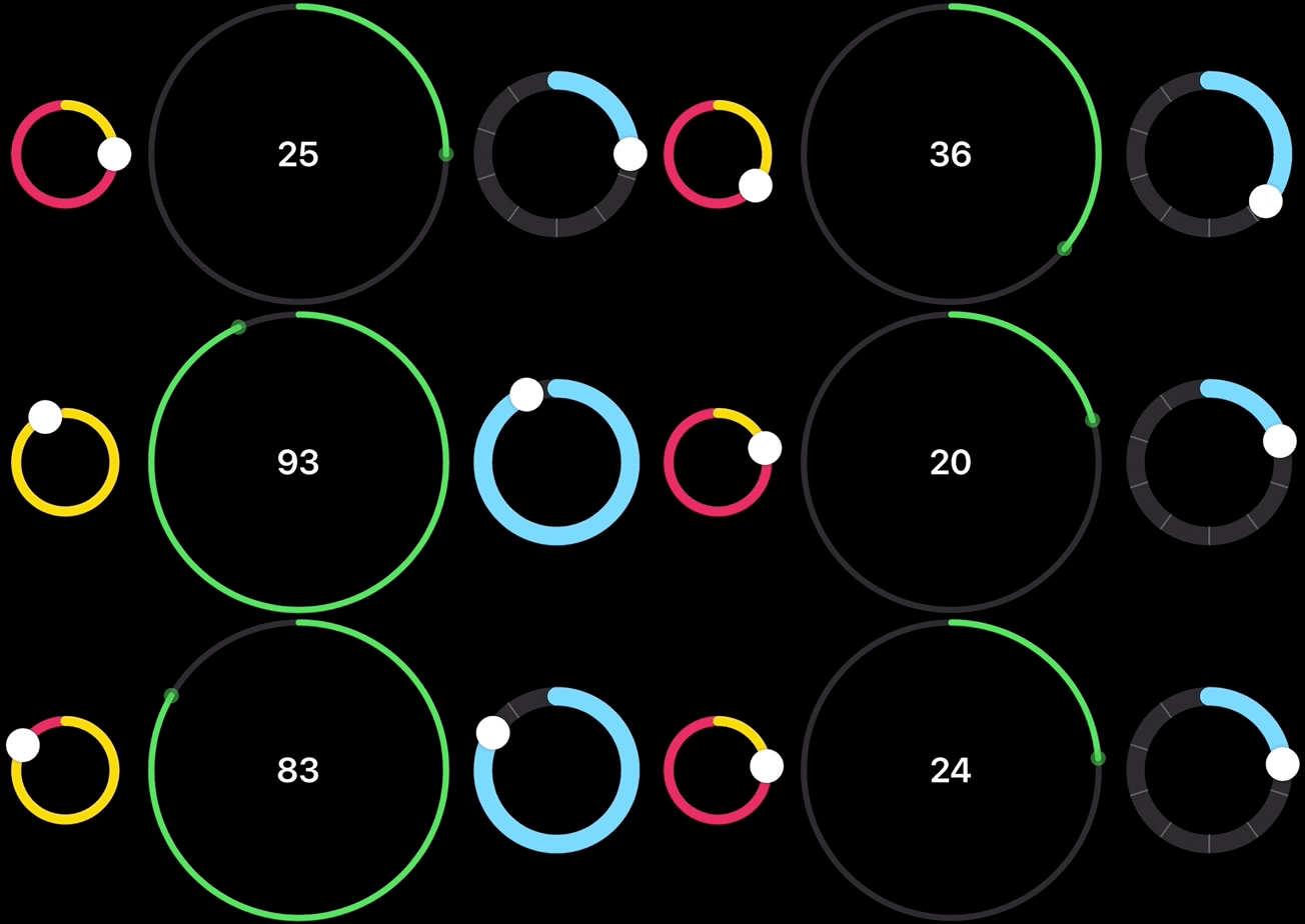
CircularSlider is a fully customizable circular slider that addresses a common need in the iOS ecosystem for sliders with a round design. Whether you are working with time selection, volume adjustment, or angle setting, CircularSlider offers unparalleled flexibility. Customization options include gradient progress lines, haptic feedback, ticks, and label support, making it an indispensable tool for creating polished and user-friendly interfaces.
To include the package, use the following URL:
https://github.com/Hovig90/AdaptiveSlider.git
This repository is available as a Swift package. To include it in your project:
- Go to File > Add Package Dependencies in Xcode.
- Add the repository URL.
- Import
AdaptiveSliderinto the Swift files where you'll use it:
import AdaptiveSliderAdd import AdaptiveSlider to use CircularSlider in your project. Then, initialize it with the following parameters:
- value: A
Bindingrepresenting the current value of the slider. - in: The range within which the slider operates. Default is
0...1. - step: The incremental step for the slider’s value. Default is
0.01. - label: (optional) A custom label for the slider. Default is
EmptyView().
import AdaptiveSlider

struct ContentView: View {
    @State private var sliderValue: Double = 50

    var body: some View {
        CircularSlider(value: $sliderValue, in: 0...100) {
            Text(String(format: "%.0f", sliderValue))
        }
    }
}Below are examples of how you can customize CircularSlider using its powerful modifiers:
Adjust the appearance of CircularSlider to suit your app’s design:
CircularSlider(value: $sliderValue, in: 0...100)
    .radius(120) // Sets the radius of the circular slider.
    .tint(.yellow) // Customizes the color of the progress track.
    .trackStyle(lineWidth: 10, color: .gray) // Configures the track’s width and color.
.thumbStyle(radius: 8, color: .red) // Sets the thumb's radius and color.Add ticks to visualize key values along with step increments. This enhances user interaction by providing clear visual markers.
CircularSlider(value: $sliderValue, in: 0...100, step: 10) {
    Text(String(format: "%.0f", sliderValue))
        .font(.title3)
        .fontWeight(.semibold)
}
.radius(60)
.trackStyle(lineWidth: 8)
.showTicks(count: 10) // Adds ticks to the slider for better visualization.Create visually engaging sliders with gradient progress lines:
CircularSlider(value: $sliderValue, in: 0...100) {
				Text("\(Int(sliderValue1))")
		}
.tint(LinearGradient(colors: [.red, .orange, .yellow], startPoint: .top, endPoint: .bottom))Add haptic feedback for a tactile user experience:
CircularSlider(value: $sliderValue, in: 0...100)
    .hapticFeedback(.medium)
Accessibility support is already enabled for CircularSlider. However, you can further enhance it by adding descriptive accessibility properties:
CircularSlider(value: $sliderValue, in: 0...100)
    .accessibilityValue("75 percent", hint: "Adjust the temperature setting", label: "Temperature Control")
This modifier allows you to define a custom value, hint, and label for assistive technologies like VoiceOver.
If you encounter an issue or have suggestions for improving this project, please submit an issue or pull request. Your contributions are always welcome!


