This project is a WPI CS 573 project 1, 2, intended to explore and visualize the Internet usage and mobile subscriptions in worldwide using D3.js. A short video can be found [here].
https://q-zhao.github.io/dataviz-project-QZhao/
This project uses the combination of datasets from Our World in Data, include:
- Internet users’ numbers and GDPs of different countries from 1981 – 2016
- mobile phone subscriptions number of different countries from 1980 to 2013
This visualization consists of 3 parts: (1) Country selector (left panel), (2) Relations between Internet Users and GDP per capita of a selected country (right top panel), and (3) Relations between Internet Users and mobile subscriptions of a selected country (right bottom panel)
In the Country selector panel, where there is a selector bar and a global map, users can select a specifc country by either drag and double-click the country in the earth, or select manually via the selection bar on the top. Once a country is selected, the rest two visualization parts are updated interactively. This visualization is a modification of KoGor's block global earth, by converting the d3.v3 to d3.v4 global earth.
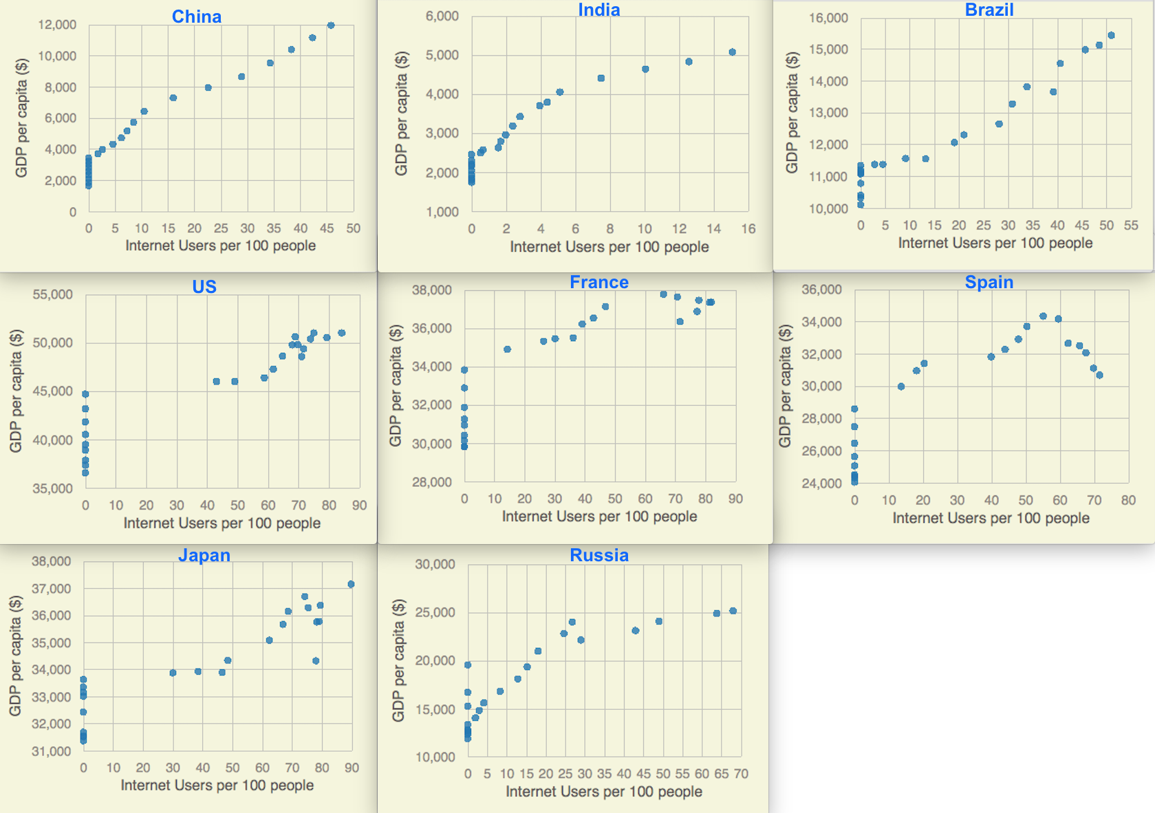
The second part of the visualization is a scatter plot of the relationship between Internet Users (x-axis) and GDP per capita (y-axis) of the country selected. The correlations between these two components are displayed. With mouse hover onto a specifc point, the correpsonding year is shown up.
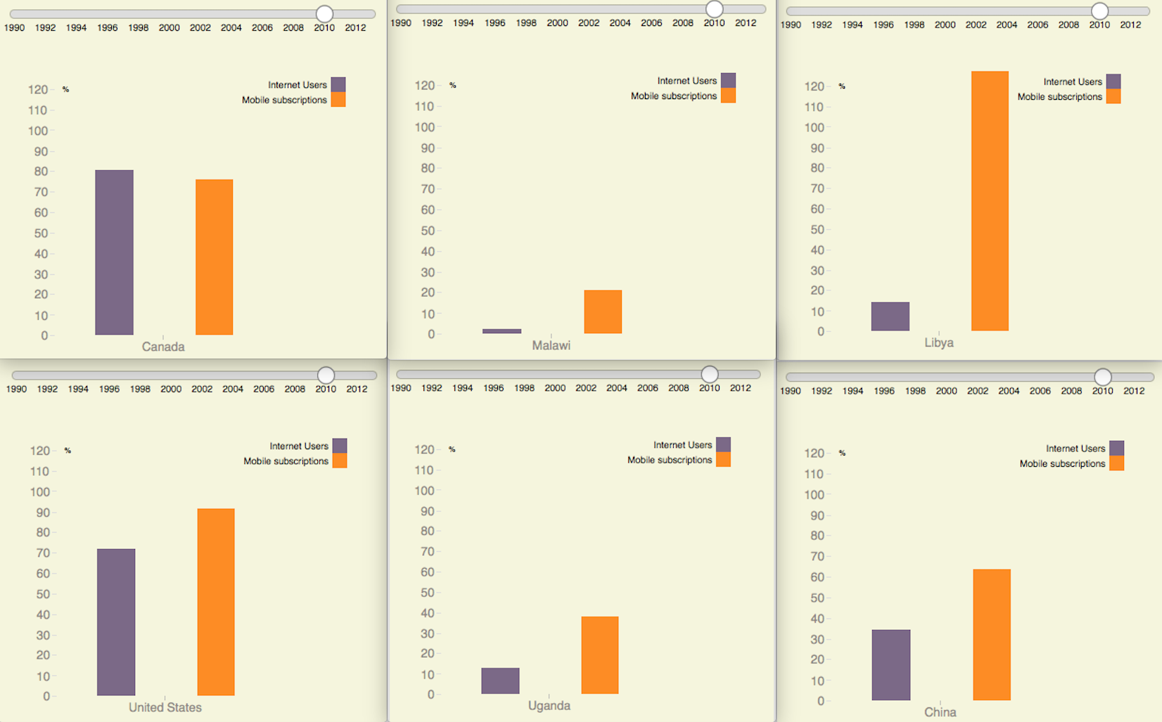
The third part of the visualization contains a year selection bar, and a bar chart of the relations between Internet Users and mobile subscriptions. Once users change the year in selection bar, the below bar chart is updated.
This project is intended to address the following questions:
-
How are Internet usage and mobile subscriptions changing over time in every country?
Overall, both Internet usage and mobile subscriptions are increasing over time. Although this information is not shown directly as a seperate chart since the trends are so obvious, it can be figured out by either hovering mouse on each point of the scatter plot or by sliding the year selection bar from left to right to see the bar chart changes.
Click to play the video: -
The relationship between GDP per capita and Internet User over time.
GDP (gross domestic project) a measure of a country's economic output that accounts for population. It divides the country's gross domestic product by its total population 3.
 For those developing countries such as China, India or Brazil, although GDP per capita is is highly related to Internet users per 100 people. For most developed countries such as the United States, France, or Spain, this correlation is not as strong as developing countries. Interestingly, for a large amount of countries, there is an obvious change in correlations in economic recession around 2008 and 2009. Although the GDP per capita drops during that period, the Internet Users maintained in a high level.
Overall, it is hard to draw a conclusion to say if GDP per capita and Internet user percentage is high correlated or not. -
The relationship between Mobile subscriptions and Internet User over time.
Overall, the mobile subscriptions and Internet users are increasing worldwidely over the past 20 years. For most countries, there are more mobile subsribers than Internet users, which does make sense for two reasons. Firstly, mobile phones came earlier to most people than the Internet in aspect of popularity. Secondly, all phones before iPhone in 2007 are not considered as smart phones and have very limited Internet access.
 There are two factors in this visualization that can somehow reflect properties of a country. One is the absolute ratio of both mobile subscribers and Internet users. For example, both these two numbers are around 80 % in developed countries in 2010 such as the United States or Canada, where as these two numbers are still quite low in developing countries, such as Malawi or Uganda. Another factor is the relative ratio (similarities) between mobile subscribers and Internet users, especially most mobile phones nowadays have very powerful Internet access abilities. Generally, the more similar these two percentages are, the more advanced a country is. For example, Canada has both mobile and Internet users of 80%, whereas Lybia has mobile subscribers more than 10 times than Internet users. We also need to take policies into consideration. For example, in China, people prefer to have two phone numbers subscribed because the charging fees are different from different callers.
To sum up, the percentage users of mobile subscriptions and Internet usages are two very important factors. Although they both increase fast in the past several decades in most countries, the different rate they increase in a country can somehow reflect some properties of that country.
In this data visualization project, the Internet usage and mobile subscriptions in worldwide are explored. Three major panels are created to visualize country selection, the relation between GDP per capita and Internet users, and the relation between mobile subscriptions and Internet users over years. This visualization is trying to address questions including how Internet usage and mobile subscriptions changes over years, and what are their relations, as well as some thoughts on analysis of these data to somehow understand some properties of a country.
1: https://web.wpi.edu/academics/catalogs/grad/cscourses.html ↩
2: https://www.manning.com/livevideo/d3-js-in-motion ↩
3: https://www.thebalance.com/gdp-per-capita-formula-u-s-compared-to-highest-and-lowest-3305848 ↩
A template project that uses Webpack and D3. Designed as a starting point for interactive data visualization projects that require JavaScript code to be organized across many files (as ES6 modules).
The starter code here is from Stylized Scatter Plot with Color Legend.
This project uses NPM and Webpack. To get started, clone the repository and install dependencies like this:
cd dataviz-project-template
npm install
You'll need to build the JavaScript bundle using WebPack, using this command:
npm run build
To see the page run, you'll need to serve the site using a local HTTP server.
npm install -g http-server
http-server
Now the site should be available at localhost:8080.
For automatic refreshing during development, you can start the Webpack Dev Server like this:
npm run serve
