English | 简体中文
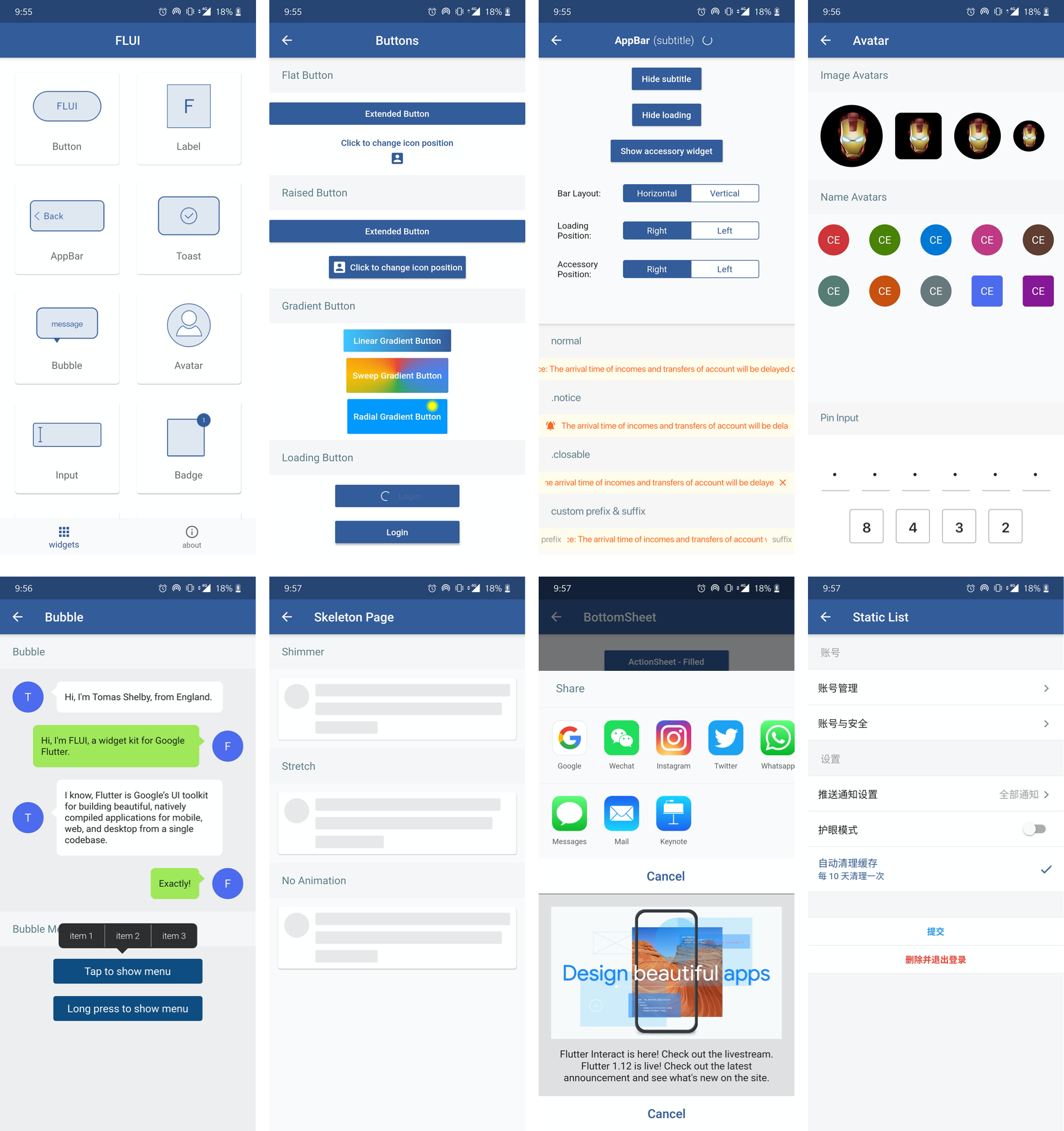
- A set of high-quality Flutter widgets out of the box
- Comprehensive usage examples and documentation
- Fine-grained non-stylized widgets for different types of applications
- Supports Dark Mode and RTL
FLUI has good compatibility on multiple clients, and the framework will be developed based on Flutter Stable Channel.
Currently supports v1.12.13+hotfix.5 and above.
dependencies:
  flui: 0.8.0
Then run flutter pub get to download the dependencies.
After the dependency installation is completed, you can directly import the widget.
import 'package:flui/flui.dart';

// in somewhere
FLAppBarTitle(
    title: 'AppBar',
    subtitle: '(subtitle)',
    layout: FLAppBarTitleLayout.vertical,
    showLoading: true
)- Button
- Label
- Toast
- Bubble
- Input
- Avatar
- Badge
- Image
- CountStepper
- AppBar
- NoticeBar
- Empty
- Skeleton
- BottomSheet
- List
- Theme
Principles:
- Branches that submit new widgets should be named 'feature-' + widget name. Fixing issues need to be prefixed with 'bugfix-'
- The submitted widgets need to be general. If the widget is rare or not sure whether it needs to be added to FLUI, you can raise a issue which starts with [feature] for discussion
- The API design of the new widget is as standard and readable as possible, following the naming and usage rules of Flutter's official widgets.
- Please comment above properties and methods how to use it so that I can add to the documentation and examples.
- Commit messages: prefix with
feat | fix | docs | style | refactor | perf | test | workflow | ci | chore | types:.
MIT License


