Name of this .md file
This document focuses on some notable javascript functions (common and uncommon), event listeners (common and uncommon), css rulesets (common and uncommon) , media queries (common and uncommon), keyframes, bugs fixed, problems which have not been fixed, problems needs to be tested out by the end-user, additional notes and pointers that the reader of this document should understand before proceeding with any interactions for my website.
- Wireframing for desktop or desktop-like screens
- Wireframing for mobile phone screens
- Problems that have been identified by the developer, and needs to be fixed by the user
- Problems that have been identified by the developer, the developer has not successfully fixed it.
- Bug fixes
- Javascript functions
- Common javascript functions
- Uncommon javascript functions
- Javascript event listeners
- Common javascript event listeners
- Uncommon javascript event listeners
- Important CSS selectors that I would like to highlight
- Media queries
- Keyframes
- normalise.css (applies for all .html files)
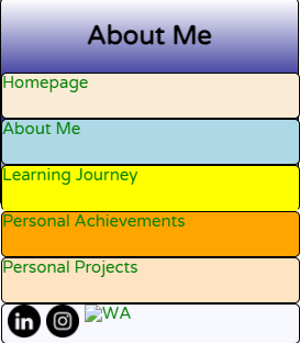
- AboutMe.html
- LearningJourney.html
- PersonalAchievements.html
- index.html (Homepage)
- AboutMe.css
- LearningJourney.css
- Personal Achievements.css
- Homepage.css (Homepage)
- PersonalProjects.css
- AboutMePage.js
- PersonalAchievements.js (applies to PersonalAchievements.html)
- PersonalProjects.js (applies to PersonalProjects.html only this javascript is built based on PersonalAchievements.html
- MyLearningJourney.js (applies to MyLearningJourney.html only)
- homepage.js (javascript for js built on script.js)
- ContactCard.html
- ContactCard.css
- ContactCard.js
Wireframing for desktop or desktop-like screens:
1)AboutMeDesktop.xd
2)HomepageDesktop.xd
3)LearningJourneyDesktop.xd
4)PersonalAchievementsDesktop.xd
5)PersonalProjectsDesktop.xd
6)ContactCardDesktop.xd
Wireframing for mobile phone: Please go through the wireframes for mobile first. It contains a diagram on what container that particular container has been contained within.
1)AboutMeMobile.xd
2)HomepageMobile.xd
3)LearningJourneyMobile.xd
4)PersonalAchievementsMobile.xd
5)PersonalProjectsMobile.xd
6)ContactCardMobile.xd
Total number of files need to be opened(excluding README.md): 30
PLEASE FIND THE CORRECT FILES FIRST FROM THE FOLDER BEFORE ASSUMING THAT THE PRODUCER HAS FORGOTTEN TO UPLOAD THEM
Welcome to my website, in this text document I will be sharing about how this website works, and what are some of the codes that I have used in order to ensure that this website functions as intended.
READ THIS FIRST BEFORE PROCEEDING OR INTERACTING WITH MY WEBSITE
There have been instances whereby the IG and WA icons located within the header fails to load properly. If that happens. Right click each individual icon, once the drop down menu has been displayed, select "Loan image in a tab", if the page shows "403 Forbidden", follow the steps below:
1) FOR WA ICON:
Go to this website: https://icon-icons.com/icon/whatsapp-black-logo/147050
Right click on the image, open image in a new tab, and refresh your browser (on the same with the image open). Once the image has finished loading, return back to my webpage, and refresh the page (Fn+F5). The icon should come back.
**2) FOR IG ICON: **
Go to this website: https://icon-icons.com/icon/instagram-black-logo/147122
Right click on the image, open image in a new tab, and refresh your browser (on the same page with the image open). Once the image has finished loading, return back to my webpage, and refresh the page (Fn+F5). The icon should come back.
When you are trying to enlarge an image, please do note that there are no scroll bars provided for scrolling down of the enlarged image.
- Use a scroll wheel on your mouse to scroll the image.
We are currently still working on including a scrollbar for the enlarged images.
v.1.6.4: Menu bar for mobile webpages doesn't show up when the width of the screen is reduced to a set size.
v.1.6.41: Broken links to Contact Card fixed.
v.1.6.42: More broken links fixed.
v.1.6.5: Drop down menus in the header, aside and the overlay menu fixed. Drop down menus display when hovered, closes when cursor leaves the target container that triggers the drop down when hovered.
v.1.6.55: To trigger drop down menu on the mobile webpage, which is the overlay menu, users can now tap open a button labelled as 'expand'. Once the drop down menu opens, the text within the button changes to 'collapse', users can also close the menu by tapping on the collapse button, if they have tapped it accidentally.
v.1.6.56: The overlay drop down menu does not close upon redirect (for mobile webpages only). Overlay menu closes upon redirect.
v.1.6.58: The overlay drop down menu doesn't reset upon closure, that being said, label of the button changes back to "expand", and closure of the overlay dropdown menu.
v.1.6.6: If one overlay drop down menu opens, and I attempt to open anotheer overlay drop down menu, the previously opened overlay drop down menu closes.
v.1.6.8: Details of images may be too small. Included a 'Enlarge Image' button that opens up the entire image in an separate overlay container within the same page.
v.1.6.81: Close button not working, when the enlarged image is opened.
v.1.6.83: Deviation to text while the aside menu bar opens up. Used the flex property to control the width of aside and article containers, created a 'Nav' button, as a 'gateway' to accessing the aside menu. Purpose is to create a widescreen webpage for an enhanced browsing experience.
v.1.6.89: Created a delay for the aside navigation menu before closing as soon as the cursor leaves the menu.
v.1.6.91: Fixed delay reset not working as soon as cursor leaves and return within the delay.
v.1.6.95: Improvements made to better adaptation of contents and containers to varying screen sizes.
v.1.7.1: Re-designed the aside menu, included the name of the page.
v.1.7.2: Overlay menu on phone cannot scroll down when orientation is landscape. Fixed. v.1.7.4: Dropdown menu in header does forces the header to increase in height. Very annoying, which also forces article to move down.
v.1.7.41: Decreased aside drop down menu delay time by 1000 milliseconds.
v.1.7.43: Removal of redundant code, and synchronised function names across all javascripts used. Overlay menu bar does not close upon successful redirection.
v.1.7.9: REMOVED ALL DUPLICATE IDs (THAT'S ABOUT A THOUSAND ERRORS REMOVED NGL)
v.1.7.95: Disabled 'Enlarged Image' buttons re enabled upon refreshing page. Problem fixed to, despite refreshing the page, the buttons still remain disabled due to screen-width.
CURRENT VERSION: v.1.7.95
To create a website that is 100% widescreen for a more comfortable viewing, especially for desktop screens, utilising the entire width of the viewport, and create a highly responsive webpage, when the width of the viewport changes due to restrictions caused by the device's screen, or changes widths of the browser.
The green coloured header navigation bar that you see here
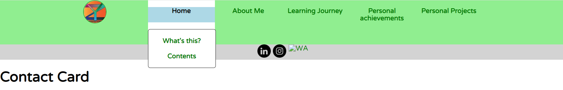
represents positivity and hope.
I tried to stay away from using too much words on my main navigation bar. A wordy navigation bar would rather make the entire navigation bar look rather messy and unorganised, so I created a website logo (which also serves as a home button for the users to click on if they wish to return back to the homepage.)
Common javascript functions, refer to functions that can be found in all javascript documents, which are script.js, script1.js, script2.js, script3.js
Total number of javascript (function(){}) used: 12 (The following list summarises the COMMON functions used within all JS files.)
- ConfirmationReset()
- ConfirmationSubmit()
- ConfirmationRedirectIGProfile()
- ConfirmationRedirectLinkedInProfile()
- ConfirmationRedirectContactNo()
- openNav()
- closeNav()
- ConfirmationRedirectHomepage()
- ConfirmationRedirectAboutMe()
- ConfirmationRedirectLearningJourney()
- ConfirmationRedirectPersonalAchievements()
- ConfirmationRedirectPersonalProjects()
- Control()
All common Javascript functions, except 'Control(), openNav() and closeNav()' return a boolean value, (either 'true' or 'false').
onclick = "return ConfirmationReset()" -> onclick = true OR onclick = false. Using the idea of boolean flags to control page redirections within the website.
Failure to include "return" together with the function name when writing the value for the onclick attribute may cause the webpage redirection to misbehave (will still redirect to the target page regardless of the user's selection).
I will be going through each of the functions, in the following order (excluding Control() since I will be touching on that function first).
Let us begin with the Control() function.
Now with the ConfirmationSubmit() function.
Let us take a look on how the ConfirmationSubmit() function looks like. (Image taken from AboutMe.js)
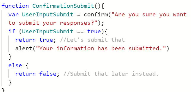
UserInputSubmit (var)
For example, if the user clicks on the button, named 'Submit' under the form, a message box would pop up within the browser that prompts the user whether he/she would like to submit his/her responses, if the user clicks on the 'OK' button, this is equivalent to a response of 'true' and is stored to a variable 'UserInput'. Now we will execute the if...else statement. In the if....else statement, it has clearly stated that if the UserInput variable contains a value 'true' then it will submit the responses. Done. If the user clicks, on 'Cancel', false get stored into the variable 'UserInput' and hence, the information will not be submitted for processing.
It can be said that ConfirmationSubmit() controls this 'SUBMIT' button, as shown below.

Do take note that an alert box will show up in your browser the moment you click on the 'Submit Now!' button as shown above.
The message that will be displayed within the alert box would be "Your response has been submitted successfully". You will be redirected to another page, but we are currently working on it.
It is important that when you are calling the function, include the return keyword. This would ensure that the function really returns either 'true' or 'false' to be assigned to the attribute named 'onclick'.
Now with the ConfirmationReset() function.
Let us take a look on how the ConfirmationReset() function looks like. (Image taken from AboutMe.js)
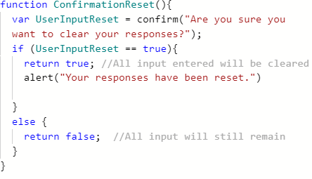
UserInputReset (var)
For example, if the user clicks on the button, named 'Reset' within the form, a message box would pop up within the browser that prompts the user whether he/she would like to reset his/her responses, if the user clicks on the 'OK' button, this is equivalent to a response of 'true' and is stored to a variable 'UserInputReset'. Now we will execute the if...else statement. In the if....else statement, it has clearly stated that if the UserInput variable contains a value 'true' then it will submit the responses. Done. If the user clicks, on 'Cancel', false get stored into the variable 'UserInputReset' and hence, the information written in each of the fields will not be cleared. However, the user may also change his / her responses before submitting.
It can be said that the ConfirmationReset() button controls this 'Reset' button, as shown below.

Upon clicking on the Reset button as shown below, an alert box will show up in your browser.
The alert box looks something like this:
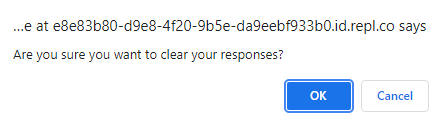
The message that will be displayed within the alert box would be "Your responses have been cleared". You will not be redirected to any other page.
It is important that when you are calling the function, include the return keyword. This would ensure that the function really returns either 'true' or 'false' to be assigned to the attribute named 'onclick'.
Now with the ConfirmationRedirectIGProfile() function.
Let us take a look on how the ConfirmationRedirectIGProfile() function looks like. (Image taken from AboutMePage.js)

Upon clicking on an icon that looks like this:
You will get a alert box like this:
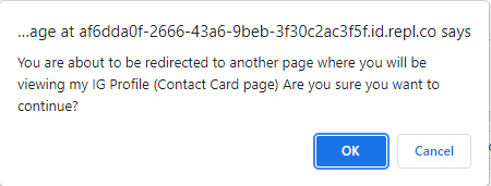
If you click ok, you will be redirected to the Contact Card page > IG Profile.
Now with the ConfirmationRedirectLinkedInProfile() function.
Let us take a look on how the ConfirmationRedirectLinkedInProfile() function looks like. (Image taken from AboutMePage.js)
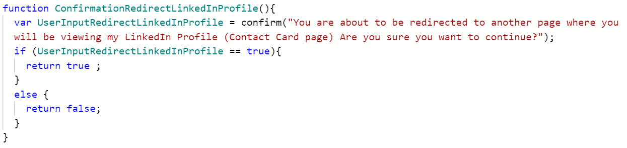
Upon clicking on an icon that looks like this:
You will get a alert box like this:

If you click ok, you will be redirected to the Contact Card page > LinkedIn Profile.
Now with the ConfirmationRedirectContactPage() function.
Let us take a look on how the ConfirmationRedirectContactPage() function looks like. (Image taken from AboutMePage.js)
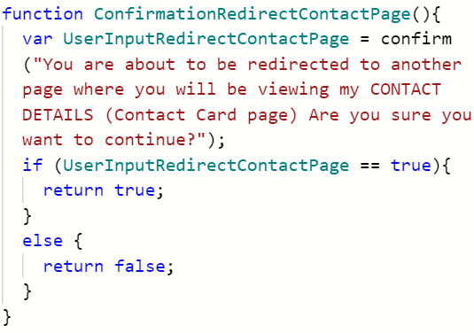
Upon clicking on an icon that looks like this:
You will get a alert box like this:
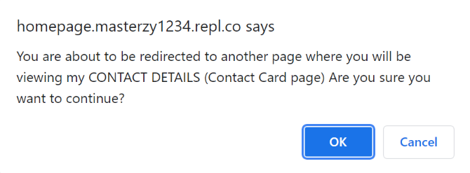
If you click ok, you will be redirected to the Contact Card page > LinkedIn Profile.
Control(), openNav(), closeNav() ARE VOID FUNCTIONS
These functions don't return anything. They are only responsible for executing the codes written under the if..else clauses. If the conditions for the if statement is not met, then the program will move on to execute the statements which are written under the else statement.
These three void function have two things in common apart from not having a return value. They control the behaviour of the overlay menu (can only be opened when the width of your viewport is less than 1100px). In other words, these 3 functions are "executable functions", meaning it only executes a block of code that is written under the function, and does not return a value, which can be also viewed as the "end product" of the execution.
So, a void function is a non-return type function that only executes a block of code written under it.
The overlay menu is defined by the CSS selector, by the name of #overlayMenu{} (will go into detail of what are some characteristics and functioning of this CSS section of this .md document.)
I will be going through each of the functions, in the following order:
Let us begin with the Control() function.
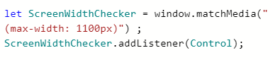
The Control() function is responsible for ensuring that the overlay Menu for the mobile webpage successfully closes when the width of the screen is increased to beyond 1100px. Please refer to the images below to get a better understanding of what exactly did I mean by "The overlay menu closes when the width of the screen is more than 1100px wide.
First let's take a look at the Control() function first. (These images are taken from 'PersonalAchievements.js')
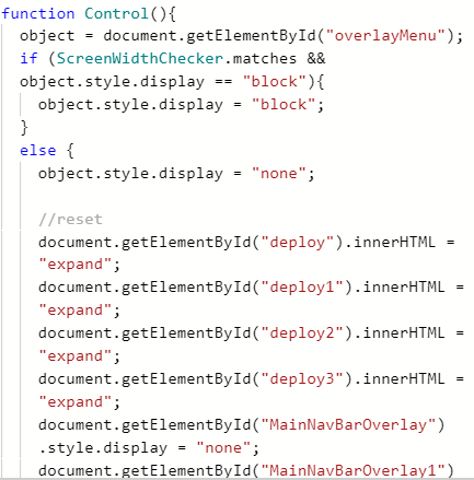
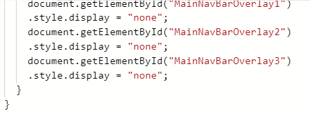
The Control() is also backed by an event listener. REMEMBER: Control() only helps to close the overlay Menu and restore default settings when the width of the screen is greater than 1100px.
object (var)
Think of this event listener as the "brain" of the function.
I call these "assisting conditionals".
The following images show the above mentioned function and event listeners in action.

When the width the screen is increased, the overlay menu disappears. This is because, the overlay menu is only a menu designed on mobile phone screens, when the screen width is increased beyond 1100px, it is considered a desktop screen and a desktop webpage has its own dedicated navigation bar. (The green horizontal bar situated at the top of every page).
If you narrow down the width of the screen and open the overlay menu again, you will realise that the dropdown menu in the overlay menu has been closed for you.
Now let us take a look at the openNav() function
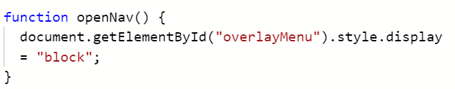
No variables are used in the function.
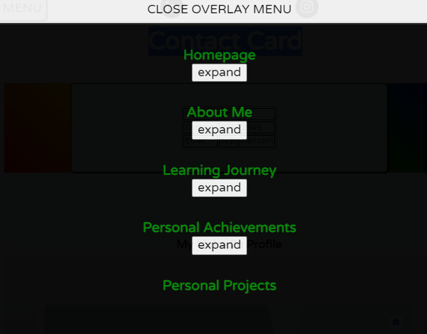
The openNav() function is only responsible for opening the overlay menu upon clicking on the 'MENU' found on the menu bar on the MOBILE webpage.
And the closeNav() function
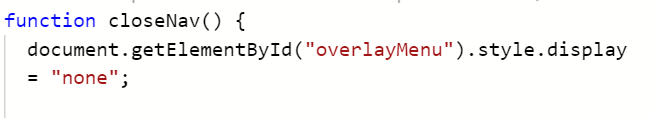
No variables are used in the function.
The closeNav() function is only responsible for closing the overlay menu upon clickiin on the 'CLOSE OVERLAY MENU' found within the overlay menu.
We will take a look at the following functions first:
- Control1()
- Control2()
- Control3()
- Control4()
- Control5()
- Control6()
- DisableEnlargeImage()
Think of these functions as a virtual switch. Their main responsibility is to ensure that certain elements closes and opens when certain conditions are met.
Personal Achievements, My Learning Journey, and Personal Projects page contains images. These images will have to resize with changing width and height. On desktop screens, the image may be resized to a certain point whereby some details, such as text would be too small to be visible. There is a enlarge image button located beside every single image on the mentioned pages
Here are some of the images.
Control1()

enlargedImage (var)
**Control2() **
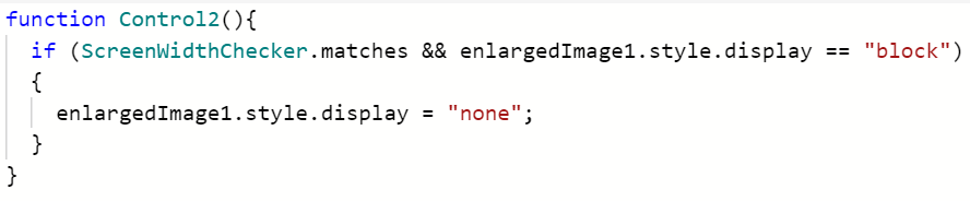
enlargedImage1 (var)
Control3()
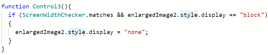
enlargedImage2 (var)
Control4()
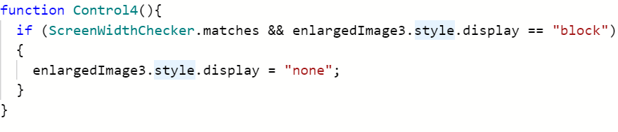
enlargedImage3 (var)
Control5()
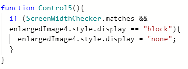
enlargedImage4 (var)
Control6()
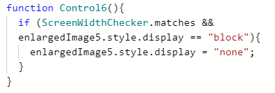
enlargedImage5 (var)
Do take note that in order to shorten the amount of words written for each line, I assigned each document.getElementById("Element") to a designated variable first. Below shows some images.
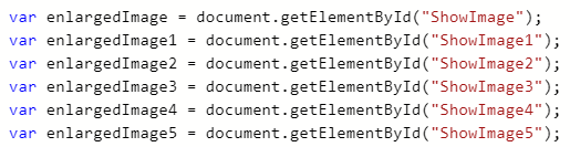
#ShowImage, #ShowImage1, #ShowImage2, #ShowImage3, #ShowImage4, #ShowImage5 are all containers used to contain the enlarged image. Each of these variables are only responsible for controlling the opening and closure of the images, due to screen width.
This is because, each of the mentioned CSS ruleset applies to only ONE single image. Personal Achievements page contains 6 images, Learning Journey page only consists of 3 images, Personal Projects page only consists of 4 images, hence the number of #ShowImage(Identifier No) is different. This means that #ShowImage5 ruleset only exists in Personal Achievements page and not in both Personal Projects and Learning Journey page.
These enlarged images are only used to serve as a tool for desktop viewers to view the images, as it would be rather incovenient for them to zoom in on the browser. On a mobile device or tablet computers, since the user can directly enlarge the screen by using certain gestures, hence the enlarged image is not important anymore.
Event fired through (user interaction method) on a target "ID", tag or "CLASS" execute code block under a function
Number of event listeners in common among Homepage.js, ContactCard.js, PersonalAchievements.js, PersonalProjects.js, AboutMe.js: 7a
Note that each of these event listeners controls two different type of anonymous functions. One of the anonymous functions is responsible for changing the text within a button whereas the other anonymous function is responsible for controlling the opening and closing of the dropdown menu.
Had to split into 2 anonymous functions for the same event listener "button.addEventListeners" to avoid any potential conflicts while running the program, also to avoid any confusion during verification and bug fixes.
THERE ARE A TOTAL OF 4 BUTTONS THAT COULD BE FOUND IN EACH OF THE OVERLAY MENU. However, I will only be focusing on one of the event listeners that have been mentioned among the four.
overlay menu dropdown looks something like this:
White coloured background, link written in green, when hovered, a blue highlight is shown.
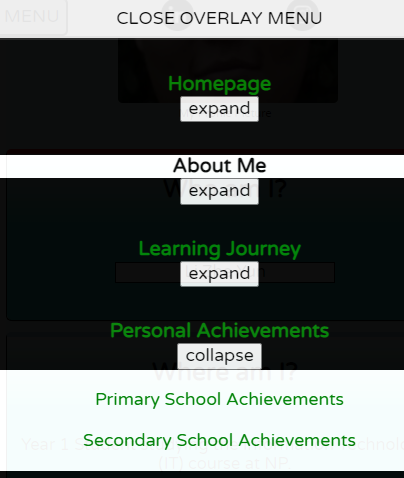
**1) These event listeners are responsible for toggling between the words "expand" and "collapse" on the overlay menu(only visible when screen width is less than 720px. **
From (when the dropdown menu is closed)

To (when dropdown menu is opened)

2) The same event listeners listed is also responsible for making the dropdown menu in the overlay menu to appear and disappear.
**3) These event listeners ensure that only ONE drop down menu gets opened within the overlay menu **
When tapping on the expand button that opens up a dropdown menu containing links to a specific section of the website to 'Personal Achievements'
PLEASE TRY THE ABOVE IN YOUR BROWSER TO CHECK THAT IT REALLY WORKS.
When tapping on the expand button that opens up a dropdown menu containing links to a specific section of the website to the 'Learning Journey' page.
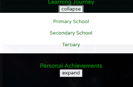
Notice that the dropdown menu containing certain links to 'Personal Achievements' closed?
openNavigationBar.addEventListener("mouseover", function(){}), when your cursor is hovering above the 'Nav' button that can be found on the left side of your screen.
This is how the 'Nav' button looks like on the webpage (in desktop mode).

The aside navigation bar will pop up, showing the names of the pages that are accessible. DO NOTE THAT THE NAV BUTTON ONLY APPEARS WHEN YOUR SCREEN WIDTH IS GREATER THAN 720PX.**
This is what you will see when your cursor is hovered above the 'Nav' button.
**openNavigationBar.addEventListener("mouseout", function(){}) when your cursor leaves the aside navigation bar, the aside navigation bar will disappear, and the webpage stretches to fill the space that was taken up by the aside navigation bar. **
Uncommon event listeners mean that, certain event listeners are found in one or more, but not all javascripts, and not in the rest.
These event listeners are ONLY found in PersonalAchievements.js, PersonalProjects.js, and Learning Journey.js.
I will list out the number of event listeners that can be found in 1 or more of the files mentioned above.
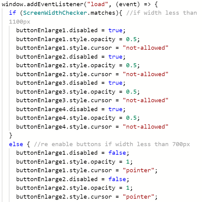
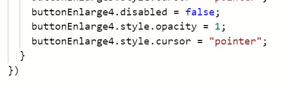
window.addEventListener("load", function(){})
Retains its disability despite refreshing of page.
If only the page is refreshed when the width of the viewport is greater than 1100px, then re enable the button, change cursor style to a "pointer", and increase opacity to 1, else cursor style is kept at "not-allowed", and opacity stays at 0.
Part 1
Part 2
YOU CAN REFER TO MY WIREFRAMES FOR THE EXACT LOCATION OF CONTAINERS, SELECTORS. THEY ARE LABELLED CLEARLY THERE. YOU CAN USE THIS readme.md FILE.
There are multiple CSS statements in which all 4 CSS files share in common, they are basically responsible for navigation, footer, layouts. I will be going through the CSS statements in which all 4 CSS files share in common, before moving on to each of the CSS statements that are unique to 1 of the CSS files.
#DropDownBoxAside{} is responsible for defining the outline and structure of the menu drop down content box, when using your mouse and allowing the cursor to hover above the words.
I referred them as 'Drop Box Containers'.
The position of the final dropdown menu is relative to the position of , which are:
- Homepage
- About Me
- Learning
- Personal Achievements
Because we only want this content box to be displayed, hence under #DropDownBoxAside{}, we introduce a new property "display" and set its value to "none". When "display" is set to "none", this means that the dropdown menu disappears entirely from the webpage. Modify the display from "block" to "none" and avoid using the opacity property, as it is because, even though the image looks like it has disappeared entirely from the webpage itself, but the link is still detectable by hovering your cursor over the rough location where your button/link was at previously. In that way, people may misclick and gets redirected to another part of the website without prior notice. By setting display to "none", we are actually making sure that
Remember, #DropDownBoxAside{} is only responsible for defining the structure of the drop box for 'About Me', there are 3 more containers, that are responsible for defining the structure of the drop box for 'Homepage' DropDownBoxAsideHomepage{}, 'Learning Journey' DropDownBoxAsideLearningJourney{}, and lastly 'Personal Achievements' DropDownBoxAsidePersonalAchievements{}
#dropdownMethod{} ensures that the content box opens the moment the cursor hovers above the target button or word. The drop down menu will open and then display the contents which are housed under the separate 'drop down containers'.
In this section I will highlight some of the media queries that I have used to ensure that the webpage is responsive whenever the
There are 2 types of media queries used in my webpages, they are mainly:
I will begin with Orientation-based media queries, then followed by Screen-width-based media queries.
Let us take a look at how the orientation-based media query is like in the following image:
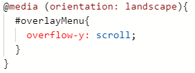
#overlayMenu
This is how the original #overlayMenu CSS selector looks like. Notice that it does not contain the 'overflow-y' property?
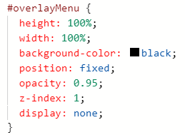
First of all, there are 2 types of orientations, they are mainly Portrait and Landscape. Do note that this css selector defines a overlay CONTAINER for the overlay menu, assuming that the menu is opened when the phone screen is Portrait.
Comparing between #overlayMenu within @media and outside of @media, do you notice that the "overflow-y" property being absent?. Well, by default, if you don't include overflow-y in your CSS selectors, the value of overflow-y would be set to "VISIBLE", which means that any overflow content outside of the overflow Menu would be displayed as well, and we will get something like this: (NOTE: The blue coloured box is the region where the text should be displayed.)
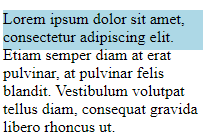
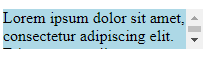
But we don't want that. We want something like this:
Now we will take a look at "Screen-width-based media queries".
Screen-width-based media queries in action:
On desktop screens:
On mobile screens:
Navigation Bar in the header tag disappears, a menu button shows up. Upon clicking, you will get an overlay menu where you can navigate within my website.
Only #smallNavBar remains. #smallNavBar is actually the lightgray horizontal bar that you saw in the desktop navigation bar.

@keyframes are responsible for creating certain animation found within the homepage. The image below shows where the animation could be found on my homepage.
All @keyframes have their own unique "animation-name" that serves as an identifier.
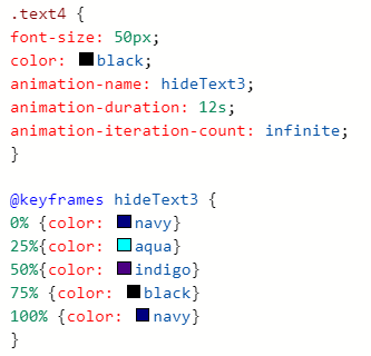
One keyframe for each text, so that the text could blend in with the background, as follows:


You can see that the 'welcome' word is trying to blend in with the background. The word 'welcome' vanishes into the background after a period of time as it is because the color of the word matches with the color of the background after a certain duration of time. That's why the word seems to 'vanish'.
Highlighting the region will reveal the underlying text in the background.

Each line of text that you see above is controlled by 1 single @keyframe. There is also a dedicated keyframe for the coloured background, such that it changes after a set time-interval as decided by the 'percentage' that you see with reference to the value of the "animation-duration" written under each target CSS ruleset.
So if the animation-duration is set to 12s, 25% of a 12 is 4s. This means that the colour of the background, and the text must change every 4s.

The slashes signifies that these areas would be potentially blank, regardless of the screen width and height. Flex containers, contents will have to reposition themselves with media queries written within CSS / Javascript.
The above image is a CSS validation logo that certifies that all my webpages are free of any CSS errors. You can also click on these images and it will redirect you to a page, where it says: "Congratulations! No error found"
This image is located near the footer of every single webpage created.
IG Icon taken from the following website:
** https://cdn.icon-icons.com/icons2/2428/PNG/512/instagram_black_logo_icon_147122.png**
LinkedIn Icon taken from the following website: https://cdn.icon-icons.com/icons2/2428/PNG/512/linkedin_black_logo_icon_147114.png
WA Icon taken from the following website:
https://cdn.icon-icons.com/icons2/2428/PNG/512/whatsapp_black_logo_icon_147050.png
normalise.css was taken from https://necolas.github.io/normalize.css/