


vue-toasted is a cool material toast plugin with variety of options and styles. it is touch compatible and responsive. issues and pr's are always welcome
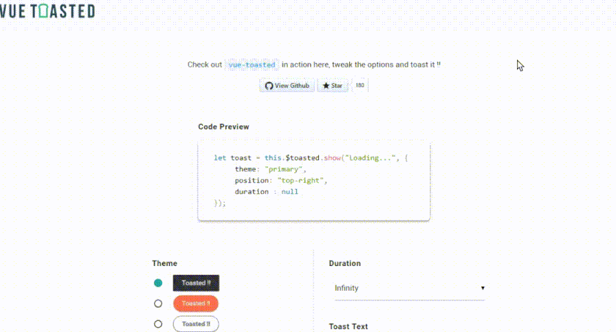
Checkout the Interactive Demo here.
It is simple. couple of lines all what you need.
# install it via npm
npm install vue-toasted --save
// register the plugin on vue
import Toasted from 'vue-toasted';
Vue.use(Toasted)
// you can also pass options, check options reference below
Vue.use(Toasted, Options)// you can call like this in your component
this.$toasted.show('hello billo')
// and also
Vue.toasted.show('hola billo');All Good Now you have this cool toast in your project.. let's take a look at the api
vue-toasted has methods which makes it much easier to use
all the below methods return the Toasted Object of the toast.
Vue.toasted.success( {string | html } message, {object} options)

// available methods
Vue.toasted.show(message, options)
Vue.toasted.success(message, options)
Vue.toasted.info(message, options)
Vue.toasted.error(message, options)check the examples to see how to manipulate the object.
// html element of the toast
el : HtmlElement

// change text or html of the toast
text : Function(text)

// fadeAway the toast. default delay will be 800ms
goAway : Function(delay = 800)
using the toast object
let myToast = this.$toasted.show("Holla !!");
myToast.text("Changing the text !!!").goAway(1500);
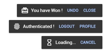
⚡ You can have single or multiple actions in the toast. take a look at the example below
{
    // you can pass a single action as below
    action : {
        text : 'Cancel',
        onClick : (e, toastObject) => {
            toast.goAway(0);
        }
    },

    // you can pass a multiple actions as an array of actions
    action : [
        {
            text : 'Cancel',
            onClick : (e, toastObject) => {
                toast.goAway(0);
            }
        },
        {
            text : 'Undo',
            onClick : (e, toastObject) => {
                this.$router.push({ name : 'somewhere' })
            }
        }
    ]
}☀️ Now Material Icons are supported. you will have to import the material icons into your project. example
{
    // pass the icon name as string
    icon : 'check'

    // or you can pass an object
    icon : {
        name : 'watch',
        after : true // this will append the icon to the end of content
    }
}below are the available options
| Option | Type's | Default | Description |
|---|---|---|---|
| position | String | 'top-right' | Position of the toast container ['top-right', 'top-center', 'top-left', 'bottom-right', 'bottom-center', 'bottom-left'] |
| duration | Number | null | Display time of the toast in millisecond |
| action | Object, Array | null | Add single or multiple actions to toast { text : String, icon : String, onClick : Function(event, toastObject) } |
| fullWidth | Boolean | false | Enable Full Width |
| fitToScreen | Boolean | false | Fits to Screen on Full Width |
| className | String, Array | null | Custom css class name of the toast |
| containerClass | String, Array | null | Custom css classes for toast container |
| Icon | String, Object | null | Material icon name as string. { name : String , after : Boolean } |
| type | String | 'default' | Type of the Toast ['success', 'info', 'error'] |
| theme | String | 'primary' | Theme of the toast you prefer ['primary', 'outline', 'bubble'] |
| onComplete | Function | null | Trigger when toast is completed |
You can register your own toasts like below and it will be available all over the application.
Toasted.register methods api details...
| Parameters | Type's | Default | Description |
|---|---|---|---|
| name* | String | - | name of your toast |
| message* | String/Function(payload) | - | Toast Body Content |
| options | String/Object | {} | Toast Options as Object or either of these strings ['success', 'info', 'error'] |
Take a look at the below examples
import Toasted from 'vue-toasted';
Vue.use(Toasted);

// Lets Register a Global Error Notification Toast.
Vue.toasted.register('my_app_error', 'Oops.. Something Went Wrong..', {
    type : 'error',
    icon : 'error_outline'
})
After Registering your toast you can easily access it in the vue component like below
// this will show a toast with message 'Oops.. Something Went Wrong..'
// all the custom toasts will be available under `toasted.global`
this.$toasted.global.my_app_error();You can also pass message as a function. which will give you more power. Lets think you need to pass a custom message to the error notification we built above.
this.$toasted.global.my_app_error({
    message : 'Not Authorized to Access'
});
you can register a toast with payload like below on the example.
import Toasted from 'vue-toasted';
Vue.use(Toasted);

// options to the toast
let options = {
    type : 'error',
    icon : 'error_outline'
};

// register the toast with the custom message
Vue.toasted.register('my_app_error',
    (payload) => {

        // if there is no message passed show default message
        if(! payload.message) {
    	    return "Oops.. Something Went Wrong.."
        }

        // if there is a message show it with the message
        return "Oops.. " + payload.message;
    },
    options
)On Mobile Toasts will be on full width. according to the position the toast will either be on top or bottom.
- Whoever contributes to this project 😉
- Inspired and developed from materialize-css toast.
Enjoy Toasting !!