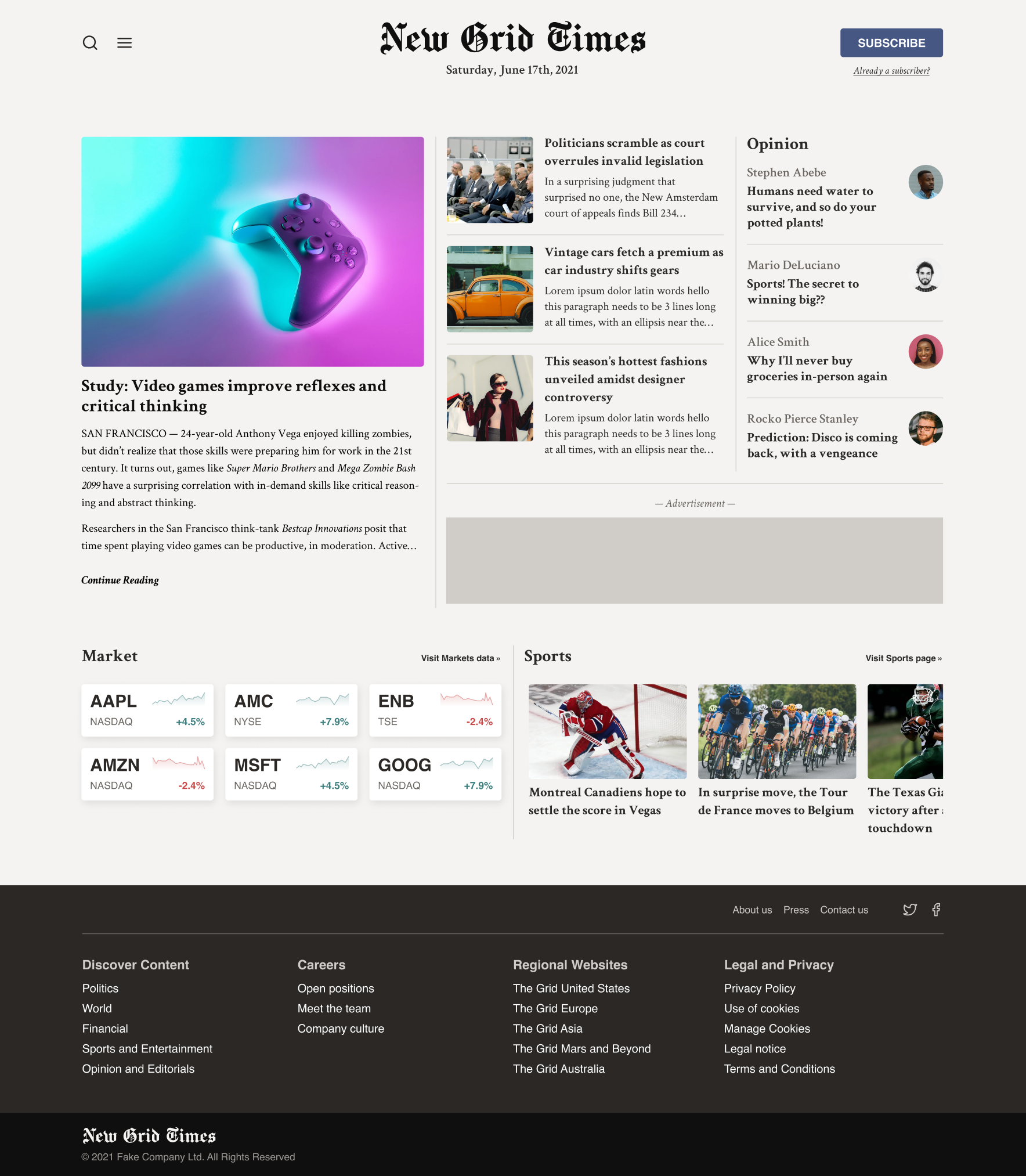
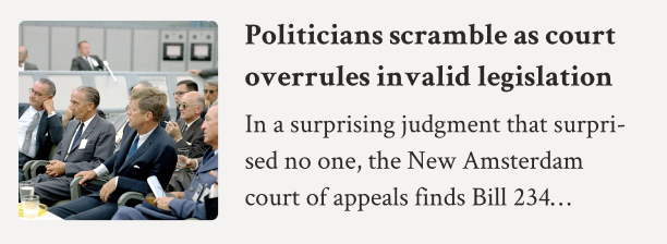
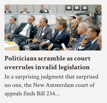
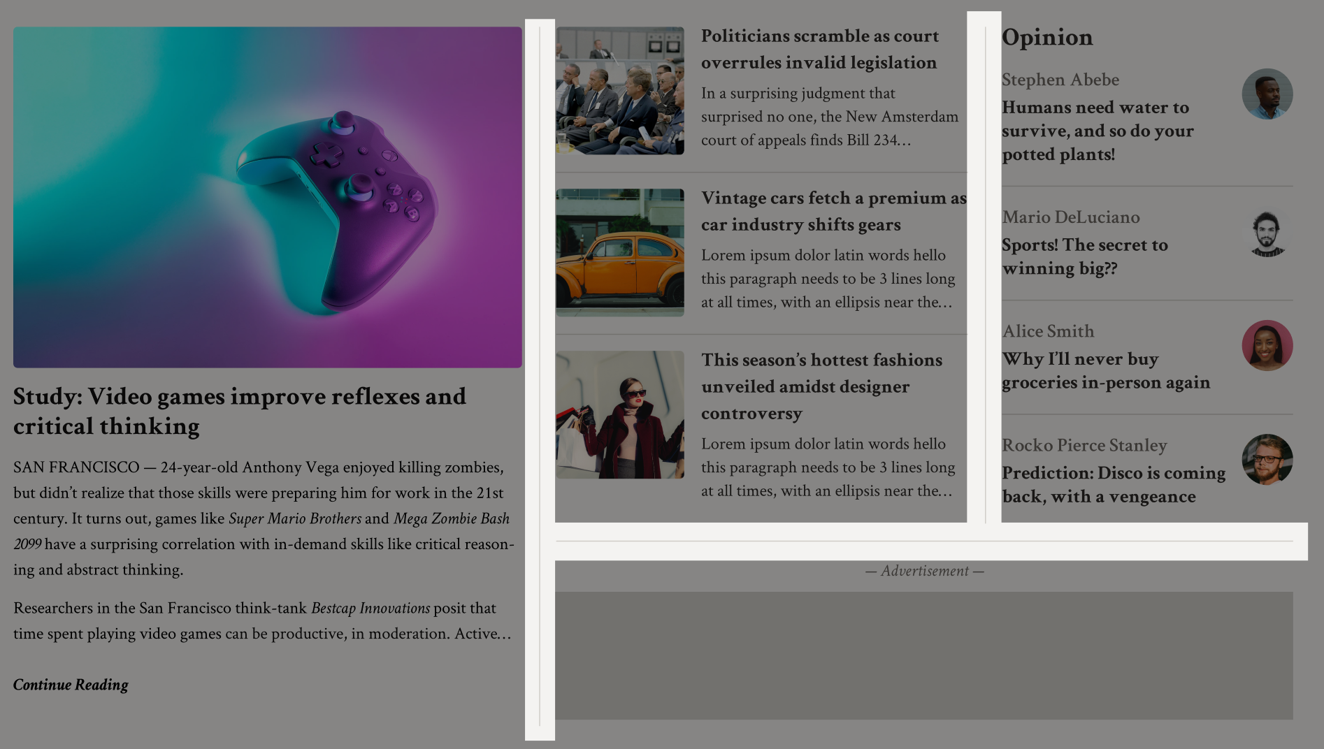
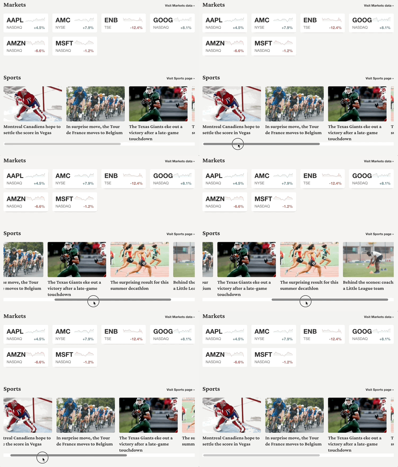
In this workshop, our goal is to build a sophisticated, responsive grid layout for an online newspaper, the New Grid Times:
Like the last few workshops, this is a React / styled-components application.
This application is built using a mobile-first methodology. We're starting from a place of having almost-finished mobile styles; your mission is to add that last bit of polish on mobile, and then implement the tablet/laptop layouts specified in the designs.
Some design tokens, including colors, fonts, and media queries have been provided in src/constants.js. The colors and fonts have also been applied as global CSS variables in src/components/GlobalStyles.
Here's the full list of available CSS variables:
--color-white
--color-offblack
--color-gray-100
--color-gray-300
--color-gray-500
--color-gray-700
--color-gray-900
--color-primary      <-- dark blue
--color-secondary    <-- green
--color-urgent       <-- red

--font-weight-normal
--font-weight-medium
--font-weight-bold

--font-family-serif
--font-family-sans-serif
--font-family-logo
The app is broken into 4 main compartments:
- The header
- The main story grid
- The "specialty" story grid
- The footer
The main story grid holds the big featured story, the secondary stories, and the opinion/editorial stories. The "specialty" story grid holds the market and sports sections.
The data for the stories is held in a JS file, src/data.js. In a real app, this would be read from a database.
If you run into problems running a local development server, check out our Troubleshooting Guide on the course platform.
This guide addresses the common Digital Envelope Routine error you may have seen.
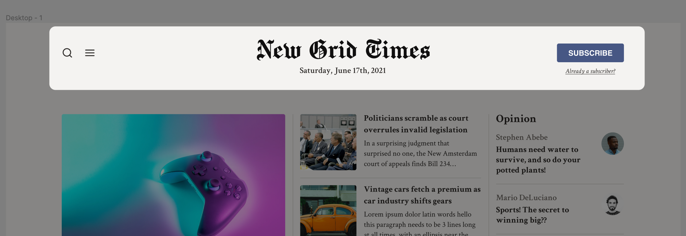
Like in the Sole&Ankle workshop, this workshop features a two-step header that changes between desktop and mobile.
This workshop has been created with a "Mobile-first" methodology, and so your goal this time is to create a desktop variant of the header, and ensure the right header is used at both viewport sizes.
Before we start working on the tablet and laptop grid layouts, we need to add a bit of missing polish to the mobile implementation, and prep certain elements to make it easier to create our tablet/laptop grids.
This exercise is split into a few mini-parts:
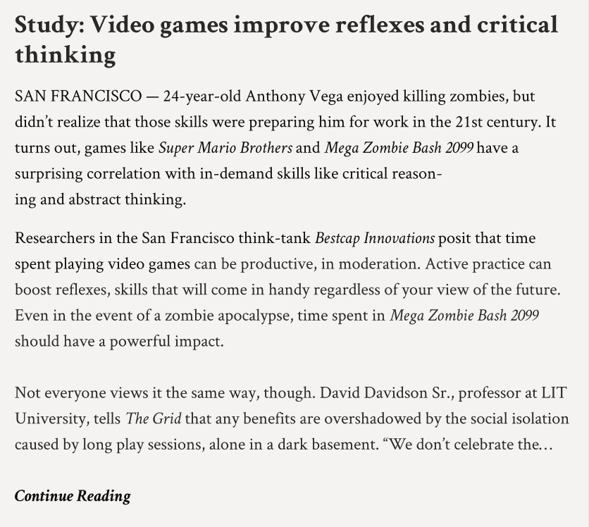
In the mockup, our main story's preview text is truncated on mobile after 8 lines of text:
The exact # of lines shown depends on the viewport size. For example, the amount of lines doubles on tablet:
Note: on certain screen sizes, you may see an ellipsis alone on its own line. Don't worry about trying to solve for this.
The syntax for multi-line ellipsis is difficult to remember, so you might wish to review the lesson from Module 6.
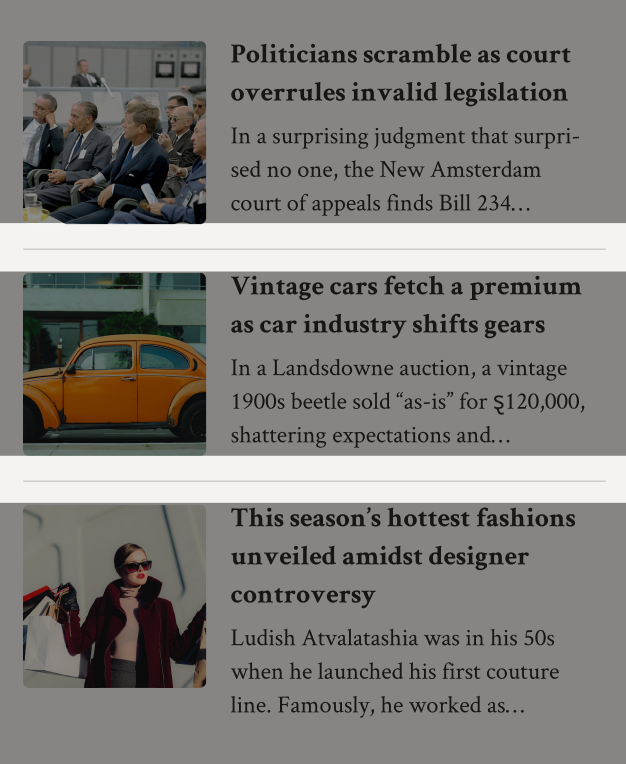
There are also dividers between the stories that are in lists, like the secondary and opinion stories:
Critically, the borders only run between stories. Not above the top story, or below the last story.
A good place to start is in MainStoryGrid.js. That's where all of these stories are laid out.
Opinion stories show a picture of the journalist. On mobile, this image is meant to be shifted off to the side:
This same layout is used on laptop, but not on tablet. Update it across all relevant viewport sizes.
Alright, time to create our first responsive grid!
Update the MainStoryGrid component to support the layouts shown in Figma for tablet and laptop.
There are some interesting details that are easy to miss:
In the last exercise, we updated our "Opinion" stories so that the avatar was shifted off to the side on mobile and laptop sizes.
In our new tablet grid, the opinion section itself takes on a different layout:
Our stories are arranged horizontally in a row, instead of vertically in a column. The borders between stories disappear.
We'll need to dip into OpinionStory.js and make some changes based on the viewport size. A TabletOnly query can be used for this case.
Similarly, on tablet, our SecondaryStory switches to a new layout.
On mobile/laptop:
On tablet:
When our grid grows to have multiple columns, we want to add a thin grey line between the columns:
We discuss strategies for this situation in the “Grid Dividers” lesson.
After creating the grid, you may find that certain things don't sit completely right. Compare the output to the design, and look for opportunities to shift things around to match a bit more perfectly.
Underneath the main grid we've been working on, we have another grid, with specialized items about markets and sports.
On mobile, we can use the “World Famous” grid snippet to arrange both the market cards and the sports stories.
When we get to the larger viewports, though, the sports stories operate a little bit differently: they form a single long line, with overflow to allow us to scroll horizontally:
Finally, on large viewports, we want the market and sports sections to sit side-by-side, with a divider:
Last but not least, the footer!
There are some alignment changes between different viewport sizes, like the TopRow and SubFooter:
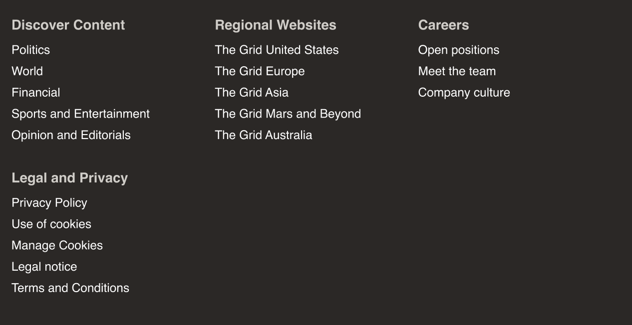
We also need to switch from a vertical list to a dynamic grid, for the main nav links:
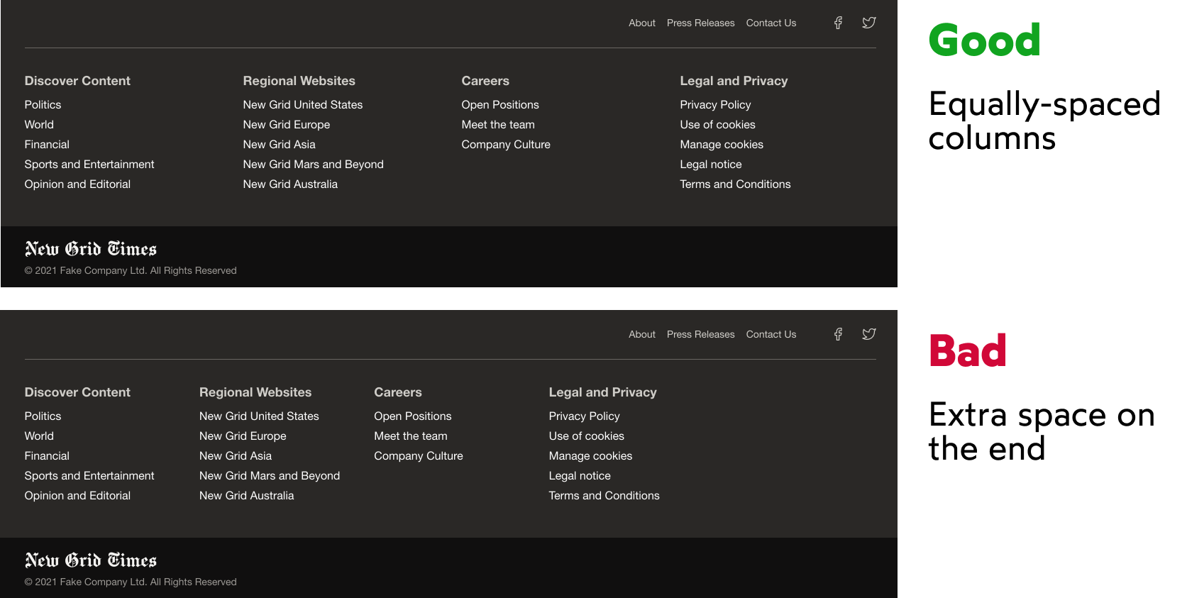
Finally, we want the columns on desktop to be equally-spaced:
View the solution on the course platform: https://courses.joshwcomeau.com/css-for-js/07-css-grid/19-workshop-solution
