Complex UI (part 3)
After part one and two we have pretty useful item shelfs, but they're inactive and lives outside any context. Put them inside panels and add very basic interaction.
Some components such as <ItemSlot /> knows everything about their content but else doesn't care about content and want just wrap it. Here is place for nested hierarchy. Greatest example is panels.
Declare simple panel component with magicaly <Hierarchy /> tag:
<?xml version="1.0" encoding="utf-8" ?>
<Root Name="Simple Panel">
  <Image Mode="Sliced" Anchor="Stretch" Resource="skin/panel-bg">
    <!-- Magic happen here -->
    <Hierarchy Anchor="Stretch" Margin="20, 20" Pivot="MiddleCenter" />
  </Image>
</Root>
What exactly <Hierarchy /> to do? Pretty oblivious! Put injected hierarchy inside! Simple example will say more than I, just add panel at GameUI.xml with <Children />:
<?xml version="1.0" encoding="utf-8" ?>
<Root Name="In Game UI">
<Panel Anchor="Stretch" Margin="30" Pivot="MiddleCenter">
<Children>
<Text FontSize="15" Alignment="MiddleCenter" Anchor="Stretch" Resource="fonts/sylfaen">
Injected hierarchy
</Text>
</Children>
</Panel>
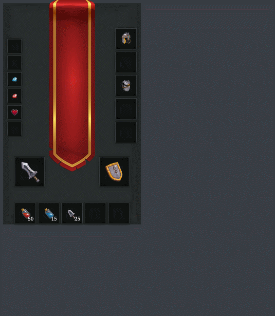
</Root> As expected it shows panel with text as we declared and sure <Children /> hierarchy can be more complex than just text. I putted our shelfs inside panel to make paperdoll (gist):
Looks pretty same as first screen already! Time to interact with items.
As first screen says each item should show proper tooltip info. Go with baby steps and first go to try to change icon color at hover item? ReUI allow to use <OnMouseOver /> and <OnMouseOut /> tags to declare lua code what will invoke at same pointer events. Let's add them inside <ItemSlot /> declaration:
  <Image Anchor="Stretch" Name="Item icon">
    <OnMouseOver>
      -- invokes when pointer is over at icon
      self:setColor('#FF0000')
      -- and set color as red
    </OnMouseOver>
    <OnMouseOut>
      -- invokes when pointer is out from icon
      self:setColor('#FFFFFF')
      -- and set color back to white
    </OnMouseOut>
    <OnState>
      self:setDisabled(not state.icon)
      self:setResource(state.icon)
    </OnState>
  </Image>
Whole file is here. Pretty simple, isn't? Let's run it and check it out:
Callbacks is last one thing what we should to know to make tooltip is live. It's pretty simple and work 100% on lua.
First, we should define function somewhere inside InGame.xml state, like so:
  <OnProps>
    function onItemSelected(info)
      scope:setState('selectedItem', info)
    end

    state.itemCallback = onItemSelected
  </OnProps>
and pass it to each shelf and item slots:
<ItemShelf>
  return {
    onHover = state.itemCallback,
    -- other properties
  }
</ItemShelf>
and same with <Itteration /> inside <ItemShelf />:
<Itteration>
  -- setup item size and pos

  -- pass callback
  local item = state.items[index] or {}
  item = state.onHover
  return item
</Itteration>
and finally call it with state data inside slot:
<?xml version="1.0" encoding="utf-8" ?>
<Root Name="Item slot">
  <OnProps>
    ...
    state.data = props
    state.data.onSelected = nil
  </OnProps>

  ...
  <Image Anchor="Stretch" Name="Item icon">
    <OnMouseOver>
      state.onHover(state.data)
    </OnMouseOver>
    <OnMouseOut>
      state.onHover(nil)
    </OnMouseOut>
    ...
  </Image>
  ...
</Root>
Just for show how it works I write state.selectedItem.name inside InGame scope in simple <Text /> tag and left figure out how to declare proper tooltip for you (or take a look at final result from .zip) and just show what I achieved: