Made with ❤️ by XMARTLABS. This is the re-creation of XLForm in Swift.

|

|

|
|---|
For more information look at our blog post that introduces Eureka.
- Xcode 9+
- Swift 4
You can clone and run the Example project to see examples of most of Eureka's features.

|

|
|---|
By extending FormViewController you can then simply add sections and rows to the form variable.
import Eureka

class MyFormViewController: FormViewController {

    override func viewDidLoad() {
        super.viewDidLoad()
        form +++ Section("Section1")
            <<< TextRow(){ row in
                row.title = "Text Row"
                row.placeholder = "Enter text here"
            }
            <<< PhoneRow(){
                $0.title = "Phone Row"
                $0.placeholder = "And numbers here"
            }
        +++ Section("Section2")
            <<< DateRow(){
                $0.title = "Date Row"
                $0.value = Date(timeIntervalSinceReferenceDate: 0)
            }
    }
}
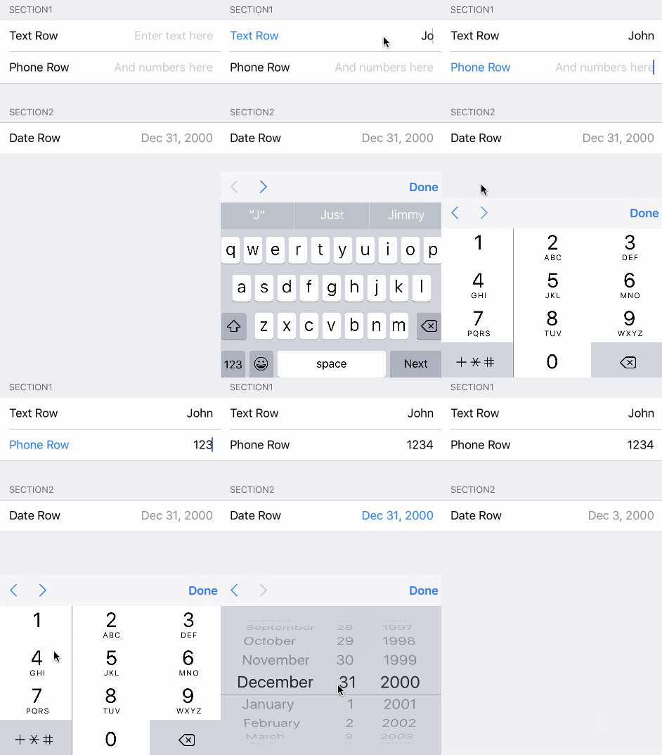
In the example we create two sections with standard rows, the result is this:
You could create a form by just setting up the form property by yourself without extending from FormViewController but this method is typically more convenient.
To change the behaviour of this you should set the navigation options of your controller. The FormViewController has a navigationOptions variable which is an enum and can have one or more of the following values:
- disabled: no view at all
- enabled: enable view at the bottom
- stopDisabledRow: if the navigation should stop when the next row is disabled
- skipCanNotBecomeFirstResponderRow: if the navigation should skip the rows that return false to
canBecomeFirstResponder()
The default value is enabled & skipCanNotBecomeFirstResponderRow
To enable smooth scrolling to off-screen rows, enable it via the animateScroll property. By default, the FormViewController jumps immediately between rows when the user hits the next or previous buttons in the keyboard navigation accesory, including when the next row is off screen.
To set the amount of space between the keyboard and the highlighted row following a navigation event, set the rowKeyboardSpacing property. By default, when the form scrolls to an offscreen view no space will be left between the top of the keyboard and the bottom of the row.
class MyFormViewController: FormViewController {

    override func viewDidLoad() {
        super.viewDidLoad()
        form = ...

	// Enables the navigation accessory and stops navigation when a disabled row is encountered
	navigationOptions = RowNavigationOptions.Enabled.union(.StopDisabledRow)
	// Enables smooth scrolling on navigation to off-screen rows
	animateScroll = true
	// Leaves 20pt of space between the keyboard and the highlighted row after scrolling to an off screen row
	rowKeyboardSpacing = 20
    }
}
If you want to change the whole navigation accessory view, you will have to override the navigationAccessoryView variable in your subclass of FormViewController.
The Row object holds a value of a specific type.
For example, a SwitchRow holds a Bool value, while a TextRow holds a String value.
// Get the value of a single row
let row: TextRow? = form.rowBy(tag: "MyRowTag")
let value = row.value

// Get the value of all rows which have a Tag assigned
// The dictionary contains the 'rowTag':value pairs.
let valuesDictionary = form.values()Eureka includes custom operators to make form creation easy:
form +++ Section()

// Chain it to add multiple Sections
form +++ Section("First Section") +++ Section("Another Section")

// Or use it with rows and get a blank section for free
form +++ TextRow()
+++ TextRow() // Each row will be on a separate sectionform +++ Section()
<<< TextRow()
<<< DateRow()
// Or implicitly create the Section
form +++ TextRow()
<<< DateRow()// Append Sections into a Form
form += [Section("A"), Section("B"), Section("C")]
// Append Rows into a Section
section += [TextRow(), DateRow()]Eureka includes callbacks to change the appearance and behavior of a row.
A Row is an abstraction Eureka uses which holds a value and contains the view Cell. The Cell manages the view and subclasses UITableViewCell.
Here is an example:
let row  = SwitchRow("SwitchRow") { row in      // initializer
                        row.title = "The title"
                    }.onChange { row in
                        row.title = (row.value ?? false) ? "The title expands when on" : "The title"
                        row.updateCell()
                    }.cellSetup { cell, row in
                        cell.backgroundColor = .lightGray
                    }.cellUpdate { cell, row in
                        cell.textLabel?.font = .italicSystemFont(ofSize: 18.0)
}-
onChange()
Called when the value of a row changes. You might be interested in adjusting some parameters here or even make some other rows appear or disappear.
-
onCellSelection()
Called each time the user taps on the row and it gets selected.
-
cellSetup()
Called only once when the cell is first configured. Set permanent settings here.
-
cellUpdate()
Called each time the cell appears on screen. You can change the appearance here using variables that may not be present on cellSetup().
-
onCellHighlightChanged()
Called whenever the cell or any subview become or resign the first responder.
-
onRowValidationChanged()
Called whenever the the validation errors associated with a row changes.
-
onExpandInlineRow()
Called before expanding the inline row. Applies to rows conforming
InlineRowTypeprotocol. -
onCollapseInlineRow()
Called before collapsing the inline row. Applies to rows conforming
InlineRowTypeprotocol. -
onPresent()
Called by a row just before presenting another view controller. Applies to rows conforming
PresenterRowTypeprotocol. Use it to set up the presented controller.
You can set a title String or a custom View as the header or footer of a Section.
Section("Title")

Section(header: "Title", footer: "Footer Title")

Section(footer: "Footer Title")You can use a Custom View from a .xib file:
Section() { section in
    var header = HeaderFooterView<MyHeaderNibFile>(.nibFile(name: "MyHeaderNibFile", bundle: nil))

    // Will be called every time the header appears on screen
    header.onSetupView = { view, _ in
        // Commonly used to setup texts inside the view
        // Don't change the view hierarchy or size here!
    }
    section.header = header
}
Or a custom UIView created programmatically
Section(){ section in
    var header = HeaderFooterView<MyCustomUIView>(.class)
    header.height = {100}
    header.onSetupView = { view, _ in
        view.backgroundColor = .red
    }
    section.header = header
}
Or just build the view with a Callback
Section(){ section in
    section.header = {
          var header = HeaderFooterView<UIView>(.callback({
              let view = UIView(frame: CGRect(x: 0, y: 0, width: 100, height: 100))
              view.backgroundColor = .red
              return view
          }))
          header.height = { 100 }
          return header
        }()
}In this case we are hiding and showing whole sections.
To accomplish this each row has a hidden variable of optional type Condition which can be set using a function or NSPredicate.
Using the function case of Condition:
Condition.function([String], (Form)->Bool)The array of String to pass should contain the tags of the rows this row depends on. Each time the value of any of those rows changes the function is reevaluated.
The function then takes the Form and returns a Bool indicating whether the row should be hidden or not. This the most powerful way of setting up the hidden property as it has no explicit limitations of what can be done.
form +++ Section()
            <<< SwitchRow("switchRowTag"){
                $0.title = "Show message"
            }
            <<< LabelRow(){

                $0.hidden = Condition.function(["switchRowTag"], { form in
                    return !((form.rowBy(tag: "switchRowTag") as? SwitchRow)?.value ?? false)
                })
                $0.title = "Switch is on!"
        }
public enum Condition {
case function([String], (Form)->Bool)
case predicate(NSPredicate)
}The hidden variable can also be set with a NSPredicate. In the predicate string you can reference values of other rows by their tags to determine if a row should be hidden or visible.
This will only work if the values of the rows the predicate has to check are NSObjects (String and Int will work as they are bridged to their ObjC counterparts, but enums won't work).
Why could it then be useful to use predicates when they are more limited? Well, they can be much simpler, shorter and readable than functions. Look at this example:
$0.hidden = Condition.predicate(NSPredicate(format: "$switchTag == false"))And we can write it even shorter since Condition conforms to ExpressibleByStringLiteral:
$0.hidden = "$switchTag == false"Note: we will substitute the value of the row whose tag is 'switchTag' instead of '$switchTag'
For all of this to work, all of the implicated rows must have a tag as the tag will identify them.
We can also hide a row by doing:
$0.hidden = trueas Condition conforms to ExpressibleByBooleanLiteral.
Not setting the hidden variable will leave the row always visible.
For sections this works just the same. That means we can set up section hidden property to show/hide it dynamically.
To disable rows, each row has an disabled variable which is also an optional Condition type property. This variable also works the same as the hidden variable so that it requires the rows to have a tag.
Note that if you want to disable a row permanently you can also set disabled variable to true.
To display a list of options, Eureka includes a special section called SelectableSection.
When creating one you need to pass the type of row to use in the options and the selectionStyle. The selectionStyle is an enum which can be either multipleSelection or singleSelection(enableDeselection: Bool) where the enableDeselection parameter determines if the selected rows can be deselected or not.
form +++ SelectableSection<ListCheckRow<String>>("Where do you live", selectionType: .singleSelection(enableDeselection: true))

let continents = ["Africa", "Antarctica", "Asia", "Australia", "Europe", "North America", "South America"]
for option in continents {
    form.last! <<< ListCheckRow<String>(option){ listRow in
        listRow.title = option
        listRow.selectableValue = option
        listRow.value = nil
    }
}To create such a section you have to create a row that conforms the SelectableRowType protocol.
public protocol SelectableRowType : RowType {
    var selectableValue : Value? { get set }
}
This selectableValue is where the value of the row will be permanently stored. The value variable will be used to determine if the row is selected or not, being 'selectableValue' if selected or nil otherwise.
Eureka includes the ListCheckRow which is used for example. In the custom rows of the Examples project you can also find the ImageCheckRow.
To easily get the selected row/s of a SelectableSection there are two methods: selectedRow() and selectedRows() which can be called to get the selected row in case it is a SingleSelection section or all the selected rows if it is a MultipleSelection section.
Additionally you can setup list of options to be grouped by sections using following properties of SelectorViewController:
-
sectionKeyForValue- a closure that should return key for particular row value. This key is later used to break options by sections. -
sectionHeaderTitleForKey- a closure that returns header title for a section for particular key. By default returns the key itself. -
sectionFooterTitleForKey- a closure that returns footer title for a section for particular key.
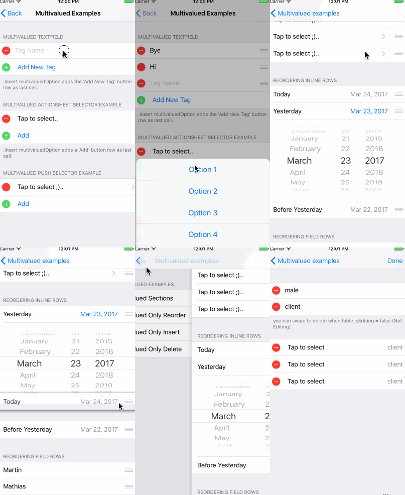
Eureka supports multiple values for a certain field (such as telephone numbers in a contact) by using Multivalued sections. It allows us to easily create insertable, deletable and reorderable sections.
In order to create a multivalued section we have to use MultivaluedSection type instead of the regular Section type. MultivaluedSection extends Section and has some additional properties to configure multivalued section behavior.
let's dive into a code example...
form +++
    MultivaluedSection(multivaluedOptions: [.Reorder, .Insert, .Delete],
                       header: "Multivalued TextField",
                       footer: ".Insert adds a 'Add Item' (Add New Tag) button row as last cell.") {
        $0.addButtonProvider = { section in
            return ButtonRow(){
                $0.title = "Add New Tag"
            }
        }
        $0.multivaluedRowToInsertAt = { index in
            return NameRow() {
                $0.placeholder = "Tag Name"
            }
        }
        $0 <<< NameRow() {
            $0.placeholder = "Tag Name"
        }
    }
Previous code snippet shows how to create a multivalued section. In this case we want to insert, delete and reorder rows as multivaluedOptions argument indicates.
addButtonProvider allows us to customize the button row which inserts a new row when tapped and multivaluedOptions contains .Insert value.
multivaluedRowToInsertAt closure property is called by Eureka each time a new row needs to be inserted. In order to provide the row to add into multivalued section we should set this property. Eureka passes the index as closure parameter. Notice that we can return any kind of row, even custom rows, even though in most cases multivalued section rows are of the same type.
Eureka automatically adds a button row when we create a insertable multivalued section. We can customize how the this button row looks like as we explained before. showInsertIconInAddButton property indicates if plus button (insert style) should appear in the left of the button, true by default.
There are some considerations we need to have in mind when creating insertable sections. Any row added to the insertable multivalued section should be placed above the row that Eureka automatically adds to insert new rows. This can be easily achieved by adding these additional rows to the section from inside the section's initializer closure (last parameter of section initializer) so then Eureka adds the adds insert button at the end of the section.
For more information on how to use multivalued sections please take a look at Eureka example project which contains several usage examples.
Eureka 2.0.0 introduces the much requested built-in validations feature.
A row has a collection of Rules and a specific configuration that determines when validation rules should be evaluated.
There are some rules provided by default, but you can also create new ones on your own.
The provided rules are:
- RuleRequired
- RuleEmail
- RuleURL
- RuleGreaterThan, RuleGreaterOrEqualThan, RuleSmallerThan, RuleSmallerOrEqualThan
- RuleMinLength, RuleMaxLength
- RuleClosure
Let's see how to set up the validation rules.
override func viewDidLoad() {
        super.viewDidLoad()
        form
          +++ Section(header: "Required Rule", footer: "Options: Validates on change")

            <<< TextRow() {
                $0.title = "Required Rule"
                $0.add(rule: RuleRequired())

		// This could also have been achieved using a closure that returns nil if valid, or a ValidationError otherwise.
		/*
		let ruleRequiredViaClosure = RuleClosure<String> { rowValue in
		return (rowValue == nil || rowValue!.isEmpty) ? ValidationError(msg: "Field required!") : nil
		}
		$0.add(rule: ruleRequiredViaClosure)
		*/

                $0.validationOptions = .validatesOnChange
            }
            .cellUpdate { cell, row in
                if !row.isValid {
                    cell.titleLabel?.textColor = .red
                }
            }

          +++ Section(header: "Email Rule, Required Rule", footer: "Options: Validates on change after blurred")

            <<< TextRow() {
                $0.title = "Email Rule"
                $0.add(rule: RuleRequired())
                $0.add(rule: RuleEmail())
                $0.validationOptions = .validatesOnChangeAfterBlurred
            }
            .cellUpdate { cell, row in
                if !row.isValid {
                    cell.titleLabel?.textColor = .red
                }
            }
As you can see in the previous code snippet we can set up as many rules as we want in a row by invoking row's add(rule:) function.
Row also provides func remove(ruleWithIdentifier identifier: String) to remove a rule. In order to use it we must assign an id to the rule after creating it.
Sometimes the collection of rules we want to use on a row is the same we want to use on many other rows. In this case we can set up all validation rules using a RuleSet which is a collection of validation rules.
var rules = RuleSet<String>()
rules.add(rule: RuleRequired())
rules.add(rule: RuleEmail())

let row = TextRow() {
            $0.title = "Email Rule"
            $0.add(ruleSet: rules)
            $0.validationOptions = .validatesOnChangeAfterBlurred
        }
Eureka allows us to specify when validation rules should be evaluated. We can do it by setting up validationOptions row's property, which can have the following values:
.validatesOnChange- Validates whenever a row value changes..validatesOnBlur- (Default value) validates right after the cell resigns first responder. Not applicable for all rows..validatesOnChangeAfterBlurred- Validates whenever the row value changes after it resigns first responder for the first time..validatesOnDemand- We should manually validate the row or form by invokingvalidate()method.
If you want to validate the entire form (all the rows) you can manually invoke Form validate() method.
Each row has the validationErrors property that can be used to retrieve all validation errors. This property just holds the validation error list of the latest row validation execution, which means it doesn't evaluate the validation rules of the row.
As expected, the Rules must use the same types as the Row object. Be extra careful to check the row type used. You might see a compiler error ("Incorrect arugment label in call (have 'rule:' expected 'ruleSet:')" that is not pointing to the problem when mixing types.
Eureka 4.1.0 introduces the swipe feature.
You are now able to define multiple leadingSwipe and trailingSwipe actions per row. As swipe actions depend on iOS system features, leadingSwipe is available on iOS 11.0+ only.
Let's see how to define swipe actions.
let row = TextRow() {
            let deleteAction = SwipeAction(
                style: .destructive,
                title: "Delete",
                handler: { (action, row, completionHandler) in
                    //add your code here.
                    //make sure you call the completionHandler once done.
                    completionHandler?(true)
                })
            deleteAction.image = UIImage(named: "icon-trash")

            $0.trailingSwipe.actions = [deleteAction]
            $0.trailingSwipe.performsFirstActionWithFullSwipe = true

            //please be aware: `leadingSwipe` is only available on iOS 11+ only
            let infoAction = SwipeAction(
                style: .normal,
                title: "Info",
                handler: { (action, row, completionHandler) in
                    //add your code here.
                    //make sure you call the completionHandler once done.
                    completionHandler?(true)
                })
            infoAction.backgroundColor = .blue
            infoAction.image = UIImage(named: "icon-info")

            $0.leadingSwipe.actions = [infoAction]
            $0.leadingSwipe.performsFirstActionWithFullSwipe = true
}It is very common that you need a row that is different from those included in Eureka. If this is the case you will have to create your own row but this should not be difficult. You can read this tutorial on how to create custom rows to get started. You might also want to have a look at EurekaCommunity which includes some extra rows ready to be added to Eureka.
To create a row with custom behaviour and appearance you'll probably want to create subclasses of Row and Cell.
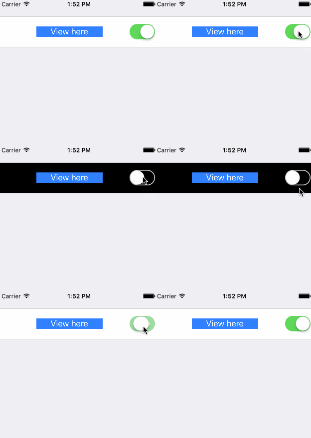
Remember that Row is the abstraction Eureka uses, while the Cell is the actual UITableViewCell in charge of the view.
As the Row contains the Cell, both Row and Cell must be defined for the same value type.
// Custom Cell with value type: Bool
// The cell is defined using a .xib, so we can set outlets :)
public class CustomCell: Cell<Bool>, CellType {
    @IBOutlet weak var switchControl: UISwitch!
    @IBOutlet weak var label: UILabel!

    public override func setup() {
        super.setup()
        switchControl.addTarget(self, action: #selector(CustomCell.switchValueChanged), for: .valueChanged)
    }

    func switchValueChanged(){
        row.value = switchControl.on
        row.updateCell() // Re-draws the cell which calls 'update' bellow
    }

    public override func update() {
        super.update()
        backgroundColor = (row.value ?? false) ? .white : .black
    }
}

// The custom Row also has the cell: CustomCell and its correspond value
public final class CustomRow: Row<CustomCell>, RowType {
    required public init(tag: String?) {
        super.init(tag: tag)
        // We set the cellProvider to load the .xib corresponding to our cell
        cellProvider = CellProvider<CustomCell>(nibName: "CustomCell")
    }
}Custom rows need to subclass `Row` and conform to `RowType` protocol. Custom cells need to subclass `Cell` and conform to `CellType` protocol.
Just like the callbacks cellSetup and CellUpdate, the Cell has the setup and update methods where you can customize it.
A inline row is a specific type of row that shows dynamically a row below it, normally an inline row changes between a expand and collapse mode whenever the row is tapped.
So to create a inline row we need 2 rows, the row that are "always" visible and the row that will expand/collapse.
Another requirement is that the value type of these 2 rows must be the same.
Once we have these 2 rows, we should make the top row type conforms to InlineRowType which will add some methods to the top row class type such as:
func expandInlineRow()
func hideInlineRow()
func toggleInlineRow()
Finally we must invoke toggleInlineRow() when the row is selected, for example overriding the customDidSelect() row method.
public override func customDidSelect() {
    toggleInlineRow()
}Note: A Presenter row is a row that presents a new UIViewController.
To create a custom Presenter row you must create a class that conforms the PresenterRowType protocol. It is highly recommended to subclass SelectorRow as it does conform to that protocol and adds other useful functionality.
The PresenterRowType protocol is defined as follows:
public protocol PresenterRowType: TypedRowType {
    typealias ProviderType : UIViewController, TypedRowControllerType
    var presentationMode: PresentationMode<ProviderType>? { get set }
    var onPresentCallback: ((FormViewController, ProviderType)->())? { get set }
}
The onPresentCallback will be called when the row is about to present another view controller. This is done in the SelectorRow so if you do not subclass it you will have to call it yourself.
The presentationMode is what defines how the controller is presented and which controller is presented. This presentation can be using a Segue identifier, a segue class, presenting a controller modally or pushing to a specific view controller. For example a CustomPushRow can be defined like this:
public final class CustomPushRow<T: Equatable>: SelectorRow<PushSelectorCell<T>, SelectorViewController<T>>, RowType {

    public required init(tag: String?) {
        super.init(tag: tag)
        presentationMode = .show(controllerProvider: ControllerProvider.callback {
            return SelectorViewController<T>(){ _ in }
            }, onDismiss: { vc in
                _ = vc.navigationController?.popViewController(animated: true)
        })
    }
}
You can place your own UIViewController instead of SelectorViewController<T> and your own cell instead of PushSelectorCell<T>.
Sometimes we want to change the UI look of one of our rows but without changing the row type and all the logic associated to one row. There is currently one way to do this if you are using cells that are instantiated from nib files. Currently, none of Eureka's core rows are instantiated from nib files but some of the custom rows in EurekaCommunity are, in particular the PostalAddressRow which was moved there.
What you have to do is:
- Create a nib file containing the cell you want to create.
- Then set the class of the cell to be the existing cell you want to modify (if you want to change something more apart from pure UI then you should subclass that cell). Make sure the module of that class is correctly set
- Connect the outlets to your class
- Tell your row to use the new nib file. This is done by setting the
cellProvidervariable to use this nib. You should do this in the initialiser, either in each concrete instantiation or using thedefaultRowInitializer. For example:
<<< PostalAddressRow() {
     $0.cellProvider = CellProvider<PostalAddressCell>(nibName: "CustomNib", bundle: Bundle.main)
}
You could also create a new row for this. In that case try to inherit from the same superclass as the row you want to change to inherit its logic.
There are some things to consider when you do this:
- If you want to see an example have a look at the PostalAddressRow or the CreditCardRow which have use a custom nib file in their examples.
- If you get an error saying
Unknown class <YOUR_CLASS_NAME> in Interface Builder file, it might be that you have to instantiate that new type somewhere in your code to load it in the runtime. Callinglet t = YourClass.selfhelped in my case.
Label Row
|
Button Row
|
Check Row
|
Switch Row
|
Slider Row
|
Stepper Row
|
Text Area Row
|
These rows have a textfield on the right side of the cell. The difference between each one of them consists in a different capitalization, autocorrection and keyboard type configuration.

|
TextRow NameRow URLRow IntRow PhoneRow PasswordRow EmailRow DecimalRow TwitterRow AccountRow ZipCodeRow |
All of the FieldRow subtypes above have a formatter property of type NSFormatter which can be set to determine how that row's value should be displayed. A custom formatter for numbers with two digits after the decimal mark is included with Eureka (DecimalFormatter). The Example project also contains a CurrencyFormatter which displays a number as currency according to the user's locale.
By default, setting a row's formatter only affects how a value is displayed when it is not being edited. To also format the value while the row is being edited, set useFormatterDuringInput to true when initializing the row. Formatting the value as it is being edited may require updating the cursor position and Eureka provides the following protocol that your formatter should conform to in order to handle cursor position:
public protocol FormatterProtocol {
    func getNewPosition(forPosition forPosition: UITextPosition, inTextInput textInput: UITextInput, oldValue: String?, newValue: String?) -> UITextPosition
}
Additionally, FieldRow subtypes have a useFormatterOnDidBeginEditing property. When using a DecimalRow with a formatter that allows decimal values and conforms to the user's locale (e.g. DecimalFormatter), if useFormatterDuringInput is false, useFormatterOnDidBeginEditing must be set to true so that the decimal mark in the value being edited matches the decimal mark on the keyboard.
Date Rows hold a Date and allow us to set up a new value through UIDatePicker control. The mode of the UIDatePicker and the way how the date picker view is shown is what changes between them.
Date Row
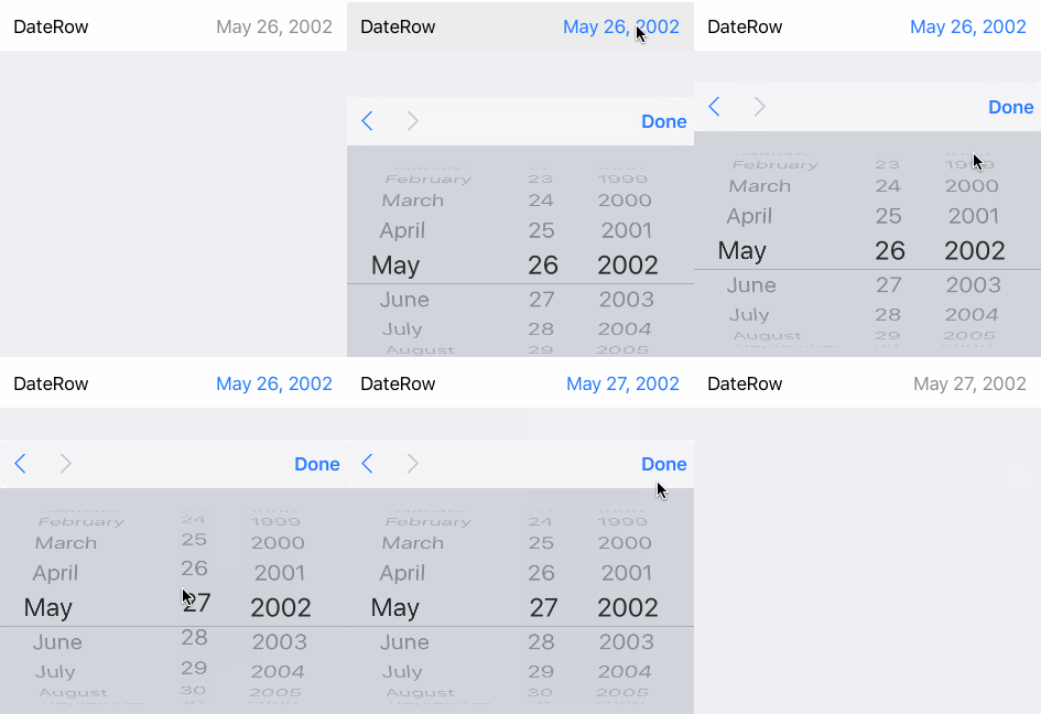
Picker shown in the keyboard. |
Date Row (Inline)

The row expands. |
Date Row (Picker)

The picker is always visible. |
With those 3 styles (Normal, Inline & Picker), Eureka includes:
- DateRow
- TimeRow
- DateTimeRow
- CountDownRow
These are rows with a list of options associated from which the user must choose.
<<< ActionSheetRow<String>() {
                $0.title = "ActionSheetRow"
                $0.selectorTitle = "Pick a number"
                $0.options = ["One","Two","Three"]
                $0.value = "Two"    // initially selected
}Segmented Row
|
Segmented Row (w/Title)
|
Picker Row
Presents options of a generic type through a picker view (There is also Picker Inline Row) |
Let us know about it, we would be glad to mention it here. :)
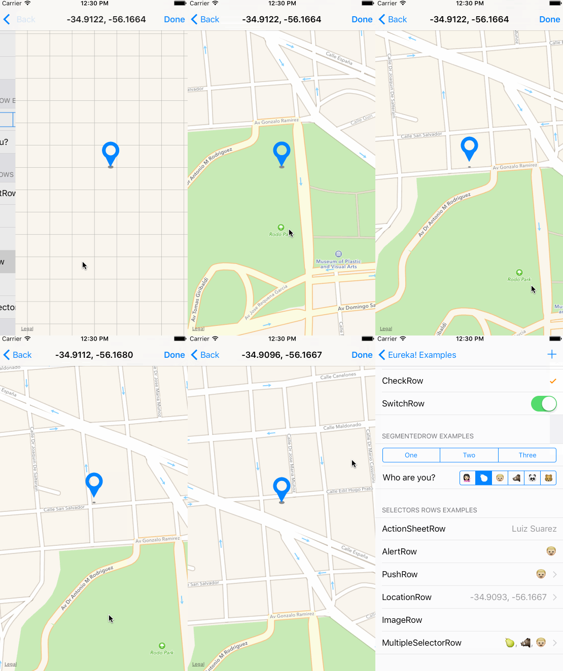
- LocationRow (Included as custom row in the example project)
CocoaPods is a dependency manager for Cocoa projects.
Specify Eureka into your project's Podfile:
source 'https://github.com/CocoaPods/Specs.git'
platform :ios, '9.0'
use_frameworks!

pod 'Eureka'
Then run the following command:
$ pod installCarthage is a simple, decentralized dependency manager for Cocoa.
Specify Eureka into your project's Cartfile:
github "xmartlabs/Eureka" ~> 4.0
- Clone Eureka as a git submodule by running the following command from your project root git folder.
$ git submodule add https://github.com/xmartlabs/Eureka.git-
Open Eureka folder that was created by the previous git submodule command and drag the Eureka.xcodeproj into the Project Navigator of your application's Xcode project.
-
Select the Eureka.xcodeproj in the Project Navigator and verify the deployment target matches with your application deployment target.
-
Select your project in the Xcode Navigation and then select your application target from the sidebar. Next select the "General" tab and click on the + button under the "Embedded Binaries" section.
-
Select
Eureka.frameworkand we are done!
- If you want to contribute please feel free to submit pull requests.
- If you have a feature request please open an issue.
- If you found a bug check older issues before submitting an issue.
- If you need help or would like to ask general question, use StackOverflow. (Tag
eureka-forms).
Before contribute check the CONTRIBUTING file for more info.
If you use Eureka in your app We would love to hear about it! Drop us a line on twitter.
We can get a particular row by invoking any of the following functions exposed by the Form class:
public func rowBy<T: Equatable>(tag: String) -> RowOf<T>?
public func rowBy<Row: RowType>(tag: String) -> Row?
public func rowBy(tag: String) -> BaseRow?
For instance:
let dateRow : DateRow? = form.rowBy(tag: "dateRowTag")
let labelRow: LabelRow? = form.rowBy(tag: "labelRowTag")

let dateRow2: Row<DateCell>? = form.rowBy(tag: "dateRowTag")

let labelRow2: BaseRow? = form.rowBy(tag: "labelRowTag")let section: Section? = form.sectionBy(tag: "sectionTag")Invoking setValues(values: [String: Any?]) which is exposed by Form class.
For example:
form.setValues(["IntRowTag": 8, "TextRowTag": "Hello world!", "PushRowTag": Company(name:"Xmartlabs")])Where "IntRowTag", "TextRowTag", "PushRowTag" are row tags (each one uniquely identifies a row) and 8, "Hello world!", Company(name:"Xmartlabs") are the corresponding row value to assign.
The value type of a row must match with the value type of the corresponding dictionary value otherwise nil will be assigned.
If the form was already displayed we have to reload the visible rows either by reloading the table view tableView.reloadData() or invoking updateCell() to each visible row.
Row does not update after changing hidden or disabled condition
After setting a condition, this condition is not automatically evaluated. If you want it to do so immediately you can call .evaluateHidden() or .evaluateDisabled().
This functions are just called when a row is added to the form and when a row it depends on changes. If the condition is changed when the row is being displayed then it must be reevaluated manually.
Look at this issue.
- Set up a new header/footer data ....
section.header = HeaderFooterView(title: "Header title \(variable)") // use String interpolation
//or
var header = HeaderFooterView<UIView>(.class) // most flexible way to set up a header using any view type
header.height = { 60 }  // height can be calculated
header.onSetupView = { view, section in  // each time the view is about to be displayed onSetupView is invoked.
    view.backgroundColor = .orange
}
section.header = header- Reload the Section to perform the changes
section.reload()selectableRowCellUpdate and selectableRowCellSetup properties are provided to be able to customize SelectorViewController and MultipleSelectorViewController selectable cells.
let row = PushRow<Emoji>() {
              $0.title = "PushRow"
              $0.options = [💁🏻, 🍐, 👦🏼, 🐗, 🐼, 🐻]
              $0.value = 👦🏼
              $0.selectorTitle = "Choose an Emoji!"
          }.onPresent { from, to in
              to.dismissOnSelection = false
              to.dismissOnChange = false
              to.selectableRowCellUpdate = { cell, row in
                  cell.textLabel?.text = "Text " + row.selectableValue!  // customization
                  cell.detailTextLabel?.text = "Detail " +  row.selectableValue!
              }
}As we've said Form and Section types conform to MutableCollection and RangeReplaceableCollection. A Form is a collection of Sections and a Section is a collection of Rows.
RangeReplaceableCollection protocol extension provides many useful methods to modify collection.
extension RangeReplaceableCollection {
    public mutating func append(_ newElement: Self.Element)
    public mutating func append<S>(contentsOf newElements: S) where S : Sequence, Self.Element == S.Element
    public mutating func insert(_ newElement: Self.Element, at i: Self.Index)
    public mutating func insert<S>(contentsOf newElements: S, at i: Self.Index) where S : Collection, Self.Element == S.Element
    public mutating func remove(at i: Self.Index) -> Self.Element
    public mutating func removeSubrange(_ bounds: Range<Self.Index>)
    public mutating func removeFirst(_ n: Int)
    public mutating func removeFirst() -> Self.Element
    public mutating func removeAll(keepingCapacity keepCapacity: Bool)
    public mutating func reserveCapacity(_ n: Self.IndexDistance)
}
These methods are used internally to implement the custom operators as shown bellow:
public func +++(left: Form, right: Section) -> Form {
    left.append(right)
    return left
}

public func +=<C : Collection>(inout lhs: Form, rhs: C) where C.Element == Section {
    lhs.append(contentsOf: rhs)
}

public func <<<(left: Section, right: BaseRow) -> Section {
    left.append(right)
    return left
}

public func +=<C : Collection>(inout lhs: Section, rhs: C) where C.Element == BaseRow {
    lhs.append(contentsOf: rhs)
}
You can see how the rest of custom operators are implemented here.
It's up to you to decide if you want to use Eureka custom operators or not.
So we can make Eureka even better!

This can be found in the CHANGELOG.md file.


