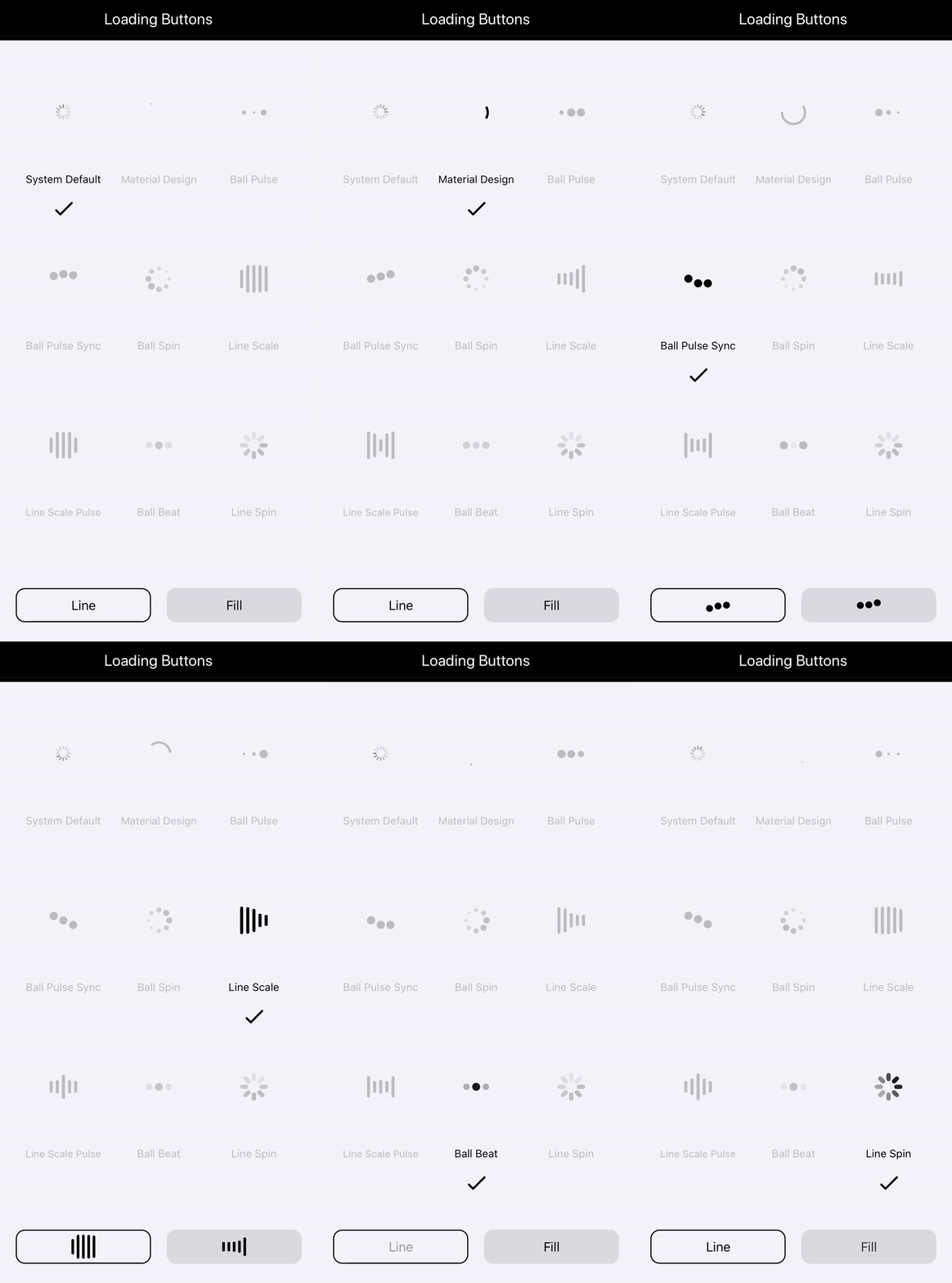
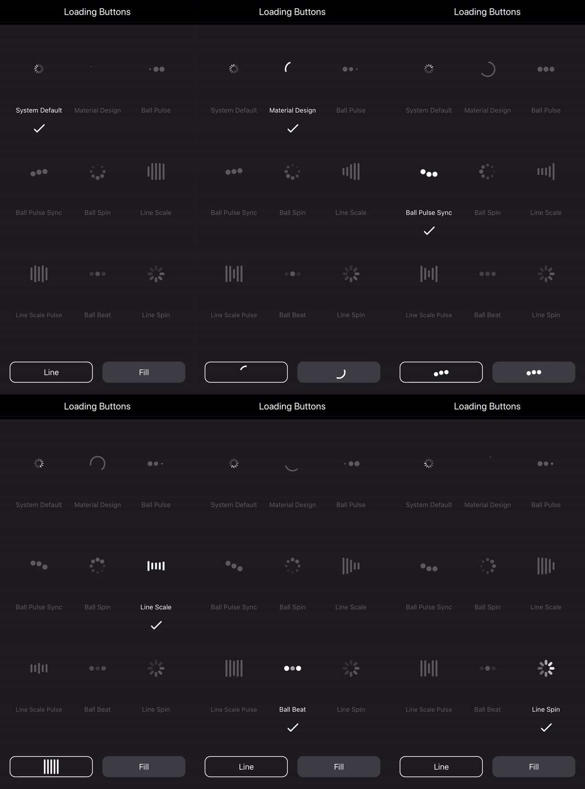
A collection of loading buttons and their styling written in Swift.
You may see the following Medium article for detailed explanation of creating loading buttons.
| Light mode | Dark mode |
|---|---|
 |
 |
- The example gives you 9 choices of loading indicators with the loading button.
- The IndicatorProtocol clearly defines the functions and properties. You can refer to it and customize your own.
- The LoadingButton class is made to be open, from which you can easily inherit and create your own.
- Swift 5.0
- iOS 11.0+
LoadingButtons project is available via CocoaPods. To install it, simply add the following line to your Podfile:
$ pod 'MHLoadingButton'
If you don't use CocoaPods, you can download the entire project then import all the source files and use them in your project.
// The frame is default to zero. You need to use AutoLayout to resize it.
// Otherwise, you can specify the frame in initializer.
if #available(iOS 13.0, *) {
    // This is the new initializer for iOS 13 dark/light mode.
    // The syste colors will be used.
    btnLoading = LoadingButton(text: "Button", buttonStyle: .outline) // Outlined button
    btnLoading = LoadingButton(text: "Button", buttonStyle: .fill)    // Filled button
} else {
    // Custom color initializer
    btnLoading = LoadingButton(text: "Button", textColor: .black, bgColor: .white)
}btnLoading.indicator = UIActivityIndicatorView()| Light mode | Dark mode |
|---|---|
 |
 |
btnLoading.indicator = MaterialLoadingIndicator(color: .gray)| Light mode | Dark mode |
|---|---|
 |
 |
btnLoading.indicator = BallPulseSyncIndicator(color: .gray)| Light mode | Dark mode |
|---|---|
 |
 |
btnLoading.indicator = BallSpinFadeIndicator(color: .gray)| Light mode | Dark mode |
|---|---|
 |
 |
btnLoading.indicator = LineScalePulseIndicator(color: .gray)| Light mode | Dark mode |
|---|---|
 |
 |
btnLoading.indicator = LineScaleIndicator(color: .gray)| Light mode | Dark mode |
|---|---|
 |
 |
btnLoading.indicator = BallPulseIndicator(color: .gray)| Light mode | Dark mode |
|---|---|
 |
 |
btnLoading.indicator = BallBeatIndicator(color: .gray)| Light mode | Dark mode |
|---|---|
 |
 |
btnLoading.indicator = LineSpinFadeLoader(color: .gray)| Light mode | Dark mode |
|---|---|
 |
 |


