The layout-with-tables killer.
Problem: structuring content beyond single columns.
Existing solutions:
- pre-define template(s) and additional db fields for holding content.
- use tables within TinyMCE Content editor.
- define content in seperate DataObjects, eg Page Elements Module
- SilverStripe Blocks
New solution: use the CSS grids we've come to know and love
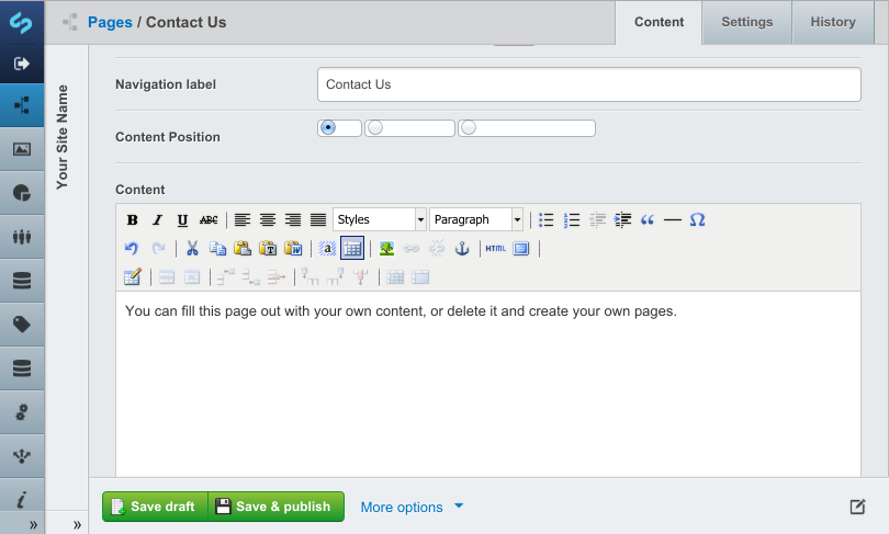
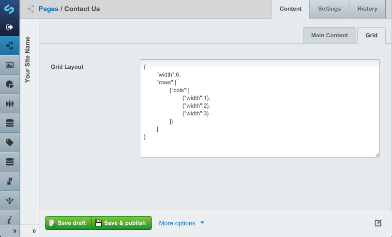
This can be done by splitting up 'Content' field with a short delimiter string, and also storing a (sub)grid structure. The grid strucutre could be predefined by a designer, or edited by the user. This means defining the appropriate nesting of rows, columns, and width each column spans.
The same TinyMCE editor interface can be used, with the only difference being that you choose what part of the grid you are working on. On save, the seperate grid sections are concatenated into the 'Content' db field, and are delimited by a front-end invisible string.
When rendering on the front-end, the defined grid structure is traversed (depth first), dropping the delimited Content into the appropriate areas.
This idea relies on the fact that most grid systems are the same. Most have:
- Predefined number of columns
- HTML structure & CSS classes for defining grid layout
For example, here is the bootstrap structure
<div class="row">
    <div class="span4">...</div>
    <div class="span8">...</div>
</div>
Converted to a generic SilverStripe template:
<div class="row">
	<% loop Columns %>
		<div class="span{$Width}">
			$Content
		</div>
	<% end_loop %>
</div>
The minor differences between grid systems should be handled by using a slightly different row template.
- Grid system agnostic: it should would work with different CSS grid systems.
- Un-obtrusive: it doesn't require any new data objects, or fields.
- Clever: all content is stored in 'Content' db field, therefore taking full advantage of history, rollback etc.
- Graceful: the 'Content' field could still be displayed in a single column format with $Content, because delimiters will be hidden. This also means content summaries can still be used.
- 34
- 960
- 978
- 1140
- blueprint
- bootstrap
- columnal
- foundation
- golden
- responsive
- responsive 2
- semantic
- unsemantic
- zen

