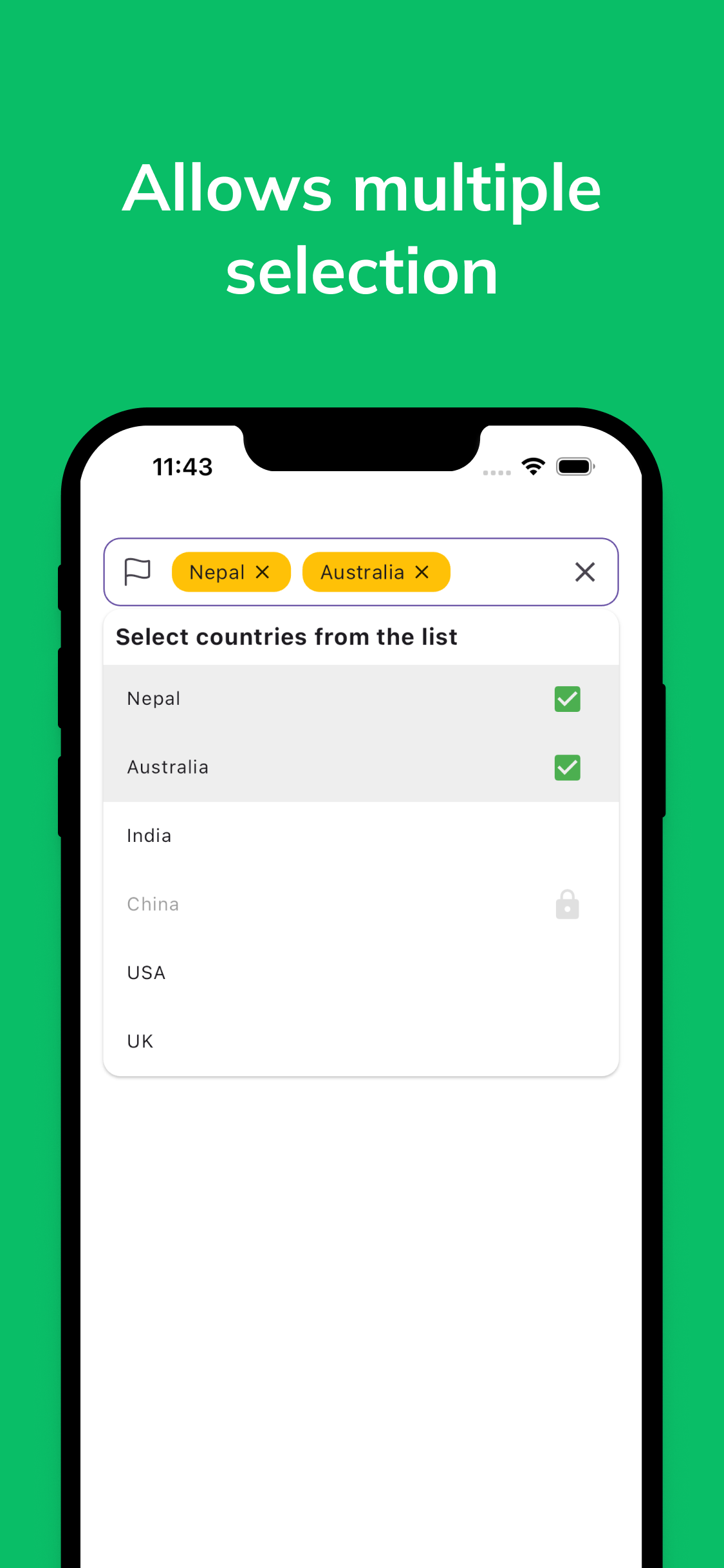
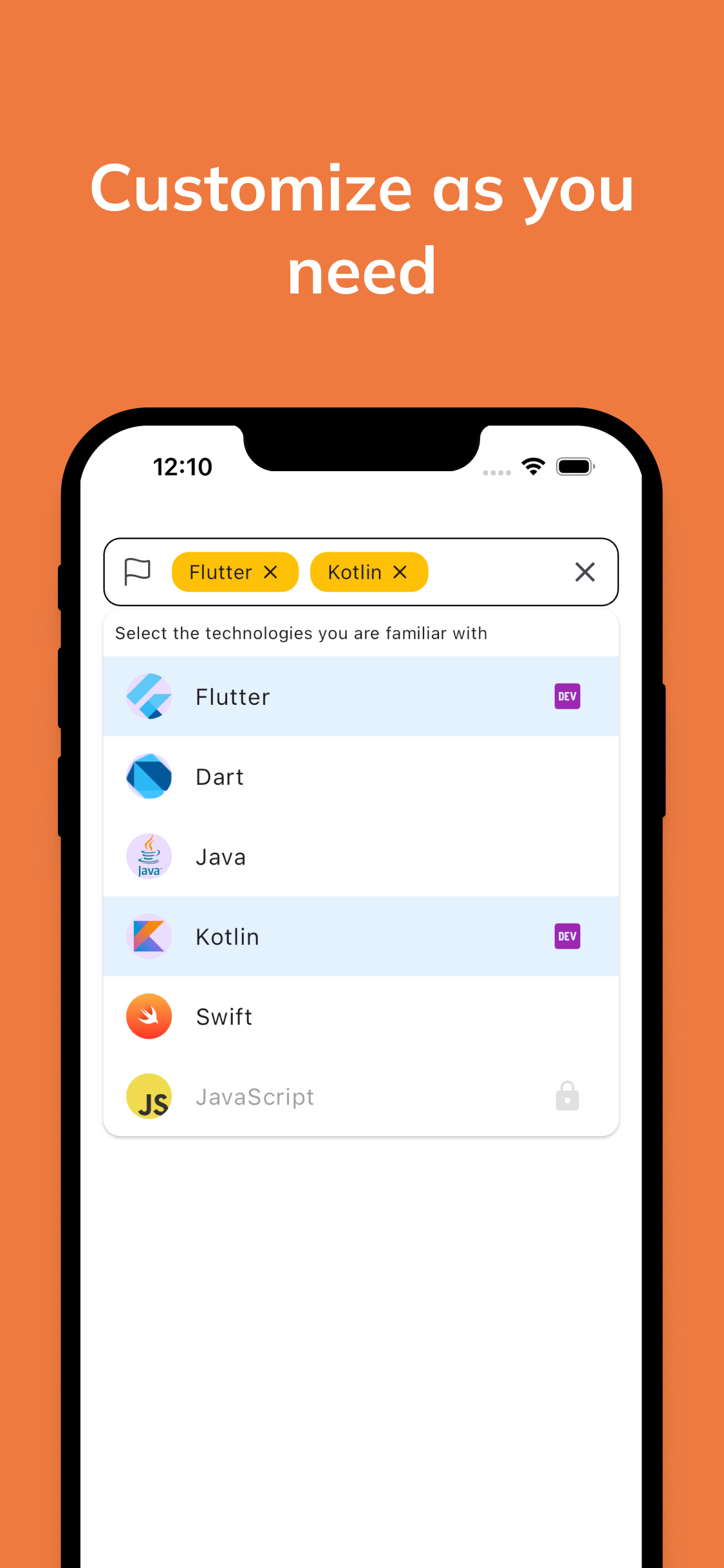
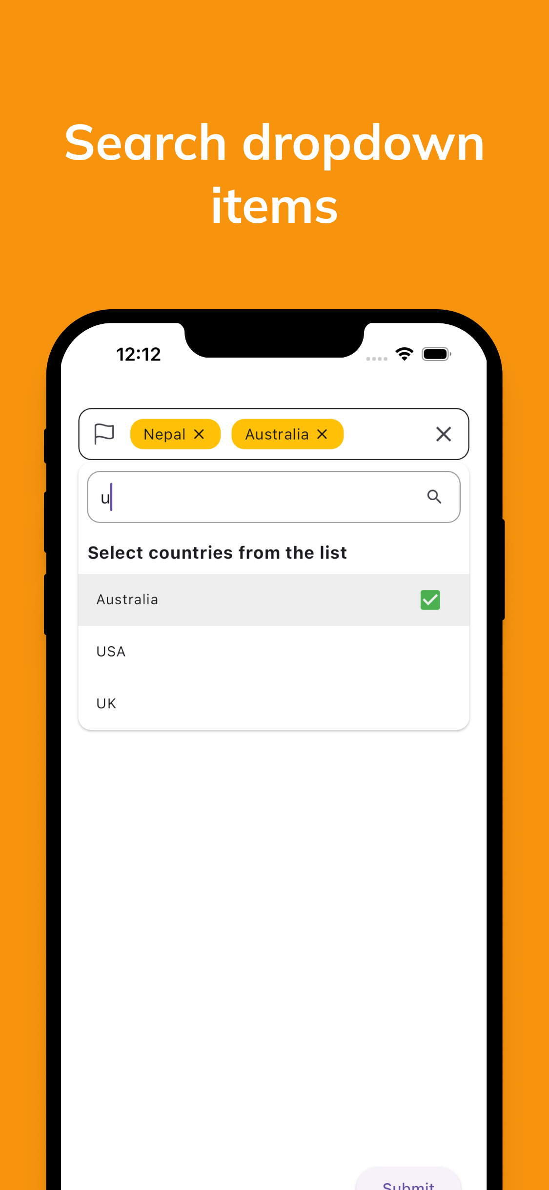
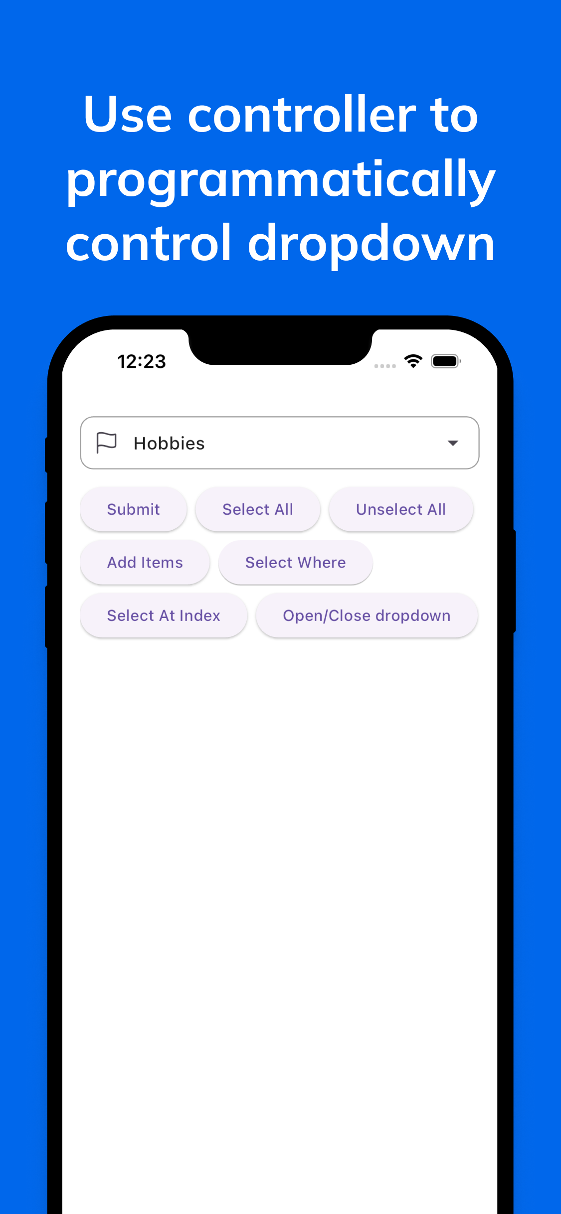
The MultiSelect Dropdown for Flutter is a powerful and customizable widget that empowers you to effortlessly manage and search through multiple items in a dropdown list. Customize the dropdown with your own style, and use the controller to programmatically control the dropdown.
- The
MultiSelectDropDownwidget has been renamed toMultiDropdown, which now supportsFormValidation. - The
MultiSelectControllermethods have been updated/renamed. - The
ValueItemclass has replaced theDropdownItemclass. - The
.networkconstructor has been removed and has been replaced with thefutureconstructor, which accepts a future callback to fetch the data from the server. Use it to handle future your own way. onOptionsSelectedhas been replaced withonSelectionChange. TheonSelectionChangecallback is called whenever the selection changes in the dropdown, whether it is selected or deselected.- A lot of parameters have been renamed and updated. Please check the documentation for the updated parameters.
Preview | Controller | Parameters
You can use the controller to programmatically select/unselect items, clear the selection, and get the selected items, set disabled items, show/hide the dropdown. It is still in beta, will be stable in the next release.
final MultiSelectController<User> _controller = MultiSelectController<User>();

_controller.clearAll(); /// Clear all selected items

_controller.selectWhere(bool Function(DropdownItem<User>) predicate); /// Select items based on a predicate

_controller.setItems(List<DropdownItem<User>> options); /// Set items of the dropdown

_controller.addItem(DropdownItem<User> option); /// Add item to dropdown

_controller.addItems(List<DropdownItem<User>> options); /// Add  items to dropdown

_controller.disableWhere(bool Function(DropdownItem<User>) predicate); /// Disable items based on a predicate

_controller.selectAll(); /// Select all items

_controller.selectAtIndex(int index); /// Select item at index

_controller.selectWhere(bool Function(DropdownItem<User>) predicate); /// Select items based on a predicate

_controller.deselectWhere(bool Function(DropdownItem<User>) predicate); /// Deselect items based on a predicate

_controller.items; /// Get all items

_controller.selectedItems; /// Get selected items

_controller.disabledItems; /// Get disabled items

_controller.openDropdown(); /// Show the dropdown

_controller.closeDropdown(); /// Hide the dropdown if it is open
| Parameter | Type | Description | Default |
|---|---|---|---|
| items | List<DropdownItem> | The list of dropdown items. | Required |
| singleSelect | bool | The selection type of the dropdown. | false |
| chipDecoration | ChipDecoration | The configuration for the chips. | ChipDecoration() |
| fieldDecoration | FieldDecoration | The decoration of the field. | FieldDecoration() |
| dropdownDecoration | DropdownDecoration | The decoration of the dropdown. | DropdownDecoration() |
| searchDecoration | SearchFieldDecoration | The decoration of the search field. | SearchFieldDecoration() |
| dropdownItemDecoration | DropdownItemDecoration | The decoration of the dropdown items. | DropdownItemDecoration() |
| itemBuilder | DropdownItemBuilder? | The builder for the dropdown items. | null |
| selectedItemBuilder | SelectedItemBuilder? | The builder for the selected items. | null |
| itemSeparator | Widget? | The separator between the dropdown items. | null |
| validator | String? Function(List<DropdownItem>? selectedOptions)? | The validator for the dropdown. | null |
| autovalidateMode | AutovalidateMode | The autovalidate mode for the dropdown. | AutovalidateMode.disabled |
| controller | MultiSelectController? | The controller for the dropdown. | null |
| maxSelections | int | The maximum number of selections allowed. | 0 |
| enabled | bool | Whether the dropdown is enabled. | true |
| searchEnabled | bool | Whether the search field is enabled. | false |
| focusNode | FocusNode? | The focus node for the dropdown. | null |
| future | FutureRequest? | The future request for the dropdown items. | null |
| onSelectionChange | OnSelectionChanged? | The callback when the item is changed. | null |
| closeOnBackButton | bool | Closes the dropdown on back button | false |
| onSearchChange | ValueChanged? | The callback when the search text changes. | null |
| Parameter | Type | Description | Default |
|---|---|---|---|
| label | String | The label of the dropdown item. | Required |
| value | T | The value associated with the dropdown item. | Required |
| disabled | bool | Indicates whether the dropdown item is disabled. | false |
| selected | bool | Indicates whether the dropdown item is selected. | false |
| Parameter | Type | Description | Default |
|---|---|---|---|
| deleteIcon | Icon | The icon to display for deleting a chip. | Icon(Icons.close) |
| backgroundColor | Color | The background color of the chip. | Colors.blue |
| labelStyle | TextStyle | The style of the chip label. | TextStyle() |
| padding | EdgeInsets | The padding around the chip. | EdgeInsets.all(8.0) |
| border | BoxBorder | The border of the chip. | Border() |
| spacing | double | The spacing between chips. | 8.0 |
| runSpacing | double | The spacing between chip rows (when the chips wrap). | 8.0 |
| borderRadius | BorderRadiusGeometry | The border radius of the chip. | BorderRadius.circular(12) |
| wrap | bool | Whether to wrap chips or scroll them. | true |
| Parameter | Type | Description | Default |
|---|---|---|---|
| labelText | String? | The label text to display above the dropdown field. | null |
| hintText | String? | The hint text to display in the dropdown field. | null |
| border | InputBorder? | The border of the dropdown field. | null |
| focusedBorder | InputBorder? | The border of the dropdown field when it is focused. | null |
| disabledBorder | InputBorder? | The border of the dropdown field when it is disabled. | null |
| errorBorder | InputBorder? | The border of the dropdown field when there is an error. | null |
| suffixIcon | Widget? | The icon to display at the end of the dropdown field. | Icon(Icons.arrow_drop_down) |
| prefixIcon | Widget? | The icon to display at the start of the dropdown field. | null |
| labelStyle | TextStyle? | The style of the label text. | null |
| hintStyle | TextStyle? | The style of the hint text. | null |
| borderRadius | double | The border radius of the dropdown field. | 8.0 |
| animateSuffixIcon | bool | Animate the icon or not. | true |
| padding | EdgeInsets? | Padding around the dropdown field. | null |
| showClearIcon | bool | Show the clear icon or not. | true |
| Parameter | Type | Description | Default |
|---|---|---|---|
| backgroundColor | Color | The background color of the dropdown. | Colors.white |
| elevation | double | The elevation of the dropdown. | 1.0 |
| maxHeight | double | The max height of the dropdown. | 400.0 |
| borderRadius | BorderRadius | The border radius of the dropdown. | BorderRadius.circular(12.0) |
| marginTop | double | The margin top of the dropdown. | 0.0 |
| header | Widget? | The header of the dropdown. | null |
| footer | Widget? | The footer of the dropdown. | null |
| Parameter | Type | Description | Default |
|---|---|---|---|
| hintText | String | The hint text to display in the search field. | 'Search' |
| border | InputBorder? | The border of the search field. | null |
| focusedBorder | InputBorder? | The border of the search field when it is focused. | null |
| searchIcon | Icon | The icon to display in the search field. | Icon(Icons.search) |
| Parameter | Type | Description | Default |
|---|---|---|---|
| backgroundColor | Color | The background color of the dropdown item. | null |
| disabledBackgroundColor | Color | The background color of the disabled dropdown item. | null |
| selectedBackgroundColor | Color | The background color of the selected dropdown item. | null |
| selectedTextColor | Color | The text color of the selected dropdown item. | null |
| textColor | Color | The text color of the dropdown item. | null |
| disabledTextColor | Color | The text color of the disabled dropdown item. | null |
| selectedIcon | Icon | The icon to display for the selected dropdown item. | null |
| disabledIcon | Icon | The icon to display for the disabled dropdown item. | null |


