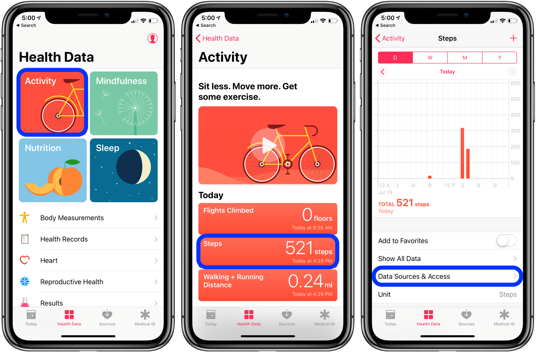
Our phones are great mini-trackers that can be used for analyzing insights in our health. If you are an Apple user, you probably know about Apple Health. It is an iOS feature that monitors and organizes health-related data. It consolidates data gathered by the Apple ecosystem and third-party devices and apps. Depending on your specific setup, it may offer valuable insights on your physical activity, body measurements, sleep habits, heart rate, hearing, nutrition, blood glucose or even menstrual cycle, to give a few examples. While some metrics are simple such as the number of steps, others are more elaborated as the ratios of double-support time or asymmetry while we walk. As I am using an Apple watch, I would like to create something with Python, which will provide me with better understanding of the data I am providing my watch.
I will be using the exported data from my Apple Health App.
- Download the Data
- Exploring the Data
- Analyzing the Data
1. Downloading the dataset First, I need to download the dataset. It requires a few manual steps:
- Open the Health app on your phone.
- Touch the profile picture on the top-right corner.
- Press on "Export All Health Data" at the bottom of the screen.
- Download the created .zip file. I chose to save it on iCloud and then manually download it on my laptop.
2. Set-up Data Version Control (DVC)
As the downloaded health data file is too big to be uploaded on GitHub, I quickly set-up DVC to access the data from there.
3. Processing the XML file
From the two files inside the archive, the one named export.xml has the data I need.
Firstly, I started by analyzing the steps that I have made throughout the years. I will attach few figures, which will show overview. The first one on the left shows the top 5 results throughout the years. The second figure in the middle represents the top 10 results for most active months. Finally, the figure on the right represents the steps in overview of August 2022.
Secondly, I took a look at the distribution of the walking activity during the week.
Looks like I am pretty active in the beginning and the end of the week.
Besides that, I created aa plot, which represents my cycling activity throughout the years. Recently, I started cycling more, so I wanted to take a look at that.
As I thought, my cycling activity has increased rapidly. 🙂


