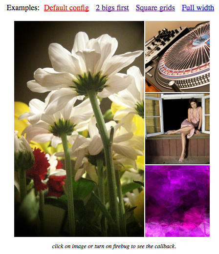
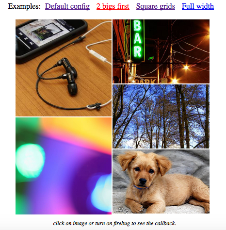
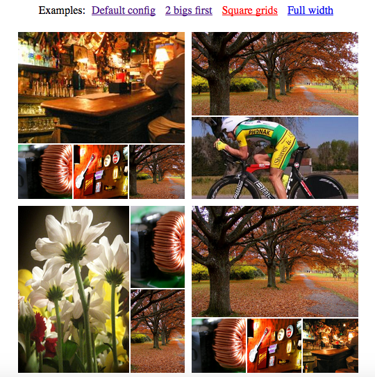
Photo grid like facebook in angular js with no dependencies. Work well when images have variety in dimension, scale images but respect ratio and improve display images in cells.
This module can be used with these options:
| Option | Description | Value | Default |
|---|---|---|---|
| urlKey | object attribute present for image url ex:{url: "/example.jpg"} => urlKey: "url" | string | "original_url" |
| sortByKey | object attribute present for order of object in array ex:[{nth: 1}, {nth: 2}] => sortByKey: "nth" | string | "nth" |
| isResponsive | option to make the directive responsive | boolean | false |
| onClicked | image click event handler, argument is clicked image | function | none |
| onBuilded | callback when grid was built completed | function | none |
| onDOMReady | callback when DOM generated completely from array images object | function | none |
| margin | space between each image on grid | number | 2 |
| maxLength | maximum objects in array grid choose to build | number | 5 |
| isSquare | options to build grid has the height equals to width ex: used to display grid of grids without break layout | boolean | false |
| buildOnLoading | option to trigger build grid, grid be built while images loading if it's true. Otherwise, grid will be built only one when all image loaded | boolean | true |
####Note:
  This directive used to built the grid of images
  (let's look at the demo source code to see how the array of images look like),
  so you should prepare the array of images object first
  then following this guide below.
####1. Inject module to your angular app definition:
angular.module("ngApp", ["ngPhotoGrid"])
####2. On your controller, you should define the options and events handler if needed like this:
  $scope.gridOptions = {
    urlKey      :     "original_url",
    sortKey     :     "nth",
    isResponsive:     false,
    onClicked   :     function(image) {
                        alert(JSON.stringify(image))
                      },
    onBuilded   :     function() {
                        console.log ("built completed!")
                        $scope.isBuildingGrid = false;
                      },
    margin      :     2,
    maxLength   :     7
  }
####3. Use directive in template like this:
<div ng-photo-grid="" images="images" grid-options="gridOptions"></div>
####4. Open browser then see the magic, you can refresh (F5) browser again to see others style of grid was built (if your images were random order and have different dimension)
####Updated: 05-15-2017
- Added responsive option
####Updated: 08-11-2015
- Fixed display grid when has 2 images
- Added css border to grid cell. Include style in border.css if you want grid cell is bordered.
####Others Contribution are welcome so if you find any issue, please post issues or email me at: jerryc.nguyen92[at]gmail.com
Thanks lorempixel.com for better images in demo pages.
##MIT License


