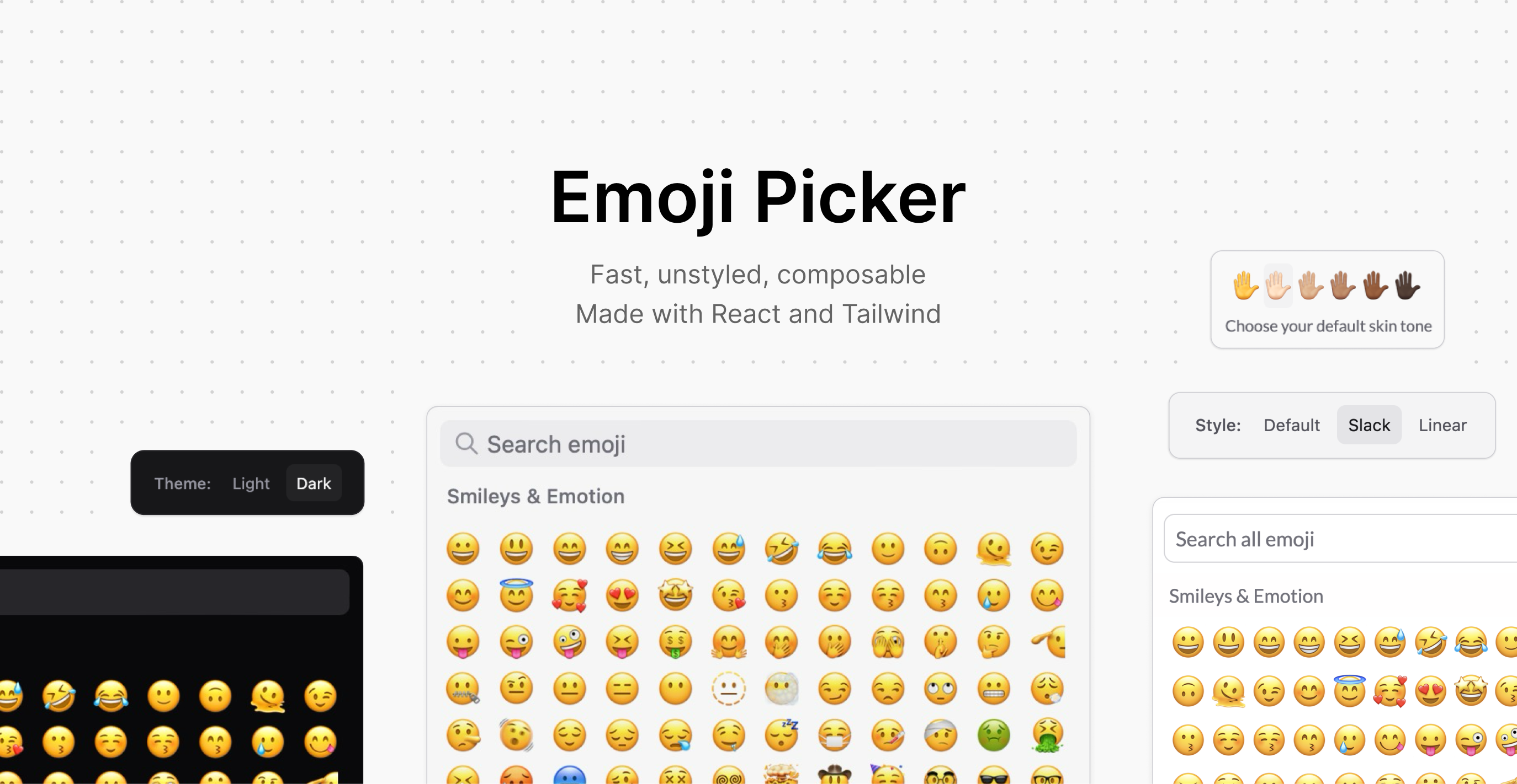
To use this component your project must be using React and Tailwind.
To install the component:
bun add @ferrucc-io/emoji-picker
# or
yarn add @ferrucc-io/emoji-picker
# or
npm i @ferrucc-io/emoji-picker
# or
pnpm add @ferrucc-io/emoji-picker
Then in your project you can use the component like this:
<EmojiPicker onEmojiSelect={handleEmojiSelect}>
  <EmojiPicker.Header>
    <EmojiPicker.Input placeholder="Search emoji" />
  </EmojiPicker.Header>
  <EmojiPicker.Group>
    <EmojiPicker.List />
  </EmojiPicker.Group>
</EmojiPicker>
Finally, import the component styles in your Tailwind configuration:
// If you're using Tailwind v4.x
// In your CSS file containing your tailwind configuration
// Add this line:
@source "../node_modules/@ferrucc-io/emoji-picker";

// If you're using Tailwind v3.x
// In your tailwind.config.ts
"content": [
  // Keep the existing content array
  // Add this line:
  "./node_modules/@ferrucc-io/emoji-picker/dist/**/*.{js,jsx,ts,tsx}",
],- 🎨 Unstyled & Composable: Built with Tailwind CSS. Every component is minimally styled by default and fully customizable.
- ⚡️ Fast & Lightweight: Virtualized list for smooth scrolling. Only renders emojis in view.
- 🎯 Accessible: Full keyboard navigation support. ARIA labels and proper semantic markup.
- 🌈 Dominant Color Hover: Built-in dominant color hover for supported emojis.
<EmojiPicker onEmojiSelect={handleEmojiSelect}>
  <EmojiPicker.Header>
    <EmojiPicker.Input placeholder="Search emoji" />
  </EmojiPicker.Header>
  <EmojiPicker.Group>
    <EmojiPicker.List />
  </EmojiPicker.Group>
</EmojiPicker>The base component accepts several props for customization:
interface EmojiPickerProps {
  emojisPerRow?: number;      // Number of emojis per row
  emojiSize?: number;         // Size of each emoji in pixels
  containerHeight?: number;    // Height of the emoji container
  maxUnicodeVersion?: number; // Maximum Unicode version to include in the list of emojis (we default to 15.0)
  onEmojiSelect?: (emoji: string) => void; // Callback when emoji is selected
}The main idea behind the component is to be able to support as many different styles as possible. The first version we made supports building a picker that looks like the ones in Slack and Linear.
In the future it would be great to support more styles like the ones in Discord, Whatsapp, Notion etc.
<EmojiPicker
  className="border border-zinc-200 dark:border-zinc-800 rounded-lg"
  emojisPerRow={12}
  emojiSize={28}
  onEmojiSelect={onEmojiSelect}
>
  <EmojiPicker.Header className="p-2 pb-0">
    <EmojiPicker.Input
      placeholder="Search emoji"
      autoFocus={true}
      className="focus:ring-2 focus:ring-inset ring-1 ring-transparent"
    />
  </EmojiPicker.Header>
  <EmojiPicker.Group>
    <EmojiPicker.List hideStickyHeader={true} containerHeight={400} />
  </EmojiPicker.Group>
</EmojiPicker><EmojiPicker
className="font-['Lato'] w-[380px] border-none"
emojisPerRow={9}
emojiSize={36}
>
<EmojiPicker.Header>
<EmojiPicker.Input
placeholder="Search all emoji"
className="h-[36px] bg-white dark:bg-zinc-800 border border-zinc-300 dark:border-zinc-600 w-full rounded-[8px] text-[15px] focus:shadow-[0_0_0_1px_#1d9bd1,0_0_0_6px_rgba(29,155,209,0.3)] dark:focus:shadow-[0_0_0_1px_#1d9bd1,0_0_0_6px_rgba(29,155,209,0.3)] focus:border-transparent focus:outline-none mb-1"
hideIcon
/>
</EmojiPicker.Header>
<EmojiPicker.Group>
<EmojiPicker.List containerHeight={320} />
</EmojiPicker.Group>
<EmojiPicker.Preview>
{({ previewedEmoji }) => (
<>
{previewedEmoji ?
<EmojiPicker.Content />
:
<button>Add Emoji</button>
}
<EmojiPicker.SkinTone />
</>
)}
</EmojiPicker.Preview>
</EmojiPicker>This project is currently used by:
- June - An analytics product for B2B SaaS
- Typefully - The writing app for X, LinkedIn, Threads and more
Feel free to open a PR to add your name here if you're using the component in your project.
This project was created using bun init in bun v1.2.0. Bun is a fast all-in-one JavaScript runtime.
This project is structured as a monorepo with two main parts:
packages/emoji-picker: The main package containing the emoji picker componentdemo: A demo application showcasing different uses of the component
To get started with development:
# Install dependencies for all packages
bun install

# Run the development server
bun devTo update the emoji hover colors:
cd packages/emoji-picker
bun run build:emoji-colors
This will generate a new emojiColors.ts file in the package's src/utils directory.
# Run tests for the emoji picker package
cd packages/emoji-picker
bun test
Contributions are welcome! Please feel free to submit a PR.


