FlexiSheet is a powerful, reusable table component for React applications. It supports features like editable cells, row/column disabling, Zod-based validation, grouping rows by headers, and configurable footers.
- Editable Cells: Supports real-time editing with validation.
- Zod Validation: Per-column validation using Zod schemas.
- Row/Column Disabling: Disable specific rows or columns.
- Grouping Rows: Group data using a
headerKeyfield. - Footer Support: Add totals rows and custom footer elements.
Link: https://flexisheet.vercel.app/
Ensure you have the following installed in your project:
-
Zod for validation:
bun install zod
-
TanStack Table for table functionality:
bun install @tanstack/react-table
-
ShadCN/UI for UI components:
bunx --bun shadcn@latest add table
-
Tailwind CSS for styling:
bun install tailwindcss postcss autoprefixer
👀 NOTE: The id field is required for each row. It should be unique for each row.
const initialData = [
  { id: 1, materialName: "Material A", cft: 0.1, rate: 100, amount: 10 },
  { id: 2, materialName: "Material B", cft: 0.2, rate: 200, amount: 40 },
];import { z } from "zod";
const materialNameSchema = z.string().min(1, "Required");
const cftSchema = z.number().nonnegative().optional();
const rateSchema = z.number().min(0, "Must be >= 0");
const amountSchema = z.number().min(0, "Must be >= 0");
const columns = [
{ accessorKey: "materialName", header: "Material Name", validationSchema: materialNameSchema },
{ accessorKey: "cft", header: "CFT", validationSchema: cftSchema },
{ accessorKey: "rate", header: "Rate", validationSchema: rateSchema },
{ accessorKey: "amount", header: "Amount", validationSchema: amountSchema },
];import React, { useState } from "react";
import SheetTable from "./components/sheet-table";
const App = () => {
const [data, setData] = useState(initialData);
/**
* onEdit callback: updates local state if the new value is valid. (Normal usage)
*/
const handleEdit = <K extends keyof RowData>(
rowId: string, // Unique identifier for the row
columnId: K, // Column key
value: RowData[K], // New value for the cell
) => {
setData((prevData) =>
prevData.map(
(row) =>
String(row.id) === rowId
? { ...row, [columnId]: value } // Update the row if the ID matches
: row, // Otherwise, return the row unchanged
),
);
console.log(
`State updated [row id=${rowId}, column=${columnId}, value=${value}]`,
value,
);
};
return (
<SheetTable
columns={columns}
data={data}
onEdit={handleEdit}
disabledColumns={["amount"]} // Example: Disable editing for "amount" col
showHeader={true}
/>
);
};
export default App;const groupedData = [
{
id: 1,
headerKey: "Group A",
materialName: "Material A",
cft: 0.1,
rate: 100,
amount: 10,
},
{
id: 2,
headerKey: "Group A",
materialName: "Material B",
cft: 0.2,
rate: 200,
amount: 40,
},
{
id: 3,
headerKey: "Group B",
materialName: "Material C",
cft: 0.3,
rate: 300,
amount: 90,
},
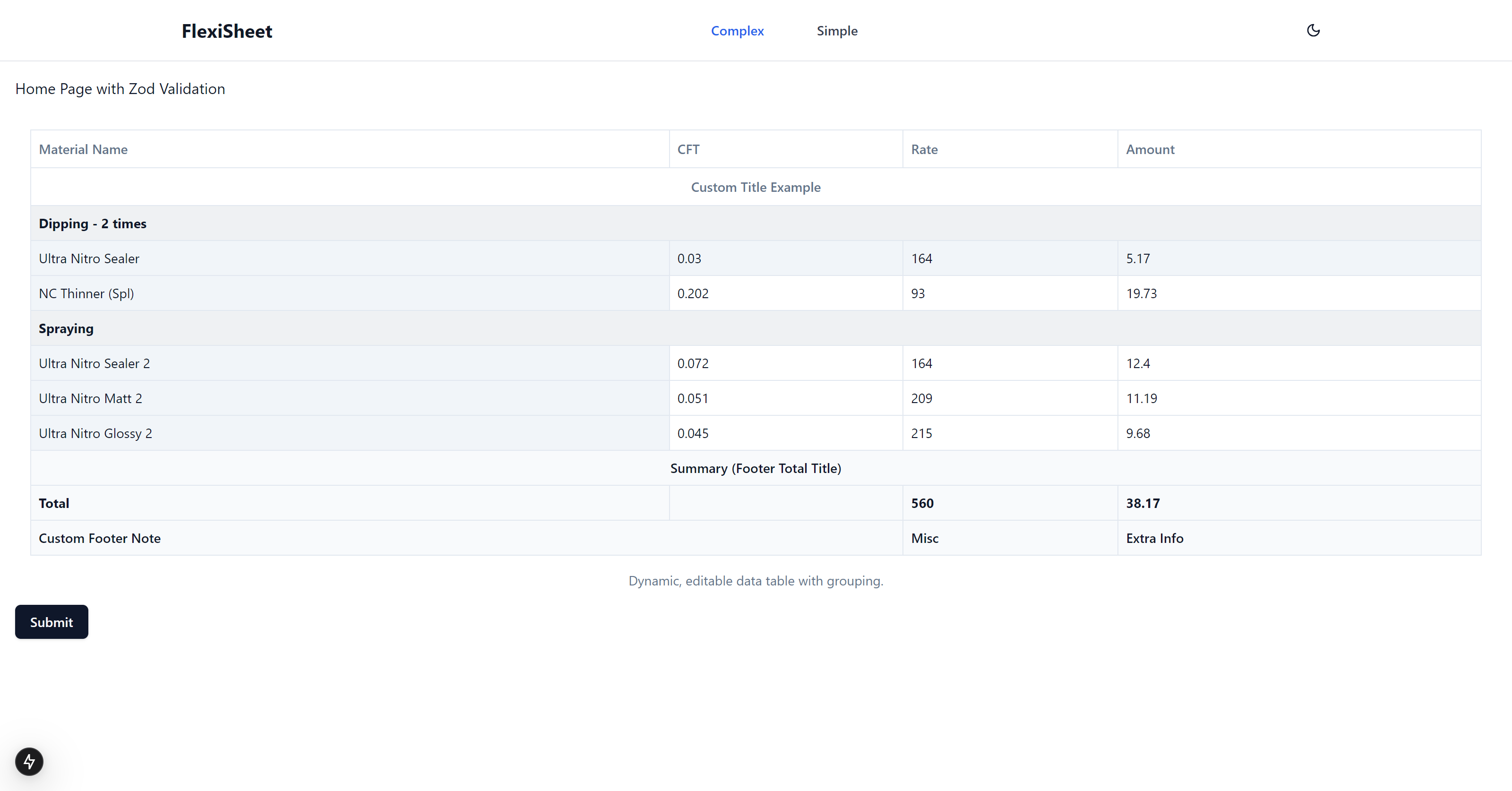
];<SheetTable
columns={columns}
data={groupedData}
disabledColumns={["materialName"]}
disabledRows={{
"Dipping - 2 times": [0], // Disable the second row in this group
Spraying: [1], // Disable the first row in this group
}}
/><SheetTable
columns={columns}
data={data}
totalRowValues={{ cft: 0.6, rate: 600, amount: 140 }}
totalRowLabel="Total"
totalRowTitle="Summary"
footerElement={<div>Custom Footer Content</div>}
/>You can disable specific rows and columns by using the disabledColumns and disabledRows props in the SheetTable component.
-
Disable Columns:
<SheetTable
  disabledColumns={["amount", "rate"]} // Disable editing for "amount" and "rate" columns
/>
-
Disable Rows(normal):
<SheetTable
  disabledRows={[0, 1]} // Disable the 1st & 2nd row
/>
-
Disable Rows(group):
<SheetTable
  disabledRows={{
    "Group A": [0], // Disable the first row in Group A
    "Group B": [1], // Disable the second row in Group B
  }}
/>
Yes, you can use Zod schemas to define validation rules for each column using the validationSchema property.
Example:
const rateSchema = z.number().min(0, "Rate must be greater than or equal to 0");
const columns = [
  {
    accessorKey: "rate",
    header: "Rate",
    validationSchema: rateSchema,
  },
];If validation fails while editing a cell, the cell will:
- Display an error class (e.g.,
bg-destructive/25by default). - Not trigger the
onEditcallback until the value is valid.
To group rows, provide a headerKey field in your data and the SheetTable will automatically group rows based on this key.
Example:
const groupedData = [
  { headerKey: "Group A", materialName: "Material A", cft: 0.1 },
  { headerKey: "Group B", materialName: "Material B", cft: 0.2 },
];Yes, you can enable column resizing by setting enableColumnSizing to true and providing column size properties (size, minSize, and maxSize) in the column definitions.
Example:
const columns = [
  {
    accessorKey: "materialName",
    header: "Material Name",
    size: 200,
    minSize: 100,
    maxSize: 300,
  },
];
<SheetTable columns={columns} enableColumnSizing={true} />;Use the totalRowValues, totalRowLabel, and footerElement props to define footer content.
Example:
<SheetTable
  totalRowValues={{ cft: 0.6, rate: 600, amount: 140 }}
  totalRowLabel="Total"
  footerElement={<div>Custom Footer Content</div>}
/>Yes, but for optimal performance:
- Use memoization for
columnsanddatato prevent unnecessary re-renders. - Consider integrating virtualization (e.g.,
react-window) for very large datasets.
Yes, you can control column visibility using the tableOptions.initialState.columnVisibility configuration.
Example:
<SheetTable
  tableOptions={{
    initialState: { columnVisibility: { amount: false } }, // Hide "amount" column
  }}
/>FlexiSheet supports common keyboard actions like copy (Ctrl+C), paste (Ctrl+V), and undo (Ctrl+Z). You don’t need to configure anything to enable these actions.
Use Zod's array schema to validate the entire dataset on form submission.
Example:
const handleSubmit = () => {
  const tableSchema = z.array(rowDataZodSchema);
  const result = tableSchema.safeParse(data);
  if (!result.success) {
    console.error("Invalid data:", result.error.issues);
  } else {
    console.log("Valid data:", data);
  }
};Sub-rows are supported using a subRows field within each row object. The subRows field is an array of child rows, where each child row can have its own data and even further sub-rows (nested structure).
Example Sub-row Data Structure:
const dataWithSubRows = [
  {
    id: 1,
    materialName: "Material A",
    cft: 0.1,
    rate: 100,
    amount: 10,
    subRows: [
      {
        id: 1.1,
        materialName: "Sub-Material A1",
        cft: 0.05,
        rate: 50,
        amount: 5,
      },
      {
        id: 1.2,
        materialName: "Sub-Material A2",
        cft: 0.05,
        rate: 50,
        amount: 5,
      },
    ],
  },
  {
    id: 2,
    materialName: "Material B",
    cft: 0.2,
    rate: 200,
    amount: 40,
  },
];
How to Handle Sub-row Editing:
To handle editing for sub-rows, ensure that your onEdit callback can traverse the subRows array and update the appropriate row.
Example:
function updateNestedRow<K extends keyof RowData>(
  rows: RowData[],
  rowId: string,
  colKey: K,
  newValue: RowData[K],
): RowData[] {
  return rows.map((row) => {
    if (row.id === rowId) {
      return { ...row, [colKey]: newValue };
    }
    if (row.subRows && row.subRows.length > 0) {
      return {
        ...row,
        subRows: updateNestedRow(row.subRows, rowId, colKey, newValue),
      };
    }
    return row;
  });
}

export default function HomePage() {
  const [data, setData] = useState<RowData[]>(initialData);

  const handleEdit = <K extends keyof RowData>(
    rowId: string,
    columnId: K,
    value: RowData[K],
  ) => {
    setData((prevData) => {
      const newRows = updateNestedRow(prevData, rowId, columnId, value);
      return newRows;
    });
  };
}-
Clone the repository:
git clone https://github.com/jacksonkasi1/FlexiSheet.git
-
Install dependencies:
bun install
-
Run the development server:
bun dev
This project is licensed under the MIT License. See the LICENSE file for details.