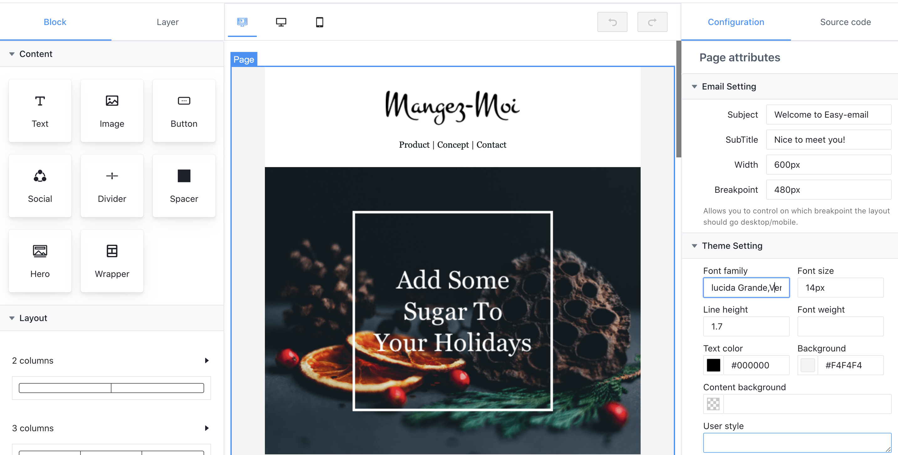
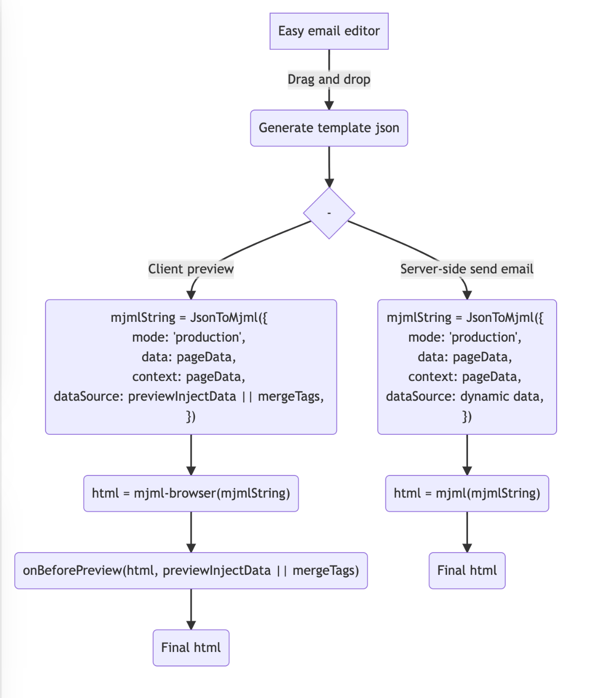
Easy email is developed based on the MJML and has very good compatibility. At the same time, it can generate code through drag-and-drop editing.
- Drag and drop editor
- Can be converted into
MJML, or generated throughMJML - Defined custom block
- Dynamic rendering
- Easily customize UI when you need
- Theme configuration
| Video Overview |
|---|
 |
| Watch video overview:https://www.bilibili.com/video/BV1YQ4y167bb |
Check out the live demo here: http://easy-email-m-ryan.vercel.app
$ npm install --save easy-email-core easy-email-editor easy-email-extensions react-final-formor
$ yarn add easy-email-core easy-email-editor easy-email-extensions react-final-formimport React from 'react';
import { BlockManager, BasicType, AdvancedType } from 'easy-email-core';
import { EmailEditor, EmailEditorProvider } from 'easy-email-editor';
import { ExtensionProps, StandardLayout } from 'easy-email-extensions';
import { useWindowSize } from 'react-use';
import 'easy-email-editor/lib/style.css';
import 'easy-email-extensions/lib/style.css';
// theme, If you need to change the theme, you can make a duplicate in https://arco.design/themes/design/1799/setting/base/Color
import '@arco-themes/react-easy-email-theme/css/arco.css';
const categories: ExtensionProps['categories'] = [
{
label: 'Content',
active: true,
blocks: [
{
type: AdvancedType.TEXT,
},
{
type: AdvancedType.IMAGE,
payload: { attributes: { padding: '0px 0px 0px 0px' } },
},
{
type: AdvancedType.BUTTON,
},
{
type: AdvancedType.SOCIAL,
},
{
type: AdvancedType.DIVIDER,
},
{
type: AdvancedType.SPACER,
},
{
type: AdvancedType.HERO,
},
{
type: AdvancedType.WRAPPER,
},
],
},
{
label: 'Layout',
active: true,
displayType: 'column',
blocks: [
{
title: '2 columns',
payload: [
['50%', '50%'],
['33%', '67%'],
['67%', '33%'],
['25%', '75%'],
['75%', '25%'],
],
},
{
title: '3 columns',
payload: [
['33.33%', '33.33%', '33.33%'],
['25%', '25%', '50%'],
['50%', '25%', '25%'],
],
},
{
title: '4 columns',
payload: [[['25%', '25%', '25%', '25%']]],
},
],
},
];
const initialValues = {
subject: 'Welcome to Easy-email',
subTitle: 'Nice to meet you!',
content: BlockManager.getBlockByType(BasicType.PAGE)!.create({}),
};
export default function App() {
const { width } = useWindowSize();
const smallScene = width < 1400;
return (
<EmailEditorProvider
data={initialValues}
height={'calc(100vh - 72px)'}
autoComplete
dashed={false}
>
{({ values }) => {
return (
<StandardLayout
compact={!smallScene}
categories={categories}
showSourceCode={true}
>
<EmailEditor />
</StandardLayout>
);
}}
</EmailEditorProvider>
);
}
Please see https://github.com/m-Ryan/easy-email-demo
| property | Type | Description |
|---|---|---|
| height | string / number | Set the height of the container |
| data | interface IEmailTemplate { content: IPage; subject: string; subTitle: string; } | Source data |
| children | ( props: FormState,helper: FormApi<IEmailTemplate, Partial>) => React.ReactNode | ReactNode |
| onSubmit | Config<IEmailTemplate, Partial>['onSubmit']; | Called when the commit is triggered manually |
| fontList | { value: string; label: string; }[]; | Default font list. |
| interactiveStyle | { hoverColor?: string; selectedColor?: string;} | Interactive prompt color |
| onUploadImage | (data: Blob) => Promise; | Triggered when an image is pasted or uploaded |
| onAddCollection | (payload: CollectedBlock) => void; | Add to collection list |
| onRemoveCollection | (payload: { id: string; }) => void; | Remove from collection list |
| dashed | boolean | Show dashed |
| autoComplete | boolean | Automatically complete missing blocks. For example, Text => Section, will generate Text=>Column=>Section |
| mergeTags | Object | A merge tag is a bit of specific code that allows you to insert dynamic data into emails. Like {{user.name}}, and used for preview |
| previewInjectData | Object | Dynamic data for preview, it will overwrite mergeTags. |
| onBeforePreview | (html: string, mergeTags: PropsProviderProps['mergeTags']) => string | Promise You can replace mergeTags when previewing. |
| hotkey | Description |
|---|---|
| mod+z | undo |
| mod+y | redo |
| delete/backspace | delete block |
| tab / shift + tab | fast select block, if block is focusing,tab select next block & shift + tab select prev block |
- I18n support
- Awesome responsive, support mobile and desktop display different styles (without any compatibility issues)
- Replace shadow dom with iframe, support firefox/safari browsers.
- Improve documentation and add more usage examples
If you like this project, please consider donating.
$ git clone [email protected]:arco-design/easy-email.git
$ cd easy-email
$ yarn install-all
$ yarn dev
The MIT License


.svg)


