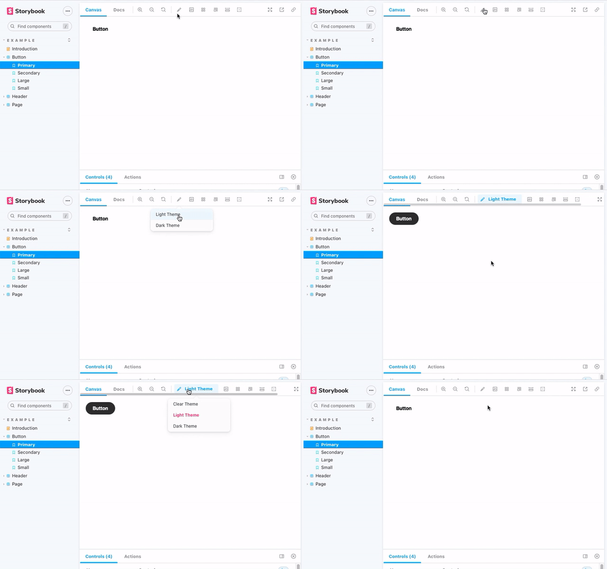
Storybook CSS Variables Theme can be used to switch out CSS files in Storybook.
npm install @etchteam/storybook-addon-css-variables-theme --save-devCreate a file called main.js in your storybook config.
Add the following content to it:
module.exports = {
  addons: ['@etchteam/storybook-addon-css-variables-theme'],
};
Next, create a file called preview.js in your storybook config.
You will need to import your style files with some some inline loader options. Specifically you will need to call style-loader with ?injectType=lazyStyleTag to it doesn't run the CSS immediately. After than you can chain your preferred CSS/SCSS/Less/etc loaders.
import light from '!!style-loader?injectType=lazyStyleTag!css-loader!../src/scss/light.css'
import dark from '!!style-loader?injectType=lazyStyleTag!css-loader!../src/scss/dark.css'
Import the decorator from the CSS Variables Theme addon
import cssVariablesTheme from '@etchteam/storybook-addon-css-variables-theme'

export const decorators = [
  cssVariablesTheme,
];
Then pass the CSS files to the addon via the exported parameters.
export const parameters = {
  cssVariables: {
    files: {
      light,
      dark,
    }
  }
}
Made with ☕ at Etch
