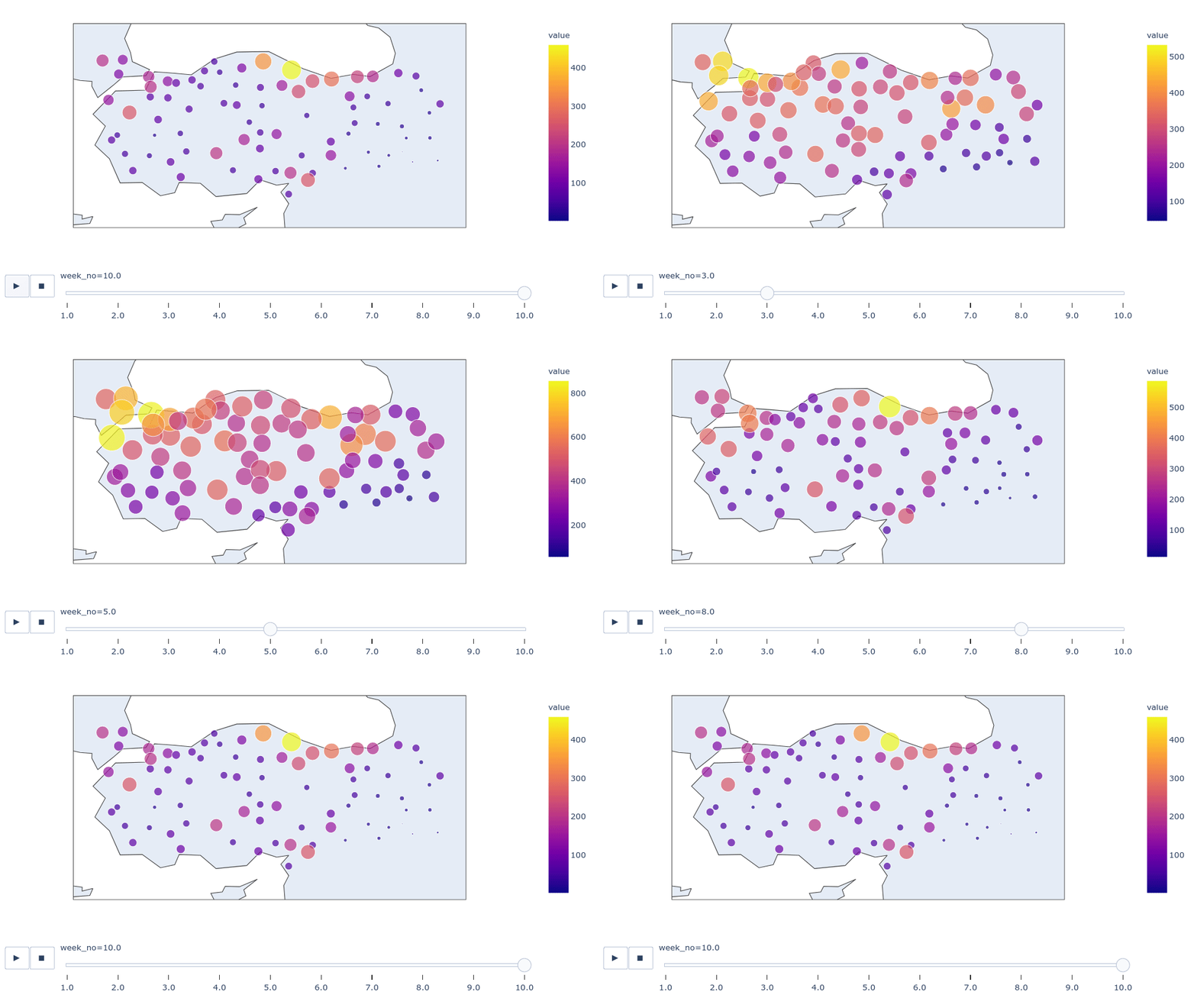
This repository created for a data visualization project that given in scope of MIS376 Knowledge Mapping and Data Visualization Course.
This project intended to investigate the effects of lockdown periods on daily new cases specifically in Turkey. There are several lockdown periods include weekends and some complete, long-period (longer than one week) lockdowns. That project aims to visualize the effects of these variables on covid statistics and demonstrate the strength of the relationship if exists.
In this project, there are three data sources.
The first data is from ourworldindata.org, which is names owid-covid-data.csv and it contains various covid related columns for every country across the globe. It can be downloaded as CSV with few clicks so there is not much effort to get that data. We use some of the columns from the data and we only use rows that are related to Turkey. In our case, we use 'new_cases' column.
Second data 'df_cities_risk_weekly.csv' is not available on the internet and we collect it from web news with web scraping techniques. The reason why it is now available can be the weekly publishing mechanism of the government sources on each separates date and therefore there is not a collection of all week together. Our data_scraping_weekly_risk_rate.ipynb notebook was created for that purpose and at the end, it export 'df_cities_risk_weekly.csv' as a complete collection of weeks. It contains 10-week data of city risk map from 16 march to 23 May 2021.
The lockdown started at week 6.
