


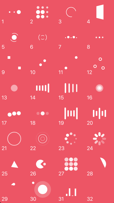
this is a small library to show loading and indicator in UIButton, with fully customizable styles. there are 6 different styles, you can set the colors from interface builder or programmatically.
- animation style : like appstore download button
- animation style : 4 phases Animation(normal, loading, success, error)
- animation style : like telegram sharing
- animation style : like android
- animation style : downloading
- Carthage Support

loady minimum target requirement is iOS 10.0
just add this line into your podfile
pod 'loady'or for manual installation simply copy the Source Code into your project, take a look at the example project for more info

       // sets animation type
        self.allInOneview?.animationType = LoadingType.all.rawValue

        // sets the color that fills the button after percent value changed
        self.allInOneview?.backgroundFillColor = .purple

        // sets the indicator color above the button
        self.allInOneview?.loadingColor = .yellow

        // sets the indictore view color (dark or light) inside the button
        self.allInOneview?.indicatorViewStyle = .light

        // some animations have image inside (e.g appstore pause image), this line sets that image
        self.allInOneview?.pauseImage = UIImage(named: "pause.png")

        // starts loading animation
        self.allInOneview?.startLoading()

        // some animations have filling background, or change the circle stroke, this sets the filling percent, number is something between 0 to 100
        self.allInOneview?.fillTheButton(with: 10)

        // some animations have circular loading , this sets the percents of circle that are completed, number is something between 0 to 100
self.allInOneview?.fillTheCircleStrokeLoadingWith(percent: 25) // setup colors, titles and images
self.fourPhases?.loadingColor = UIColor(red:0.38, green:0.66, blue:0.09, alpha:1.0)
self.fourPhases?.fourPhases = (
// normal phase
LoadyAnimationOptions.FourPhase.Phases.normal(title: "Lock", image: UIImage(named: "unlocked"), background: UIColor(red:0.00, green:0.49, blue:0.90, alpha:1.0)),
// loading phase
LoadyAnimationOptions.FourPhase.Phases.loading(title: "Waiting...", image: UIImage(named: ""), background: UIColor(red:0.17, green:0.24, blue:0.31, alpha:1.0)),
// success phase
LoadyAnimationOptions.FourPhase.Phases.success(title: "Activated", image: UIImage(named: "locked"), background: UIColor(red:0.15, green:0.68, blue:0.38, alpha:1.0)),
// error phase
LoadyAnimationOptions.FourPhase.Phases.error(title: "Error", image: UIImage(named: "unlocked"), background: UIColor(red:0.64, green:0.00, blue:0.15, alpha:1.0))
)
// then later in your code after user click on the button just call, this line take the button to loading phase,
self.fourPhases?.startLoading()
// in loading phase three different stage is available, you can cancel the loading by calling
self.fourPhases?.normalPhase()
// you can take the button to success phase by calling
self.fourPhases?.successPhase()
// you can take the button to error phase by calling
self.fourPhases?.errorPhase()
| Loading To Normal | Loading To Success | Loading To Error |
|---|---|---|

|

|

|
// setup download button details
        self.downloading?.animationsOptions.downloading = LoadyAnimationOptions.Downloading.init(
            downloadingLabel: (title: "Copying Data...", font: UIFont.boldSystemFont(ofSize: 18), textColor : UIColor(red:0, green:0.71, blue:0.8, alpha:1)),
            percentageLabel: (font: UIFont.boldSystemFont(ofSize: 14), textColor : UIColor(red:0, green:0.71, blue:0.8, alpha:1)),
            downloadedLabel: (title: "Completed.", font: UIFont.boldSystemFont(ofSize: 20), textColor : UIColor(red:0, green:0.71, blue:0.8, alpha:1))
        )
| Set class | change attributes |
|---|---|
 |
 |
BONUS - NVActivityIndicatorView
if you are a fan of NVActivityIndicatorView, its very easy to integrate it with loady, you can replace our default iOS indicatorView with NVActivityIndicatorView <3 now we have a new property which accepts LoadyActivityIndicator Protocol, just set it with your favorite activity indicator view like below
// first conform to the LoadyActivityIndicator protocol like this
extension NVActivityIndicatorView : LoadyActivityIndicator {

}

// then replace loady default activity indicator with yours
let nv = NVActivityIndicatorView(frame: .zero)
nv.type = .circleStrokeSpin
nv.color = .red
nv.padding = 12
self.loadyButton?.activiyIndicator = nv


- Unable to find a specification for
loady
if you get some error like this with cocoapod, just update your pod with this commands in your terminal
    > [!] Unable to find a specification for `loady`

    $ pod repo update
    $ pod install