A set of explainability and interpretability tools for Convolutional Neural Networks.
Diamond Cutter gives the researcher an insider's look on hidden layers of CNNs.
It does so by visualizing, mapping and giving context to layer activation data,
in different activation layouts (channel, spatial, neuron groups) & UI layouts (visualizations, maps, plots).
Most of these tools were created by OpenAI researchers (see Acknowledgments),
the project's purpose is to apply those tools & research on "real world" problems.
It unifies existing tools, generalizes them to support all CNN models (FUTURE),
and implements their use for CNN investigation (focused on Transfer Learning).
* Support all state-of-the-art CNN models & generate visualizations for them
* Feature analysis of any CNN model (more generalization, generate visualizations in real time)
* Where to “cut” networks for Transfer Learning – what layers should stay “frozen” and should we remove some the last layers completely?
Future thoughts – general:
* Ethical interpretability – show feature extraction flow by layer advancement (similar to ATTRIBUTION BY FACTORIZED GROUPS in 2018 article)
* Digital art – generate visualizations from a mix of different neurons
* Integrating natural language to describe visualization content to make visualizations more clear.
Future thoughts – specific tools:
* Find dataset examples that share high activation values in the same spatial position.
* Feature OpenAI’s visualization diversity feature, to clear up visualization meanings.
* Feature OpenAI’s visualization neuron groups feature.
Notes:
* This tool is not yet completed, view it’s progress at the bottom of the page.
* Project's code is a mesh of code from multiple projects.
* There's a pending problem with the clarity of visualizations generated from advanced layers in large models, inception v4 for instance.
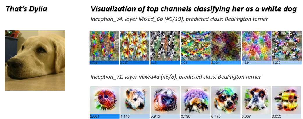
Channel Attribution – shows visualizations of the top activated channels for specific image/s.
This tool allows a better understanding of what patterns & textures the model focuses on when classifying your data.

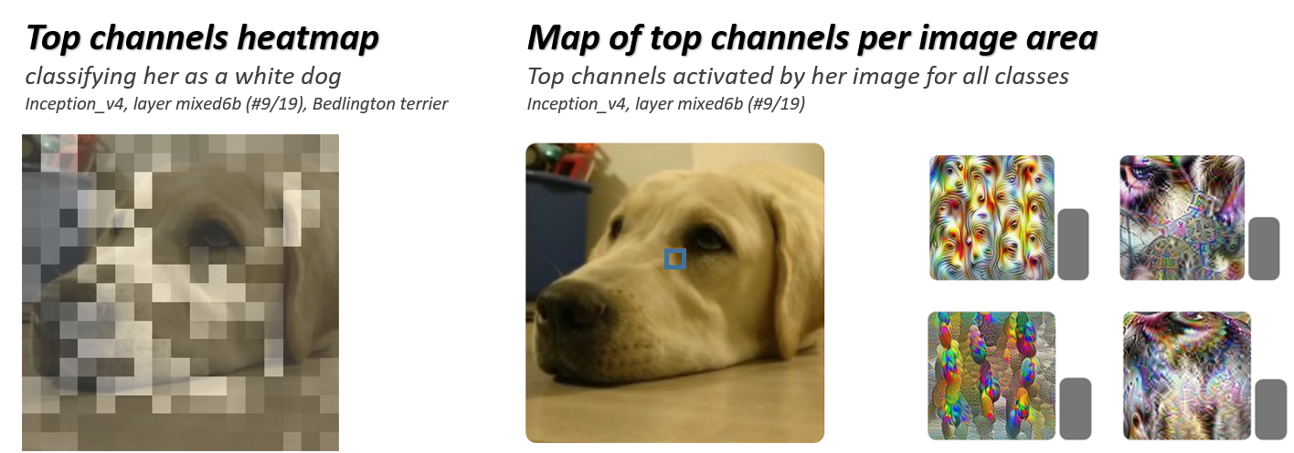
Attribution Map, Heatmap – splits an image to spatial cells and shows top activated channels for each cell.
This tool allows a better understanding of what area of the image the model focuses on when classifying data.

Diamond Cutter is based on the following tools & research:
Lucid Framework https://github.com/tensorflow/lucid
Feature Visualization https://distill.pub/2017/feature-visualization/
The Building Blocks of Interpretability https://distill.pub/2018/building-blocks/
Related work, not included in this project:
Zoom In: An Introduction to Circuits https://distill.pub/2020/circuits/zoom-in/
Exploring Neural Networks with Activation Atlases https://distill.pub/2019/activation-atlas/
1. View a visualization (so cool!) of top activated channels in CNN models for transfer learning with your data.
This way you're able to examine if your data activates channels with relevant patterns.
Note: work in progress, includes only channels visualizations from original models, modified networks will be added.
Available models: inception_v1, inception_v4.
- List 1 or more image urls
- Choose a combination of a model and its specific layer
- Choose a class for prediction
- The tool sums and sorts top activations used for prediction
- Visualization of top channel activations will be presented
- If the layer is in the “frozen” part of the transferred model, visualizations were already generated
- If the selected layer is a new convolution layer, visualizations will be generated.
Making sure the model (& layer) focuses on a correct object & pattern, in the right area.
2. View a visualization of the top activated channels, attributed to spatial location in image
This way you can examine if the channel focuses on relevant areas in the image, and by the right patterns.
Negative example: focusing on a reflection coming from a product's label instead of label's content.
Note: work in progress, includes only channel visualizations from original models, modified networks will be added.
Available models: inception_v1, inception_v4.
- Choose an image as your input
- Choose a combination of a model and its specific layer
- Choose a class for prediction
- The tool splits the input image into cells, hover above each cell to see its top channel activations
- If the layer is in the “frozen” part of the transferred model, visualizations were already generated
- If the selected layer is a new convolution layer, visualizations will be generated.
3. View a heatmap of channel activations for your specified class.
This way you can examine if the model focuses on the correct area of your image for classification.
Negative example: focusing on dog food when predicting "dog".
Model Inventory
- Test all prepared models from lucid’s inventory
- model list: ✔️ InceptionV1, InceptionV2, InceptionV3, ✔️ InceptionV4, 🚧 NasnetLarge, NasnetMobile, PnasnetLarge, PnasnetMobile, VGG16, 🚧 VGG19, ResnetV1_50, ResnetV1_101, ResnetV1_152, InceptionResnetV2, MobilenetV1_025, MobilenetV1_050, AlexNet
- if model doesn’t exist, convert model to modelzoo format & import to project
- For each model, map the following artifacts: output layer name, output layer size, pre-output layer name, desired image shape, layer names coupled with square root of layer size (for “spritemap”), layer list - sorted by position in network (ascending)
Visualizations - General
- ✔️ Generalize channel visualization generation flow for all “frozen” models (original tool includes visualization only for Inception V4)
- ✔️ Build a “spritemap” assembly script – the visualization tools extract layer’s channel visualizations from a large image that maps all of them, ordered by channel index
- Generate visualizations for each layer of each model.
This takes a lot of time in Google colab terms.
Inception V1 was a small network compared to Inception V4 and Nasnet Large for example (more layers per model, more channels per layer).
- Channel visualizations are made by a process similar to adversarial networks, to prevent reaching to an adversarial “level”, various regularization techniques are used. Original regularization parameters worked well on Inception V1, for more models further parameter optimization is needed, visualizations look vague.
- Build channel visualization generation flow for new layers that are attached to the original “frozen” model layers
Model Training
- Add a general flow for attaching a new output / convolution layer to a certain layer for a certain model
- Build a comparison flow between for transferred model prediction values
- Allow persistency, saving new trained models & results to the user’s google drive
User Interface
- ✔️ Add simple way for the user to view all available models
- ✔️ Add simple way for the user to view all layers in model
- ✔️ Notify user about expected image size for each model
- Add simple way for the user to attach new output / convolution layers to a “frozen” model, “cutting at a certain layer
- Add a plot comparing model prediction rates
- Add simple way for the user to upload data / download from external source
- Add a simple way for the user to map it’s google drive to the notebook for persistency
Channel Visualizations
- ✔️ Generalize tool’s flow for compatibility to all models
- ✔️ Original tool compares 2 classes as positive & negative: build an option for only 1 class (without negative class)
- ✔️ Build an option to include multiple images, and get their overall top activated channels
- Build an option for an automatic pick for the channels of the class with the highest prediction value (positive class)
- Build an option for an automatic pick for the channels of the class with the second-highest prediction value (negative class)
- Generate all visualizations for prepared models (across all layers and channels)
- Add an option to use Channel Attribution visualization flow for a new layers added to transferred model
Attribution – Semantic Map, Heatmap
- Combine Semantic Map & Heatmap to a single tool
- ✔️ Generalize Semantic Map & Heatmap visualization flows for all models
- ✔️ Heatmap: original tool presents heatmaps of 2 classes as positive & negative (orange, blue)
- Add an option for only 1 class (without a negative class)
- Add an option for an automatic pick for the channels of the class with the highest prediction value (positive class)
- Add an option for an automatic pick for the channels of the class with the second-highest prediction value (negative class)
- Add an option to use Semantic Map & Heatmap for a new output / convolutional layers added to “frozen” models
- Semantic Map: Build an option to present top channel activations for a specific class
- Build an option for an automatic pick for the channels of the class with the highest prediction value

