This home test tries to simulate a site selection dashboard created with CARTO's Builder tool. You want to explore the Madrid area, trying to find good spots to locate your new restaurant. You will look at density of eating places from a POI ("Points Of Interest") dataset, rental prices from a Real Estate dataset, demographics and closeness to metro lines and stations.
Your final delivery will be the dashboard itself and a blog post where you will explain the use case behind the dashboard and the methodology you used to locate one (or several) good spots to open a new restaurant.
We will run you through a script that will help you build such dashboard. The script is not comprehensive in certain sections. That is on purpose. Please refer to CARTO's Help Center should you need additional guidance, or reach out to us.
The script is just a guide, feel free to make your own adjustments.
The first step is to import the required datasets into your CARTO account. Please, create trial account https://carto.com/signup as part of the hiring process.
There are 5 datasets you need to import:
cartodb_id: Row identifier (ignore)the_geom: Row geometry (ignore)name: Region identifier (ignore)pop_20to24: Total population in the region from 20 to 24 years oldpop_25to29: : Total population in the region from 25 to 29 years oldpop_20to24_percent: % population in the region from 20 to 24 years oldtotal_pop: Total population in the regiontotal_pop_density: : Total population in the region, normalized by the area
cartodb_id: Row identifier (ignore)the_geom: Row geometry (ignore)name: Name of the metro line
cartodb_id: Row identifier (ignore)the_geom: Row geometry (ignore)name: Name of the metro stationline: Name of the metro line
cartodb_id: Row identifier (ignore)the_geom: Row geometry (ignore)amenity: Type of POIname: Name of POI
cartodb_id: Row identifier (ignore)the_geom: Row geometry (ignore)name: Region namemonth_rental: Average monthly rent in the regionsqm_rental: Average monthly rent per square meter in the region
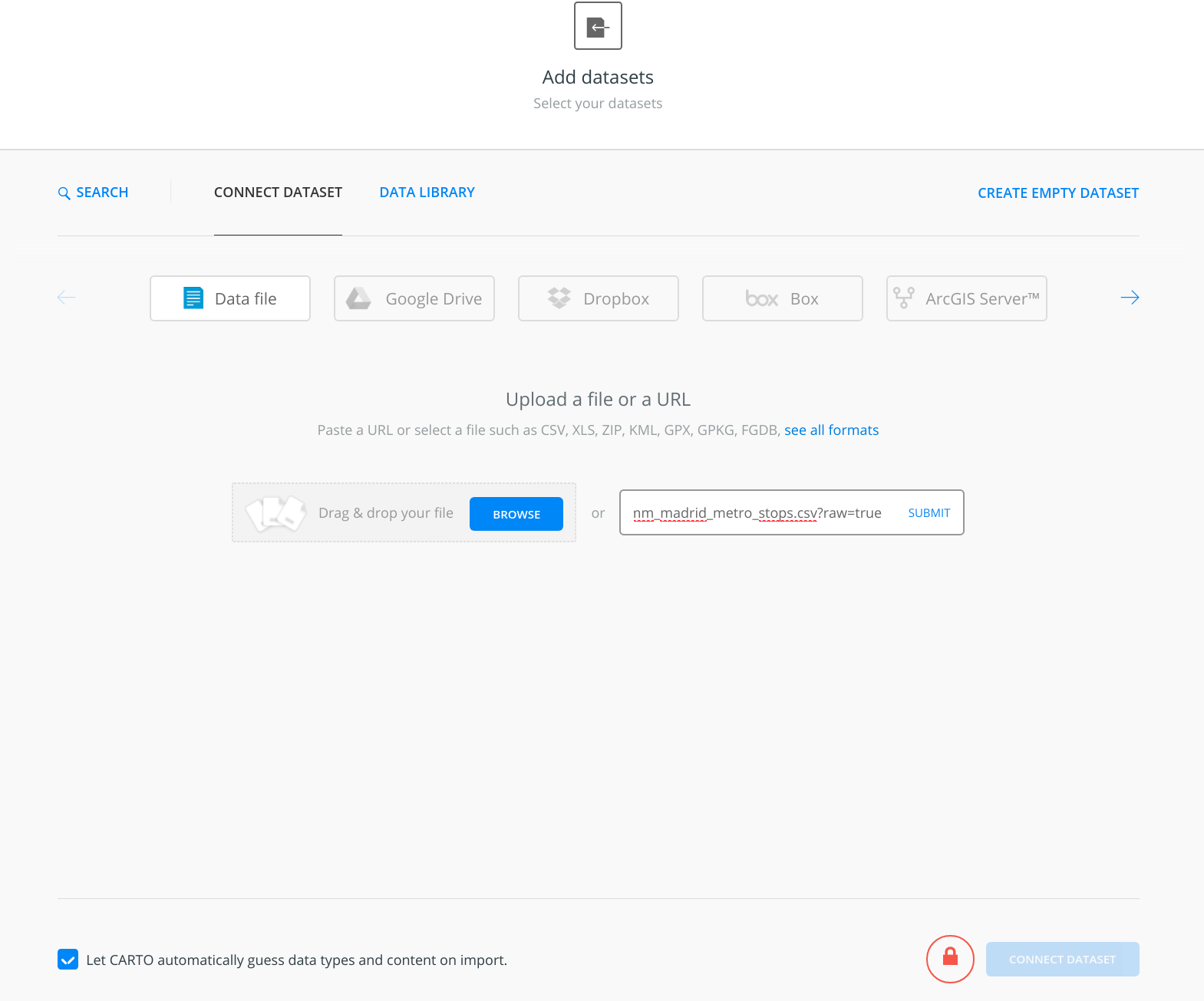
For each of them, copy the URL and use Builder's new dataset dialog to get the import done:
After one dataset is imported, it typically helps to preview it to verify everything looks good.
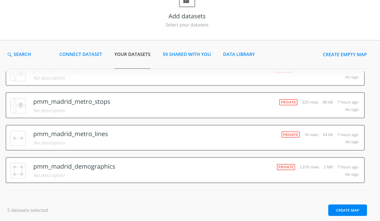
Create a new map with the 5 datasets that were previously uploaded.
It is advisable to rename the map and the layers, for the sake of clarity.
Now it is time to start styling the layers. We will start with the metro stations and metro lines layers. We recommend you hide the rest of the layers while working on this.
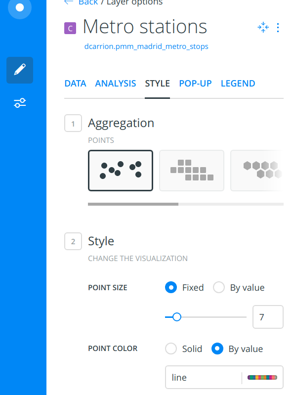
In Builder, click on the metro stations layer and go to the STYLE tab. Select By value on the POINT COLOR subsection, using line as the column name, and pick a color scheme.
Repeat the same process for the metro lines layer, by Select By value on the STROKE COLOR section, using name as the column name, and make sure you pick the same color scheme.
Notice how the colors for the metro lines and the metro stations do not match. Why is that?
In order to have the same color in both layers, copy this CARTOCSS into the STYLE tab for the metro stations:
#layer {
  marker-width: 7;
  marker-fill: #FFB927;
  marker-fill-opacity: 0.9;
  marker-line-color: #FFF;
  marker-line-width: 1;
  marker-line-opacity: 1;
  marker-type: ellipse;
  marker-allow-overlap: true;
}

#layer[line='L1'] {
  marker-fill: #30a3dc;
}

#layer[line='L2'] {
  marker-fill: #cd031d;
}

#layer[line='L3'] {
  marker-fill: #ffe114;
}

#layer[line='L4'] {
  marker-fill: #944248;
}

#layer[line='L5'] {
  marker-fill: #96bf0d;
}

#layer[line='L6'] {
  marker-fill: #a0a5a7;
}

#layer[line='L7'] {
  marker-fill: #faa64a;
}

#layer[line='L8'] {
  marker-fill: #f27ca2;
}

#layer[line='L9'] {
  marker-fill: #a93094;
}

#layer[line='L10'] {
  marker-fill: #084594;
}

#layer[line='L11'] {
  marker-fill: #008b43;
}

#layer[line='L12'] {
  marker-fill: #a49a00;
}

#layer[line='L14'] {
  marker-fill: #00aa66;
}

#layer[line='R'] {
  marker-fill: #0e4a97;
}

#layer[line='ML1'] {
  marker-fill: #0066ff;
}

#layer[line='ML2'] {
  marker-fill: #892ca0;
}

#layer[line='ML3'] {
  marker-fill: #ff0000;
}
And use this CARTOCSS for the metro lines layer:
#layer {
  line-color: #fff;
  line-width: 2;
  line-opacity: 1;
}

#layer[name='L1'] {
  line-color: #30a3dc;
}

#layer[name='L2'] {
  line-color: #cd031d;
}

#layer[name='L3'] {
  line-color: #ffe114;
}

#layer[name='L4'] {
  line-color: #944248;
}

#layer[name='L5'] {
  line-color: #96bf0d;
}

#layer[name='L6'] {
  line-color: #a0a5a7;
}

#layer[name='L7'] {
  line-color: #faa64a;
}

#layer[name='L8'] {
  line-color: #f27ca2;
}

#layer[name='L9'] {
  line-color: #a93094;
}

#layer[name='L10'] {
  line-color: #084594;
}

#layer[name='L11'] {
  line-color: #008b43;
}

#layer[name='L12'] {
  line-color: #a49a00;
}

#layer[name='L14'] {
  line-color: #00aa66;
}

#layer[name='R'] {
  line-color: #0e4a97;
}

#layer[name='ML1'] {
  line-color: #0066ff;
}

#layer[name='ML2'] {
  line-color: #892ca0;
}

#layer[name='ML3'] {
  line-color: #ff0000;
}
Finally, make the stations and lines clickable by adding pop-ups to both layers, using the name column for the metro lines layer and the name and line columns for the metro stations layer. For example:
We are interested in studying the areas that are close to metro stations, as we acknowledge their commercial potential.
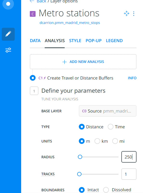
Ideally, we would be interested in defining the boundaries of those areas based on whether it takes less than a 5-minute walk to get there. Because of technical limitations on the trial CARTO accounts, it is safer to use plain distance in meters. So we would approximate those areas and use 250m-radius circles ("buffers") instead.
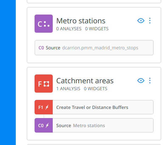
To do that, we need to run a Create Travel/Distance Buffers analysis on the metro stations layer:
Once the analysis has finished, we will drag and drop it from inside the metro stations layer so that it becomes an independent layer and we can recover the original stations. It is also a good idea to rename the new layer.
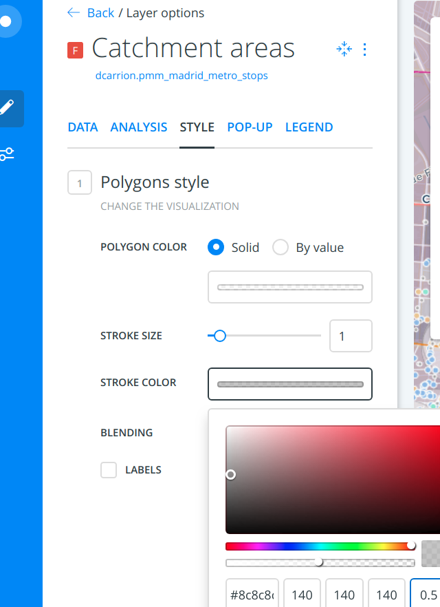
Finally, let us style the layer:
We will group the POIs into 3 categories, using CARTOCSS:
#layer {
  marker-width: 4;
  marker-fill: #a6a6a6;
  marker-fill-opacity: 0.9;
  marker-allow-overlap: true;
  marker-line-width: 1;
  marker-line-color: #FFF;
  marker-line-opacity: 1;
}

#layer {
  [amenity='bar'], [amenity='pub'], [amenity='nightclub'] {
    marker-width: 6;
    marker-fill: #88b6ea;
    marker-fill-opacity: 0.9;
    marker-allow-overlap: true;
    marker-line-width: 1;
    marker-line-color: #FFF;
    marker-line-opacity: 1;
  }
}

#layer {
  [amenity='cafe'], [amenity='fast_food'] {
    marker-width: 6;
    marker-fill: #eac688;
    marker-fill-opacity: 0.9;
    marker-allow-overlap: true;
    marker-line-width: 1;
    marker-line-color: #FFF;
    marker-line-opacity: 1;
  }
}

#layer {
  [amenity='theatre'], [amenity='cinema'], [amenity='music_venue'] {
    marker-width: 6;
    marker-fill: #88ead0;
    marker-fill-opacity: 0.9;
    marker-allow-overlap: true;
    marker-line-width: 1;
    marker-line-color: #FFF;
    marker-line-opacity: 1;
  }
}
Feel free to add pop-ups to this layer too.
For the Real Estate layer, a simple color ramp on the sqm_rental column will be enough, probably using an alpha value of around 0.3.
Feel free to add pop-ups to this layer too.
For this layer, a simple color ramp on the total_pop or total_pop_density column will be enough, probably using an alpha value of around 0.3 and avoid color collision with the Real Estate layer.
Feel free to add pop-ups to this layer too.
Let us re-order the layers in a way that make sense, Probably the POIs should go first. Metro stations, lines and catchment areas should go next, leaving the demographics and Real Estate layers at the bottom.
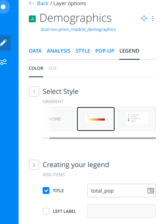
On the demographics and Real Estate layers, we will turn regular legends on. For example:
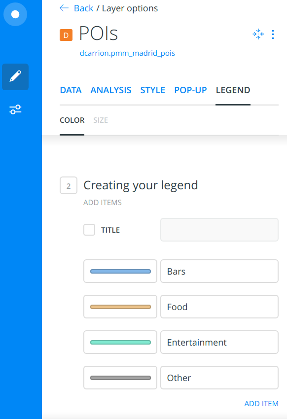
On the POI layer, we will manually copy the color values we used before to create a more custom layer:
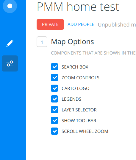
Finally, let us add a layer selector so that the final user can switch layers on and off:
There are a few indicators we may want to have at hand, like the total population on the visualized area:
For instance, a POI type selector can be handy:
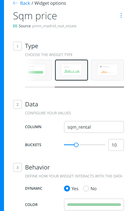
Rent variables or demographics make good bar chart widgets:
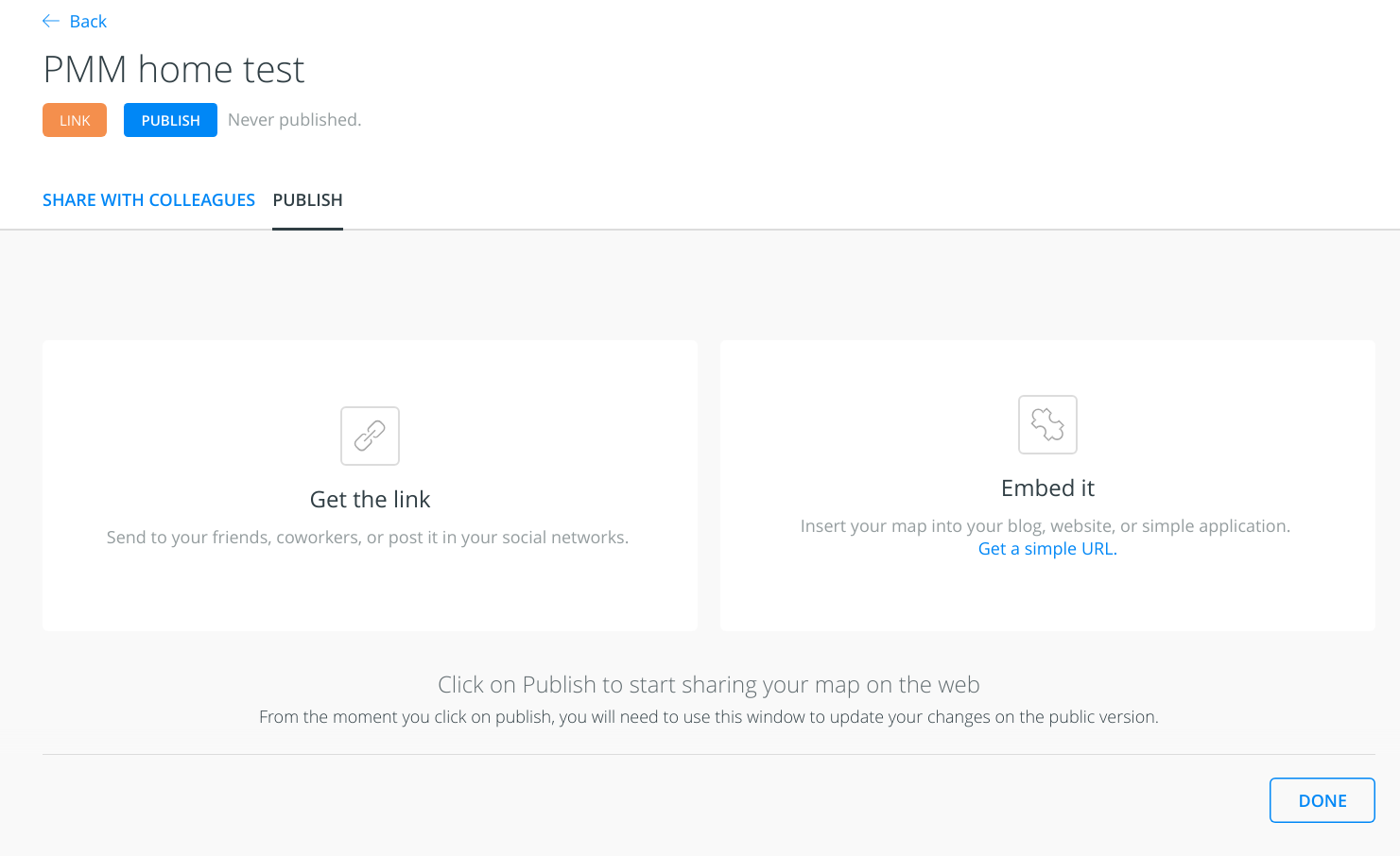
Let us make the map available to anyone you share the public link with, and publish it:
Remember that once you publish the dashboard, if you make new changes, you will have to re-publish for the changes to be available on the public view.
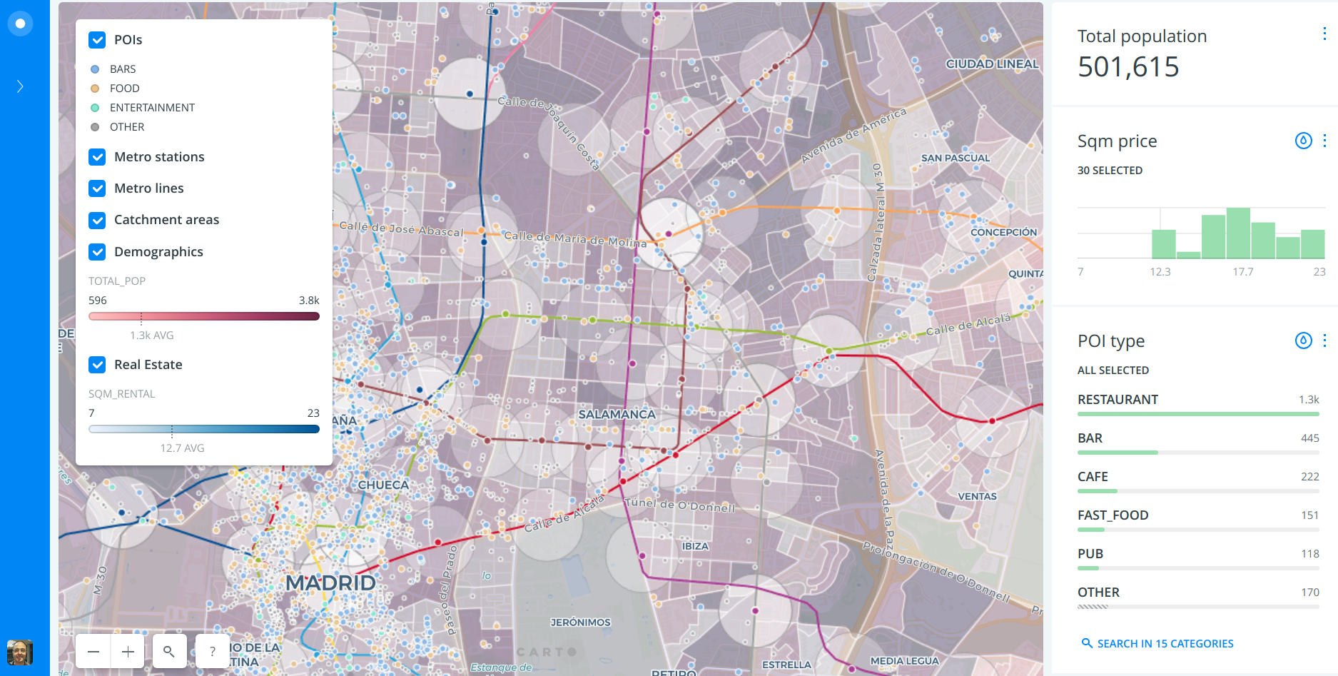
Your dashboard should look similar to this:
Now play with the widgets, filter here and there and come up with a good story on how you found great spots for new restaurants.
