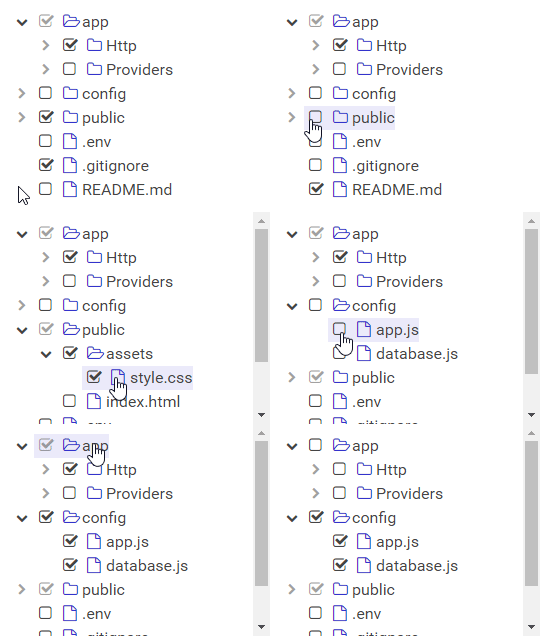
A simple and elegant checkbox tree for React.
Install the library using your favorite dependency manager:
yarn add react-checkbox-treeUsing npm:
npm install react-checkbox-tree --save
Note – This library makes use of Font Awesome styles and expects them to be loaded in the browser.
For your convenience, the library's styles can be consumed utilizing one of the following files:
node_modules/react-checkbox-tree/lib/react-checkbox-tree.cssnode_modules/react-checkbox-tree/src/less/react-checkbox-tree.lessnode_modules/react-checkbox-tree/src/scss/react-checkbox-tree.scss
Either include one of these files in your stylesheets or utilize a CSS loader:
import 'react-checkbox-tree/lib/react-checkbox-tree.css';A quick usage example is included below. Note that the react-checkbox-tree component is controlled. In other words, it is stateless. You must update its checked and expanded properties whenever a change occurs.
import React from 'react';
import CheckboxTree from 'react-checkbox-tree';

const nodes = [{
    value: 'mars',
    label: 'Mars',
    children: [
        { value: 'phobos', label: 'Phobos' },
        { value: 'deimos', label: 'Deimos' },
    ],
}];

class Widget extends React.Component {
    constructor() {
        super();

        this.state = {
            checked: [],
            expanded: [],
        };
    }

    render() {
        return (
            <CheckboxTree
                nodes={nodes}
                checked={this.state.checked}
                expanded={this.state.expanded}
                onCheck={checked => this.setState({ checked })}
                onExpand={expanded => this.setState({ expanded })}
            />
        );
    }
}
All node objects must have a unique value. This value is serialized into the checked and expanded arrays and is also used for performance optimizations.
| Property | Type | Description | Default |
|---|---|---|---|
nodes |
array | Required. Specifies the tree nodes and their children. | |
checked |
array | An array of checked node values. | [] |
disabled |
bool | If true, the component will be disabled and nodes cannot be checked. | false |
expandDisabled |
bool | If true, the ability to expand nodes will be disabled. | false |
expandOnClick |
bool | If true, nodes will be expanded by clicking on labels. Requires a non-empty onClick function. |
false |
expanded |
array | An array of expanded node values. | [] |
name |
string | Optional name for the hidden <input> element. |
undefined |
nameAsArray |
bool | If true, the hidden <input> will encode its values as an array rather than a joined string. |
false |
nativeCheckboxes |
bool | If true, native browser checkboxes will be used instead of pseudo-checkbox icons. | false |
noCascade |
bool | If true, toggling a parent node will not cascade its check state to its children. | false |
onlyLeafCheckboxes |
bool | If true, checkboxes will only be shown for leaf nodes. | false |
optimisticToggle |
bool | If true, toggling a partially-checked node will select all children. If false, it will deselect. | true |
showNodeIcon |
bool | If true, each node will show a parent or leaf icon. | true |
onCheck |
function | onCheck handler: function(checked) {} |
() => {} |
onClick |
function | onClick handler: function(clicked) {}. If set, it will be called when clicked on a node label. |
() => {} |
onExpand |
function | onExpand handler: function(expanded) {} |
() => {} |
Individual nodes within the nodes property can have the following structure:
| Property | Type | Description | Default |
|---|---|---|---|
label |
mixed | Required. The node's label. | |
value |
mixed | Required. The node's value. | |
children |
array | An array of child nodes. | null |
className |
string | A className to add to the node. | null |
disabled |
bool | Whether the node should be disabled. | false |
icon |
mixed | A custom icon for the node. | null |
showCheckbox |
bool | Whether the node should show a checkbox. | true |


