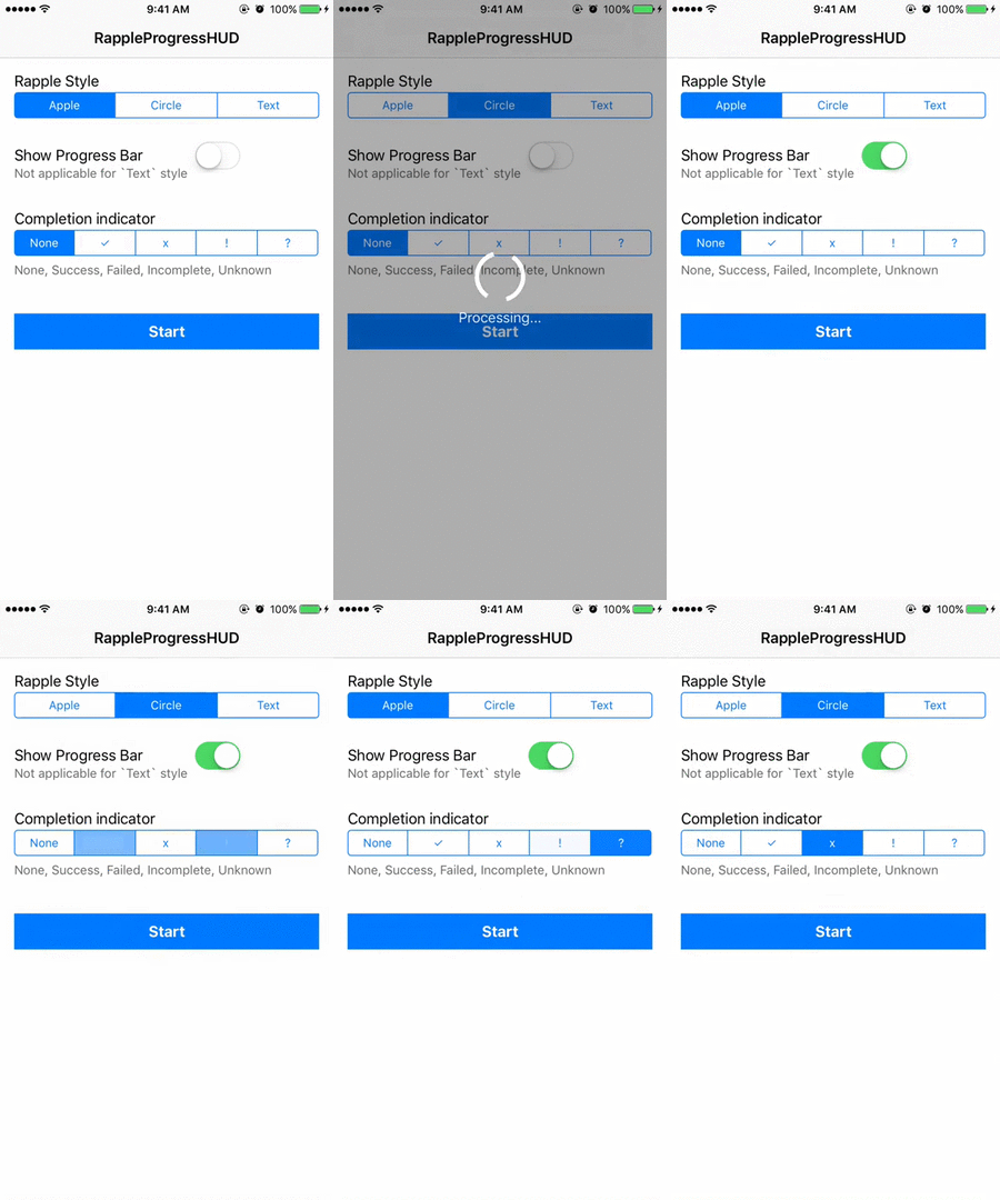
User-friendly and easy to use activity / progress indicator view with Swift 5
- Swift 5
- Xcode 11
- iOS 10+
RappleProgressHUD is available through CocoaPods. To install it, add the following line to your Podfile:
pod "RappleProgressHUD" RappleProgressHUD is available Swift Package Manager. To install it, add following git link to swift package manager
https://github.com/rjeprasad/RappleProgressHUD.gitThen simply import RappleProgressHUD
import RappleProgressHUDRappleActivityIndicatorView can be started using any of the starter methods mentioned below. When calling these starter methods, two basic optional input values can be used to customize UIs.
label this is the text value you are gonna display with the animated indicator
attributes this is a dictionary with following Keys.
RappleTintColorKeyColor of the progress circle and textRappleScreenBGColorKeyBackground color (full screen background)RappleProgressBGColorKeyBackground color around the progress indicator (Only applicable for Apple Style)RappleIndicatorStyleKeyStyle of the ActivityIndicator - see below section for stylesRappleProgressBarColorKeyProgress bar bg color - track bg colorRappleProgressBarFillColorKeyProgress bar filling color with progression - filled track colorRappleIndicatorThicknessKeyActivityIndicator thicknes(width) - applicable for 'RappleStyleCircle' and completion indicators
In above dictionary you can send 'RappleIndicatorStyleKey' with below three styles (see the demo for more details)
RappleStyleAppleDefault Apple ActivityIndicatorRappleStyleCircleCustom Circular ActivityIndicatorRappleStyleTextCustom Texual ActivityIndicator (e.g. Loading.. | Loading....)
RappleActivityIndicatorView has two pre-defines attribute sets for ease of use
RappleTintColorKeywhiteRappleScreenBGColorKeywhite: 0.0, alpha: 0.2RappleProgressBGColorKeywhite: 0.0, alpha: 0.7RappleIndicatorStyleKeyRappleStyleAppleRappleProgressBarColorKeylightGrayRappleProgressBarFillColorKeywhiteRappleIndicatorThicknessKey4.0
RappleTintColorKeywhiteRappleScreenBGColorKeywhite: 0.0, alpha: 0.5RappleProgressBGColorKeyN/ARappleIndicatorStyleKeyRappleStyleCircleRappleProgressBarColorKeylightGrayRappleProgressBarFillColorKeywhiteRappleIndicatorThicknessKey4.0
RappleTintColorKeywhiteRappleScreenBGColorKeywhite: 0.0, alpha: 0.5RappleProgressBGColorKeyN/ARappleIndicatorStyleKeyRappleStyleTextRappleProgressBarColorKeyN/ARappleProgressBarFillColorKeyN/ARappleIndicatorThicknessKey4.0
Or you can send any custom made dictionary with these Key values to customize the look and feel
to create custom attribute dictionary you can use below method, and all the parameters of this method comes with default values.
let attributes = RappleActivityIndicatorView.attribute(style: RappleStyle.apple, tintColor: .yellow, screenBG: .purple, progressBG: .black, progressBarBG: .orange, progreeBarFill: .red, thickness: 4)

let attributes = RappleActivityIndicatorView.attribute(style: RappleStyle.apple, tintColor: .yellow, progreeBarFill: .red, thickness: 2)Start RappleActivityIndicatorView using RappleModernAttributes - no text message
RappleActivityIndicatorView.startAnimating()Start RappleActivityIndicatorView with custom (or pre-defined) attributes - no text message
RappleActivityIndicatorView.startAnimating(attributes: RappleModernAttributes)Start RappleActivityIndicatorView with a text message, using RappleModernAttributes
RappleActivityIndicatorView.startAnimatingWithLabel("Processing...")Start RappleActivityIndicatorView with text message and attributes
RappleActivityIndicatorView.startAnimatingWithLabel("Processing...", attributes: RappleModernAttributes)RappleActivityIndicatorView.stopAnimating()RappleActivityIndicatorView can also be closed with completion indicator
RappleActivityIndicatorView.stopAnimation(completionIndicator: .success, completionLabel: "Completed.", completionTimeout: 1.0)You can use any of the following RappleCompletion enum values as the indicator
noneStop and hide animation with out completion indicatorsuccess✓ symbolfailed✕ symbolincomplete! symbolunknown? symbol
- progress amount 0<= progress <= 1.0
- textual progress amount value (e.g.
"3/8"or"3/10") : limited space available - textValue
nilwill display percentage values (e.g. 78%) - textValue
""-> hide textual progress amount RappleStyleApplewill use default apple progress barRappleStyleCirclewill use circular progress barRappleStyleTextwill not display any progress bar
RappleActivityIndicatorView.setProgress(0.2, textValue: "1/5")RappleActivityIndicatorView.setProgress(0.2) // Display with percentage valueFirst start progress bar using any of the starter methods
Then call setProgress methods with or without textValue: parameter
RappleActivityIndicatorView.startAnimatingWithLabel("Processing...")
RappleActivityIndicatorView.setProgress(0.2, textValue: "1/5")
Then gradually increase progress values accordingly - can be called from any thread
RappleActivityIndicatorView.setProgress(0.4, textValue: "2/5")Check for RappleActivityIndicatorView visiblility
RappleActivityIndicatorView.isVisible()To run the example project, clone the repo, and run pod install from the Example directory first.
Rajeev Prasad, [email protected]
The MIT License (MIT)
Copyright (c) 2015-2019 Rajeev Prasad [email protected]
Permission is hereby granted, free of charge, to any person obtaining a copy of this software and associated documentation files (the "Software"), to deal in the Software without restriction, including without limitation the rights to use, copy, modify, merge, publish, distribute, sublicense, and/or sell copies of the Software, and to permit persons to whom the Software is furnished to do so, subject to the following conditions:
The above copyright notice and this permission notice shall be included in all copies or substantial portions of the Software.
THE SOFTWARE IS PROVIDED "AS IS", WITHOUT WARRANTY OF ANY KIND, EXPRESS OR IMPLIED, INCLUDING BUT NOT LIMITED TO THE WARRANTIES OF MERCHANTABILITY, FITNESS FOR A PARTICULAR PURPOSE AND NON-INFRINGEMENT. IN NO EVENT SHALL THE AUTHORS OR COPYRIGHT HOLDERS BE LIABLE FOR ANY CLAIM, DAMAGES OR OTHER LIABILITY, WHETHER IN AN ACTION OF CONTRACT, TORT OR OTHERWISE, ARISING FROM, OUT OF OR IN CONNECTION WITH THE SOFTWARE OR THE USE OR OTHER DEALINGS IN THE SOFTWARE.


