


SVAR React Editor is a flexible component for creating custom edit forms for structured data. It helps you compose edit panels using various form controls.
Whether embedded inline, shown as a sidebar, or opened as a modal dialog, the Editor offers an intuitive way to manage data in CMS dashboards, info cards, user profiles, or can be attached to any UI element that needs editing functionality.
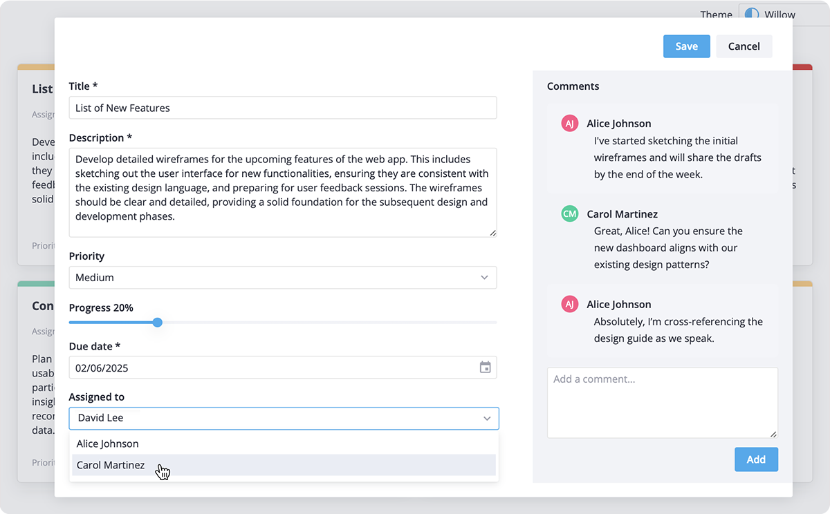
- Can be used as inline form, sidebar panel, or modal dialog;
- Form fields: text input, textarea, checkbox, radio button, date picker, and other SVAR React Core controls;
- Extendable with custom controls;
- Configurable toolbar (top or bottom);
- Form fields can be displayed in batches (with one visible at a time);
- Tabbed sections;
- Collapsible or accordion-style sections,
- Always-visible fields support;
- Prefilled values support;
- Editable or read-only modes;
- Handle real-time updates and custom save actions;
- Data validation (required fields, numbers, text);
- Localization support (labels, tooltips, messages);
- Light & dark themes;
- Custom styling via CSS.
To start using components from the Editor package, simply import the package and include the desired component in your react file:
import { Editor } from "@svar-ui/react-editor";
import "@svar-ui/react-editor/all.css";

const items = [
   { comp: 'text', key: 'name', label: 'Name', column: 'left' },
   { comp: 'checkbox', key: 'admin', label: 'Is Admin' },
   { comp: 'text', key: 'email', label: 'Email' },
   {
   comp: 'textarea',
   key: 'descr',
   label: 'Description',
   column: 'left',
   },
];

const myComponent => (<Editor items={items} />);
See the getting started guide to quickly set up and begin using SVAR Editor component in your React projects.
Post an Issue or use our community forum.