Kevin Blighe, Shahram Kordasti 2020-02-15
- Introduction
- Installation
- Tutorial 1: CyTOF FCS data
- Perform principal component analysis (PCA)
- Perform UMAP
- Create a contour plot of the UMAP layout
- Show marker expression across the layout
- Shade cells by metadata
- Find ideal clusters in the UMAP layout via k-nearest neighbours
- Plot marker expression per identified cluster
- Determine enriched markers in each cluster and plot the expression signature
- Tutorial 2: Import from Seurat
- Tutorial 3: Import any numerical data
- Acknowledgments
- Session info
- References
In the single cell World, which includes flow cytometry, mass cytometry, single-cell RNA-seq (scRNA-seq), and others, there is a need to improve data visualisation and to bring analysis capabilities to researchers even from non-technical backgrounds. scDataviz (Blighe and Kordasti 2020) attempts to fit into this space, while also catering for advanced users. Additonally, due to the way that scDataviz is designed, which is based on SingleCellExperiment (Lun et al. 2019), it has a 'plug and play' feel, and immediately lends itself as flexibile and compatibile with studies that go beyond scDataviz. Finally, the graphics in scDataviz are generated via the ggplot (Wickham 2016) engine, which means that users can 'add on' features to these with ease.
- Download the package from Bioconductor
    if (!requireNamespace('BiocManager', quietly = TRUE))
        install.packages('BiocManager')

    BiocManager::install('scDataviz')
Note: to install development version:
devtools::install_github('kevinblighe/scDataviz')- Load the package into R session
library(scDataviz)Here, we will start with sample data stored as FCS files. Specifically, we will utilise some of the data used in Deep phenotyping detects a pathological CD4+ T-cell complosome signature in systemic sclerosis.
In order to downlaod this data, we can use git clone from your command prompt:
git clone https://github.com/kevinblighe/scDataviz_data ;NB - this command (above) needs to be run outside R at your shell's command prompt (e.g., BASH)
Now, read in the data and normalise it. The processFCS command by default removes variables based on low variance and also downsamples [randomly] your data to 100000 variables. The user can change these via the downsample and downsampleVar parameters.
  filelist <- list.files(
    path = "scDataviz_data/FCS/",
    pattern = "*.fcs|*.FCS",
    full.names = TRUE)
  filelist

  metadata <- data.frame(
    sample = gsub('\\ [A-Za-z0-9]*\\.fcs$', '',
      gsub('scDataviz_data\\/FCS\\/\\/', '', filelist)),
    group = c(rep('Healthy', 7), rep('Disease', 11)),
    treatment = gsub('\\.fcs$', '',
      gsub('scDataviz_data\\/FCS\\/\\/[A-Z0-9]*\\ ', '', filelist)),
    row.names = filelist,
    stringsAsFactors = FALSE)
  metadata

  sce <- processFCS(
    files = filelist,
    metadata = metadata,
    transformation = TRUE,
    transFun = function (x) asinh(x),
    asinhFactor = 5,
    downsample = 100000,
    downsampleVar = 0.2,
    newColnames = paste0('CD', 1:65))
## [1] TRUE
```
One can also create a new SingleCellExperiment object manually using any type of data, including any data from scRNA-seq produced elsewhere. Import functions for data deriving from other sources is covered in Tutorials 2 and 3 in this vignette. All functions in scDataviz additionally accept data-frames or matrices on their own, de-necessitating the reliance on the SingleCellexperiment class.
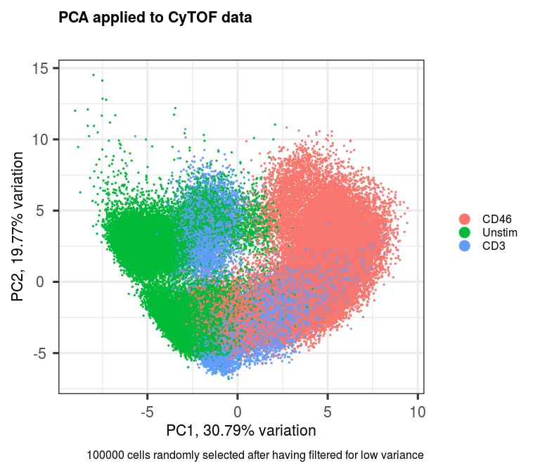
We can use the PCAtools (Blighe and Lun 2018) package for the purpose of performing PCA.
  library(PCAtools)
  p <- pca(assay(sce, 'scaled'), metadata = metadata(sce))
  biplot(p,
    lab = NULL,
    pointSize = 0.5,
    colby = 'treatment',
    legendPosition = 'right',
    title = 'PCA applied to CyTOF data',
    caption = '100000 cells randomly selected after having filtered for low variance')
We can add the rotated component loadings as a new reduced dimensional component to our dataset. Let's just add the first 20 PCs.
reducedDim(sce, 'PCA') <- p$rotated[,1:20]For more functionality via PCAtools, check the vignette: PCAtools: everything Principal Component Analysis
UMAP can be performed on the entire dataset, if your computer's memory will permit. Currently it's default is to use the data contained in the 'scaled' assay component of your SingleCellExperiment object.
sce <- performUMAP(sce)UMAP can also be stratified based on a column in your metadata, e.g., (treated versus untreated samples); however, to do this, I recommend creating separate SingleCellExperiment objects from the very start, i.e., from the the data input stage, and processing the data separately for each group.
We can also perform UMAP on a select number of PC eigenvectors. PCAtools (Blighe and Lun 2018) can be used to infer ideal number of dimensions to use via the elbow method and Horn's parallel analysis.
  elbow <- findElbowPoint(p$variance)
  horn <- parallelPCA(assay(sce, 'scaled'))

  elbow
## PC9
## 9
horn$n## [1] 4
Let's use the number of PCs identified by Horn's.
sce <- performUMAP(sce, reducedDim = 'PCA', dims = c(1:horn$n))At this point, we have done a lot - let's save the dataset.
  dir.create('save')
saveRDS(sce, 'save/FlowData.RDS', compress = TRUE)This and the remaining sections in this tutorial are about producing great visualisations of the data and attempting to make sense of it, while not fully overlapping with functionalioty provided by other programs that operate in tis space.
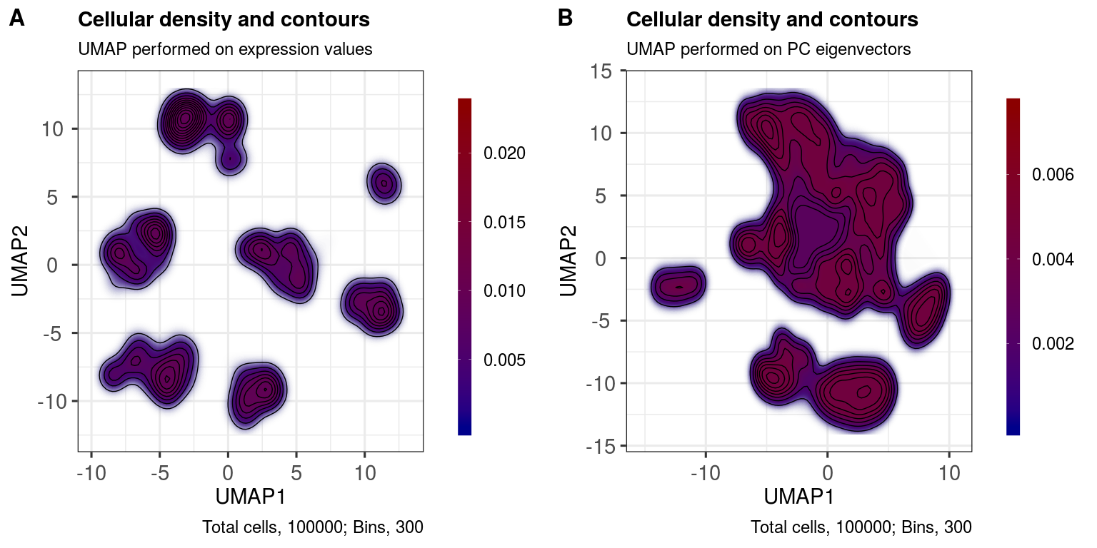
With the contour plot, we are essentially looking at celluar density. It can provide for a beautiful viusualisation in a manuscript while also serving as a useful QC tool: if the density is 'scrunched up' into a single area in the plot space, then there are likely issues with your input data distribution. We want to see well-separated, high density 'islands', or, at least, gradual gradients that blend into one another across high density 'peaks'.
  ggout1 <- contourPlot(sce,
    reducedDim = 'UMAP',
    subtitle = 'UMAP performed on expression values',
    legendLabSize = 18,
    axisLabSize = 22,
    titleLabSize = 22,
    subtitleLabSize = 18,
    captionLabSize = 18)

  ggout2 <- contourPlot(sce,
    reducedDim = 'UMAP_PCA',
    subtitle = 'UMAP performed on PC eigenvectors',
    legendLabSize = 18,
    axisLabSize = 22,
    titleLabSize = 22,
    subtitleLabSize = 18,
    captionLabSize = 18)

  plot_grid(ggout1, ggout2,
    labels = c('A','B'),
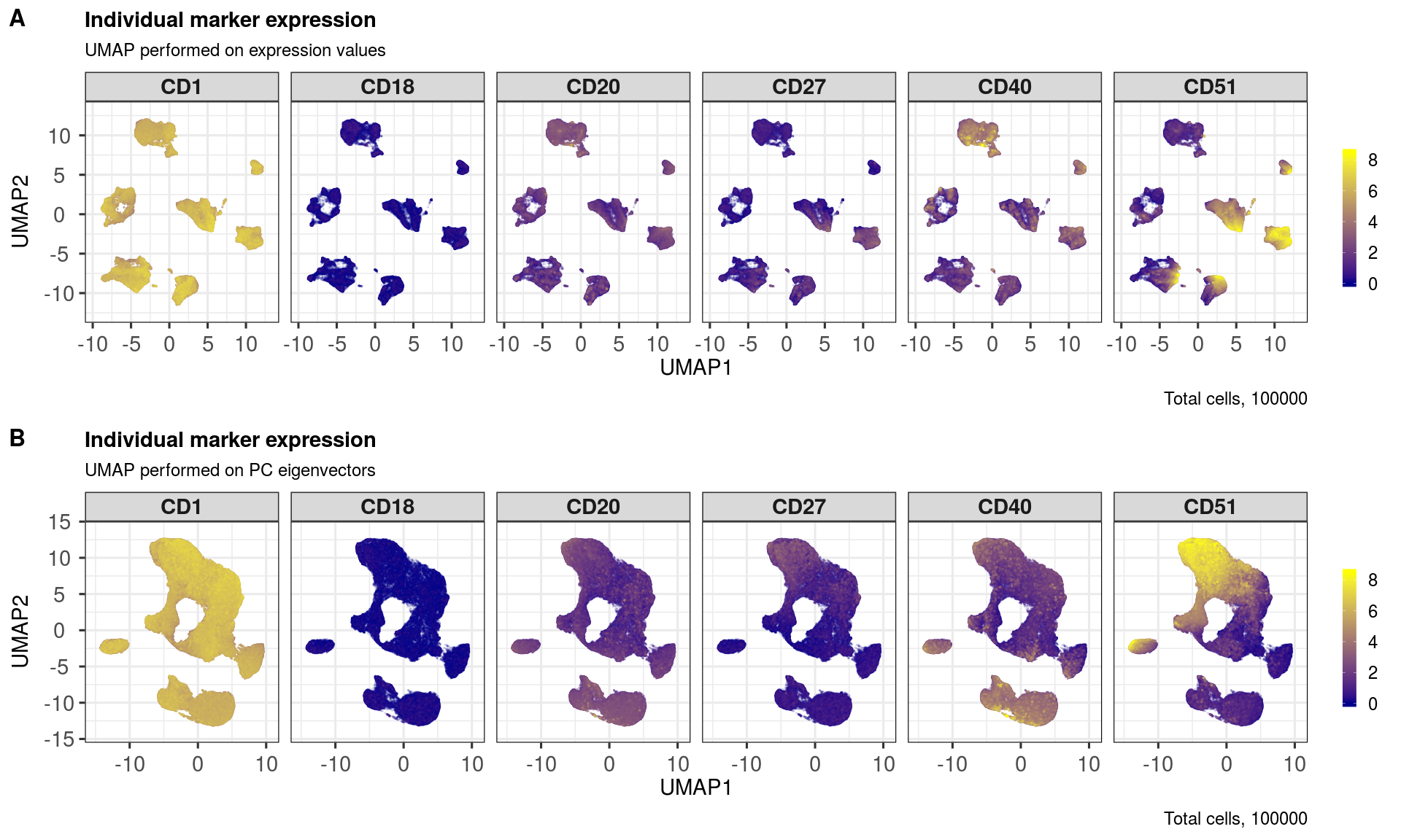
ncol = 2, align = "l", label_size = 24)Here, we randomly select some markers and then plot their expression profiles across the UMAP layouts.
  markers <- sample(rownames(sce), 6)
  markers
## [1] "CD27" "CD20" "CD51" "CD1" "CD18" "CD40"
  ggout1 <- markerExpression(sce,
    markers = markers,
    subtitle = 'UMAP performed on expression values',
    nrow = 1, ncol = 6,
    legendKeyHeight = 1.0,
    legendLabSize = 18,
    stripLabSize = 22,
    axisLabSize = 22,
    titleLabSize = 22,
    subtitleLabSize = 18,
    captionLabSize = 18)

  ggout2 <-  markerExpression(sce,
    markers = markers,
    reducedDim = 'UMAP_PCA',
    subtitle = 'UMAP performed on PC eigenvectors',
    nrow = 1, ncol = 6,
    legendKeyHeight = 1.0,
    legendLabSize = 18,
    stripLabSize = 22,
    axisLabSize = 22,
    titleLabSize = 22,
    subtitleLabSize = 18,
    captionLabSize = 18)

  plot_grid(ggout1, ggout2,
    labels = c('A','B'),
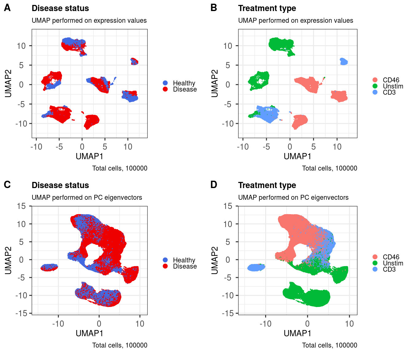
nrow = 2, align = "l", label_size = 24)Shading cells by metadata can be useful for identifying any batch effects, but also useful for visualising, e.g., differences across treatments.
First, let's take a look inside the metadata that we have.
head(metadata(sce))## sample group treatment
## cell1 P00 Disease CD46
## cell2 HD262 Healthy Unstim
## cell3 P08 Disease CD46
## cell4 P04 Disease CD46
## cell5 P08 Disease CD46
## cell6 P00 Disease Unstim
levels(metadata(sce)$group)## [1] "Healthy" "Disease"
levels(metadata(sce)$treatment)## [1] "CD46" "Unstim" "CD3"
  ggout1 <- metadataPlot(sce,
    colby = 'group',
    colkey = c(Healthy = 'royalblue', Disease = 'red2'),
    title = 'Disease status',
    subtitle = 'UMAP performed on expression values',
    legendLabSize = 16,
    axisLabSize = 20,
    titleLabSize = 20,
    subtitleLabSize = 16,
    captionLabSize = 16)

  ggout2 <- metadataPlot(sce,
    reducedDim = 'UMAP_PCA',
    colby = 'group',
    colkey = c(Healthy = 'royalblue', Disease = 'red2'),
    title = 'Disease status',
    subtitle = 'UMAP performed on PC eigenvectors',
    legendLabSize = 16,
    axisLabSize = 20,
    titleLabSize = 20,
    subtitleLabSize = 16,
    captionLabSize = 16)

  ggout3 <- metadataPlot(sce,
    colby = 'treatment',
    title = 'Treatment type',
    subtitle = 'UMAP performed on expression values',
    legendLabSize = 16,
    axisLabSize = 20,
    titleLabSize = 20,
    subtitleLabSize = 16,
    captionLabSize = 16)

  ggout4 <- metadataPlot(sce,
    reducedDim = 'UMAP_PCA',
    colby = 'treatment',
    title = 'Treatment type',
    subtitle = 'UMAP performed on PC eigenvectors',
    legendLabSize = 16,
    axisLabSize = 20,
    titleLabSize = 20,
    subtitleLabSize = 16,
    captionLabSize = 16)

  plot_grid(ggout1, ggout3, ggout2, ggout4,
    labels = c('A','B','C','D'),
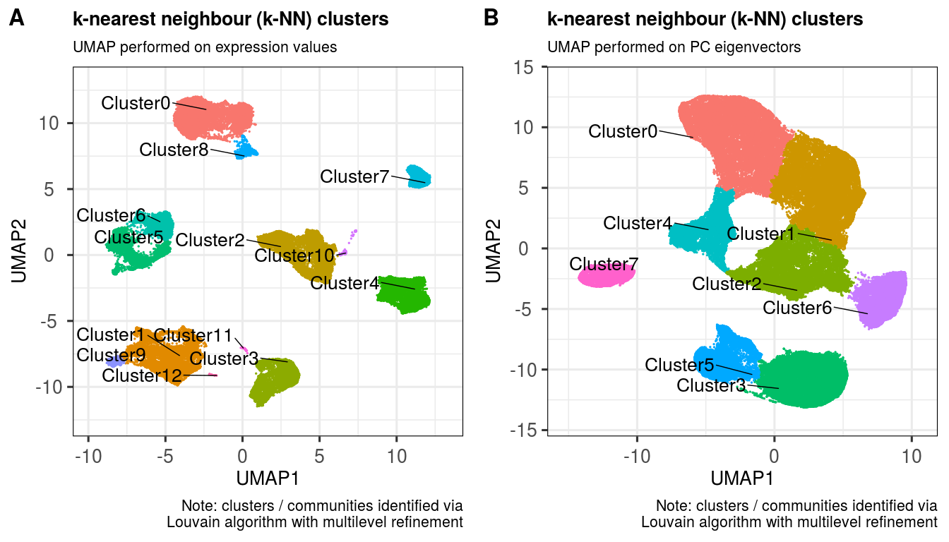
nrow = 2, ncol = 2, align = "l", label_size = 24)This function utilises the k nearest neighbours (k-NN) approach from Seurat, which works quite well on flow cytometry and CyTOF UMAP layouts, from my experience.
  sce <- clusKNN(sce,
    k.param = 20,
    prune.SNN = 1/15,
    resolution = 0.01,
    algorithm = 2)
## Modularity Optimizer version 1.3.0 by Ludo Waltman and Nees Jan van Eck
##
## Number of nodes: 100000
## Number of edges: 2240709
##
## Running Louvain algorithm with multilevel refinement...
## Maximum modularity in 10 random starts: 0.9985
## Number of communities: 13
## Elapsed time: 24 seconds
  sce <- clusKNN(sce,
    reducedDim = 'UMAP_PCA',
    clusterAssignName = 'Cluster_PCA',
    k.param = 20,
    prune.SNN = 1/15,
    resolution = 0.01,
    algorithm = 2)
## Modularity Optimizer version 1.3.0 by Ludo Waltman and Nees Jan van Eck
##
## Number of nodes: 100000
## Number of edges: 2199055
##
## Running Louvain algorithm with multilevel refinement...
## Maximum modularity in 10 random starts: 0.9974
## Number of communities: 8
## Elapsed time: 24 seconds
  ggout1 <- plotClusters(sce,
    clusterColname = 'Cluster',
    labSize = 7.0,
    subtitle = 'UMAP performed on expression values',
    caption = paste0('Note: clusters / communities identified via',
      '\nLouvain algorithm with multilevel refinement'),
    axisLabSize = 20,
    titleLabSize = 20,
    subtitleLabSize = 16,
    captionLabSize = 16)

  ggout2 <- plotClusters(sce,
    clusterColname = 'Cluster_PCA',
    reducedDim = 'UMAP_PCA',
    labSize = 7.0,
    subtitle = 'UMAP performed on PC eigenvectors',
    caption = paste0('Note: clusters / communities identified via',
      '\nLouvain algorithm with multilevel refinement'),
    axisLabSize = 20,
    titleLabSize = 20,
    subtitleLabSize = 16,
    captionLabSize = 16)

  plot_grid(ggout1, ggout2,
    labels = c('A','B'),
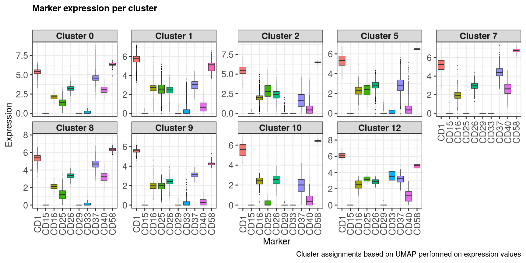
ncol = 2, align = "l", label_size = 24) markerExpressionPerCluster(sce,
caption = 'Cluster assignments based on UMAP performed on expression values',
stripLabSize = 22,
axisLabSize = 22,
titleLabSize = 22,
subtitleLabSize = 18,
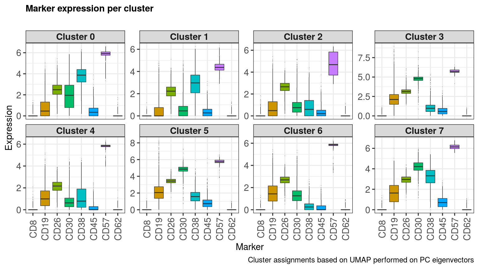
captionLabSize = 18) clusters <- unique(metadata(sce)[['Cluster_PCA']])
clusters## [1] 4 3 0 6 1 5 7 2
  markers <- sample(rownames(sce), 8)
  markers
## [1] "CD30" "CD19" "CD38" "CD26" "CD62" "CD8" "CD57" "CD45"
  markerExpressionPerCluster(sce,
    clusters = clusters,
    clusterAssign = metadata(sce)[['Cluster_PCA']],
    markers = markers,
    nrow = 2, ncol = 4,
    caption = 'Cluster assignments based on UMAP performed on PC eigenvectors',
    stripLabSize = 22,
    axisLabSize = 22,
    titleLabSize = 22,
    subtitleLabSize = 18,
captionLabSize = 18)This method also calculates metacluster abundances across a chosen phenotype. The function returns a data-frame, which can then be exported to do other analyses.
| Cluster | nCells | TotalCells | PercentCells | NegMarkers | PosMarkers | PerCent\_Healthy | PerCent\_Disease | nCell\_Healthy | nCell\_Disease |
|---|---|---|---|---|---|---|---|---|---|
| 0 | 21172 | 1e+05 | 21.172 | NA | NA | 62.2850935 | 37.714906 | 13187 | 7985 |
| 1 | 16052 | 1e+05 | 16.052 | CD47- | CD30+ | 13.2693745 | 86.730626 | 2130 | 13922 |
| 2 | 15534 | 1e+05 | 15.534 | CD30-CD51- | CD46+ | 31.8012102 | 68.198790 | 4940 | 10594 |
| 3 | 11737 | 1e+05 | 11.737 | CD37-CD46- | CD51+ | 0.1789214 | 99.821079 | 21 | 11716 |
| 4 | 11390 | 1e+05 | 11.390 | CD30-CD46- | CD47+ | 77.3397717 | 22.660228 | 8809 | 2581 |
| 5 | 8712 | 1e+05 | 8.712 | CD46- | CD47+CD51+ | 46.2695133 | 53.730487 | 4031 | 4681 |
| 6 | 7352 | 1e+05 | 7.352 | CD47- | CD46+ | 0.9521219 | 99.047878 | 70 | 7282 |
| 7 | 3410 | 1e+05 | 3.410 | CD47- | CD31+ | 55.6011730 | 44.398827 | 1896 | 1514 |
| 8 | 2206 | 1e+05 | 2.206 | CD21-CD47- | CD30+ | 67.7697189 | 32.230281 | 1495 | 711 |
| 9 | 2063 | 1e+05 | 2.063 | CD51-CD54- | CD30+CD49+ | 97.0916142 | 2.908386 | 2003 | 60 |
| 10 | 261 | 1e+05 | 0.261 | CD47- | CD46+ | 98.8505747 | 1.149425 | 258 | 3 |
| 11 | 87 | 1e+05 | 0.087 | CD21-CD25- | CD51+ | 0.0000000 | 100.000000 | 0 | 87 |
| 12 | 24 | 1e+05 | 0.024 | CD23-CD32-CD46- | CD36+ | 4.1666667 | 95.833333 | 1 | 23 |
| Cluster | nCells | TotalCells | PercentCells | NegMarkers | PosMarkers | PerCent\_CD46 | PerCent\_Unstim | PerCent\_CD3 | nCell\_CD46 | nCell\_Unstim | nCell\_CD3 |
|---|---|---|---|---|---|---|---|---|---|---|---|
| 0 | 21172 | 1e+05 | 21.172 | NA | NA | 0.0047232 | 99.9622142 | 0.0330625 | 1 | 21164 | 7 |
| 1 | 16052 | 1e+05 | 16.052 | CD47- | CD30+ | 0.3800150 | 13.2569150 | 86.3630700 | 61 | 2128 | 13863 |
| 2 | 15534 | 1e+05 | 15.534 | CD30-CD51- | CD46+ | 99.8841251 | 0.0772499 | 0.0386250 | 15516 | 12 | 6 |
| 3 | 11737 | 1e+05 | 11.737 | CD37-CD46- | CD51+ | 99.2246741 | 0.0000000 | 0.7753259 | 11646 | 0 | 91 |
| 4 | 11390 | 1e+05 | 11.390 | CD30-CD46- | CD47+ | 99.9385426 | 0.0263389 | 0.0351185 | 11383 | 3 | 4 |
| 5 | 8712 | 1e+05 | 8.712 | CD46- | CD47+CD51+ | 0.4361800 | 99.4260790 | 0.1377410 | 38 | 8662 | 12 |
| 6 | 7352 | 1e+05 | 7.352 | CD47- | CD46+ | 0.2992383 | 99.6735582 | 0.0272035 | 22 | 7328 | 2 |
| 7 | 3410 | 1e+05 | 3.410 | CD47- | CD31+ | 0.0586510 | 0.0879765 | 99.8533724 | 2 | 3 | 3405 |
| 8 | 2206 | 1e+05 | 2.206 | CD21-CD47- | CD30+ | 0.0906618 | 99.9093382 | 0.0000000 | 2 | 2204 | 0 |
| 9 | 2063 | 1e+05 | 2.063 | CD51-CD54- | CD30+CD49+ | 0.0000000 | 97.0916142 | 2.9083858 | 0 | 2003 | 60 |
| 10 | 261 | 1e+05 | 0.261 | CD47- | CD46+ | 52.4904215 | 47.5095785 | 0.0000000 | 137 | 124 | 0 |
| 11 | 87 | 1e+05 | 0.087 | CD21-CD25- | CD51+ | 63.2183908 | 0.0000000 | 36.7816092 | 55 | 0 | 32 |
| 12 | 24 | 1e+05 | 0.024 | CD23-CD32-CD46- | CD36+ | 45.8333333 | 4.1666667 | 50.0000000 | 11 | 1 | 12 |
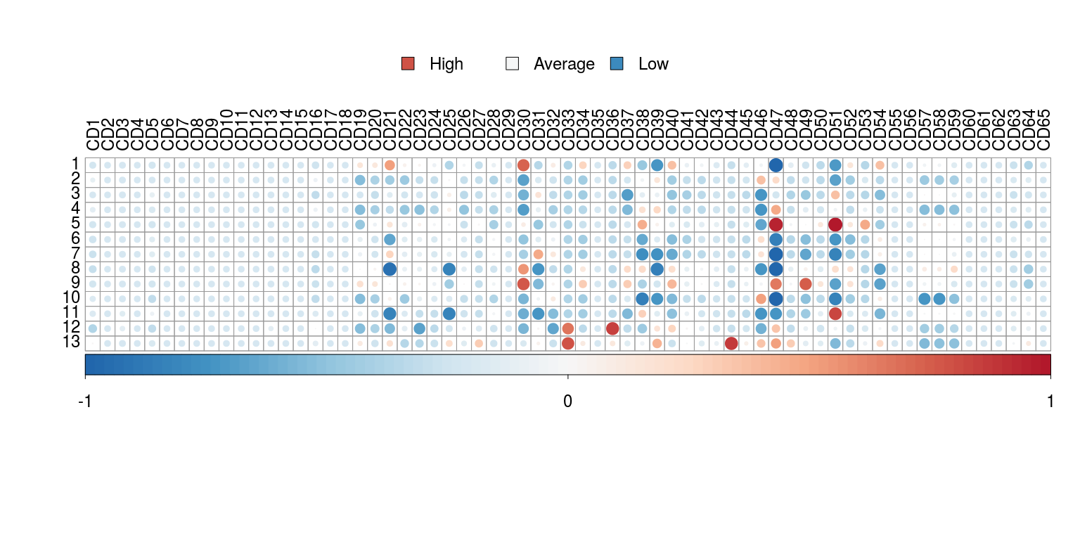
The expression signature is a quick way to visualise which markers are more or less expressed in each identified cluster of cells.
  plotSignatures(sce,
    labCex = 1.5,
legendCex = 1.5)Due to the fact that scDataviz is based on SingleCellExperiment, it has increased interoperability with other packages, including the popular Seurat (Stuart et al. 2018). Taking the data produced from the Seurat Tutorial on Peripheral Blood Mononuclear Cells (PBMCs), we can do this via as.SingleCellExperiment(), as follows:
  require(Seurat)
  require(SingleCellExperiment)

  pbmc <- readRDS('pbmc3k_final.RDS')
  pbmc.sce <- as.SingleCellExperiment(pbmc)
## [1] TRUE
We can then check the contents of the object:
assays(pbmc.sce)## List of length 2
## names(2): counts logcounts
head(metadata(pbmc.sce))## list()
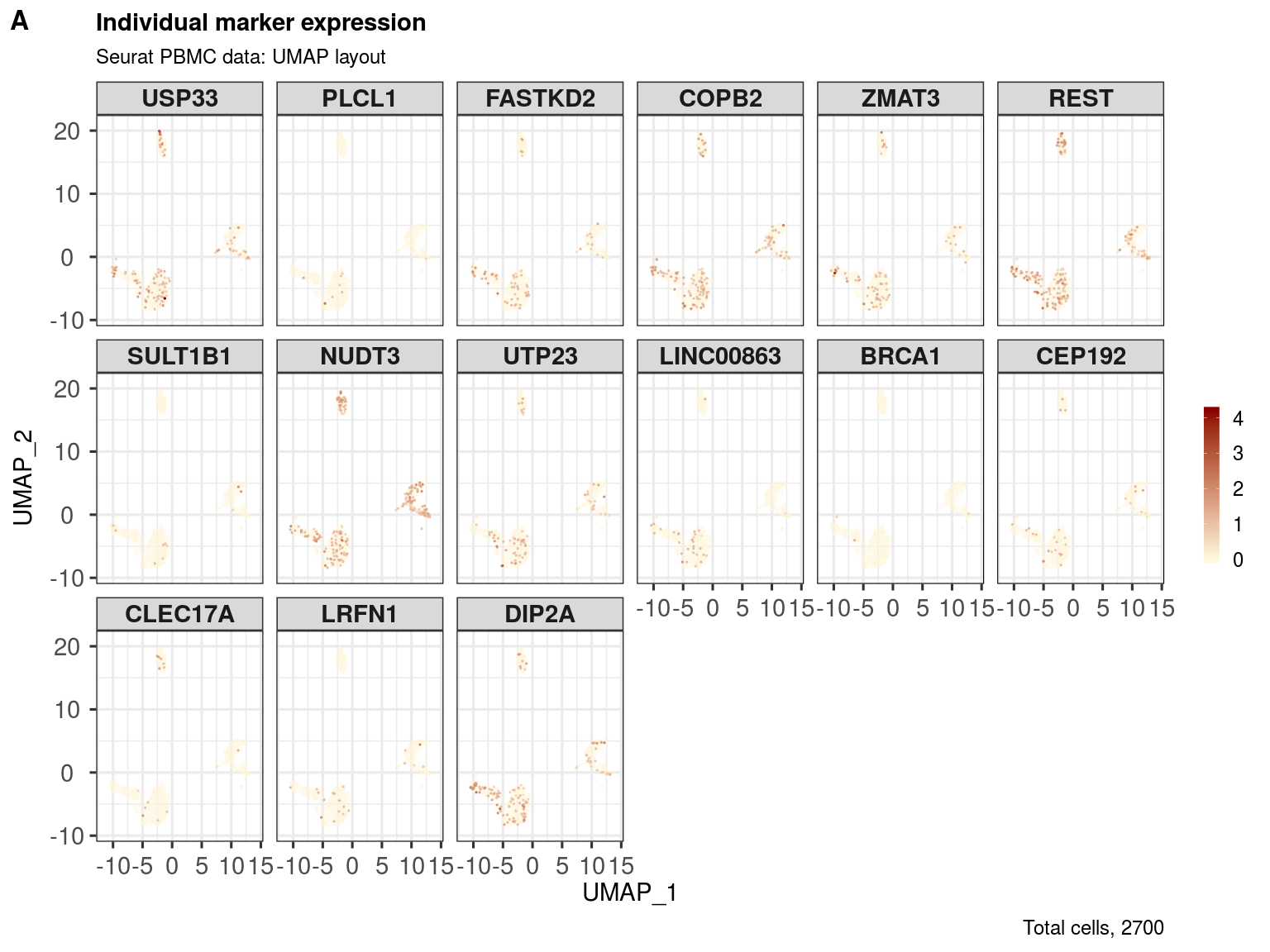
Let's check the reduced dimensions and then plot some randomly selected marker expression profiles across these.
reducedDims(pbmc.sce)## List of length 2
## names(2): PCA UMAP
head(reducedDim(pbmc.sce, 'UMAP'))## UMAP_1 UMAP_2
## AAACATACAACCAC -4.136650 -5.002530
## AAACATTGAGCTAC -1.368039 16.187368
## AAACATTGATCAGC -1.899821 -2.233947
## AAACCGTGCTTCCG 11.393142 1.269737
## AAACCGTGTATGCG -9.984254 -3.002492
## AAACGCACTGGTAC -2.112035 -5.860135
head(reducedDim(pbmc.sce, 'PCA'))[,1:5]## PC_1 PC_2 PC_3 PC_4 PC_5
## AAACATACAACCAC 4.6060466 -0.60371951 -0.6052429 -1.7231935 -0.7443433
## AAACATTGAGCTAC 0.1670809 4.54421712 6.4518867 6.8597974 -0.8011412
## AAACATTGATCAGC 2.6455614 -4.00971883 -0.3723479 -0.9960236 -4.9837032
## AAACCGTGCTTCCG -11.8569587 0.06340912 0.6226992 -0.2431955 0.2919980
## AAACCGTGTATGCG 3.0531940 -6.00216498 0.8234015 2.0463393 8.2465179
## AAACGCACTGGTAC 2.6832368 1.37196098 -0.5872163 -2.2090349 -2.5291571
  markers <- sample(rownames(pbmc.sce), 18)
  markers
## [1] "PLCL1" "DIP2A" "SULT1B1" "CLEC17A"
## [5] "ZMAT3" "BRCA1" "CEP192" "LRFN1"
## [9] "USP33" "REST" "FASTKD2" "COPB2"
## [13] "NUDT3" "UTP23" "RP11-337C18.8" "CTD-2165H16.4"
## [17] "LINC00863" "RP11-867G23.4"
  ggout <- markerExpression(pbmc.sce,
    assay = 'logcounts',
    markers = markers,
    reducedDim = 'UMAP',
    dimColnames = c('UMAP_1','UMAP_2'),
    col = c('cornsilk1', 'darkred'),
    subtitle = 'Seurat PBMC data: UMAP layout',
    nrow = 3, ncol = 6,
    legendKeyHeight = 1.0,
    legendLabSize = 18,
    stripLabSize = 22,
    axisLabSize = 22,
    titleLabSize = 22,
    subtitleLabSize = 18,
    captionLabSize = 18)

  require(cowplot)
  plot_grid(ggout,
    labels = c('A'),
    nrow = 1, align = "l", label_size = 24)
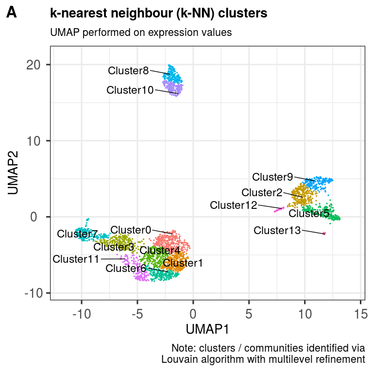
We can also derive clusters using the same k-NN approach as before. Here, we are dealing with scRNA-seq data; so, let's relax the resolution threshold somewhat, which will permit more clusters to be identified.
  pbmc.sce <- clusKNN(pbmc.sce,
    reducedDim = 'UMAP',
    dimColnames = c('UMAP_1','UMAP_2'),
    k.param = 20,
    prune.SNN = 1/15,
    resolution = 0.5,
    algorithm = 2)
## Modularity Optimizer version 1.3.0 by Ludo Waltman and Nees Jan van Eck
##
## Number of nodes: 2700
## Number of edges: 59214
##
## Running Louvain algorithm with multilevel refinement...
## Maximum modularity in 10 random starts: 0.9231
## Number of communities: 14
## Elapsed time: 0 seconds
  ggout <- plotClusters(pbmc.sce,
    clusterColname = 'Cluster',
    labSize = 6.0,
    subtitle = 'UMAP performed on expression values',
    caption = paste0('Note: clusters / communities identified via',
      '\nLouvain algorithm with multilevel refinement'),
    axisLabSize = 20,
    titleLabSize = 20,
    subtitleLabSize = 16,
    captionLabSize = 16)

  plot_grid(ggout,
    labels = c('A'),
    ncol = 1, align = "l", label_size = 24)
Now determine enriched markers per cluster.
{r knitr::kable(markerEnrichment(pbmc.sce, assay = 'logcounts'), auto = TRUE) %>% kable_styling(full_width = FALSE)
.
scDataviz will work with any numerical data, too. Here, we show a quick example of how one can import a data-matrix of randomly-generated numbers that follow a negative binomial distribution, comprising 2500 cells and 20 markers:
  mat <- jitter(matrix(
    MASS::rnegbin(rexp(50000, rate=.1), theta = 4.5),
    ncol = 20))
  colnames(mat) <- paste0('CD', 1:ncol(mat))
  rownames(mat) <- paste0('cell', 1:nrow(mat))

  metadata <- data.frame(
    group = rep('A', nrow(mat)),
    row.names = rownames(mat),
    stringsAsFactors = FALSE)
  head(metadata)
## group
## cell1 A
## cell2 A
## cell3 A
## cell4 A
## cell5 A
## cell6 A
  sce <- importData(mat,
    assayname = 'normcounts',
    metadata = metadata)
  sce
## class: SingleCellExperiment
## dim: 20 2500
## metadata(1): group
## assays(1): normcounts
## rownames(20): CD1 CD2 ... CD19 CD20
## rowData names(0):
## colnames(2500): cell1 cell2 ... cell2499 cell2500
## colData names(0):
## reducedDimNames(0):
## spikeNames(0):
## altExpNames(0):
This will also work without any assigned metadata.
  sce <- importData(mat,
    assayname = 'normcounts',
    metadata = NULL)
  sce
## class: SingleCellExperiment
## dim: 20 2500
## metadata(0):
## assays(1): normcounts
## rownames(20): CD1 CD2 ... CD19 CD20
## rowData names(0):
## colnames(2500): cell1 cell2 ... cell2499 cell2500
## colData names(0):
## reducedDimNames(0):
## spikeNames(0):
## altExpNames(0):
- Jessica Timms
- James Opzoomer
- Shahram Kordasti
sessionInfo()## R version 3.6.2 (2019-12-12)
## Platform: x86_64-pc-linux-gnu (64-bit)
## Running under: Ubuntu 16.04.6 LTS
##
## Matrix products: default
## BLAS: /usr/lib/atlas-base/atlas/libblas.so.3.0
## LAPACK: /usr/lib/atlas-base/atlas/liblapack.so.3.0
##
## locale:
## [1] LC_CTYPE=pt_BR.UTF-8 LC_NUMERIC=C
## [3] LC_TIME=en_GB.UTF-8 LC_COLLATE=pt_BR.UTF-8
## [5] LC_MONETARY=en_GB.UTF-8 LC_MESSAGES=pt_BR.UTF-8
## [7] LC_PAPER=en_GB.UTF-8 LC_NAME=C
## [9] LC_ADDRESS=C LC_TELEPHONE=C
## [11] LC_MEASUREMENT=en_GB.UTF-8 LC_IDENTIFICATION=C
##
## attached base packages:
## [1] parallel stats4 stats graphics grDevices utils datasets
## [8] methods base
##
## other attached packages:
## [1] Seurat_3.1.1 PCAtools_1.2.0
## [3] cowplot_1.0.0 lattice_0.20-38
## [5] reshape2_1.4.3 scDataviz_0.99.36
## [7] ggrepel_0.8.1 ggplot2_3.2.1
## [9] SingleCellExperiment_1.8.0 SummarizedExperiment_1.16.0
## [11] DelayedArray_0.12.0 BiocParallel_1.20.0
## [13] matrixStats_0.55.0 Biobase_2.46.0
## [15] GenomicRanges_1.38.0 GenomeInfoDb_1.22.0
## [17] IRanges_2.20.0 S4Vectors_0.24.0
## [19] BiocGenerics_0.32.0 kableExtra_1.1.0
## [21] knitr_1.26
##
## loaded via a namespace (and not attached):
## [1] Rtsne_0.15 colorspace_1.4-1 ggridges_0.5.1
## [4] XVector_0.26.0 rstudioapi_0.10 leiden_0.3.1
## [7] listenv_0.7.0 npsurv_0.4-0 xml2_1.2.2
## [10] codetools_0.2-16 splines_3.6.2 R.methodsS3_1.7.1
## [13] lsei_1.2-0 zeallot_0.1.0 jsonlite_1.6
## [16] umap_0.2.3.1 ica_1.0-2 cluster_2.1.0
## [19] png_0.1-7 R.oo_1.23.0 uwot_0.1.4
## [22] sctransform_0.2.0 readr_1.3.1 compiler_3.6.2
## [25] httr_1.4.1 dqrng_0.2.1 backports_1.1.5
## [28] assertthat_0.2.1 Matrix_1.2-17 lazyeval_0.2.2
## [31] BiocSingular_1.2.0 htmltools_0.4.0 tools_3.6.2
## [34] rsvd_1.0.2 igraph_1.2.4.1 gtable_0.3.0
## [37] glue_1.3.1 GenomeInfoDbData_1.2.2 RANN_2.6.1
## [40] dplyr_0.8.3 Rcpp_1.0.3 vctrs_0.2.0
## [43] gdata_2.18.0 ape_5.3 nlme_3.1-142
## [46] DelayedMatrixStats_1.8.0 gbRd_0.4-11 lmtest_0.9-37
## [49] xfun_0.11 stringr_1.4.0 globals_0.12.4
## [52] rvest_0.3.5 lifecycle_0.1.0 irlba_2.3.3
## [55] gtools_3.8.1 future_1.15.0 zlibbioc_1.32.0
## [58] MASS_7.3-51.4 zoo_1.8-6 scales_1.0.0
## [61] hms_0.5.2 RColorBrewer_1.1-2 yaml_2.2.0
## [64] gridExtra_2.3 reticulate_1.13 pbapply_1.4-2
## [67] stringi_1.4.3 highr_0.8 corrplot_0.84
## [70] flowCore_1.52.0 caTools_1.17.1.2 bibtex_0.4.2
## [73] Rdpack_0.11-0 SDMTools_1.1-221.1 rlang_0.4.1
## [76] pkgconfig_2.0.3 bitops_1.0-6 evaluate_0.14
## [79] ROCR_1.0-7 purrr_0.3.3 labeling_0.3
## [82] htmlwidgets_1.5.1 tidyselect_0.2.5 RcppAnnoy_0.0.14
## [85] plyr_1.8.4 magrittr_1.5 R6_2.4.1
## [88] gplots_3.0.1.1 pillar_1.4.2 withr_2.1.2
## [91] fitdistrplus_1.0-14 survival_3.1-7 RCurl_1.95-4.12
## [94] tsne_0.1-3 tibble_2.1.3 future.apply_1.3.0
## [97] crayon_1.3.4 KernSmooth_2.23-16 plotly_4.9.1
## [100] rmarkdown_1.17 grid_3.6.2 data.table_1.12.6
## [103] metap_1.1 digest_0.6.22 webshot_0.5.2
## [106] tidyr_1.0.0 R.utils_2.9.0 RcppParallel_4.4.4
## [109] openssl_1.4.1 munsell_0.5.0 viridisLite_0.3.0
## [112] askpass_1.1
Blighe and Kordasti (2020)
Lun et al. (2019)
Wickham (2016)
Blighe and Lun (2018)
Stuart et al. (2018)
Blighe, K, and S Kordasti. 2020. “scDataviz: single cell dataviz and downstream analyses.” https://github.com/kevinblighe/scDataviz.
Blighe, K, and A Lun. 2018. “PCAtools: everything Principal Components Analysis.” https://github.com/kevinblighe/PCAtools.
Lun, A, D Risso, K Korthauer, and K Rue-Albrecht. 2019. “SingleCellExperiment: S4 Classes for Single Cell Data.” R package version 1.8.0, https://bioconductor.org/packages/SingleCellExperiment.
Stuart, Tim, Andrew Butler, Paul Hoffman, Christoph Hafemeister, Efthymia Papalexi, William M Mauck III, Marlon Stoeckius, Peter Smibert, and Rahul Satija. 2018. “Comprehensive Integration of Single Cell Data.” bioRxiv. doi:10.1101/460147.
Wickham, H. 2016. “ggplot2: Elegant Graphics for Data Analysis.” Springer-Verlag New York, ISBN: 978-3-319-24277-4.
