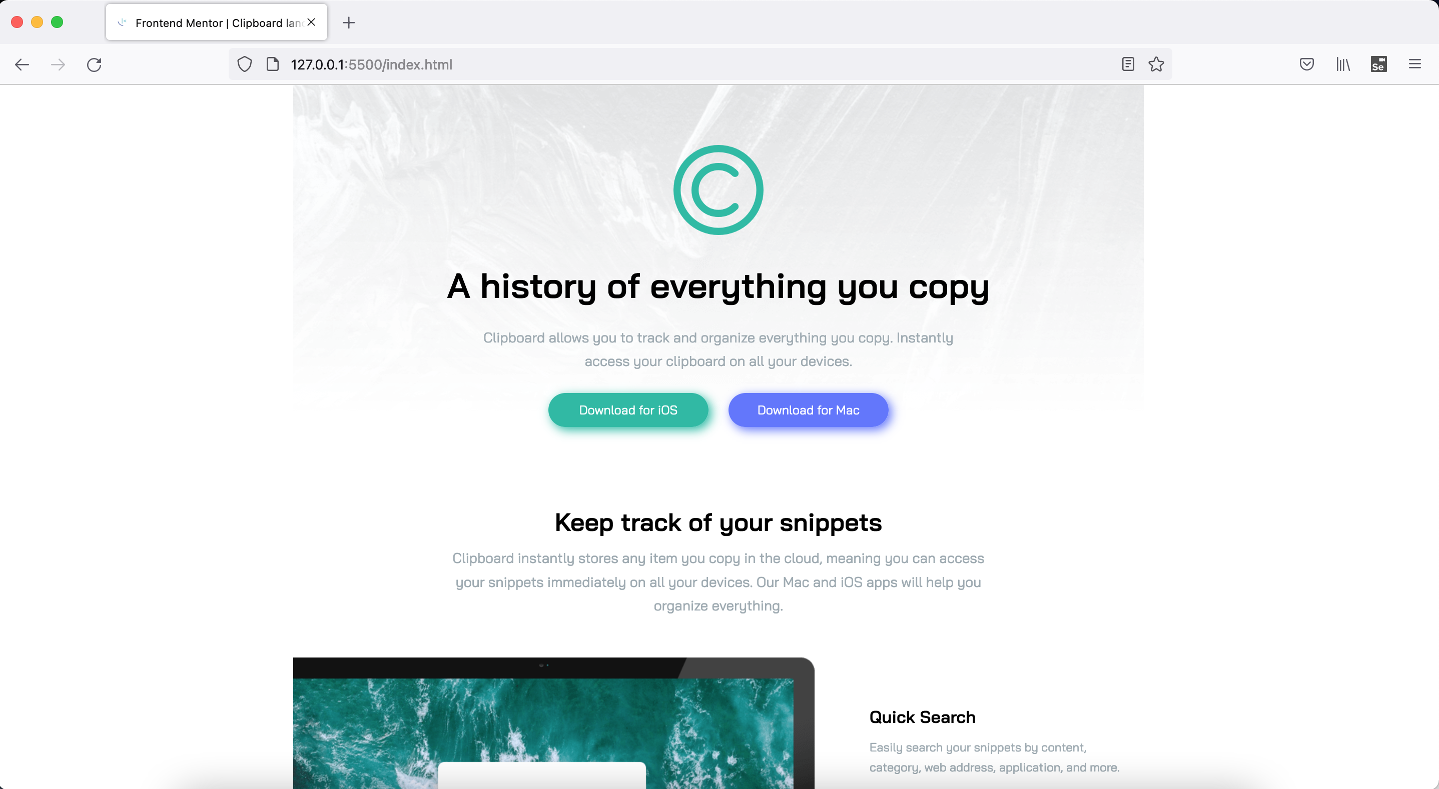
This is a solution to the Clipboard landing page challenge on Frontend Mentor. Frontend Mentor challenges help you improve your coding skills by building realistic projects.
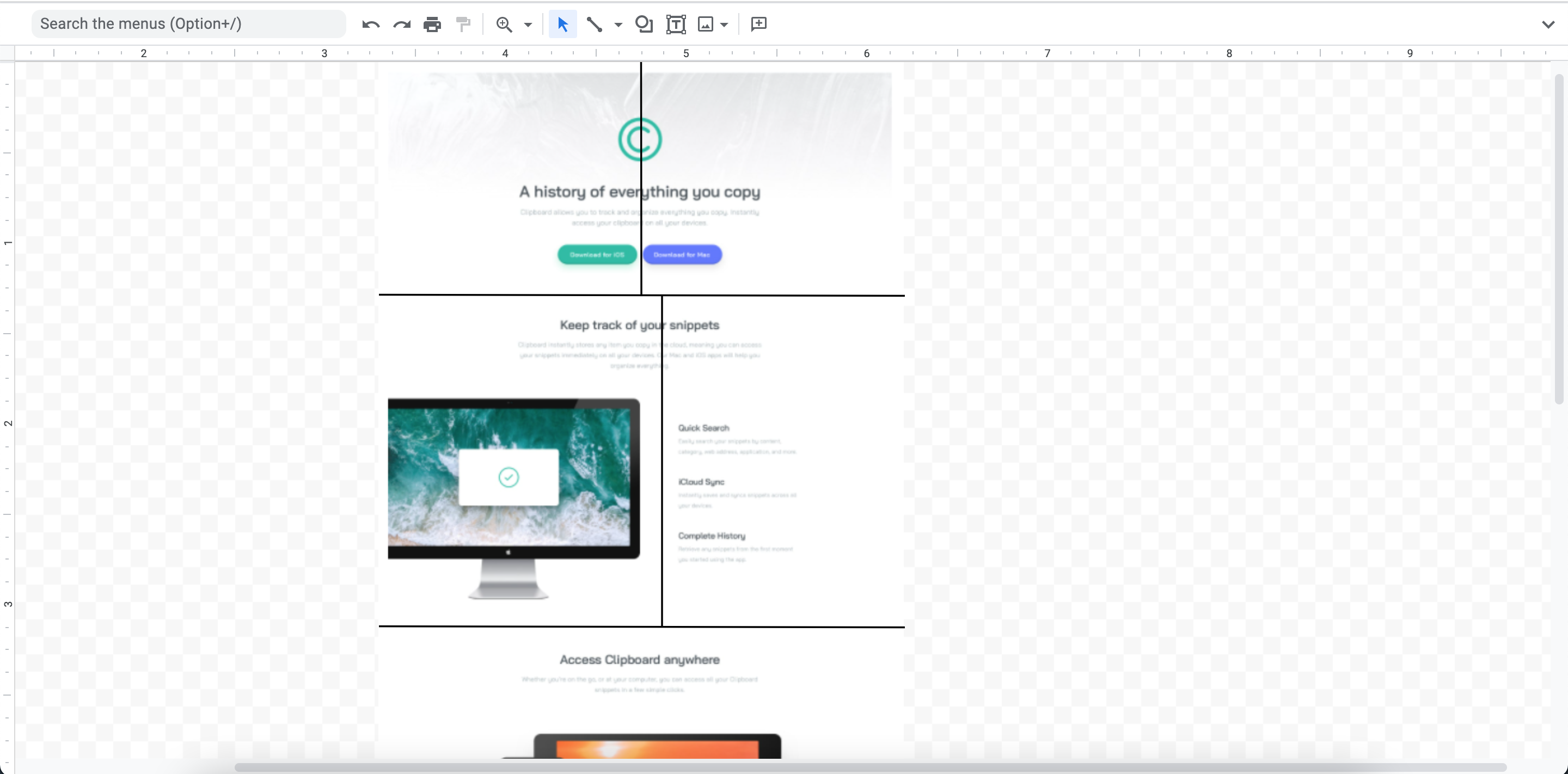
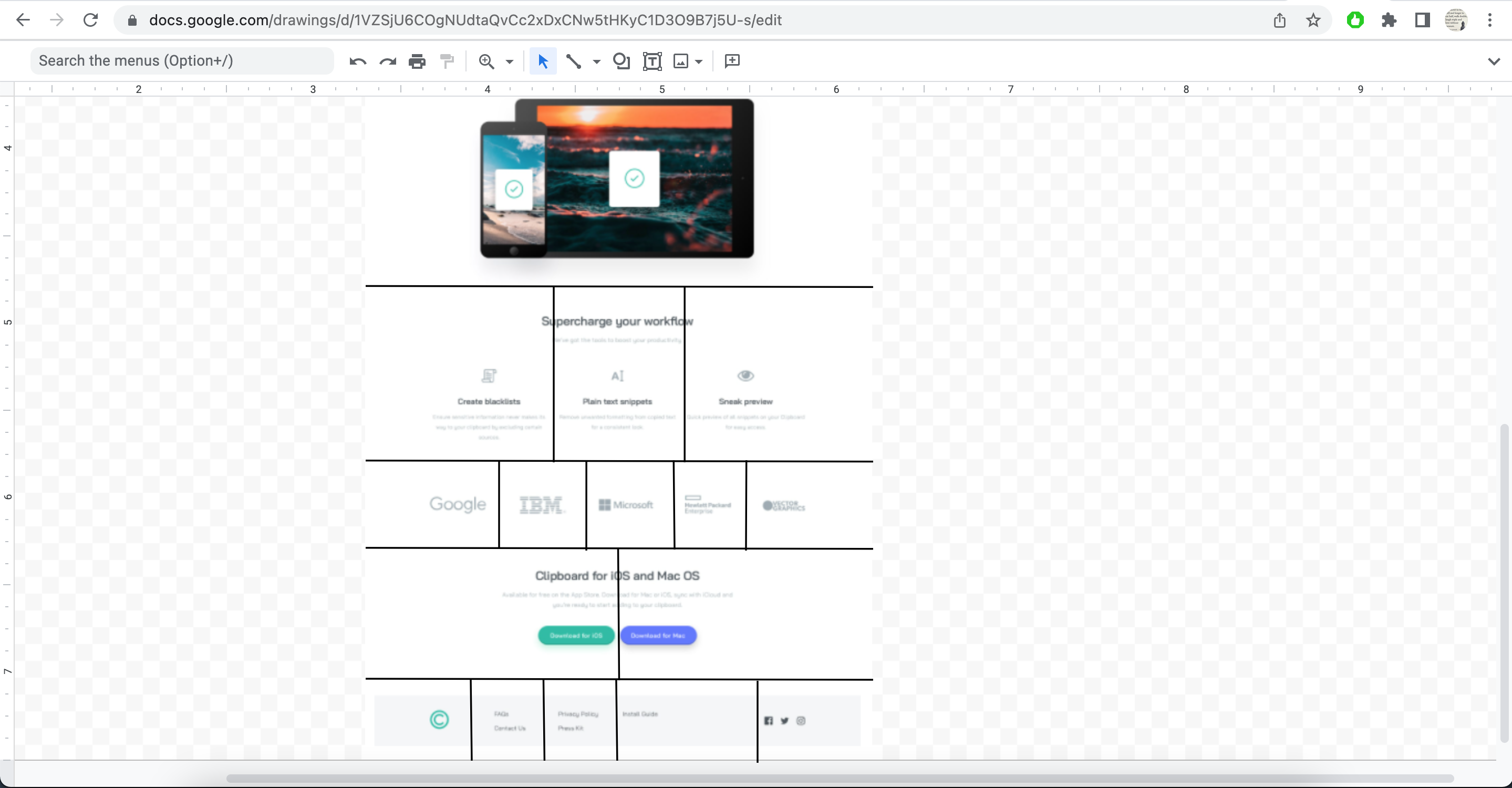
This is 11th project from "Frontend Mentor" to sharpen HTML & CSS skills along with responsive web design and it's build with "BEM", "Grid & Flexbox layout".
Users should be able to:
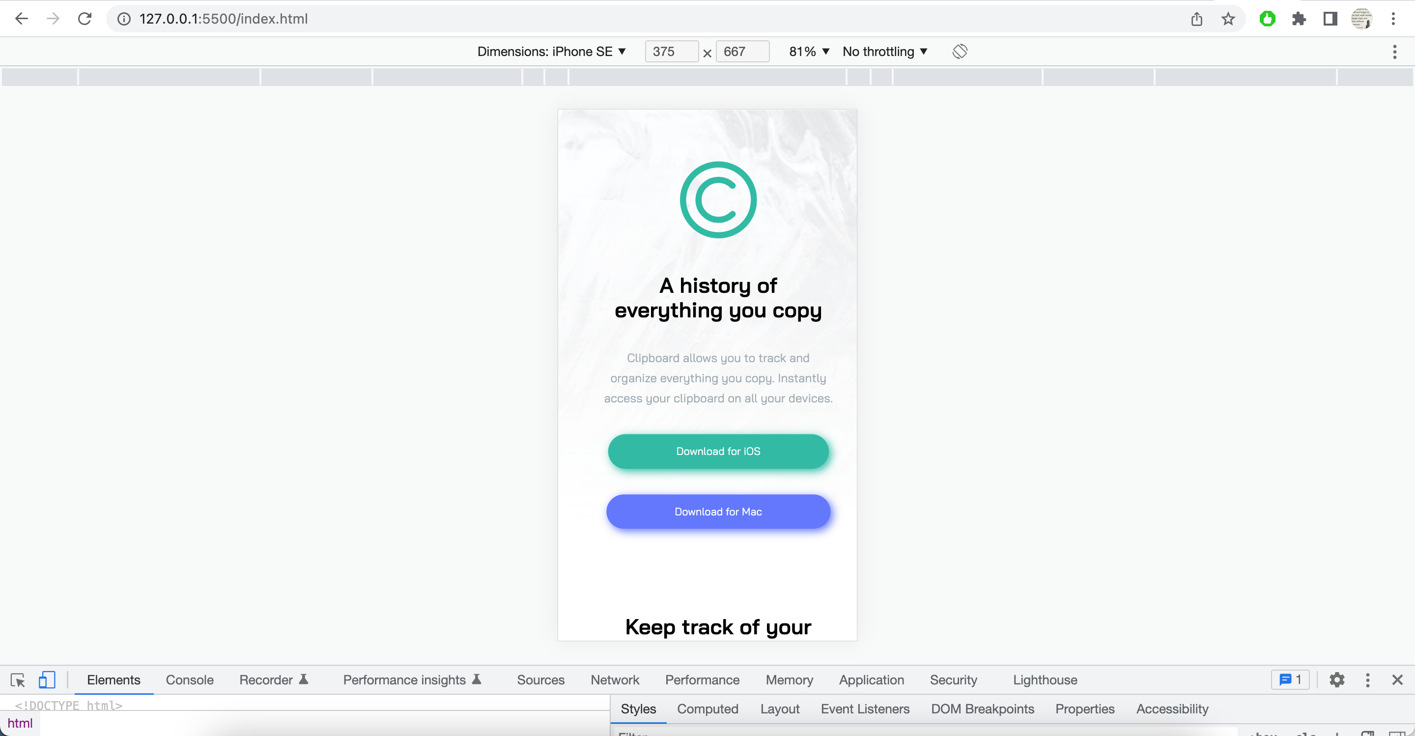
- View the optimal layout for the site depending on their device's screen size
- See hover states for all interactive elements on the page
- Semantic & Accessible HTML5 markup
- CSS BEM
- CSS Grid
- CSS Flexbox
- Mobile-first workflow
- Usage of width + max-width instead of large margin or padding values
- Resizing images
- Spacing between items
- Positioning of items in both mobile and desktop views
- Breaking big problems into smaller chunks and building on top of it
- FF and Chrome dev tool usage in various conditions
- Google "semantic html best practices"
- Google "html semantic elements rules"
- Google "can I use html body element as grid container"
- Need to practice more about width, height, positioning of items within Grid & Flexbox layouts
- How to avoid overflow issues
- Frontend Mentor slack community + website
- YT videos
- Google ofcourse
- Stackoverflow
- Twitter dev community
- Frontend Mentor - @vikramvi
- FM community
- YT content creators
- Google + SO community


