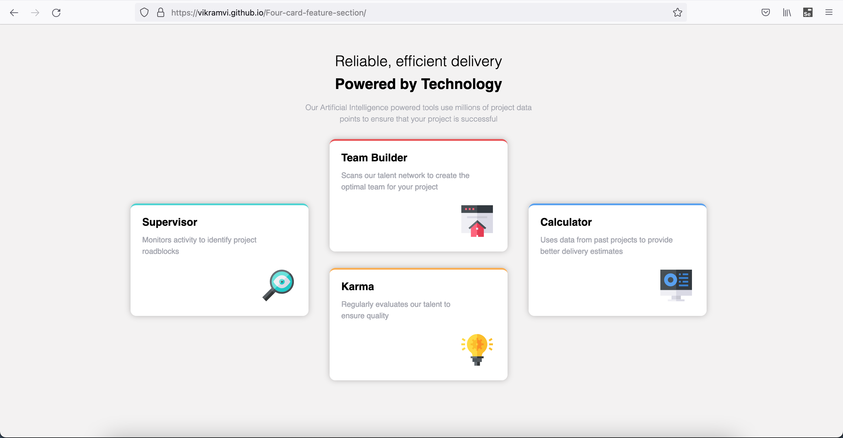
This is a solution to the Four card feature section challenge on Frontend Mentor. Frontend Mentor challenges help you improve your coding skills by building realistic projects.
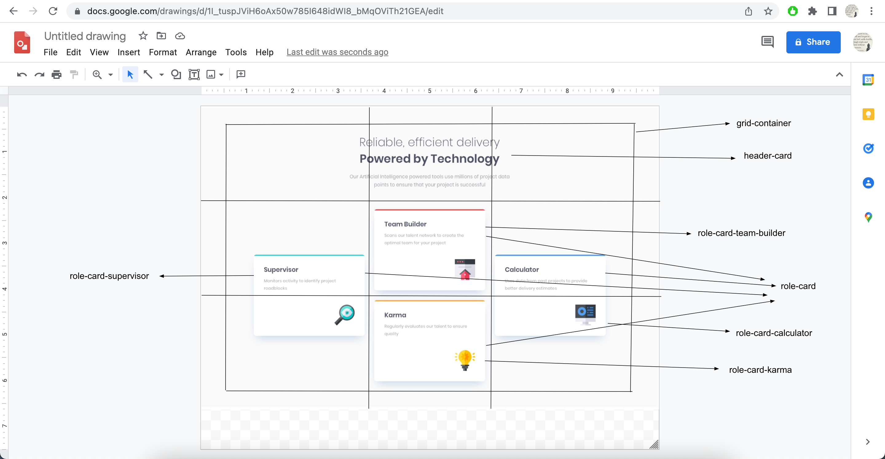
This is 8th project from "Frontend Mentor" to sharpen HTML & CSS skills along with responsive web design and it's build with "BEM" and "Grid layout".
Users should be able to:
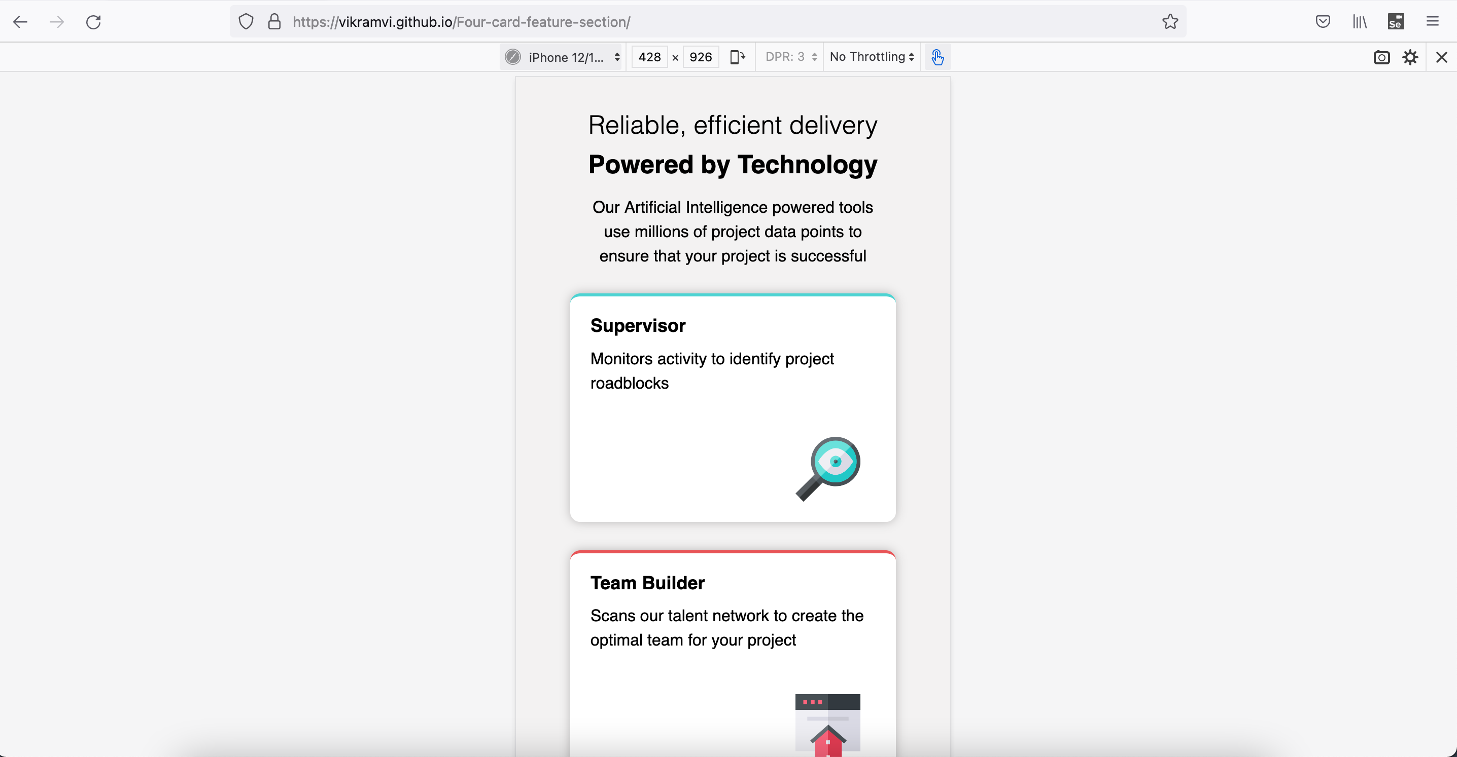
- View the optimal layout for the site depending on their device's screen size
- Semantic HTML5 markup
- CSS BEM
- CSS Grid
- Mobile-first workflow
- CSS "Grid" and "BEM" are best techniques to solve any complex design styling
- This helps with magic numbers being used in margin, padding etc
- No need to use CSS position at all
- More learnings wrt CSS Grid items positioning and aligning
- More learnings wrt CSS width & best practices
- More learnings wrt Semantic HTML
- In FF devtool, you can modify height, width with scroll bar kind of action
- More practice, reading, study is needed wrt BEM, SEO, Accessibility, CSS
- Google ofcourse
- YT videos
- Stackoverflow
- Frontend Mentor slack community
- Frontend Mentor - @vikramvi
- FM community
- SO community
- YT content creators


