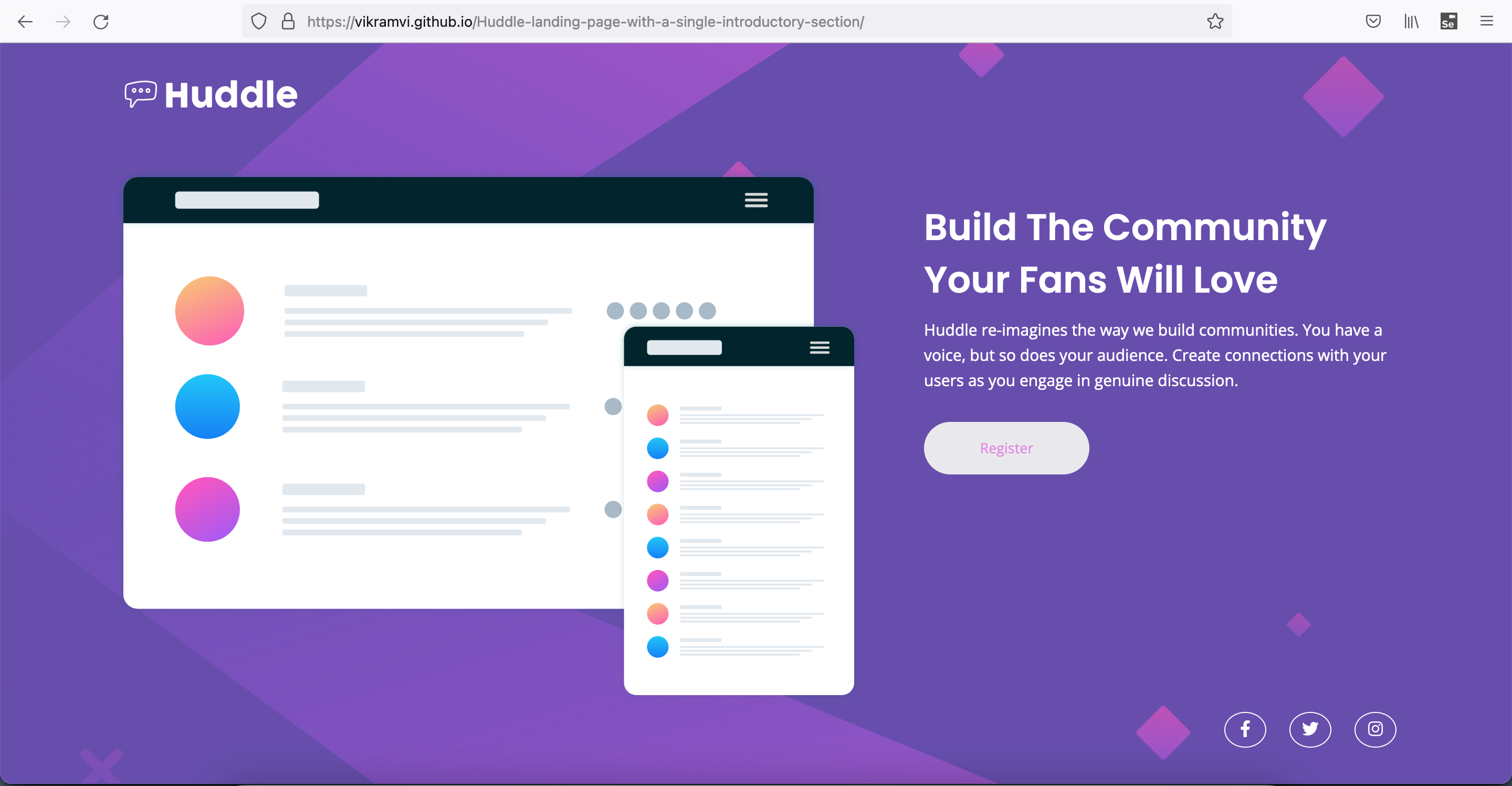
This is a solution to the Huddle landing page with single introductory section challenge on Frontend Mentor. Frontend Mentor challenges help you improve your coding skills by building realistic projects.
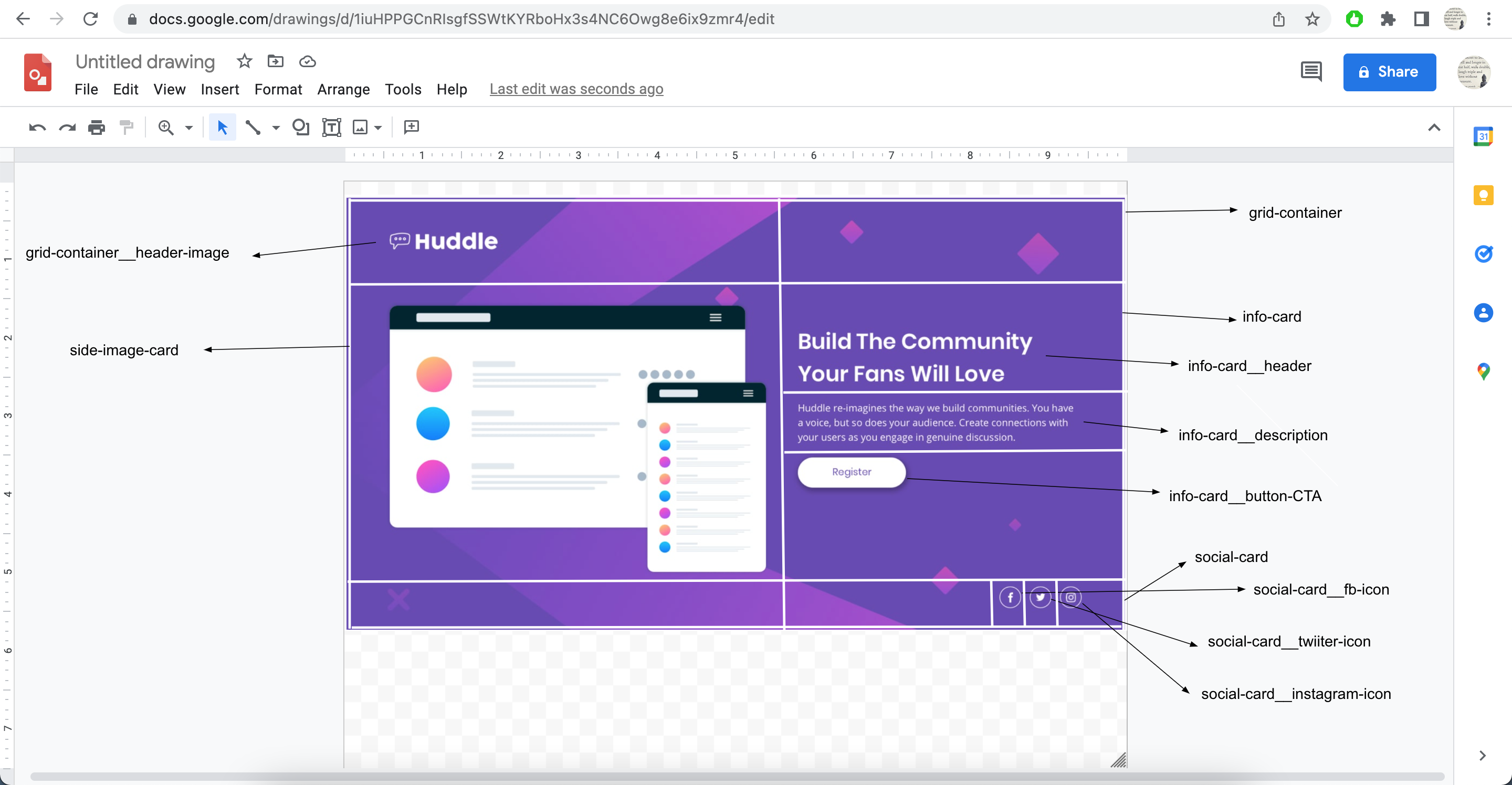
This is 9th project from "Frontend Mentor" to sharpen HTML & CSS skills along with responsive web design and it's build with "BEM" and "Grid layout".
Users should be able to:
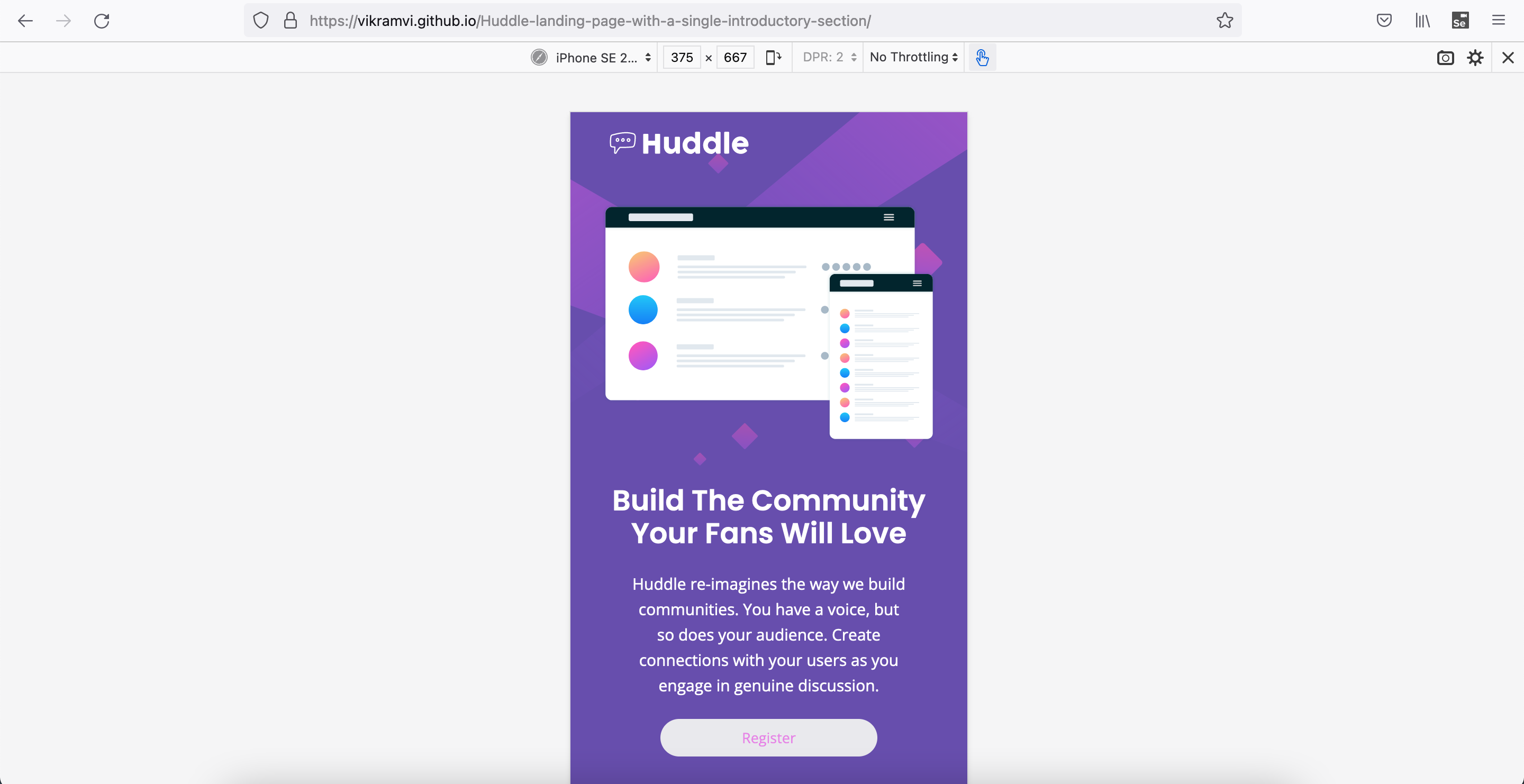
- View the optimal layout for the page depending on their device's screen size
- See hover states for all interactive elements on the page
- Semantic HTML5 markup
- CSS BEM
- CSS Grid
- Mobile-first workflow
- "width, "max-width" usage wrt CSS Grid
- Trial error from FF dev tool before doing actual code change
- fontawesome icon usage and related properties
- Grid item horizontal, vertical placing
- More practice, reading, study is needed wrt BEM, SEO, Accessibility, CSS, HTML
- Frontend Mentor slack community + website
- YT videos
- Google ofcourse
- Stackoverflow
- Frontend Mentor - @vikramvi
- FM community
- YT content creators
- Google + SO community


