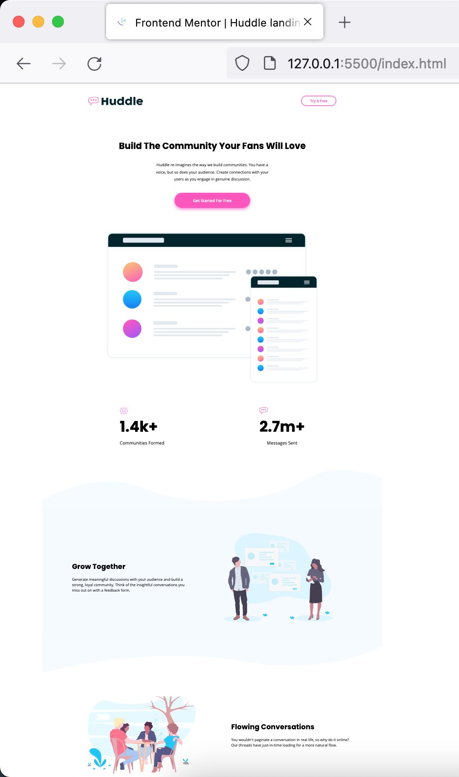
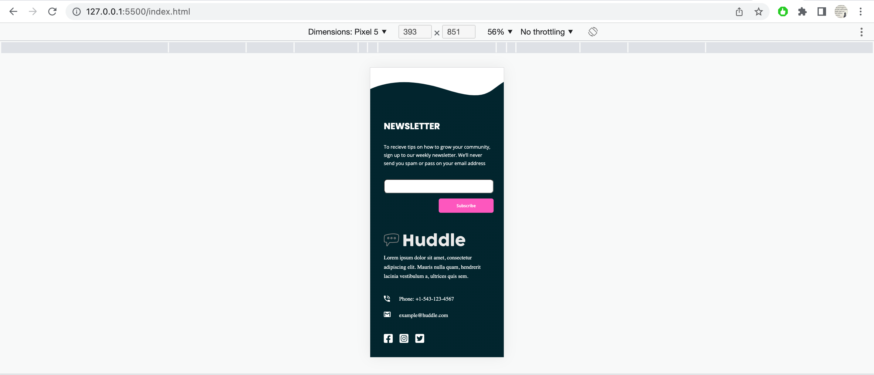
This is a solution to the Huddle landing page with curved sections challenge on Frontend Mentor. Frontend Mentor challenges help you improve your coding skills by building realistic projects.
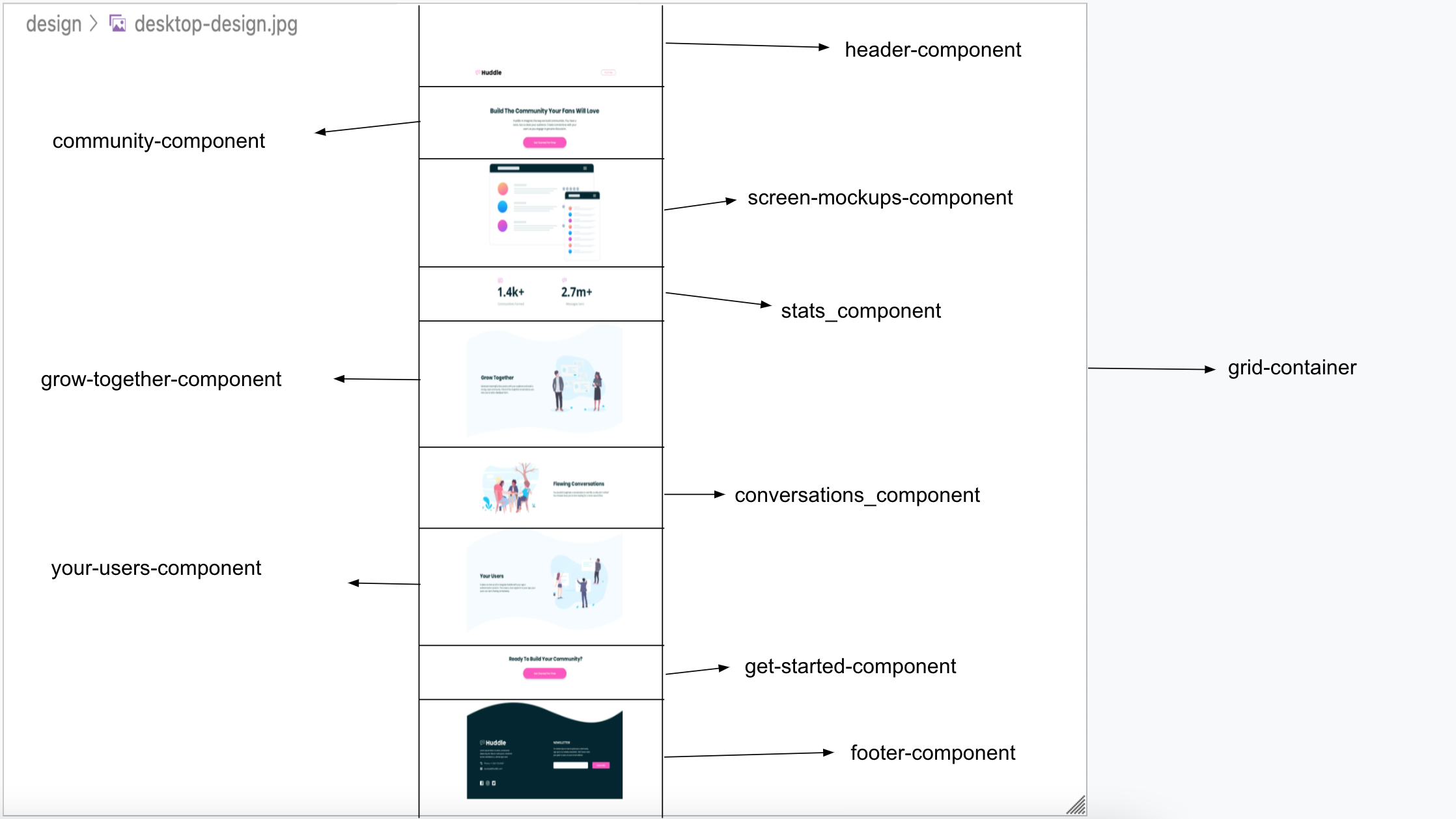
This is 13th project from "Frontend Mentor" to sharpen HTML & CSS skills along with responsive web design and it's build with "BEM", "Grid & Flexbox layout", "min-width, max-width & width in % trial & error".
Users should be able to:
- View the optimal layout for the site depending on their device's screen size
- See hover states for all interactive elements on the page
- "Little victories lead to bigger victories, that affect the battles that eventually win wars"
- Chop down big problem / task to smallest one possible and start solving / finishing one after another.
- Semantic HTML5 markup
- BEM
- Mobile-first workflow
- CSS Grid
- Flexbox
- min-width, max-width & width in % trial + errors
- Chrome and FF Dev Tools
- learning more about width, max-width & min-width techniques
- Grid & Flex usages
- Background image, color positioning
- How to make pixel perfect mobile & desktop layouts
- Learn more about semantic HTML for better SEO, Accessibility purposes
- CSS techniques to build websites faster with less bugs and refactoring needed
- Frontend Mentor slack community + website
- YT videos
- Google ofcourse
- Stackoverflow
- Twitter dev community
- Frontend Mentor - @vikramvi
- Frontend Mentor slack community
- YT content creators
- Google + SO communi


