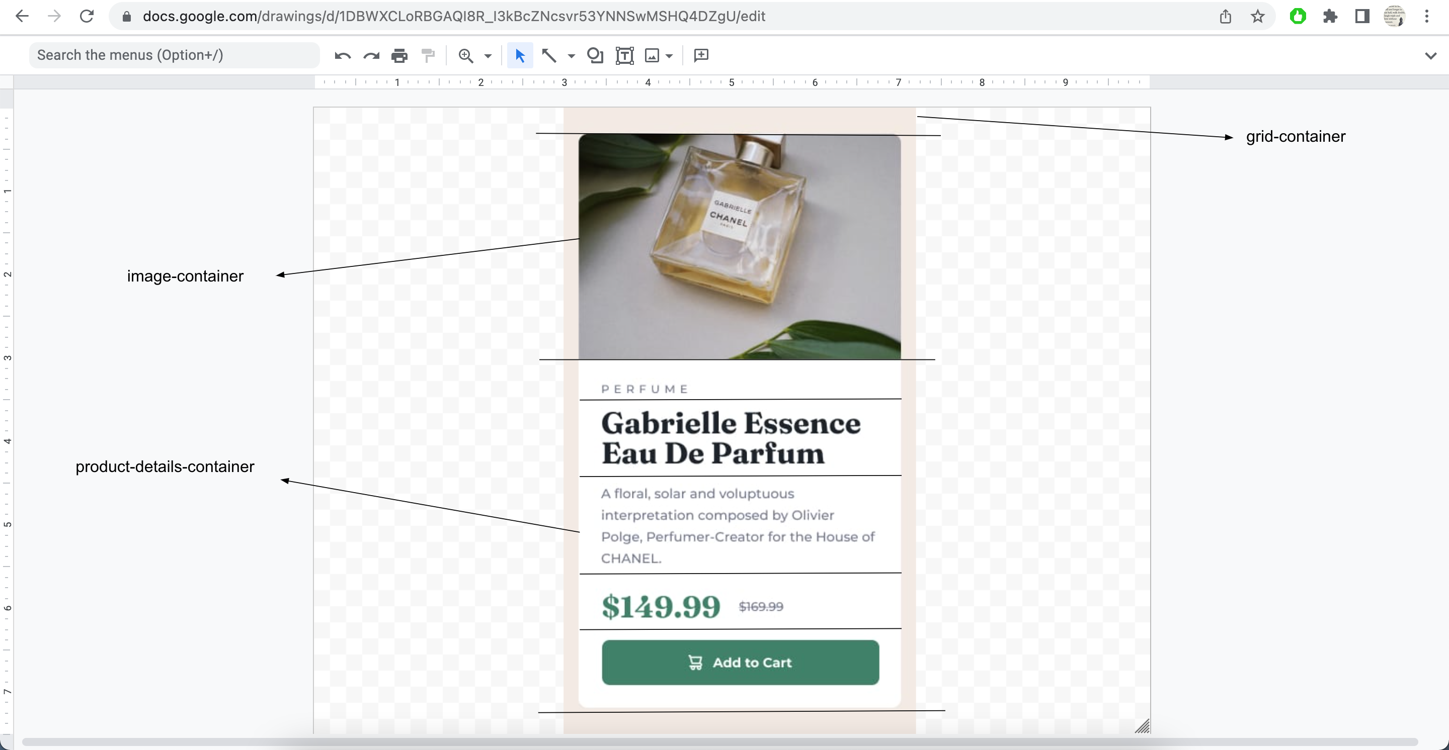
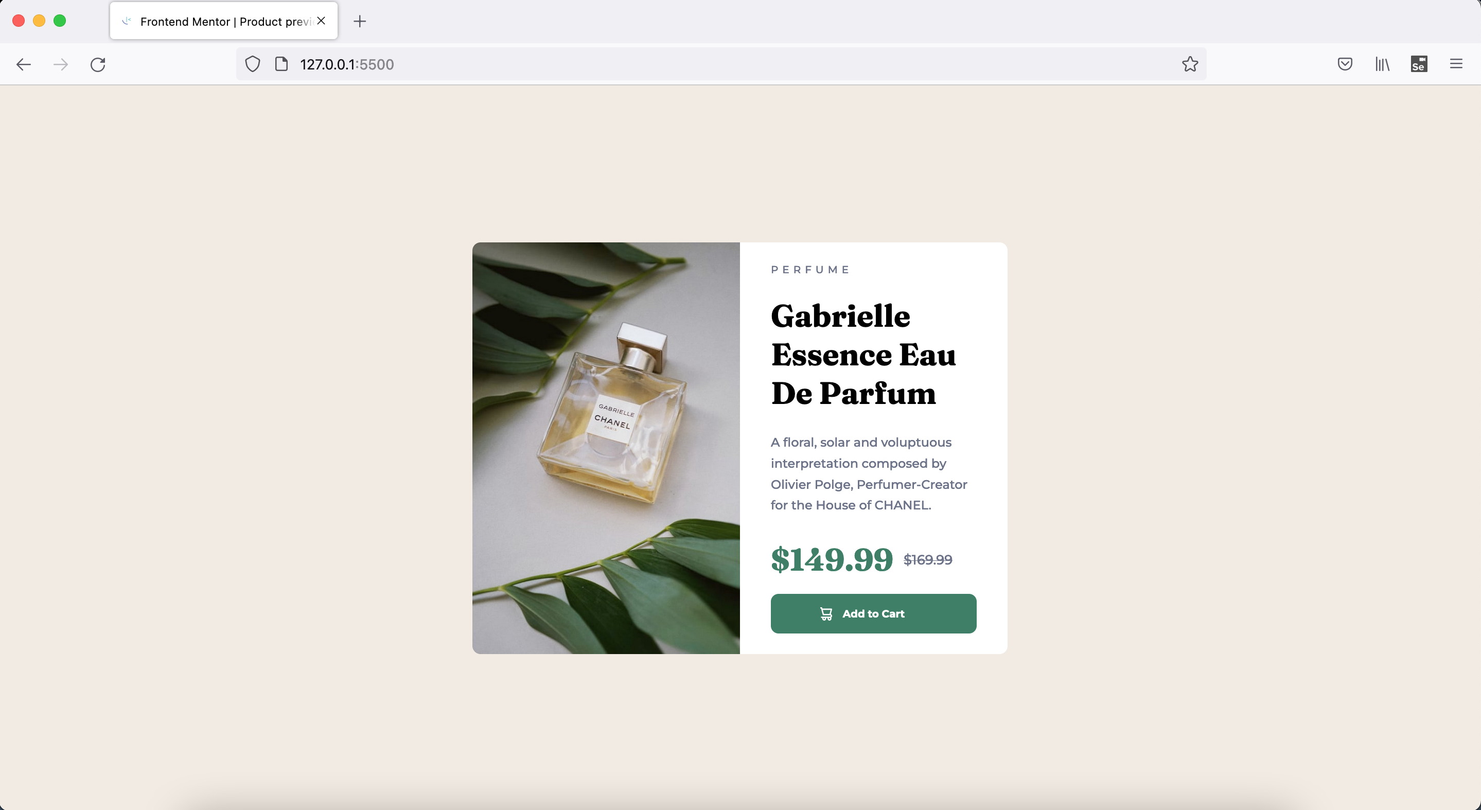
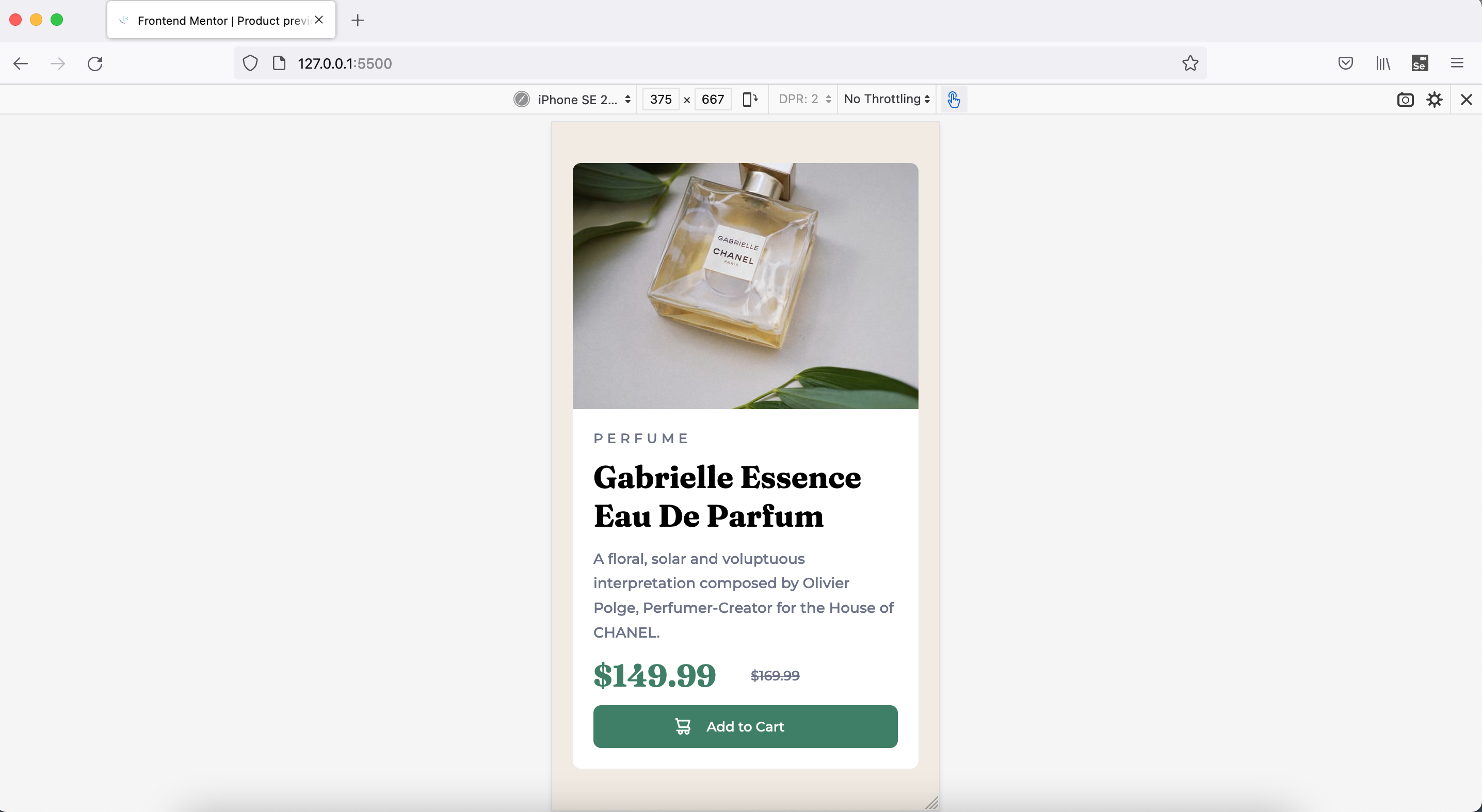
This is a solution to the Product preview card component challenge on Frontend Mentor. Frontend Mentor challenges help you improve your coding skills by building realistic projects.
This is 17th project from "Frontend Mentor" to sharpen HTML & CSS skills.
Users should be able to:
- View the optimal layout depending on their device's screen size
- See hover and focus states for interactive elements
- Grit, Love, Passion & Commitment
- Semantic + Accessible HTML5 markup
- BEM
- Mobile-first workflow
- CSS Grid
- Chrome and FF Dev Tools
- Googling
- It helps to break down big problem into smallest possible and start solving those small problems one by one
- ".. You just begin. You do the math. You solve one problem... and you solve the next one... and then the next. And If you solve enough problems, you get to come home. ..."
- Improving Googling techniques
- Better dev tool usage on both FF and Chrome
- Better debugging
- Different problem solving techniques
- Practice improves execution speed
- One can increase patience with programming and solving new challenges each day
-
Learn more about better practices wrt below
- Grid, Flexbox layouts
- Mobile layout designs
- width, max-width, min-width good practices
- padding, margin good practices
- SEO and Accessibility practices
- BEM
- Responsive Web Design optimum techniques
- Frontend Mentor slack community + website
- YT videos
- Stackoverflow
- Frontend Mentor - @vikramvi
- Frontend Mentor slack community
- YT content creators
- Google + SO community


