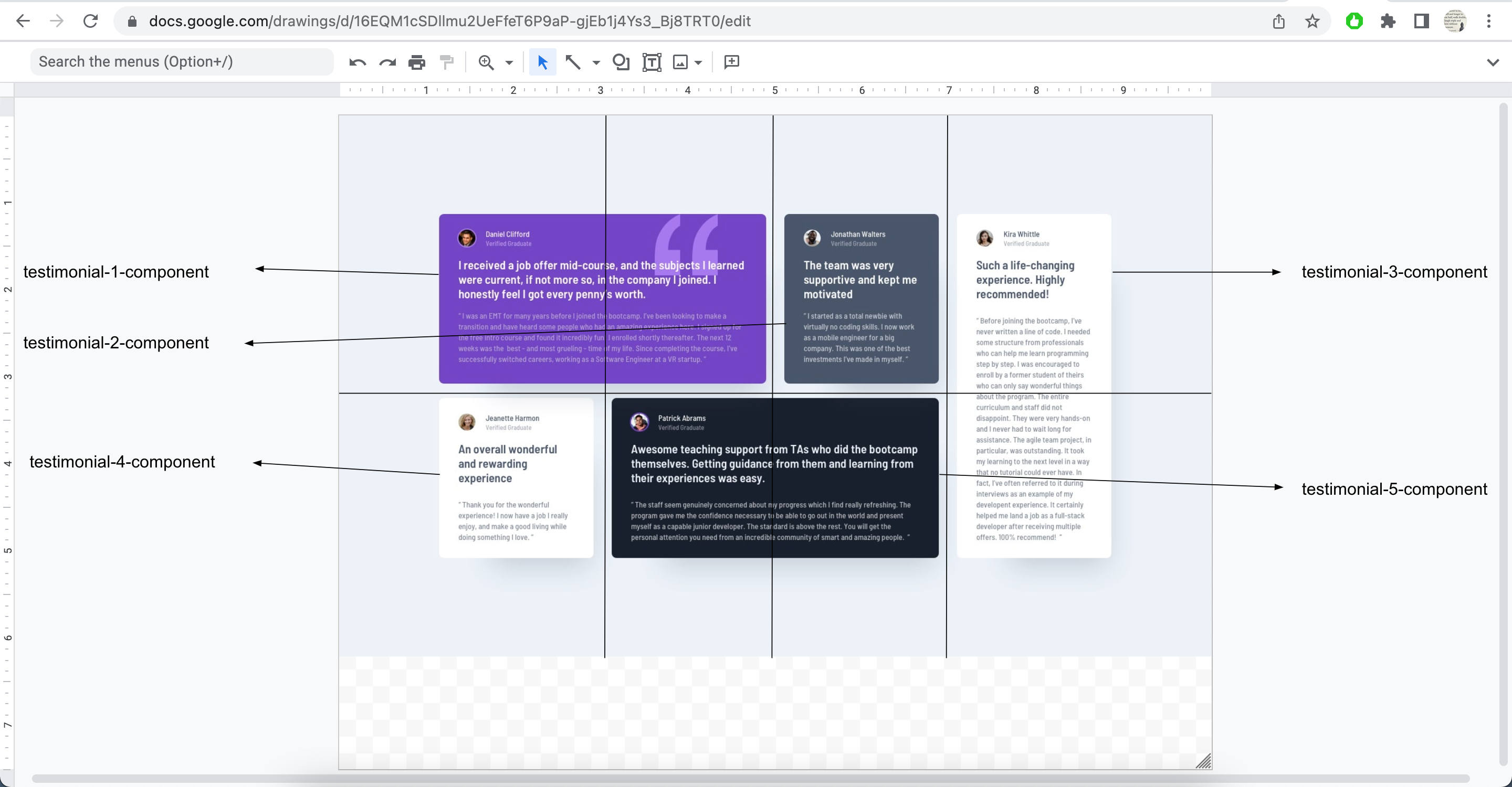
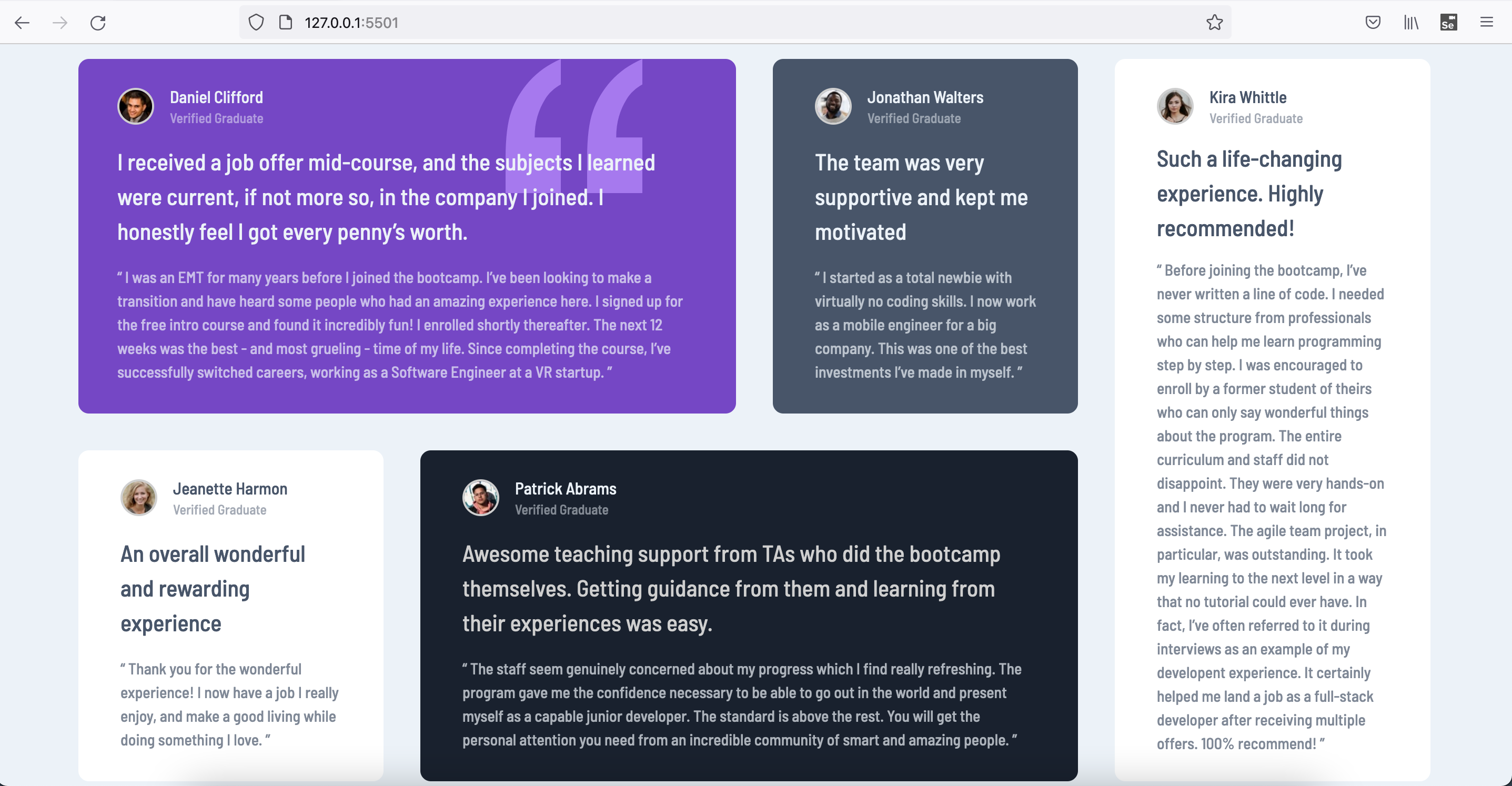
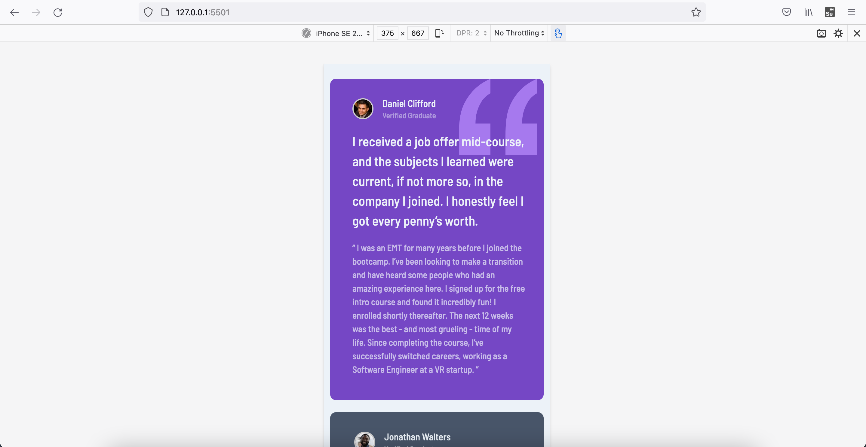
This is a solution to the Testimonials grid section challenge on Frontend Mentor. Frontend Mentor challenges help you improve your coding skills by building realistic projects.
This is 15th project from "Frontend Mentor" to sharpen HTML & CSS skills along with responsive web design and it's build with "BEM", "Grid & Flexbox layout", "min-width, max-width, width in various units & with help of Google ofcourse".
Users should be able to:
- View the optimal layout for the site depending on their device's screen size
- Semantic HTML5 markup
- BEM
- Mobile-first workflow
- CSS Grid
- Flexbox
- min-width, max-width & width in various units
- Chrome and FF Dev Tools
- Googling
- Improving Googling techniques
- Better dev tool usage on both FF and Chrome
- Better debugging
- Different problem solving techniques
-
Learn more about better practices wrt below
- Grid, Flexbox layouts
- Mobile layout designs
- width, max-width, min-width good practices
- padding, margin good practices
- SEO and Accessibility practices
- BEM
- Responsive Web Design optimum techniques
- Frontend Mentor slack community + website
- YT videos
- Stackoverflow
- Frontend Mentor - @vikramvi
- Frontend Mentor slack community
- YT content creators
- Google + SO community


