Omi v6.0.3
Omio v2.1.0
Omi - Next front end framework using web components with omio(IE8+) and omip(小程序) fallback in tiny js.
| Project | Description |
|---|---|
| omi-docs | Omi official documents |
omio |
Omi for old browsers(IE8+ and mobile browsers). |
omis |
Server-side rendering(support omio only). |
| omi-router | Omi official router in 1KB js. → DEMO |
| omi-cli | Project scaffolding |
| omi-devtools | Browser DevTools extension |
| omiu | Omi official UI |
| Project | Description |
|---|---|
omi-cloud |
小程序•云开发 |
omip |
直接使用 Omi 开发小程序或 H5 SPA |
mps |
原生小程序增强框架(JSX + Less 输出 WXML + WXSS),也支持 QQ 轻应用 |
omix |
极小却精巧的小程序框架 |
| omi-mp | 通过微信小程序开发和生成 Web 单页应用(H5 SPA) |
| comi | 小程序代码高亮和 markdown 渲染组件 |
| wx-touch-event | 基于 AlloyFinger/omi-finger 改造的小程序手势解决方案 |
| Project | Description |
|---|---|
| omi-chart | Simple HTML5 Charts using chart-x tag. |
| md2site | Static Site Generator with markdown powered by Omio. |
| omi-mvvm | MVVM comes back bravely with mappingjs strong support. |
| omi-html | Using htm in omi. |
| omi-30-seconds | Useful Omi snippets that you can understand in 30 seconds. |
| omi-canvas | Perfect fusion of web components, jsx and canvas. |
| omi-swiper | Omi + Swiper |
| omi-vscode | Vscode extension for omi, Install now! |
| omi-ex | Omi.js extension(TypeScript) |
| omi-transform | Omi / css3transform integration. Made css3 transform super easy in your Omi project. |
| omi-tap | Native tap event support(omi v4.0.24+) |
| omi-finger | Support touch and gesture events in your Omi project. |
| omi-touch | Smooth scrolling, rotation, pull to refresh and any motion for the web. |
| omi-native | Render web components to native |
| omi-i18n | Internationalization solution for omi.js using i18next ecosystem |
| omi-page | Tiny client-side router by page |
- One framework. Mobile & desktop & mini program.
- Tiny size
- Supports TypeScript
- Reactive data-binding
- Having official UI components - omiu
- Excellent compatibility(IE8+) with omio
- Real MVVM with mappingjs strong support
- Enhanced CSS, rpx unit support base on 750 screen width
- Compliance with browser trend and API design
- Merge Web Components and JSX into one framework
- Web Components can also be a data-driven view,
UI = fn(data). - JSX is the best development experience (code intelligent completion and tip) UI Expression with least grammatical noise and it's turing complete(template engine is not, es template string is but grammatical noise is too loud)
- Look at Facebook React vs Web Components,Omi combines their advantages and gives developers the freedom to choose the way they like
- Shadow DOM merges with Virtual DOM, Omi uses both virtual DOM and real Shadow DOM to make view updates more accurate and faster
- Scoped CSS's best solution is Shadow DOM, the community churning out frameworks and libraries for Scoped CSS (using JS or JSON writing styles such as Radium, jsxstyle, react-style; binding to webpack using generated unique
classNamefilename-classname-hash, such as CSS Modules, Vue), are hack technologies; and Shadow DOM Style is the perfect solution. - The original Path Updating store system. Proxy-based automatic accurate update, low power consumption, high degree of freedom, excellent performance, easy integration of
requestIdleCallback,It will automatically update UI partially when data is changed
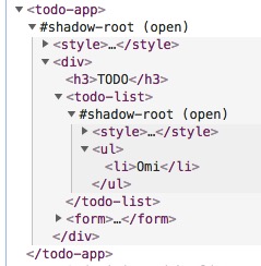
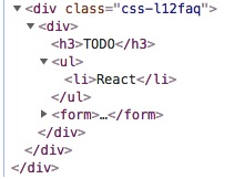
Compare TodoApp by Omi and React, Omi and React rendering DOM structure:
| Omi | React |
|---|---|
 |
 |
Omi uses Shadow DOM based style isolation and semantic structure.
- Ecosystem of Omi
- Useful Resources
- Add Omi in One Minute
- Add Omi in 30 Seconds
- Getting Started
- Debugging
- Browsers Support
- Contributors
- Maintainers
- Thanks
- License
This page demonstrates using Omi with no build tooling.
<!DOCTYPE html>
<html>

<head>
  <meta charset="UTF-8" />
  <title>Add Omi in One Minute</title>
</head>

<body>
  <script src="https://unpkg.com/omi"></script>
  <script>
    const { WeElement, h, render, define } = Omi

    define('like-button', class extends WeElement {
        install() {
          this.data = { liked: false }
        }

        render() {
          if (this.data.liked) {
            return 'You liked this.'
          }

          return h(
            'button',
            {
              onClick: () => {
                this.data.liked = true
                this.update()
              }
            },
            'Like'
          )
        }
      })

    render(h('like-button'), 'body')
  </script>
</body>

</html>
You can also use like-button tag directly in HTML:
<body>
  <like-button />
</body>You can also quickly build omi projects using modern JS code:
import { render, WeElement, define } from 'omi'

define('my-counter', class extends WeElement {
    static observe = true

    data = {
      count: 1
    }

    static css = `
      span{
          color: red;
      }`

    sub = () => {
      this.data.count--
    }

    add = () => {
      this.data.count++
    }

    render() {
      return (
        <div>
          <button onClick={this.sub}>-</button>
          <span>{this.data.count}</span>
          <button onClick={this.add}>+</button>
        </div>
      )
    }
  })

render(<my-counter />, 'body')
You can also update the view manually then you can choose the best time to update.
import { render, WeElement, define } from 'omi'

define('my-counter', class extends WeElement {
  data = {
    count: 1
  }

  static css = `
    span{
        color: red;
    }`

  sub = () => {
    this.data.count--
    this.update()
  }

  add = () => {
    this.data.count++
    this.update()
  }

  render() {
    return (
      <div>
        <button onClick={this.sub}>-</button>
        <span>{this.data.count}</span>
        <button onClick={this.add}>+</button>
      </div>
    )
  }
})

render(<my-counter />, 'body')$ npm i omi-cli -g # install cli
$ omi init my-app # init project, you can also exec 'omi init' in an empty folder
$ cd my-app # please ignore this command if you executed 'omi init' in an empty folder
$ npm start # develop
$ npm run build # release
npx omi-cli init my-appis also supported(npm v5.2.0+).
Directory description:
├─ config
├─ public
├─ scripts
├─ src
│  ├─ assets
│  ├─ elements    //Store all custom elements
│  ├─ store       //Store all this store of pages
│  ├─ admin.js    //Entry js of compiler,will build to admin.html
│  └─ index.js    //Entry js of compiler,will build to index.html
"scripts": {
    "start": "node scripts/start.js",
    "build": "PUBLIC_URL=. node scripts/build.js",
    "build-windows": "set PUBLIC_URL=.&& node scripts/build.js",
    "fix": "eslint src --fix"
}
You can set up the PUBLIC_URL, such as:
...
"build": "PUBLIC_URL=https://fe.wxpay.oa.com/dv node scripts/build.js",
"build-windows": "set PUBLIC_URL=https://fe.wxpay.oa.com/dv&& node scripts/build.js",
...Add or remove the alias config in package.json to switch omi and omio:
 ...
 "alias": {
    "omi": "omio"
  }
...| Template Type | Command | Describe |
|---|---|---|
| Base Template(v3.3.0+) | omi init my-app |
Basic omi or omio(IE8+) project template. |
| Base Template with snapshoot | omi init-snap my-app |
Basic omi or omio(IE8+) project template with snapshoot prerendering. |
| TypeScript Template(omi-cli v3.3.0+) | omi init-ts my-app |
Basic template with typescript. |
| Mobile Template | omi init-weui my-app |
Mobile web app template with weui and omi-router. |
| omi-mp Template(omi-cli v3.0.13+) | omi init-mp my-app |
Developing web with mini program template. |
| MVVM Template(omi-cli v3.0.22+) | omi init-mvvm my-app |
MVVM template. |
The base Template(omi init my-app) is based on a single-page create-react-app to be converted into a multi-page one, with configuration issues to see create-react-app user guide
Define a custom element by extending WeElement base class:
import { define, WeElement } from 'omi'

define('hello-element', class extends WeElement {
  onClick = evt => {
    // trigger CustomEvent
    this.fire('abc', { name: 'dntzhang', age: 12 })
    evt.stopPropagation()
  }

 static css = `
      div {
        color: red;
        cursor: pointer;
      }`

  render(props) {
    return (
      <div onClick={this.onClick}>
        Hello {props.msg} {props.propFromParent}
        <div>Click Me!</div>
      </div>
    )
  }
})
Using hello-element:
import { define, render, WeElement } from 'omi'
import './hello-element'

define('my-app', class extends WeElement {
  data = { abc: 'abc', passToChild: 123 }

  // define CustomEvent Handler
  onAbc = evt => {
    // get evt data by evt.detail
    this.data.abc = ' by ' + evt.detail.name
    this.data.passToChild = 1234
    this.update()
  }

  css = `
      div{
          color: green;
      }`
  }

  render(props, data) {
    return (
      <div>
        Hello {props.name} {data.abc}
        <hello-element
          onAbc={this.onAbc}
          propFromParent={data.passToChild}
          msg="WeElement"
        />
      </div>
    )
  }
})

render(<my-app name="Omi v4.0" />, 'body')
Tell Babel to transform JSX into Omi.h() call:
{
  "presets": ["env", "omi"]
}
The following two NPM packages need to be installed to support the above configuration:
"babel-preset-env": "^1.6.0",
"babel-preset-omi": "^0.1.1",
If you use babel7, you can also use the following packages and configuration:
npm install --save-dev @babel/preset-env
npm install --save-dev @babel/preset-react
{
"presets": [
"@babel/preset-env",
[
"@babel/preset-react",
{
"pragma": "Omi.h"
}
]
]
}If you don't want to write CSS in JS, you can use to-string-loader of webpack, For example, the following configuration:
{
  test: /[\\|\/]_[\S]*\.css$/,
  use: [
    'to-string-loader',
    'css-loader'
  ]
}
If your CSS file starts with "_", CSS will use to-string-loader., such as:
import { tag, WeElement render } from 'omi'

define('my-app', class extends WeElement {

  css = require('./_index.css')
  ...
  ...
  ...
You can also forget the tedious configuration and use omi-cli directly, no need to configure anything.
Here is a relatively complete example of TodoApp:
import { define, render, WeElement } from 'omi'

define('todo-list', function(props) {
  return (
    <ul>
      {props.items.map(item => (
        <li key={item.id}>{item.text}</li>
      ))}
    </ul>
  )
})

define('todo-app', class extends WeElement {
  static observe = true

  data = { items: [], text: '' }

  render() {
    return (
      <div>
        <h3>TODO</h3>
        <todo-list items={this.data.items} />
        <form onSubmit={this.handleSubmit}>
          <input
            id="new-todo"
            onChange={this.handleChange}
            value={this.data.text}
          />
          <button>Add #{this.data.items.length + 1}</button>
        </form>
      </div>
    )
  }

  handleChange = e => {
    this.data.text = e.target.value
  }

  handleSubmit = e => {
    e.preventDefault()
    if (!this.data.text.trim().length) {
      return
    }
    this.data.items.push({
      text: this.data.text,
      id: Date.now()
    })
    this.data.text = ''
  }
})

render(<todo-app />, 'body')Omi Store provides a way to pass data through the component tree without having to pass props down manually at every level, injected from the root component and shared across all subcomponents. It's very simple to use:
import { define, render, WeElement } from 'omi'

define('my-hello', class extends WeElement {
  render() {
    //use this.store in any method of any children components
    return <div>{this.store.name}</div>
  }
})

define('my-app', class extends WeElement {
  handleClick = () => {
     //use this.store in any method of any children components
    this.store.reverse()
    this.update()
  }

  render() {
    return (
      <div>
        <my-hello />
        <button onclick={this.handleClick}>reverse</button>
      </div>
    )
  }
})

const store = {
  name: 'abc',
  reverse: function() {
    this.name = this.name.split("").reverse().join("")
  }
}
//Injection through a third parameter
render(<my-app />, document.body, store)
Unlike global variables, when there are multiple root nodes, multiple stores can be injected, while there is only one global variable.
| Lifecycle method | When it gets called |
|---|---|
install |
before the component gets mounted to the DOM |
installed |
after the component gets mounted to the DOM |
uninstall |
prior to removal from the DOM |
beforeUpdate |
before update |
updated |
after update |
beforeRender |
before render() |
receiveProps |
parent element re-render will trigger it |
Easy to debug via Omi DevTools Extension [Install from Chrome WebStore], using Omi DevTools you can simply debug and manage your UI without any configuration. Just install and debug.
Since Omi uses Web Components and Shadow-DOM, it doesn't need to have another elements panel such as React has. It just adds a panel to the Elements' sidebar and it's powerful as much as React DevTools.
Omio - Omi for old browsers(IE8+ and mobile browsers)
Omi 4.0+ works in the latest two versions of all major browsers: Safari 10+, IE 11+, and the evergreen Chrome, Firefox, and Edge.
<script src="https://unpkg.com/@webcomponents/[email protected]/webcomponents-bundle.js"></script>Please contact us for any questions. Also, Add Omi QQ Group.
MIT © Tencent

