-
Notifications
You must be signed in to change notification settings - Fork 884
ColorPicker
XceedBoucherS edited this page Oct 17, 2019
·
6 revisions
Derives from Control
The ColorPicker is an editor that allows a user to pick a color from predefined color palettes. By default, there are 140 available colors and 10 predefined standard colors. You can use your own custom color palettes by setting the AvailableColors and StandardColors properties accordingly. You can also get/set the recently used colors by using the RecentColors property.
Display (DisplayColorAndName = true/false)

Expanded Standard

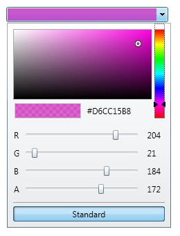
Expanded Advanced

| Property | Description |
|---|---|
| AdvancedTabHeader | Gets or sets the text to use for the "Advanced" tab in the ColorPicker's popup. |
| AvailableColors | Gets or sets all colors that are available to the user for selection. |
| AvailableColorsHeader | Gets or sets the header text of the Available Colors section. |
| AvailableColorSortingMode | Gets or sets the way the Available colors are sorted (Alphabetical or by HueSaturationBrightness). By default, Alphabetical. |
| ButtonStyle | Gets or sets the dropdown button style. |
| ColorMode | Gets or sets the current display of the ColorPicker (ColorPalette or ColorCanvas). By default, ColorPalette. |
| DisplayColorAndName | Gets or sets a value indicating if the control should display the color, or the color and color name. |
| DisplayColorTooltip | Gets or sets if Tooltips will be shown in the popup of the ColorPicker to display the preset color names. Default is True. |
| DropDownBackground | Gets or sets the background of the popup. |
| HeaderBackground | Gets or sets the background of the headers used in the popup. |
| HeaderForeground | Gets or sets the foreground of the headers used in the popup. |
| IsOpen | Gets or sets the value indicating if the color dropdown is open. |
| MaxDropDownWidth | Gets or Sets the maximum width of the ColorPicker popup's content. |
| RecentColors | Gets or sets all the recently selected colors. |
| RecentColorsHeader | Gets or sets the header text of the Recent Colors section. |
| SelectedColor | Gets or sets the currently selected color. |
| SelectedColorText | Gets the known color name, or the color hexadecimal string of the SelectedColor. |
| ShowAvailableColors | Gets or sets the visibility of the AvailableColors. |
| ShowDropDownButton | Gets or sets a value indicating whether the dropdown button is shown. |
| ShowRecentColors | Gets or sets the visibility of the RecentColors (false by default). |
| ShowStandardColors | Gets or sets the visibility of the StandardColors. |
| ShowTabHeaders | Gets or sets a value indicating if the Advanced color mode tabs are visible in the popup. |
| StandardColors | Gets or sets a standard color palette. |
| StandardColorsHeader | Gets or sets the header text of the Standard Colors section. |
| TabBackground | Gets or sets the background of the tabs used in the popup. |
| TabForeground | Gets or sets the foreground of the tabs used in the popup. |
| UsingAlphaChannel | Gets a value indicating whether the alpha channel is being used. |
| Event | Description |
|---|---|
| Closed | Raised when the ColorPicker popup is closed. |
| Opened | Raised when the ColorPicker popup is opened. |
| SelectedColorChanged | Raised when the SelectedColor value changes. |
Support this project, check out the Plus Edition.