Flutter SliverAppBar全解析,你要的效果都在这了!
转载请声明出处!!!
先来简单看下部分效果图:

本文内容可能有点多,但是都很简单,配上效果图味道更佳~
SliverAppBar 类似于Android中的CollapsingToolbarLayout,可以轻松实现页面头部展开、合并的效果。
与AppBar大部分的属性重合,相当于AppBar的加强版。
先从最基本的效果开始,一步一步做到全效果。
  const SliverAppBar({
    Key key,
    this.leading,//左侧的图标或文字,多为返回箭头
    this.automaticallyImplyLeading = true,//没有leading为true的时候,默认返回箭头,没有leading且为false,则显示title
    this.title,//标题
    this.actions,//标题右侧的操作
    this.flexibleSpace,//可以理解为SliverAppBar的背景内容区
    this.bottom,//SliverAppBar的底部区
    this.elevation,//阴影
    this.forceElevated = false,//是否显示阴影
    this.backgroundColor,//背景颜色
    this.brightness,//状态栏主题,默认Brightness.dark,可选参数light
    this.iconTheme,//SliverAppBar图标主题
    this.actionsIconTheme,//action图标主题
    this.textTheme,//文字主题
    this.primary = true,//是否显示在状态栏的下面,false就会占领状态栏的高度
    this.centerTitle,//标题是否居中显示
    this.titleSpacing = NavigationToolbar.kMiddleSpacing,//标题横向间距
    this.expandedHeight,//合并的高度,默认是状态栏的高度加AppBar的高度
    this.floating = false,//滑动时是否悬浮
    this.pinned = false,//标题栏是否固定
    this.snap = false,//配合floating使用
  })
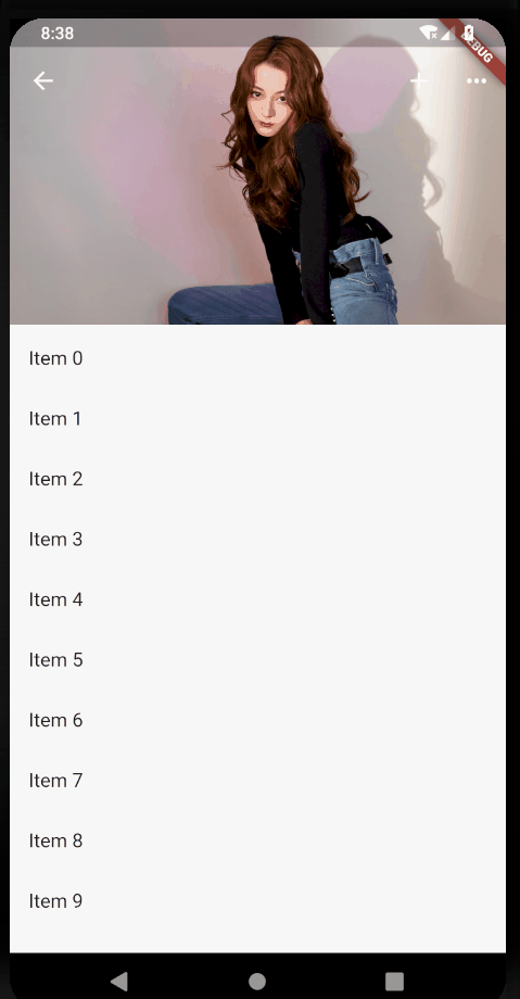
    return Scaffold(
      body: new CustomScrollView(
        slivers: <Widget>[
          new SliverAppBar(
            title: Text("标题"),
            expandedHeight: 230.0,
            floating: false,
            pinned: true,
            snap: false,
          ),
          new SliverFixedExtentList(
            itemExtent: 50.0,
            delegate: new SliverChildBuilderDelegate(
              (context, index) => new ListTile(
                    title: new Text("Item $index"),
                  ),
              childCount: 30,
            ),
          ),
        ],
      ),
    );
这是最最最基本的效果了,但是也简陋的不行,下面开始一步一步改造。
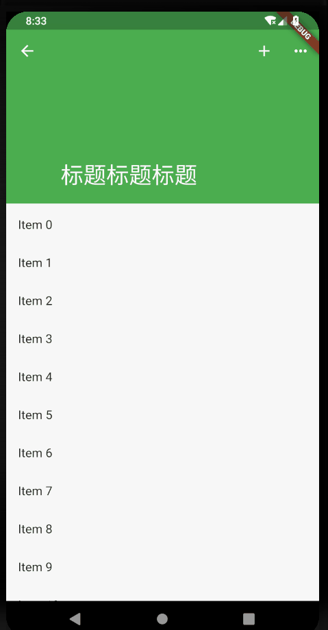
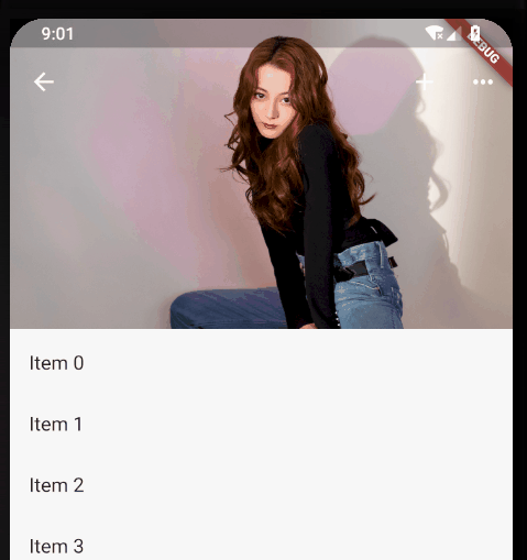
            leading: new IconButton(
              icon: Icon(Icons.arrow_back),
              onPressed: () {},
            ),

            actions: <Widget>[
              new IconButton(
                icon: Icon(Icons.add),
                onPressed: () {
                  print("添加");
                },
              ),
              new IconButton(
                icon: Icon(Icons.more_horiz),
                onPressed: () {
                  print("更多");
                },
              ),
            ],

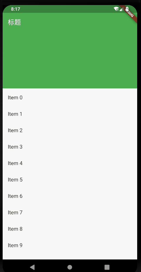
去掉title,添加flexibleSpace
            flexibleSpace: new FlexibleSpaceBar(
              title: new Text("标题标题标题"),
              centerTitle: true,
              collapseMode: CollapseMode.pin,
            ),
项目根目录下新建images文件夹,存放图片,随便选一张即可。
要加载本地图片,还需要在pubspec.yaml 文件中配置一下
  assets:
    - images/a.jpg
修改flexibleSpace
            flexibleSpace: new FlexibleSpaceBar(
              background: Image.asset("images/a.jpg", fit: BoxFit.fill),
            ),
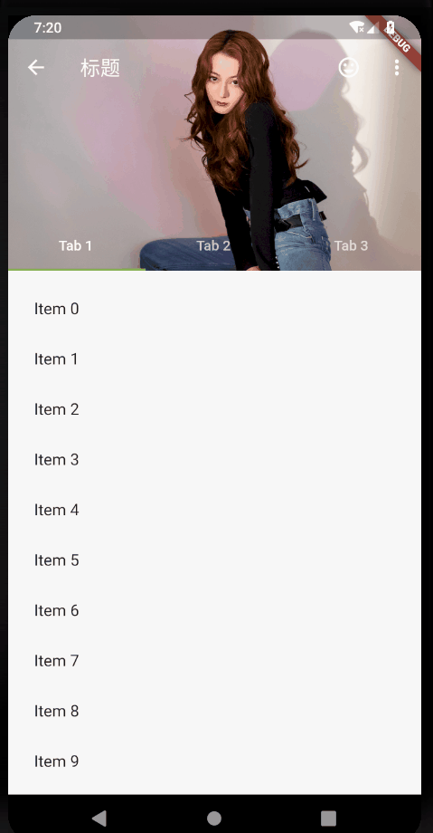
- floating: false, pinned: true, snap: false:

- floating: true, pinned: true, snap: true:

- floating: false, pinned: false, snap: false:

- floating: true, pinned: false, snap: false:
总结:仔细观察,区别主要在于:
- 标题栏是否跟着一起滑动
- 上滑的时候,SliverAppBar是直接滑上去还是先合并然后再滑上去。
- 下拉的时候,SliverAppBar是直接拉下来还是先拉下来再展开。
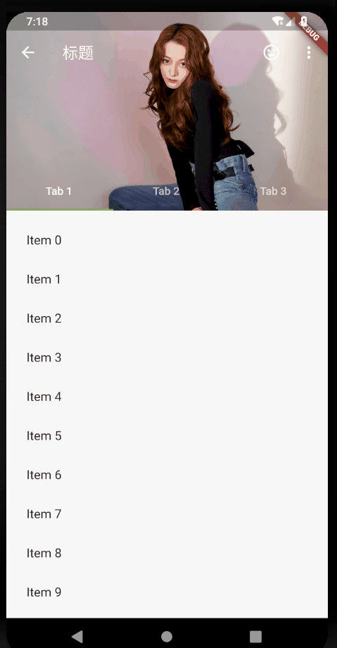
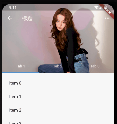
在SliverAppBar的bottom属性中添加TabBar,直接改造源码中的例子
      /// 加TabBar
      DefaultTabController(
        length: _tabs.length, // This is the number of tabs.
        child: NestedScrollView(
          headerSliverBuilder: (BuildContext context, bool innerBoxIsScrolled) {
            // These are the slivers that show up in the "outer" scroll view.
            return <Widget>[
              SliverOverlapAbsorber(
                handle:
                    NestedScrollView.sliverOverlapAbsorberHandleFor(context),
                child: SliverAppBar(
                  leading: new IconButton(
                    icon: Icon(Icons.arrow_back),
                    onPressed: () {},
                  ),
                  title: const Text('标题'),
                  centerTitle: false,
                  pinned: true,
                  floating: false,
                  snap: false,
                  primary: true,
                  expandedHeight: 230.0,

                  elevation: 10,
                  //是否显示阴影,直接取值innerBoxIsScrolled,展开不显示阴影,合并后会显示
                  forceElevated: innerBoxIsScrolled,

                  actions: <Widget>[
                    new IconButton(
                      icon: Icon(Icons.more_horiz),
                      onPressed: () {
                        print("更多");
                      },
                    ),
                  ],

                  flexibleSpace: new FlexibleSpaceBar(
                    background: Image.asset("images/a.jpg", fit: BoxFit.fill),
                  ),

                  bottom: TabBar(
                    tabs: _tabs.map((String name) => Tab(text: name)).toList(),
                  ),
                ),
              ),
            ];
          },
          body: TabBarView(
            // These are the contents of the tab views, below the tabs.
            children: _tabs.map((String name) {
              //SafeArea 适配刘海屏的一个widget
              return SafeArea(
                top: false,
                bottom: false,
                child: Builder(
                  builder: (BuildContext context) {
                    return CustomScrollView(
                      key: PageStorageKey<String>(name),
                      slivers: <Widget>[
                        SliverOverlapInjector(
                          handle:
                              NestedScrollView.sliverOverlapAbsorberHandleFor(
                                  context),
                        ),
                        SliverPadding(
                          padding: const EdgeInsets.all(10.0),
                          sliver: SliverFixedExtentList(
                            itemExtent: 50.0, //item高度或宽度,取决于滑动方向
                            delegate: SliverChildBuilderDelegate(
                              (BuildContext context, int index) {
                                return ListTile(
                                  title: Text('Item $index'),
                                );
                              },
                              childCount: 30,
                            ),
                          ),
                        ),
                      ],
                    );
                  },
                ),
              );
            }).toList(),
          ),
        ),
      ),
关于TabBar的使用可以看这篇:https://blog.csdn.net/yechaoa/article/details/90482127
ok,以上的效果基本满足日常开发需求了,也可以自己改改属性测试效果。
csdn:https://blog.csdn.net/yechaoa/article/details/90701321